
Chapter 4 of 7
Visual toolkit
Campaign look & feel
The campaign borrows Forma's brand identity and adds one thing: movement. Ink Violet sets the stage, Lilac builds the furniture, and Signal marks the one module that just moved.
Lockup
The campaign lockup
The Forma wordmark sits on top of the campaign line. The full stop is a Signal module, lifted out of place — the campaign in one detail. Use the lockup once per layout; the wordmark alone is for where the lockup won't fit.
For screens: websites, apps, social media, presentations and email.









Digital or print? The three wordmark cards hold a file per colour mode — use the switch on each card. RGB is for screens, social and Office. CMYK is for offset and digital print: flyers, inserts, partner ads. Pantone (2685 C, or Black 6 C for one colour) is for spot-colour jobs where the violet must be exact: posters, signage, shop windows and anything screen-printed or embroidered.
Clear space
Minimum sizes
Placement
Co-branding with partners
Colour versions and file formats
 Use the reversed version on Ink Violet.
 Use the Ink Violet version on Mist, Lilac or Chalk.
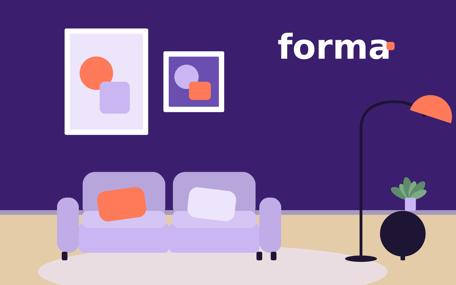 On photography, place it on a calm area with enough contrast.
 Use the black version for one-colour print and newspapers.
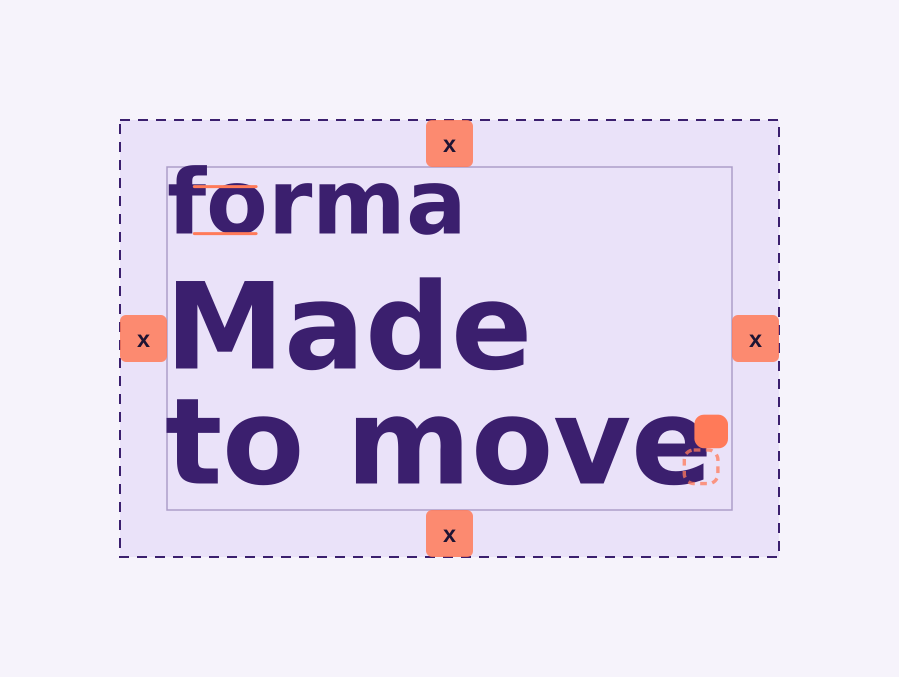
- Give it room: keep a clear space of x on every side.
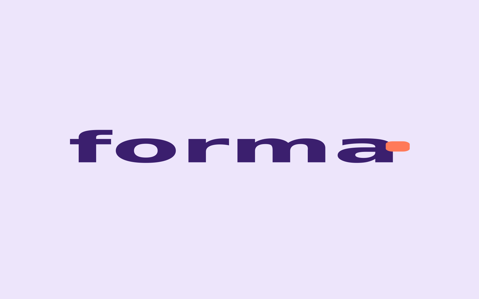 Don't stretch, squash or redraw the wordmark or lockup.
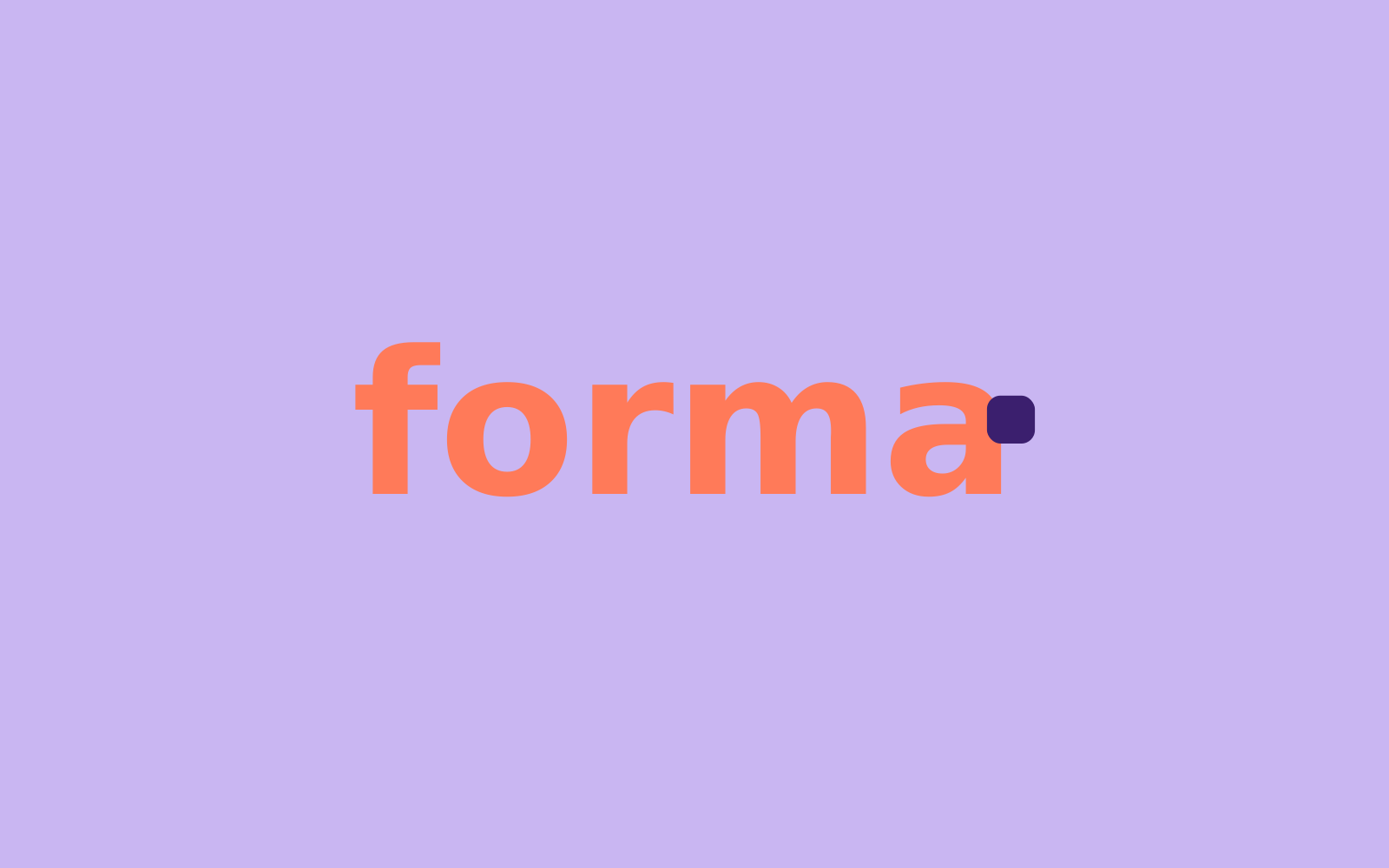 Don't recolour it. Signal is for the module, never for the letters.
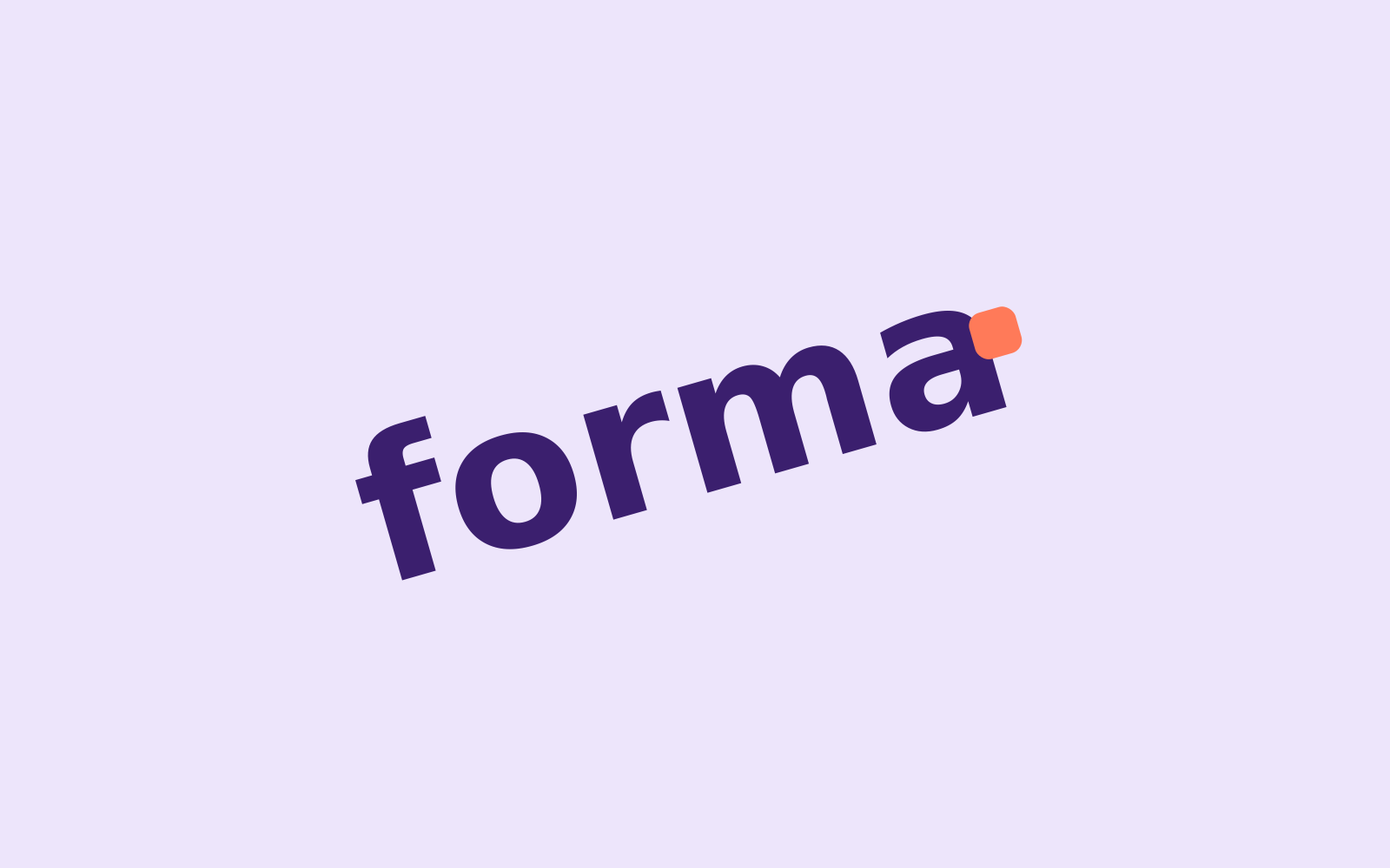 Don't rotate it. Only the module moves.
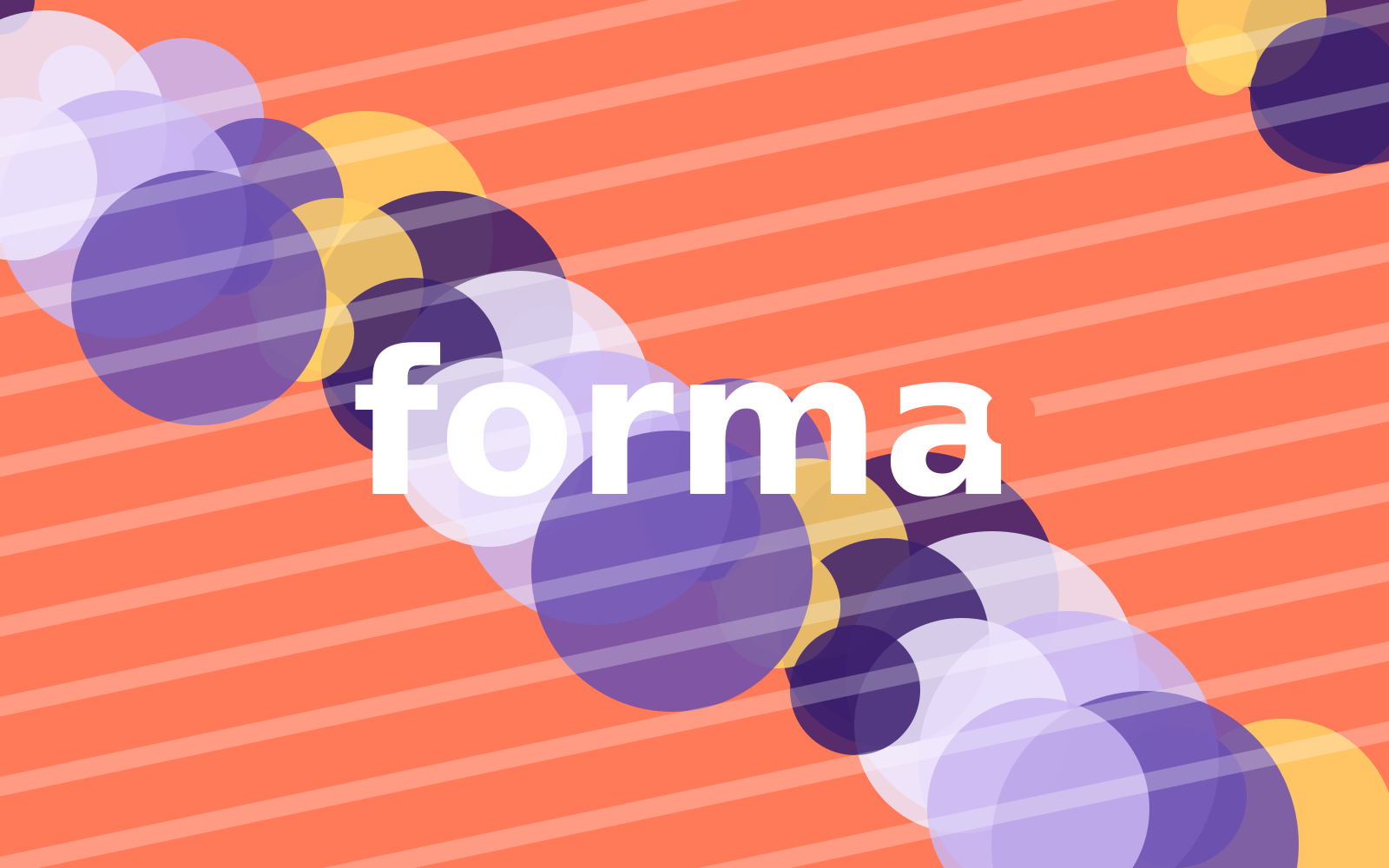 Don't place it on a busy background or pattern.
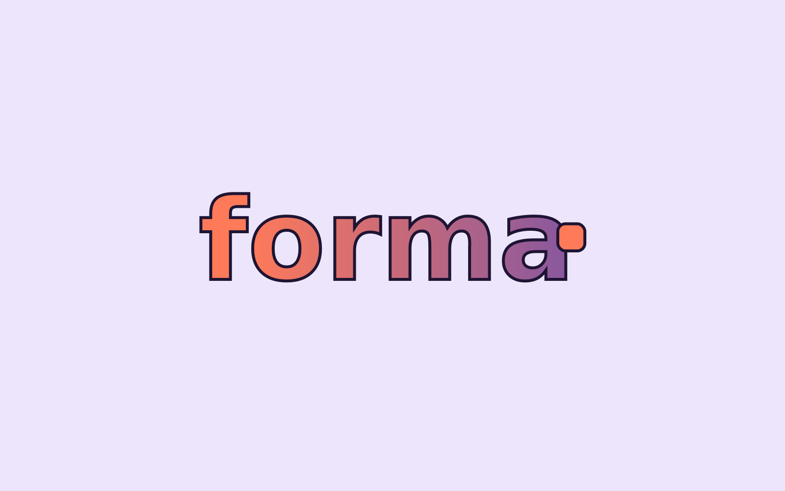 Don't add shadows, outlines, gradients or other effects.
Colour
Ink Violet sets the stage, Signal moves
Four campaign colours and two neutrals. Click any value to copy it. Print values are for coated stock; check proofs against the Pantone swatch.
Proportions
How much of each colour
Across a typical layout. Ink Violet carries the campaign; Signal stays well under 10%.
- Ink Violet 40% · Backgrounds and headlines
- Mist 22% · Floors, bands and space
- Lilac 18% · Furniture and panels
- Chalk 10% · Page and paper
- Signal 6% · The moved module and the button
- Night 4% · Body text
Contrast
Combinations that pass — and two that don't
Ratios are calculated live (WCAG 2.2). Body text needs at least 4.5:1, large text 3:1. Try the pairs with your own text.
The quick brown fox jumps over the lazy dog.
The quick brown fox jumps over the lazy dog.
The quick brown fox jumps over the lazy dog.
The quick brown fox jumps over the lazy dog.
The quick brown fox jumps over the lazy dog.
The quick brown fox jumps over the lazy dog.
The quick brown fox jumps over the lazy dog.
The quick brown fox jumps over the lazy dog.
Contrast is calculated with the WCAG 2.2 formula. AA: at least 4.5:1 for body text and 3:1 for large text (24 px, or 19 px bold); AAA: 7:1.
Using Signal
Signal is the colour of movement. It marks the one thing that moves — the module, the button, the new thing — and nothing else.
Two Signal elements per layout at most: the moved module and the call to action.
Never use it as a background for text blocks or for body copy.
Text on Signal is always Night (6.7:1). White on Signal fails contrast (2.5:1).
In print, use Pantone 1645 C for Signal on posters and in-store materials; CMYK is fine for flyers and inserts.
Typography
Syne for impact, Manrope for everything else
Two free Google Fonts, available to every partner. Syne gives the headlines their wide, slightly quirky character; Manrope keeps body copy calm and readable.
Campaign line and headlines. Sentence case, always with a full stop.
Good typography is invisible. It guides the eye from line to line, so readers stay with the story instead of the letters. Spacing between lines matters as much as the letters themselves.
- Line height
- 1.5 · 150% · 24 px at 16 px
Secondary headlines, product names, email titles. At least half the size of the display line.
Good typography is invisible. It guides the eye from line to line, so readers stay with the story instead of the letters. Spacing between lines matters as much as the letters themselves.
- Line height
- 1.5 · 150% · 24 px at 16 px
Body copy, captions, legal lines. Regular 16–18 px on screen, 9–11 pt in print.
Good typography is invisible. It guides the eye from line to line, so readers stay with the story instead of the letters. Spacing between lines matters as much as the letters themselves.
- Line height
- 1.5 · 150% · 24 px at 16 px
Eyebrows in caps. Buttons in sentence case, Night on Signal.
Good typography is invisible. It guides the eye from line to line, so readers stay with the story instead of the letters. Spacing between lines matters as much as the letters themselves.
- Line height
- 1.5 · 150% · 24 px at 16 px
Type scale
One hierarchy, everywhere
Sizes for screen at desktop width; scale everything down by the same factor for small formats. Keep this order: eyebrow, line, subhead, body, button.
Fallback fonts: email, Word and PowerPoint
Line height and letter spacing
Graphic device
The shift
Our one graphic device. A grid of soft modules, one of which has just moved: it leaves a dashed outline behind and carries a short Signal trail. Use it where there's no furniture to show — teasers, backgrounds, icons, motion.
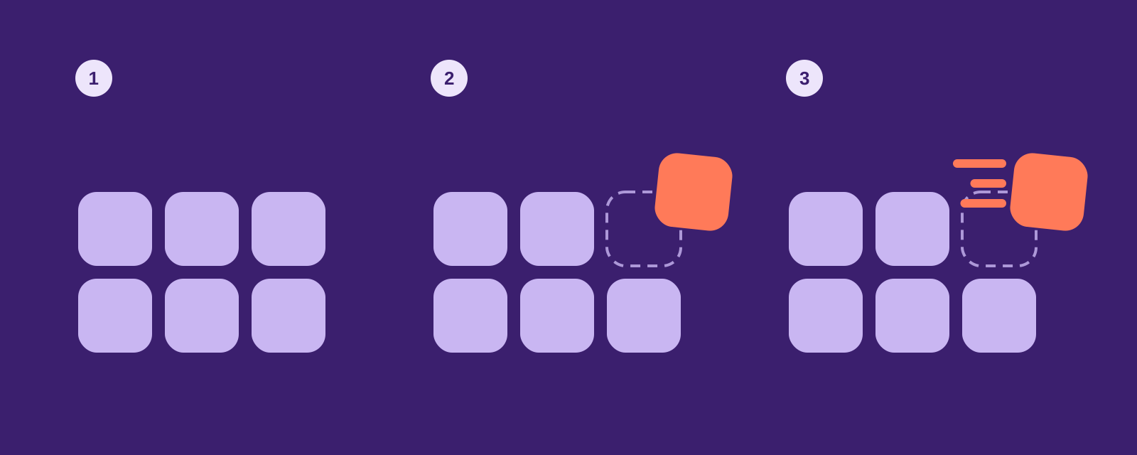
1 · Start from the grid
Square modules with 25% corner radius, gaps of 1/6 of a module. Lilac on Ink Violet, or Ink Violet on Mist.
2 · Shift one module
Move one module up and to the right by about half its size and rotate it 4–6°. It turns Signal. Leave a dashed outline where it was.
3 · Add the trail
Three rounded lines behind the module, in Signal, of different lengths. Never more than three lines, never on more than one module.

Icons
Icons that point at the product
Four brand icons tell the product story; Material Symbols (rounded, weight 500) cover everything functional in banners, the landing page and the configurator. Ink Violet, with Signal only for the moving part.
Brand icons
4 iconsInterface (Material Symbols)
12 iconsMaterial Symbols by Google, open source (Apache 2.0)
Photography
Real homes, mid-change
Campaign photography shows the moment life changes shape — not the finished showroom. Boxes still in the hallway, a new seat clicked on, a kids' drawing on the shelf. These illustrations brief the photographer on scenes and colour.
Light: daylight, from the side. No flash, no harsh shadows.
Viewpoint: eye level, a 35 mm feel. Show the room, not just the product.
Colour: at least one campaign colour in every shot — a Lilac sofa, an Ink Violet wall, a Signal cushion.
People: busy with something, not posing. Faces may be out of frame.
Space: leave a calm area of at least 30% of the frame for copy.
What this means: Something is happening — a move, a new seat — but it never feels hectic.
What this means: Daylight from the side. No flash, no harsh shadows.
What this means: Real homes with real clutter: boxes, drawings, a mug on the floor.
What this means: At least one campaign colour in every shot; no colour grading.
What this means: Show the room and the change; details only for materials.
Keywords
- mid-change
- daylight
- real homes
- eye level
- 35 mm
- a campaign colour
- people busy
- calm area for copy
Moodboard
- Show a change in progress: boxes, a half-arranged room, a module being carried.
- Shoot in real homes in Amsterdam, Utrecht and Antwerp, with real tenants where possible.
- No studio cut-outs on white for campaign visuals — those are for product pages.
- No perfect families smiling into the camera, no heavy filters or teal-and-orange grading.
Questions about this guide?
Contact LotteLast updated 24 Sept 2026
Made with brandbooks