
Live demo of the Campaign playbook blueprint · Forma is a fictional brand.All blueprintsJoin the waitlist
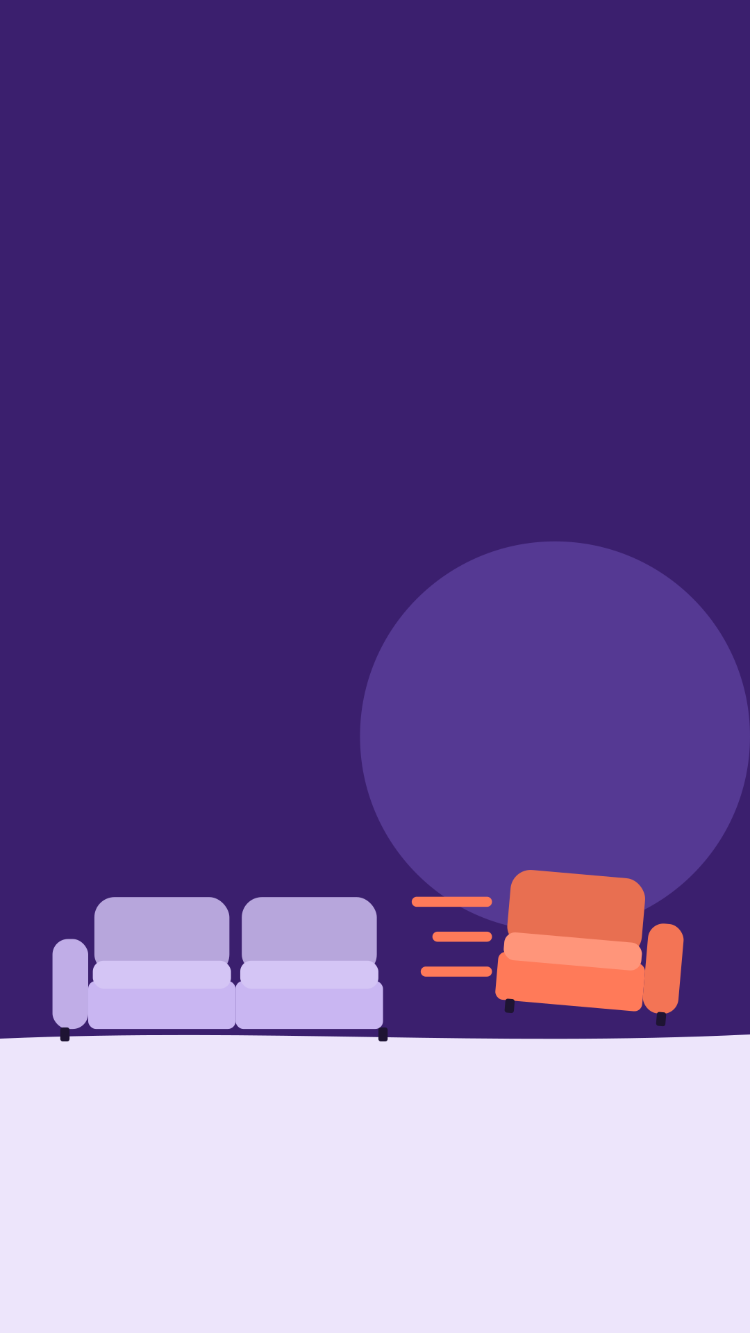
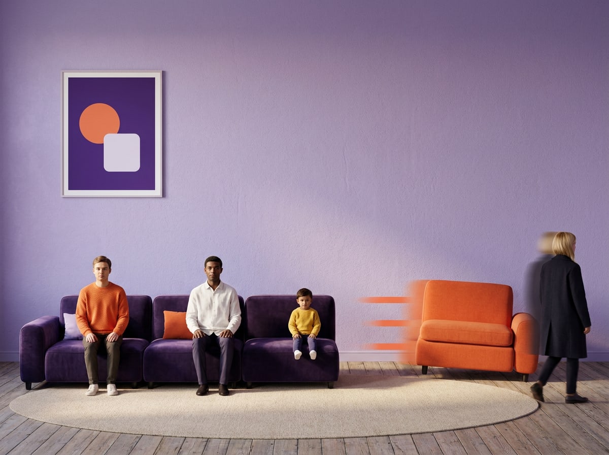
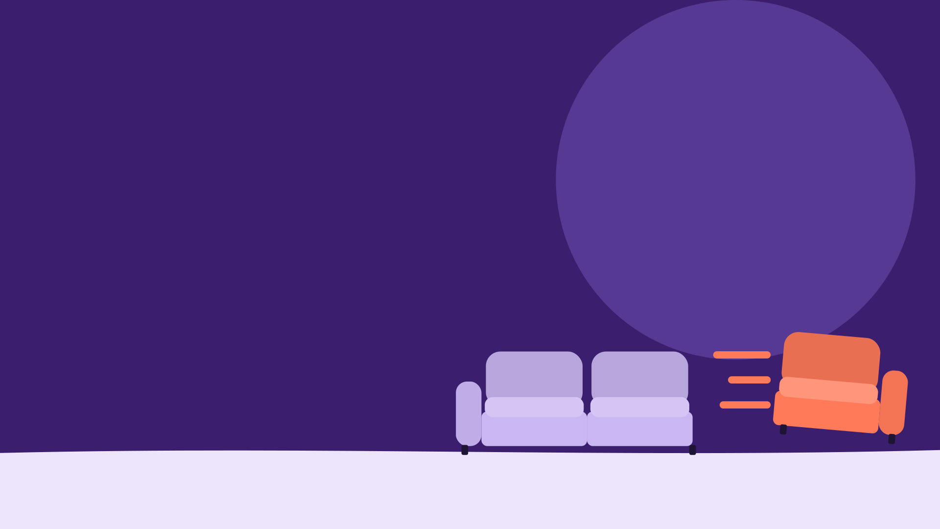
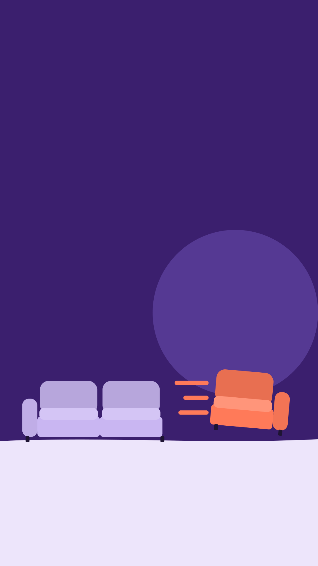
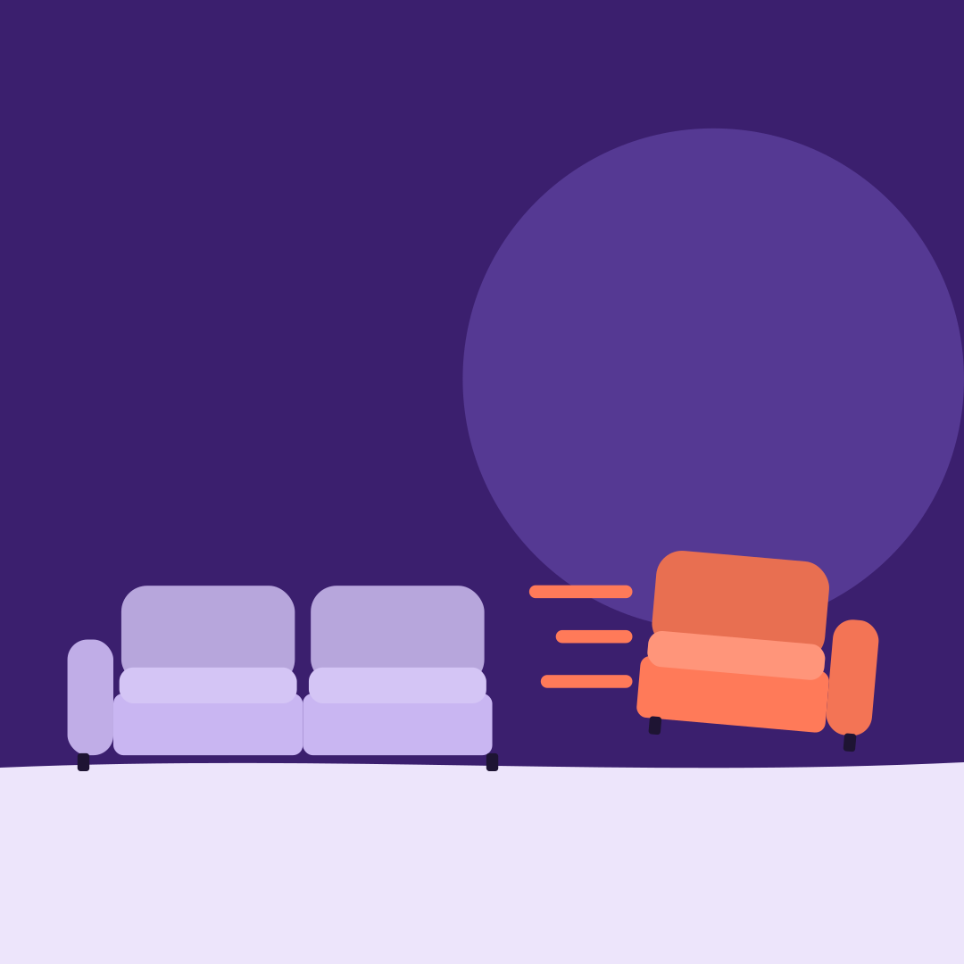
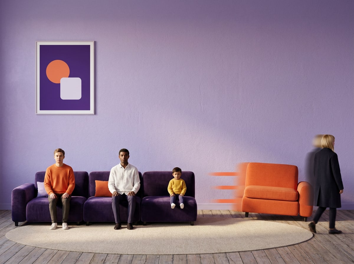
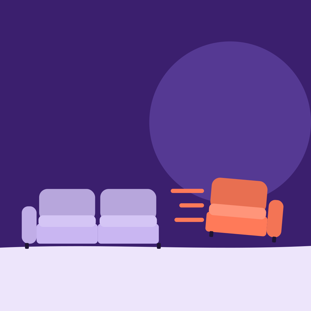
Key visual: two lilac sofa modules on an ink-violet background, a third module in Signal orange sliding out with motion lines.
Forma

Campaign playbook · Autumn 2026

Made to move.

Everything partners and agencies need to launch Forma's new modular sofas and shelving — on every channel, in one voice. Live from 6 October 2026.

Start7 chapters · Download assets

Chapter 01 / 07

Campaign idea

The idea, objective, timing and what we measure.

The idea

Furniture that keeps up with your life.

Most furniture is made to stay. Ours is made to move. The new Forma modular collection — sofas and shelving built from modules that click together — grows when your household grows, shrinks when it shrinks, and comes apart to fit up any stairwell in Amsterdam.

Made to move turns that product truth into a promise about life. Whatever moves you next — a new home, a new person, a new room — your furniture moves with you.

We don't sell sofas. We sell the next version of your living room.

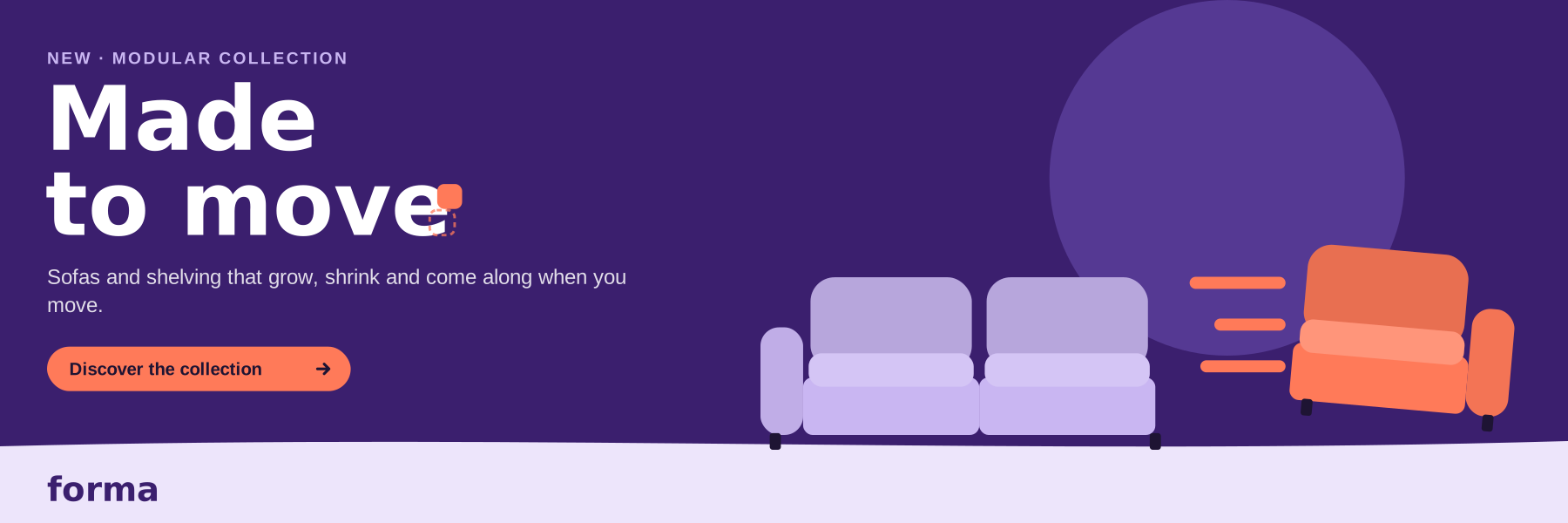
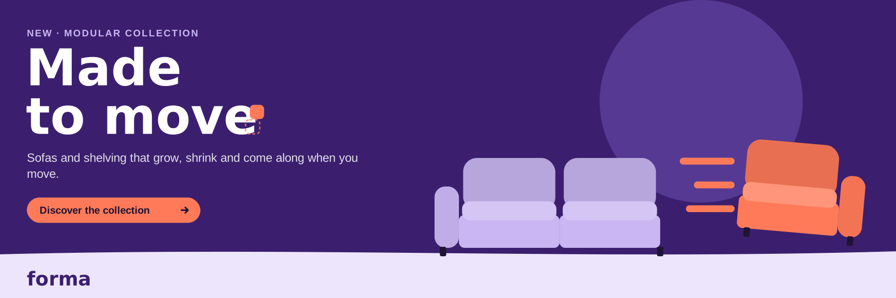
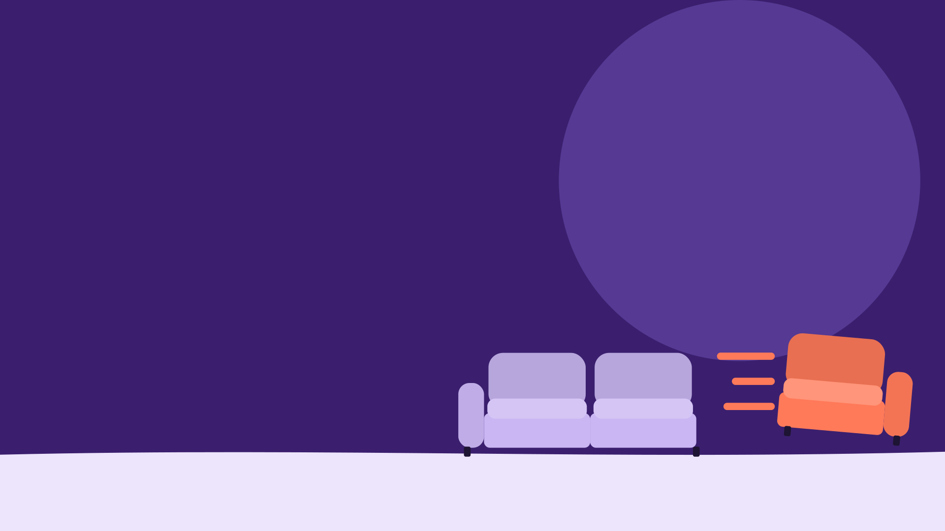
Landscape key visual with the sliding Signal module.
The key visual: one module has just moved. That single moment carries the whole campaign.

Why we're doing this

Objective and insight

Objective

Make Forma the name people think of when their life changes shape. Launch the modular collection, drive people to the online configurator and the showrooms, and sell modules — not just sofas.

Insight

Homes change faster than furniture. Our audience moves on average every four years — and most sofas don't fit through the next front door, let alone the next stage of life.

Timing

Eight weeks, four phases

The campaign launches on Tuesday 6 October 2026 at 07:00 CET and runs until Monday 30 November. A one-week teaser on social goes first.

Teaser · 29 Sep – 5 Oct

Social only. Close-ups of a single Signal module, no product names, no prices. Line: 'Something's about to move.'

Launch · 6 – 19 Oct

Full roll-out: out-of-home in Amsterdam, Utrecht, Rotterdam and Antwerp, social, email, banners, showrooms and partner stores. Launch weekend in all showrooms: 10–11 Oct.

Sustain · 20 Oct – 16 Nov

Audience stories: first flat, growing family, working from home. Retargeting towards the configurator. Partner retailers start in-store activation.

Close · 17 – 30 Nov

Retail push with the 'Add a module' offer: 15% off every extra module bought with a sofa. Offer ends Monday 30 Nov at 23:59.

Success

What we measure

Four KPIs, reported every Monday in the campaign dashboard. Partners receive their own store figures every two weeks.

18M

Impressions across out-of-home, social and display in the Netherlands and Flanders.

+8 pts

Aided brand awareness among 25–40-year-olds (brand tracker, December 2026 wave).

60,000

Configurator sessions, and 4,000 booked showroom visits.

11,000

Modules sold during the campaign; 30% of sofa orders include at least one extra module.

Embargo and launch moment
Nothing from the collection appears in public before Tuesday 6 October 2026, 07:00 CET — no product shots, no prices, no stories from the photo shoot. Teaser content (29 Sep – 5 Oct) shows only the Signal module, never a full sofa or shelf. Press receives the kit under embargo on 1 October.
Approvals
Send every new layout, caption set or format to Studio Forma before it goes live. We reply within two working days, with a maximum of two feedback rounds. Anything that changes the campaign line, the lockup or the colours needs approval from the campaign lead. Adapting an approved template (size, language, store details) needs no extra approval.
Prices, offers and claims
Always say 'from' with a price: 'Seat modules from €695'. Prices include VAT. The 'Add a module' offer runs 17–30 November only and must show its end date. Use only the proof points from the message house. They have been checked by Legal; new claims have not.
Languages and markets
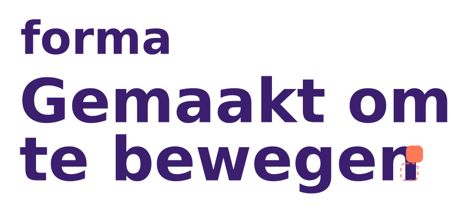
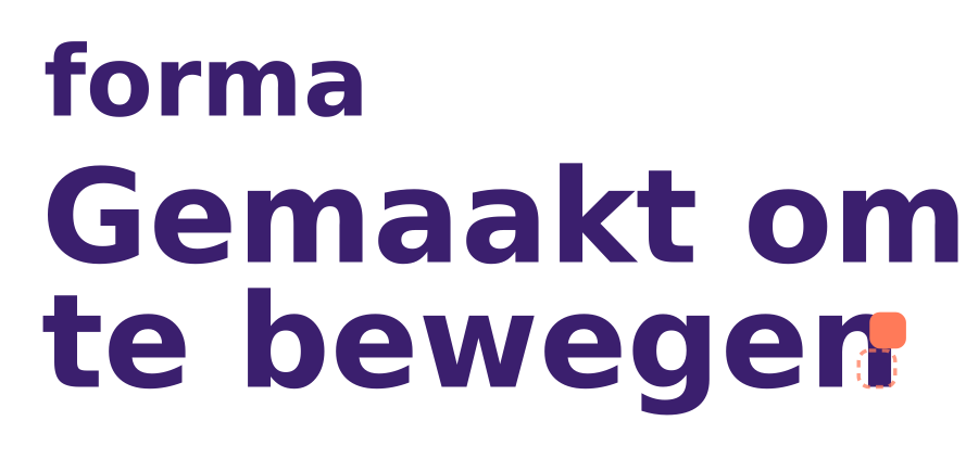
English materials use 'Made to move.', Dutch and Flemish materials use 'Gemaakt om te bewegen.' Never put both lines in one layout. In Flanders, say 'zetel' where Dutch copy says 'bank', and use Belgian prices and opening hours. Antwerp is the lead showroom for Belgian partners.
Next chapter · 02Audience & proposition

Chapter 02 / 07

Audience & proposition

Who we talk to, what we promise and why they believe it.

Audience

Life movers

25 to 40, living in cities in the Netherlands and Flanders. About to move, move in together or make room for a child. Design-minded, budget-aware, and renting as often as owning. Three people stand for them — tap a persona to meet them.

Noor

27 · starter, moving into her first flat in Amsterdam-Noord

I want a proper sofa — but I'm not carrying a three-seater up four flights for a flat I'll leave in two years.
  • Furniture that fits a small room now and a bigger one later
  • Something that looks designed, not temporary
  • A price she can split over time

Jesse & Amira

34 · expecting their first child, Utrecht

The study becomes a nursery, the living room becomes everything else. Our sofa has to keep up.
  • More seats without a new sofa
  • Covers that survive milk, crayons and a dog
  • Storage that grows with the toys

Lieve

31 · works from home in a one-bedroom flat, Antwerp

My living room is my office from nine to five. At seven it needs to feel like home again.
  • A clear line between work and home
  • Storage that doesn't swallow the room
  • Furniture she can rearrange herself

Positioning

For city dwellers whose lives change shape faster than their homes, Forma is the modular furniture brand that grows, shrinks and moves with you — because every piece is built from modules that click together, fit through any door and last for many homes.

Positioning map

Design-led
Fixed
Modular
Budget-led

Message house

One promise, three pillars

Every piece of content tells the proposition through one pillar. Pick the pillar that fits the moment and lead with one proof point — never all of them at once.

Proposition — Forma's modular sofas and shelving grow, shrink and move with you, so your home keeps up with your life.

Grows with you

Add a seat for a new housemate, a corner for movie nights, a shelf for the record collection. Proof points — 14 modules: seats, corners, chaise, ottoman and four shelf sizes — Add a module in 2 minutes, no tools — Seat modules from €695

Moves with you

Four flights of stairs, a narrow door, a borrowed car. Forma comes apart and comes along. Proof points — Every module fits through a 70 cm door — A three-seater fits in a hatchback, in five boxes — Free re-planning in the configurator after every move

Made to last

Moving doesn't mean replacing. Forma is built for many homes, not one. Proof points — 10-year guarantee on every frame — Covers zip off, wash at 30 °C and are sold separately — FSC-certified birch; fabrics from 100% recycled PET — Take-back scheme for used modules

Audiences

Messages per audience

Same campaign line, different moment. Use these as the starting point for targeting, captions and retailer conversations.

Starters — their first own place
Their moment: first flat, small budget, often a fourth-floor walk-up. Pillar: Moves with you. Lead proof: every module fits through a 70 cm door. Example headline: 'Start with one seat. Bring it to the next place.'
Growing families
Their moment: a baby on the way, a room becoming a kids' room, more people on the sofa. Pillar: Grows with you. Lead proof: add a module in two minutes, washable covers. Example headline: 'One more seat. Same sofa.'
Working from home in small spaces
Their moment: the living room is also the office, the guest room and the gym. Pillar: Grows with you. Lead proof: shelving that doubles as a room divider, in four sizes. Example headline: 'Office by day. Living room by seven.'
Partner retailers (B2B)
Their moment: a showroom floor that needs to sell more per square metre. Pillar: Made to last. Lead proof: one display set of 6 modules shows 20+ configurations; customers come back to add modules. Example line for staff: 'Build it here, change it at home.'
Next chapter · 03Messages & tone

Chapter 03 / 07

Messages & tone

Campaign line, personality, copy examples and wording.

Campaign line

Made to move.

Three words that work in a headline, a hashtag and a sales conversation. It's about the furniture — it moves — and about the people who buy it: their lives move.

How to use the line

  • Always write it with a full stop. In the lockup, the full stop is the Signal module.

  • Never change, shorten or add words. No 'Made to move you', no 'Made 2 move'.

  • English materials use Made to move. — Dutch and Flemish materials use Gemaakt om te bewegen. It's an adaptation, not a translation, and never both in one layout.

  • In running text, the line appears once at most, preferably at the end.

  • Hashtags: #MadeToMove and #GemaaktOmTeBewegen.

Personality & tone

Bold, playful, smart

Forma talks like a friend with good taste who's helped you move twice. Short sentences, real situations, one smile per piece — never a joke at the customer's expense.

Where we stand

What this means: Short, confident statements and big type. We never whisper the line.

What this means: A smile in every piece — about the situation, never about the customer.

What this means: We know the numbers, but explain them like a friend would.

What this means: Familiar furniture, unexpected ideas: the module that moves.

What this means: Design for renters and first homes, not just for collectors.

Our traits

01

Bold

We say it straight and keep it short. Verbs over adjectives.

For example
'Add a seat. Lose a seat. Keep the sofa.'

But not: 'An innovative, flexible seating solution.'

02

Playful

We find the small, recognisable moment in a big life change.

For example
'Fits up the stairs your landlord swore were wide enough.'

But not: 'LOL, moving is the worst!!'

03

Smart

Every claim earns its place with a number or a fact.

For example
'Through a 70 cm door, in five boxes.'

But not: 'Incredibly easy to move.'

Copy examples

Ready to use

Approved copy you can use as is. Write new copy in the same rhythm: one situation, one proof, the line.

Headlines

— New home. Same sofa. — One more seat. Same sofa. — Fits through the door. Every door. — Shelving that moves out when you do. — Your life changed shape. So can your sofa.

Social captions

— Moving in together? Two sofas, one living room, zero arguments. Click them into one. #MadeToMove — Four flights of stairs, five boxes, one sofa. Ask us how. — Started with one seat in 2022. Now it's a corner sofa. Same modules.

Calls to action

Primary: Discover the collection Configurator: Build your own Showroom: Come sit, swap, rebuild Offer (17–30 Nov): Add a module, save 15% Always a verb first. No 'Click here', no 'Learn more'.

Wording

Do's and don'ts

Do
  • Say 'module', 'click on', 'click off' and 'grows with you'. They describe what the product actually does.
  • Talk to one person, in the second person: 'your home', 'your next room'.
  • Back every claim with a number: 2 minutes, 70 cm, 10 years.
Don't
  • Don't call it 'flat-pack' or 'self-assembly'. Nothing needs building.
  • Don't pun on the line: no 'Made to groove', 'Move it, move it' or 'On the move'.
  • Don't use 'cheap', 'bargain' or countdown pressure. Not even during the offer.
Next chapter · 04Visual toolkit

Chapter 04 / 07

Visual toolkit

Lockup, colour, type, the shift, icons and photography.

Visual toolkit

Campaign look & feel

The campaign borrows Forma's brand identity and adds one thing: movement. Ink Violet sets the stage, Lilac builds the furniture, and Signal marks the one module that just moved.

Lockup

The campaign lockup

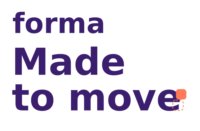
The Forma wordmark sits on top of the campaign line. The full stop is a Signal module, lifted out of place — the campaign in one detail. Use the lockup once per layout; the wordmark alone is for where the lockup won't fit.

For screens: websites, apps, social media, presentations and email.

Campaign lockup
Campaign lockup
  • SVGRGB · 954 B · 645 × 423 px
Campaign lockup — reversed
  • SVGRGB · 954 B · 645 × 423 px
Forma mark (avatars, favicons)
  • SVGRGB · 555 B · 400 × 400 px
Forma wordmark
Forma wordmark
  • SVGRGB · 246 B · 520 × 180 px
Wordmark — reversed
Wordmark — reversed
  • SVGRGB · 246 B · 520 × 180 px
Wordmark — black, one colour
  • SVGRGB · 246 B · 520 × 180 px

Digital or print? The three wordmark cards hold a file per colour mode — use the switch on each card. RGB is for screens, social and Office. CMYK is for offset and digital print: flyers, inserts, partner ads. Pantone (2685 C, or Black 6 C for one colour) is for spot-colour jobs where the violet must be exact: posters, signage, shop windows and anything screen-printed or embroidered.

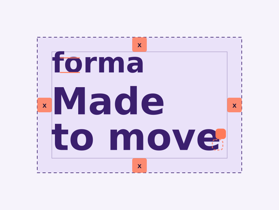
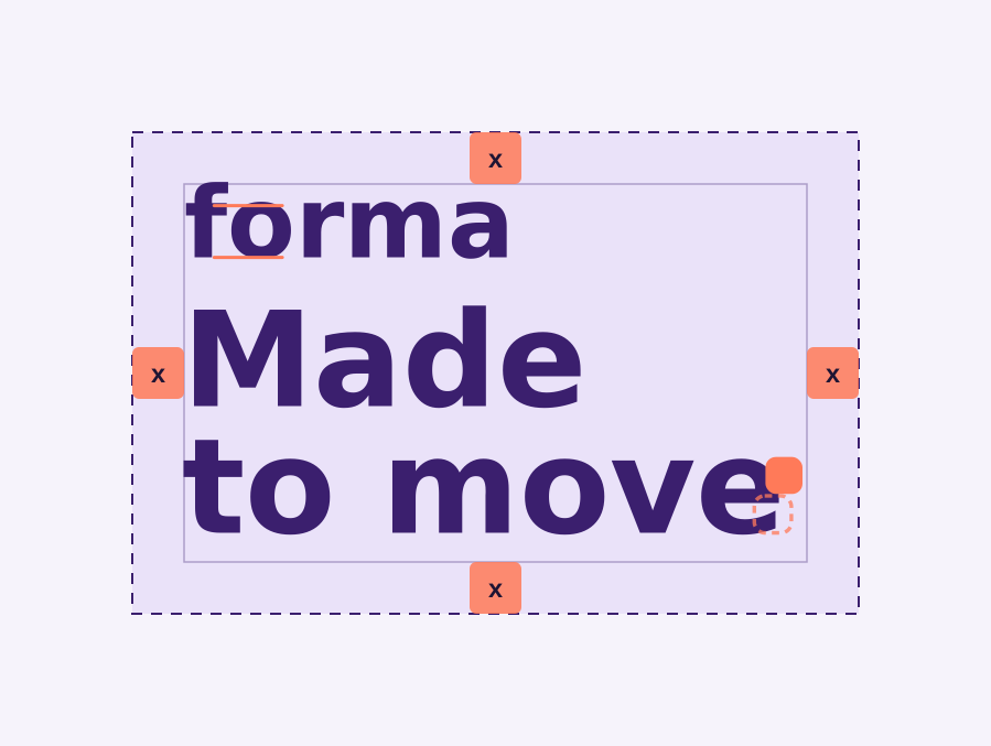
Clear-space diagram: a margin of x around the lockup, where x is the height of the 'o' in forma.
Clear space: x on every side, where x is the height of the 'o' in forma (marked in Signal).
Clear space
Keep a space of x around the lockup and the wordmark, where x is the height of the 'o' in forma. Nothing enters this zone: no copy, no partner logos, no format edge. On formats under 300 px wide, a clear space of ½x is allowed.
Minimum sizes
Campaign lockup: 120 px wide on screen, 30 mm in print. Wordmark: 24 px high on screen, 15 mm wide in print. Forma mark: 32 px — for avatars, favicons and app icons only. Below these sizes, drop the campaign line and use the wordmark.
Placement
The lockup sits top left, aligned to the margin. The margin is 7.5% of the shortest side of the format. When the campaign line is already the headline, use the wordmark on its own in the bottom band — never the line twice.
Co-branding with partners
Partner logos go in the bottom band, right-aligned, no taller than 80% of the Forma wordmark height. Separate the two logos by at least 2x. Never lock a partner logo into the campaign line or place it on Signal. Templates with a partner slot are in Assets.
Colour versions and file formats
Ink Violet lockup on Chalk, Mist or Lilac. Reversed (white) lockup on Ink Violet, Night or a calm, dark photo area. Black for one-colour print, newspapers and engraving. SVG for web and digital, vector PDF for print, PNG at 2x for presentations.
Do
  • Use the reversed version on Ink Violet.
  • Use the Ink Violet version on Mist, Lilac or Chalk.
  • On photography, place it on a calm area with enough contrast.
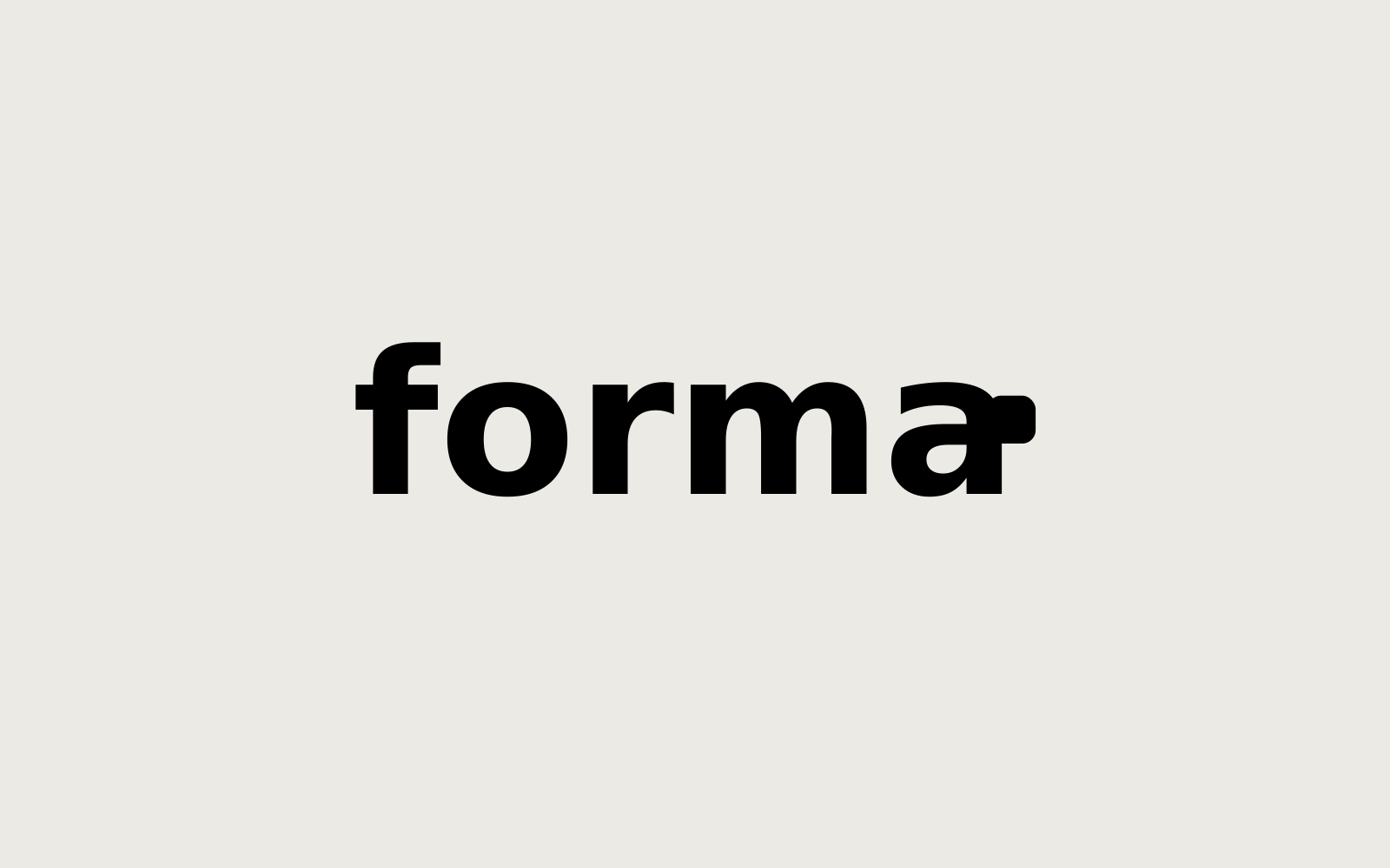
  • Use the black version for one-colour print and newspapers.
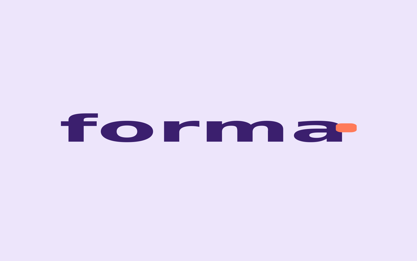
  • Give it room: keep a clear space of x on every side.
Don't
  • Don't stretch, squash or redraw the wordmark or lockup.
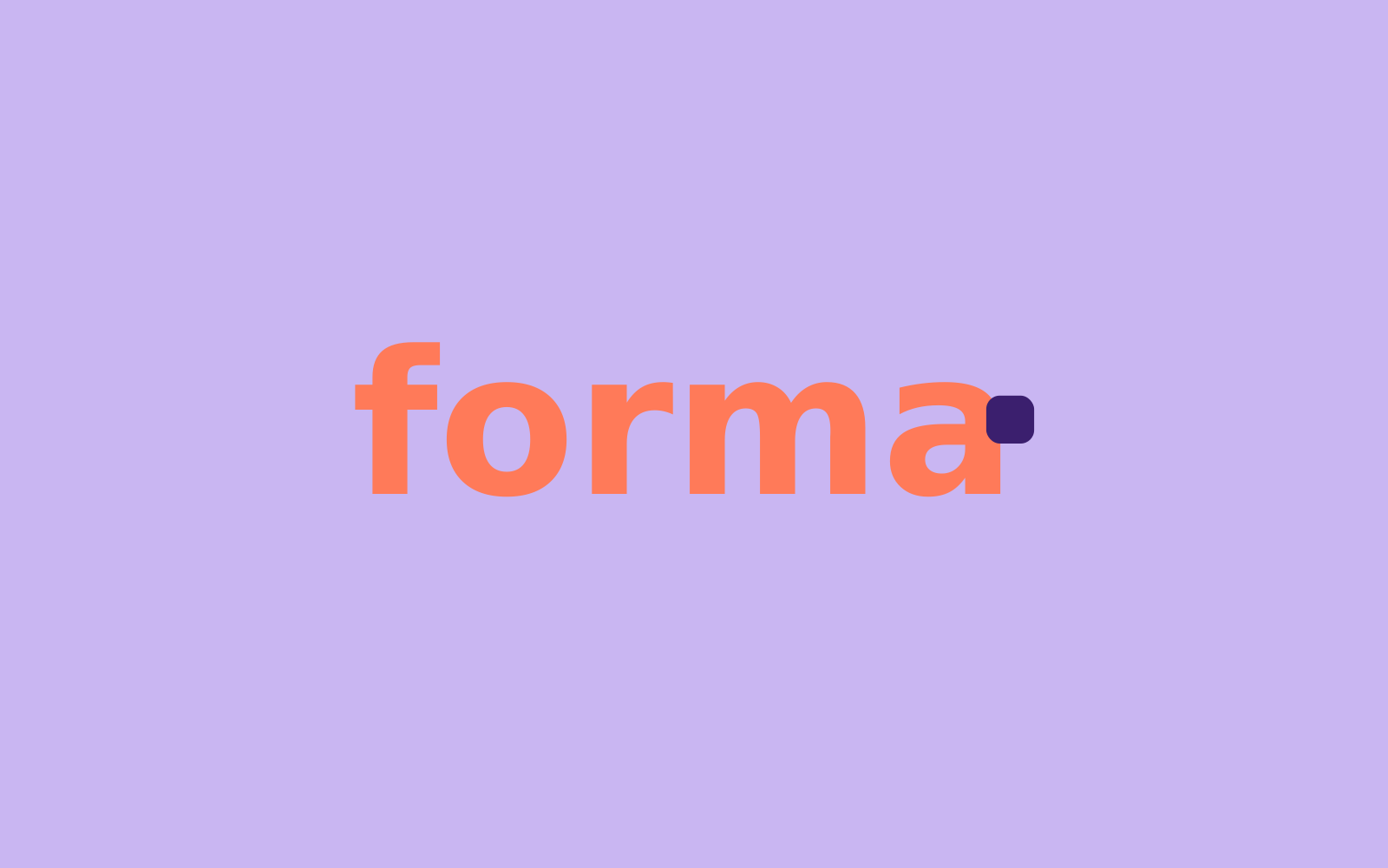
  • Don't recolour it. Signal is for the module, never for the letters.
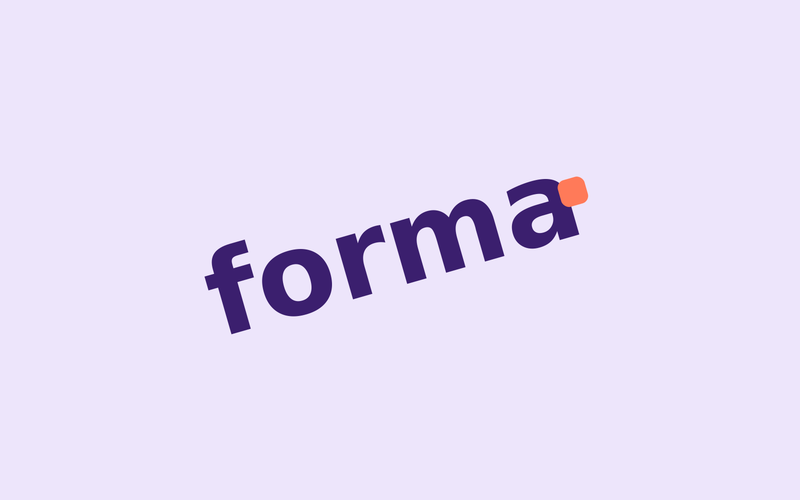
  • Don't rotate it. Only the module moves.
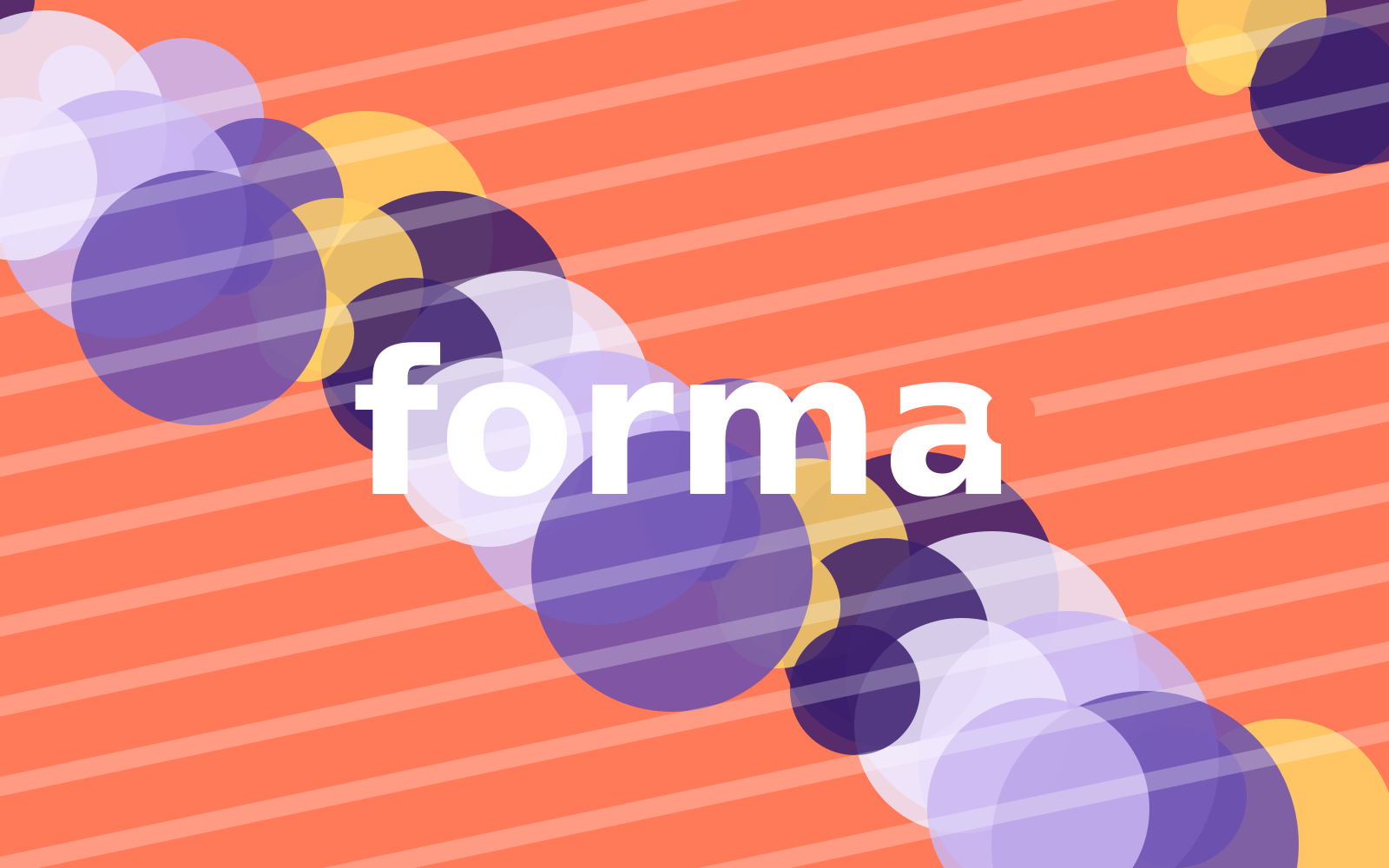
  • Don't place it on a busy background or pattern.
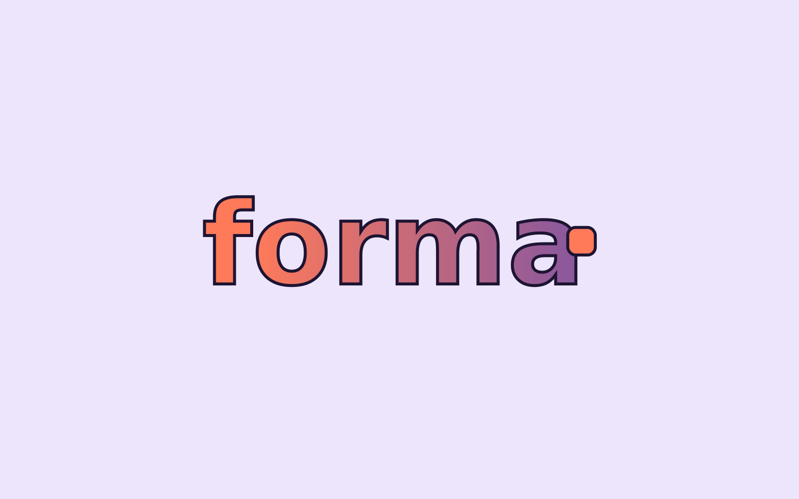
  • Don't add shadows, outlines, gradients or other effects.
Colour

Ink Violet sets the stage, Signal moves

Four campaign colours and two neutrals. Click any value to copy it. Print values are for coated stock; check proofs against the Pantone swatch.

Ink Violet
Lead colour: backgrounds and headlines, with white text.
Lilac
Furniture modules and panels, with Ink Violet text.
Mist
Floors, bottom bands and light backgrounds.
Signal
Campaign accent: the moved module and calls to action. Night text only.
Chalk
Page background on screen; unprinted paper white in print.
Night
Body text, icons and text on Signal.

Proportions

How much of each colour

Across a typical layout. Ink Violet carries the campaign; Signal stays well under 10%.

  • Ink Violet 40% · Backgrounds and headlines
  • Mist 22% · Floors, bands and space
  • Lilac 18% · Furniture and panels
  • Chalk 10% · Page and paper
  • Signal 6% · The moved module and the button
  • Night 4% · Body text

Contrast

Combinations that pass — and two that don't

Ratios are calculated live (WCAG 2.2). Body text needs at least 4.5:1, large text 3:1. Try the pairs with your own text.

Preview as
Aa
13.0:1
White on Ink Violet

The quick brown fox jumps over the lazy dog.

AAA
Aa
10.7:1
Ink Violet on Mist

The quick brown fox jumps over the lazy dog.

AAA
Aa
7.1:1
Ink Violet on Lilac

The quick brown fox jumps over the lazy dog.

AAA
Aa
6.7:1
Night on Signal

The quick brown fox jumps over the lazy dog.

AA
Aa
15.9:1
Night on Chalk

The quick brown fox jumps over the lazy dog.

AAA
Aa
7.1:1
Lilac on Ink Violet

The quick brown fox jumps over the lazy dog.

AAA
Aa
2.5:1
White on Signal

The quick brown fox jumps over the lazy dog.

Not for text
Aa
2.1:1
Signal on Mist

The quick brown fox jumps over the lazy dog.

Not for text

Contrast is calculated with the WCAG 2.2 formula. AA: at least 4.5:1 for body text and 3:1 for large text (24 px, or 19 px bold); AAA: 7:1.

Using Signal

Signal is the colour of movement. It marks the one thing that moves — the module, the button, the new thing — and nothing else.

  • Two Signal elements per layout at most: the moved module and the call to action.

  • Never use it as a background for text blocks or for body copy.

  • Text on Signal is always Night (6.7:1). White on Signal fails contrast (2.5:1).

  • In print, use Pantone 1645 C for Signal on posters and in-store materials; CMYK is fine for flyers and inserts.

Typography

Syne for impact, Manrope for everything else

Two free Google Fonts, available to every partner. Syne gives the headlines their wide, slightly quirky character; Manrope keeps body copy calm and readable.

Display
Syne
Extra bold

Campaign line and headlines. Sentence case, always with a full stop.

Good typography is invisible. It guides the eye from line to line, so readers stay with the story instead of the letters. Spacing between lines matters as much as the letters themselves.

Line height
1.5 · 150% · 24 px at 16 px
Subheads
Syne
Bold

Secondary headlines, product names, email titles. At least half the size of the display line.

Good typography is invisible. It guides the eye from line to line, so readers stay with the story instead of the letters. Spacing between lines matters as much as the letters themselves.

Line height
1.5 · 150% · 24 px at 16 px
Body
Manrope
Regular · Medium

Body copy, captions, legal lines. Regular 16–18 px on screen, 9–11 pt in print.

Good typography is invisible. It guides the eye from line to line, so readers stay with the story instead of the letters. Spacing between lines matters as much as the letters themselves.

Line height
1.5 · 150% · 24 px at 16 px
Eyebrows and buttons
Manrope
Bold

Eyebrows in caps. Buttons in sentence case, Night on Signal.

Good typography is invisible. It guides the eye from line to line, so readers stay with the story instead of the letters. Spacing between lines matters as much as the letters themselves.

Line height
1.5 · 150% · 24 px at 16 px

Type scale

One hierarchy, everywhere

Sizes for screen at desktop width; scale everything down by the same factor for small formats. Keep this order: eyebrow, line, subhead, body, button.

Eyebrow
Body font 700 · 13/18 · +12% · caps
New · modular collection
Display
Heading font 800 · 64/62 · -1%
Made to move.
Subhead
Heading font 700 · 30/34
One more seat. Same sofa.
Lead
Body font 500 · 20/28
Sofas and shelving that grow, shrink and come along when you move.
Body
Body font 400 · 17/26
Add a seat when friends stay over. Every module clicks on and off in two minutes — no tools needed.
Button
Body font 700 · 16/20
Discover the collection
Caption and legal
Body font 400 · 13/18
Prices include VAT. Offer valid 17–30 November 2026.
Fallback fonts: email, Word and PowerPoint
Syne and Manrope don't exist in Outlook, Word or on a partner's laptop. There, use: Headlines (Syne ExtraBold) → Arial Black, line height 1.0. Subheads (Syne Bold) → Arial Bold. Body, eyebrows and buttons (Manrope) → Segoe UI on Windows, Roboto or Helvetica elsewhere; Arial as a last resort. Never substitute with another display font — a plain Arial Black reads more like Forma than a look-alike.
Line height and letter spacing
Display: line height 0.95, tracking −1%. Subheads: 1.1, 0%. Body: 1.5, 0%. Eyebrows: 1.3, +12%, caps. In print, use the same ratios in points (e.g. body 10/15 pt).

Graphic device

The shift

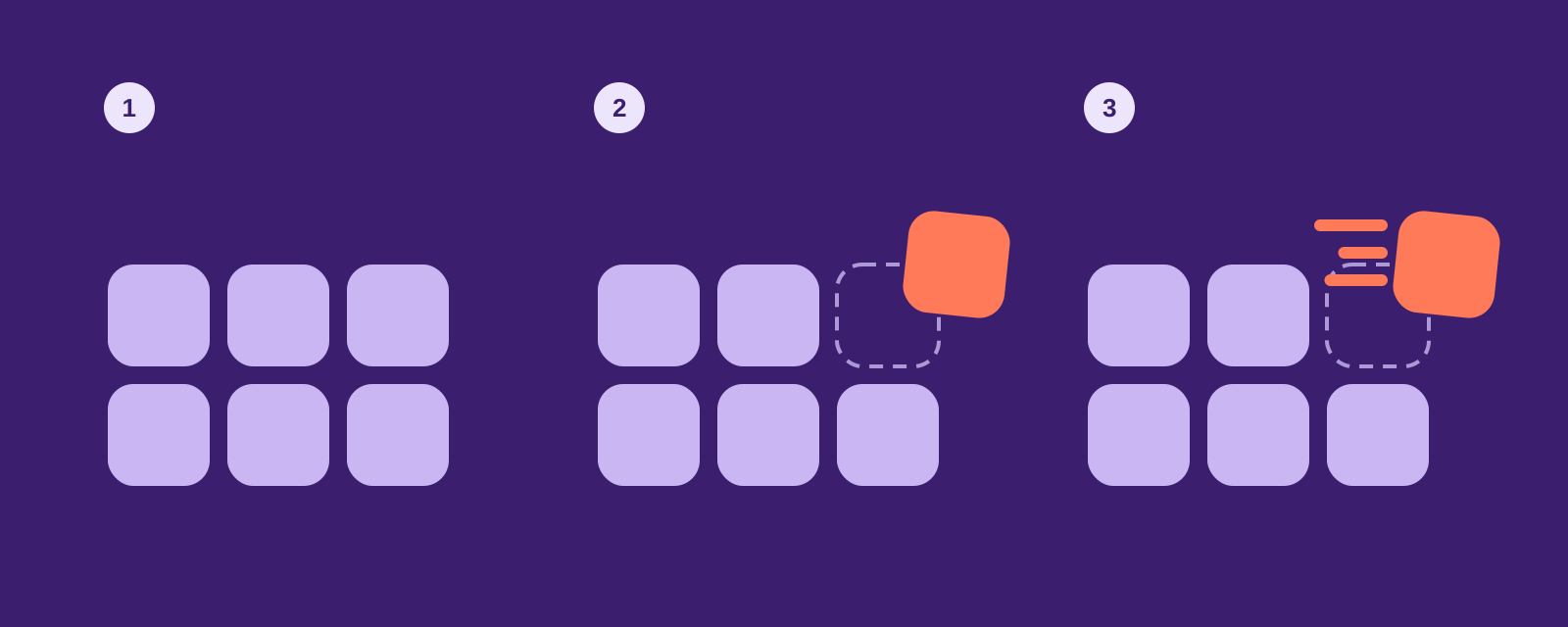
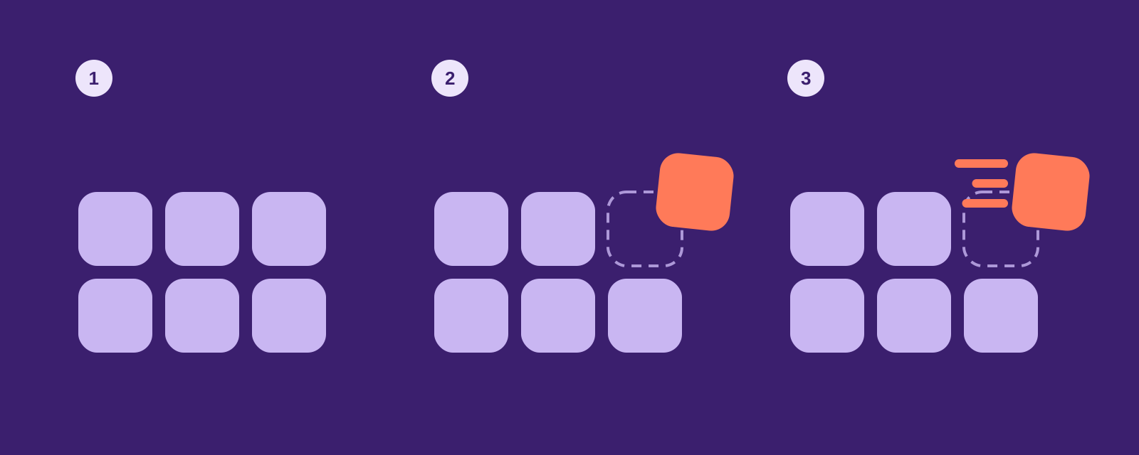
Our one graphic device. A grid of soft modules, one of which has just moved: it leaves a dashed outline behind and carries a short Signal trail. Use it where there's no furniture to show — teasers, backgrounds, icons, motion.

Three steps: a grid of lilac modules; one module shifts out in Signal leaving a dashed outline; motion lines are added.
Building the shift in three steps.

1 · Start from the grid

Square modules with 25% corner radius, gaps of 1/6 of a module. Lilac on Ink Violet, or Ink Violet on Mist.

2 · Shift one module

Move one module up and to the right by about half its size and rotate it 4–6°. It turns Signal. Leave a dashed outline where it was.

3 · Add the trail

Three rounded lines behind the module, in Signal, of different lengths. Never more than three lines, never on more than one module.

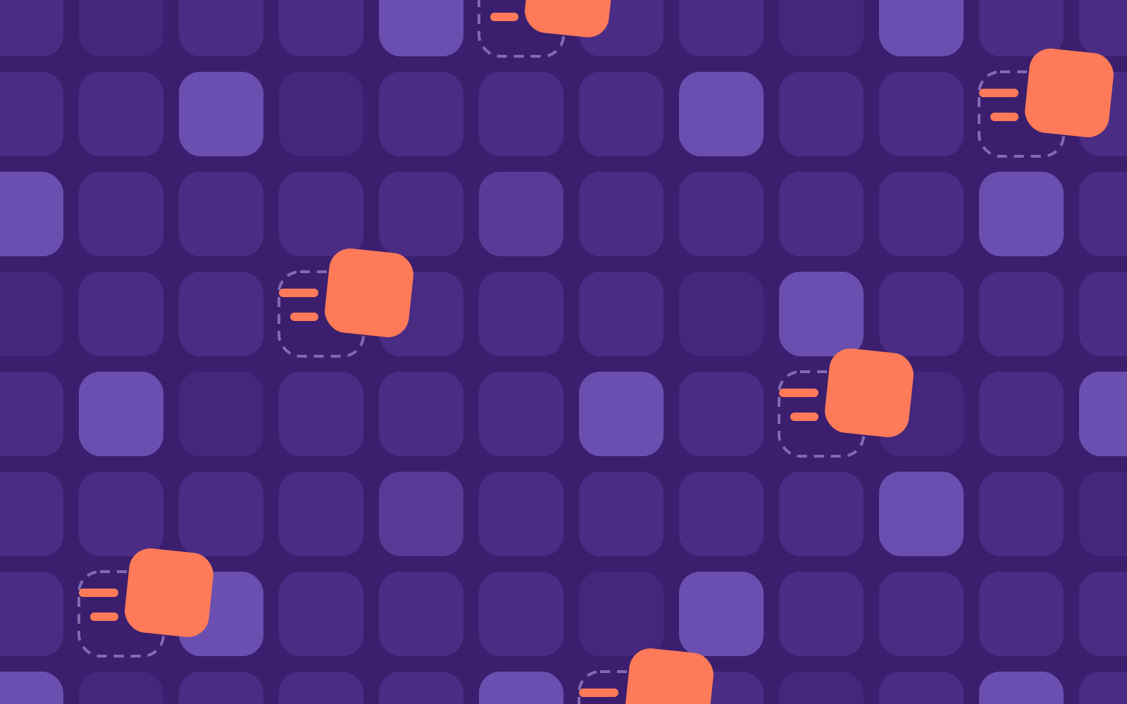
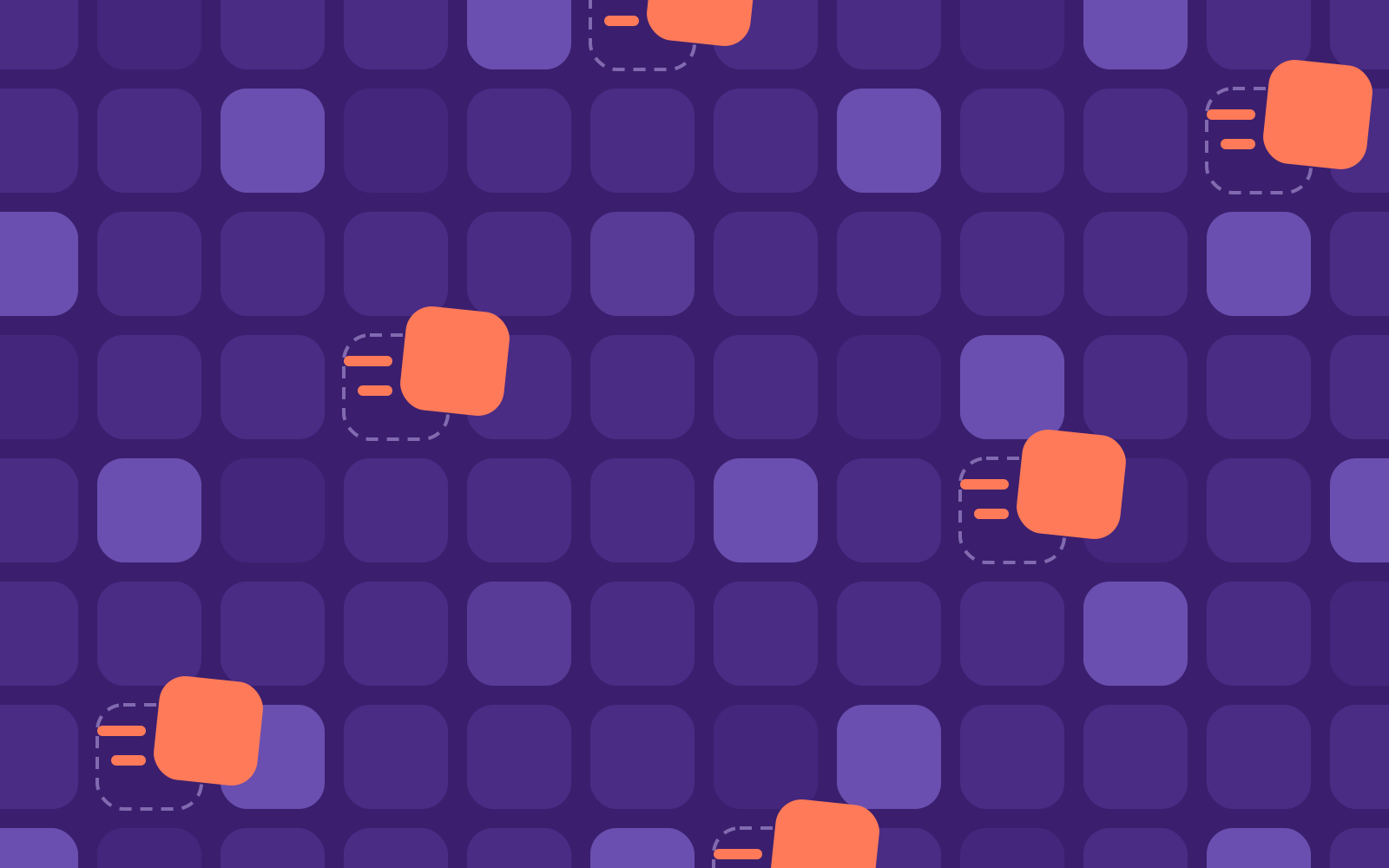
Module pattern: a grid of violet tiles with Signal modules shifting out along a diagonal.
The module pattern for backgrounds, wrapping paper and showroom walls. Crop freely, never recolour.

Icons

Icons that point at the product

Four brand icons tell the product story; Material Symbols (rounded, weight 500) cover everything functional in banners, the landing page and the configurator. Ink Violet, with Signal only for the moving part.

Brand icons

4 icons

Interface (Material Symbols)

12 icons

Material Symbols by Google, open source (Apache 2.0)

Photography

Real homes, mid-change

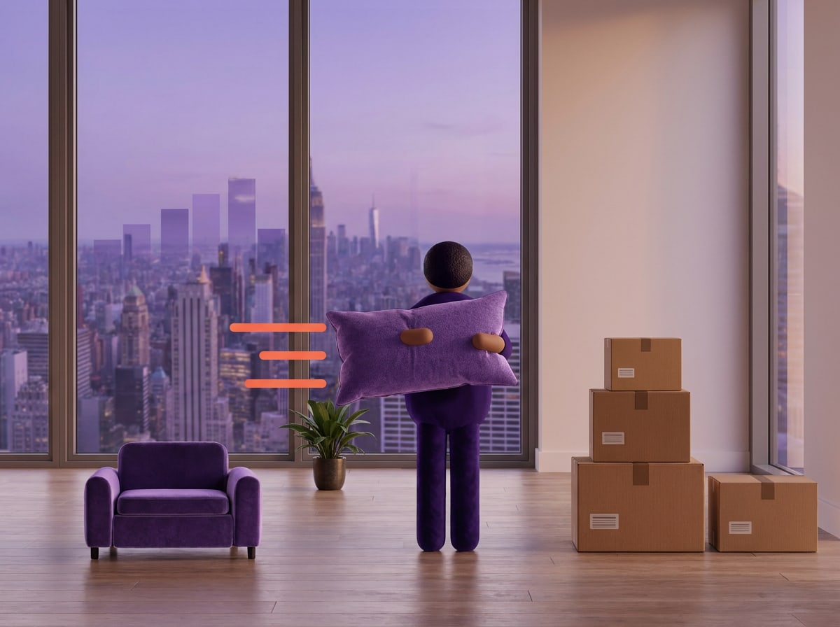
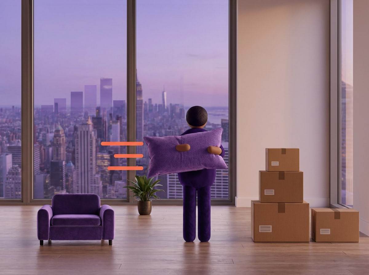
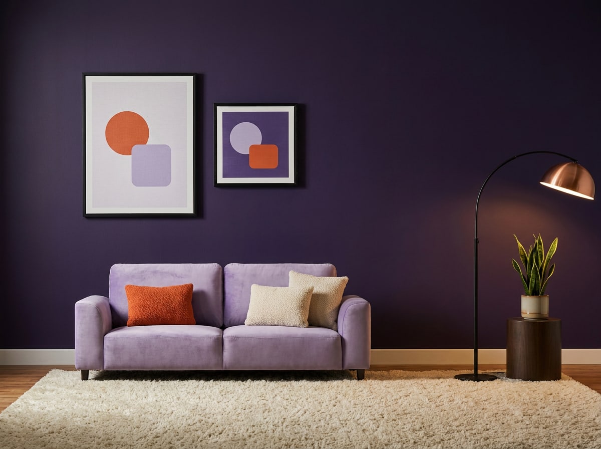
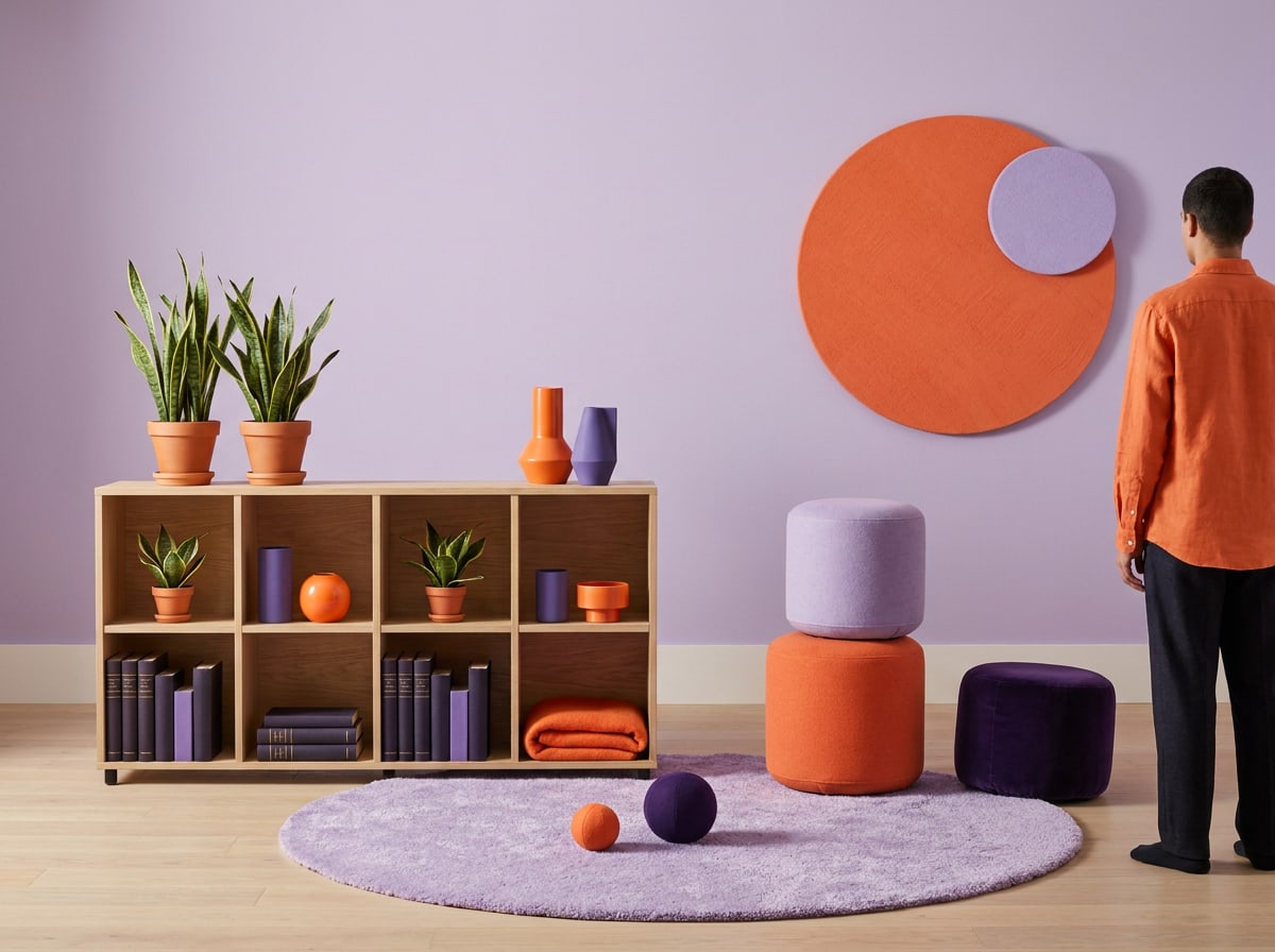
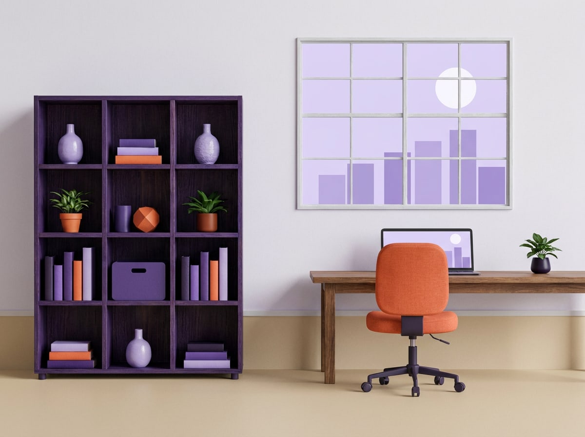
Campaign photography shows the moment life changes shape — not the finished showroom. Boxes still in the hallway, a new seat clicked on, a kids' drawing on the shelf. These illustrations brief the photographer on scenes and colour.

  • Light: daylight, from the side. No flash, no harsh shadows.

  • Viewpoint: eye level, a 35 mm feel. Show the room, not just the product.

  • Colour: at least one campaign colour in every shot — a Lilac sofa, an Ink Violet wall, a Signal cushion.

  • People: busy with something, not posing. Faces may be out of frame.

  • Space: leave a calm area of at least 30% of the frame for copy.

What this means: Something is happening — a move, a new seat — but it never feels hectic.

What this means: Daylight from the side. No flash, no harsh shadows.

What this means: Real homes with real clutter: boxes, drawings, a mug on the floor.

What this means: At least one campaign colour in every shot; no colour grading.

What this means: Show the room and the change; details only for materials.

Keywords

  • mid-change
  • daylight
  • real homes
  • eye level
  • 35 mm
  • a campaign colour
  • people busy
  • calm area for copy

Moodboard

Do
  • Show a change in progress: boxes, a half-arranged room, a module being carried.
  • Shoot in real homes in Amsterdam, Utrecht and Antwerp, with real tenants where possible.
Don't
  • No studio cut-outs on white for campaign visuals — those are for product pages.
  • No perfect families smiling into the camera, no heavy filters or teal-and-orange grading.
Next chapter · 05Layout & formats

Chapter 05 / 07

Layout & formats

Grids, margins, copy zones and key visual formats.

Layout & formats

A grid that leaves room to move

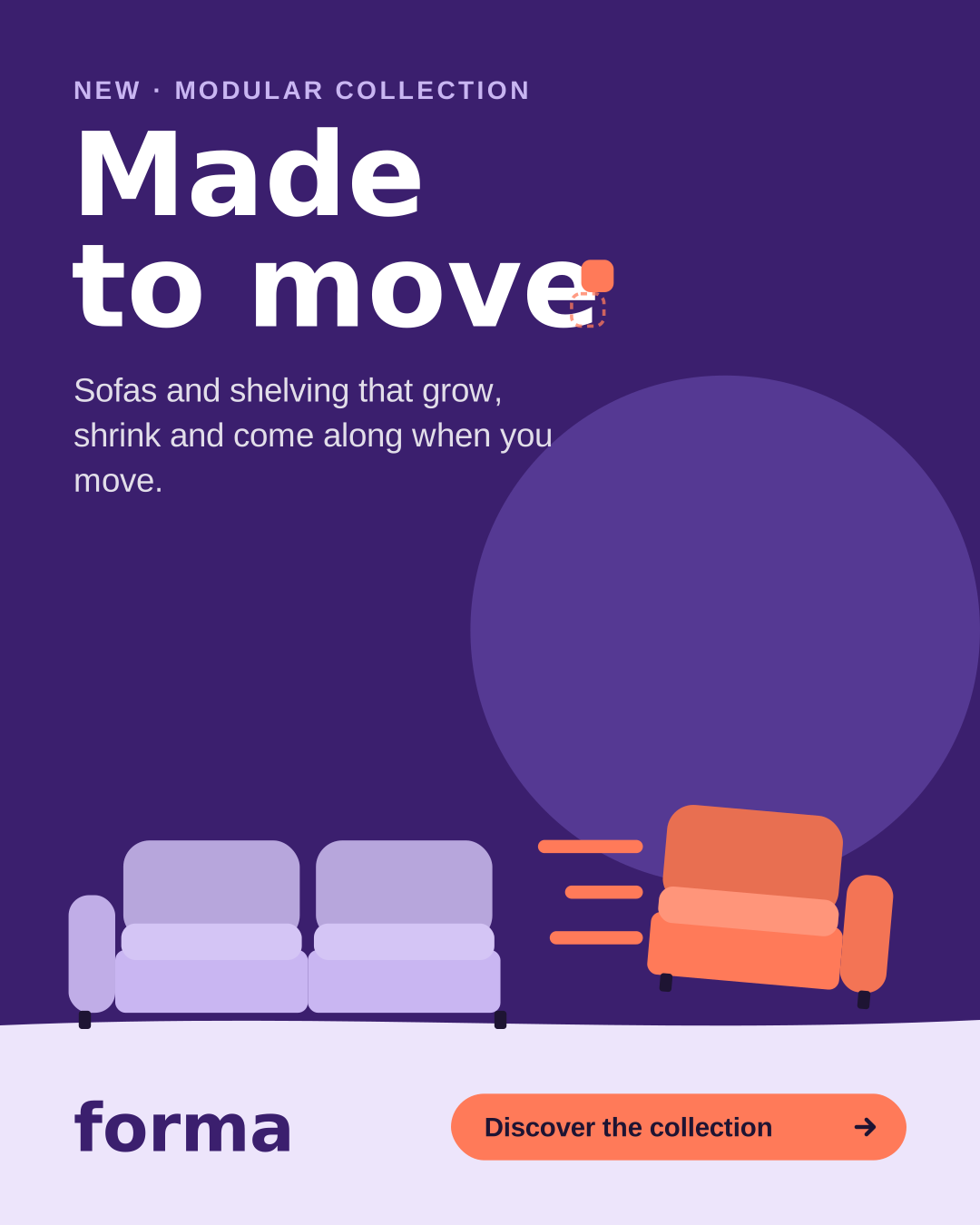
Every campaign layout uses the same logic: copy top left, furniture bottom right on the Mist floor, the lockup or wordmark in the bottom band. Pick a format to see its grid, and switch on the overlay to see it on a real post.

Feed post 4:5

Format
1080 × 1350 px
Columns
4
Column width
212 px
Gutter
24 px
Side margins
80 px
Top and bottom
80 px
Baseline
8 px

Bottom band = 20% of the width, for wordmark and button.

White space

  • Margin = 7.5% of the shortest side. Nothing important outside it.
  • Text/image ratio: copy takes at most 40% of the area, the scene at least 60%.
  • Everything aligns left. Never centre the campaign line.
  • The furniture always stands on the Mist floor; the floor band is 14–20% of the height.
  • Leave the space between the line and the sofa empty. That's where the module moves.
  • One message, one button per format. A second message is a second format.
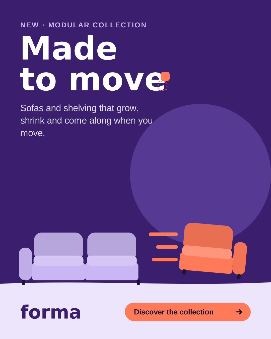
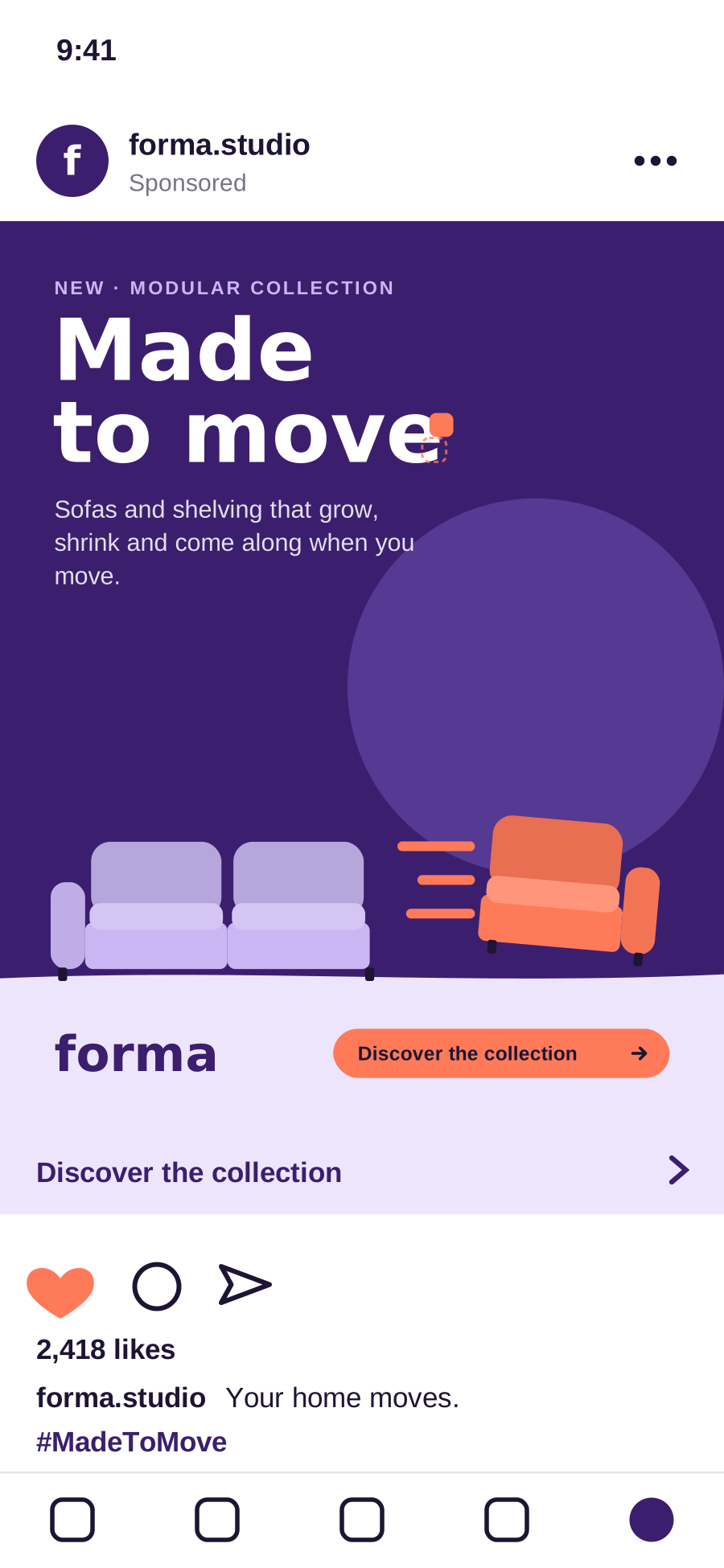
Feed post with the campaign line, the sliding Signal module and the wordmark in the bottom band.
Example · Feed post 4:5

Key visuals

One scene, three formats

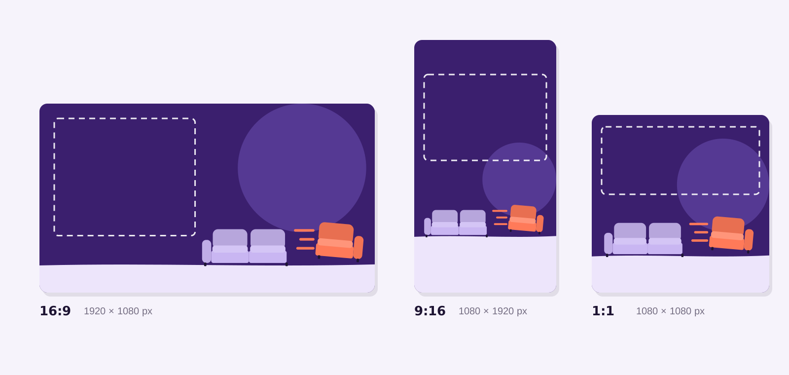
The key visual is always the same scene: two Lilac modules on a Mist floor, one Signal module sliding out. The dashed zone is reserved for copy and the lockup — never move furniture into it.

The key visual in landscape 16:9, portrait 9:16 and square 1:1, with the copy zone marked.
Clean key visuals with their copy zones. Files are in Assets.

Landscape 16:9

Billboards, email headers, LinkedIn, web heroes. Copy zone: left 45%. Furniture: right half, standing on the bottom 14%.

Portrait 9:16

Stories, Reels, TikTok, digital out-of-home. Keep the top 250 px and bottom 340 px free of copy — the app covers them.

Square 1:1

Feed posts, display, marketplace listings. Copy zone: top 40%. Lockup or wordmark in the Mist band at the bottom.

Next chapter · 06Channels

Chapter 06 / 07

Channels

Specs and guidance for social, out-of-home, email, banners, in-store and partners.

Channels

Where the campaign lives

One idea, many formats. Each channel below has its specs, a worked example and the rules that matter most. Every format ends on the same thing: the lockup and one clear action.

Channel mix

  • Out-of-home — 35% of media budget. Launch weeks, big cities.

  • Social — 30%. Teaser to close; the only channel live in teaser week.

  • Display and online video — 15%. Retargeting towards the configurator.

  • In-store and partner retail — 15%. From launch weekend, peaks in the close phase.

  • Email and CRM — 5%. Four sends: launch, two stories, the offer.

Social

Instagram, TikTok and LinkedIn

Social carries the teaser and the audience stories. Lead with the moment, not the product: the module should be moving in the first second.

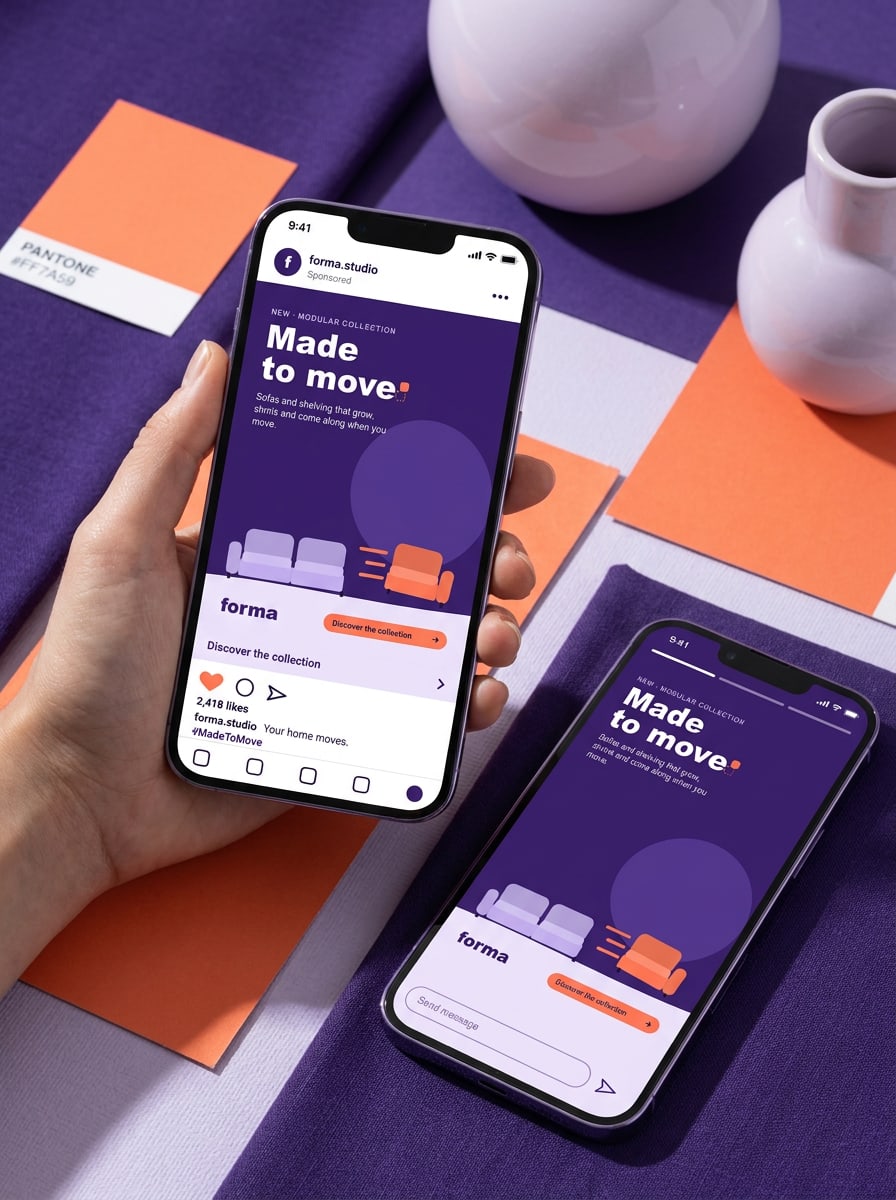
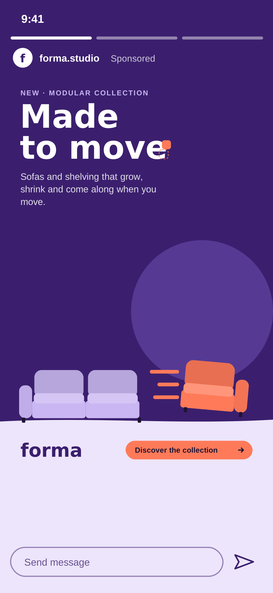
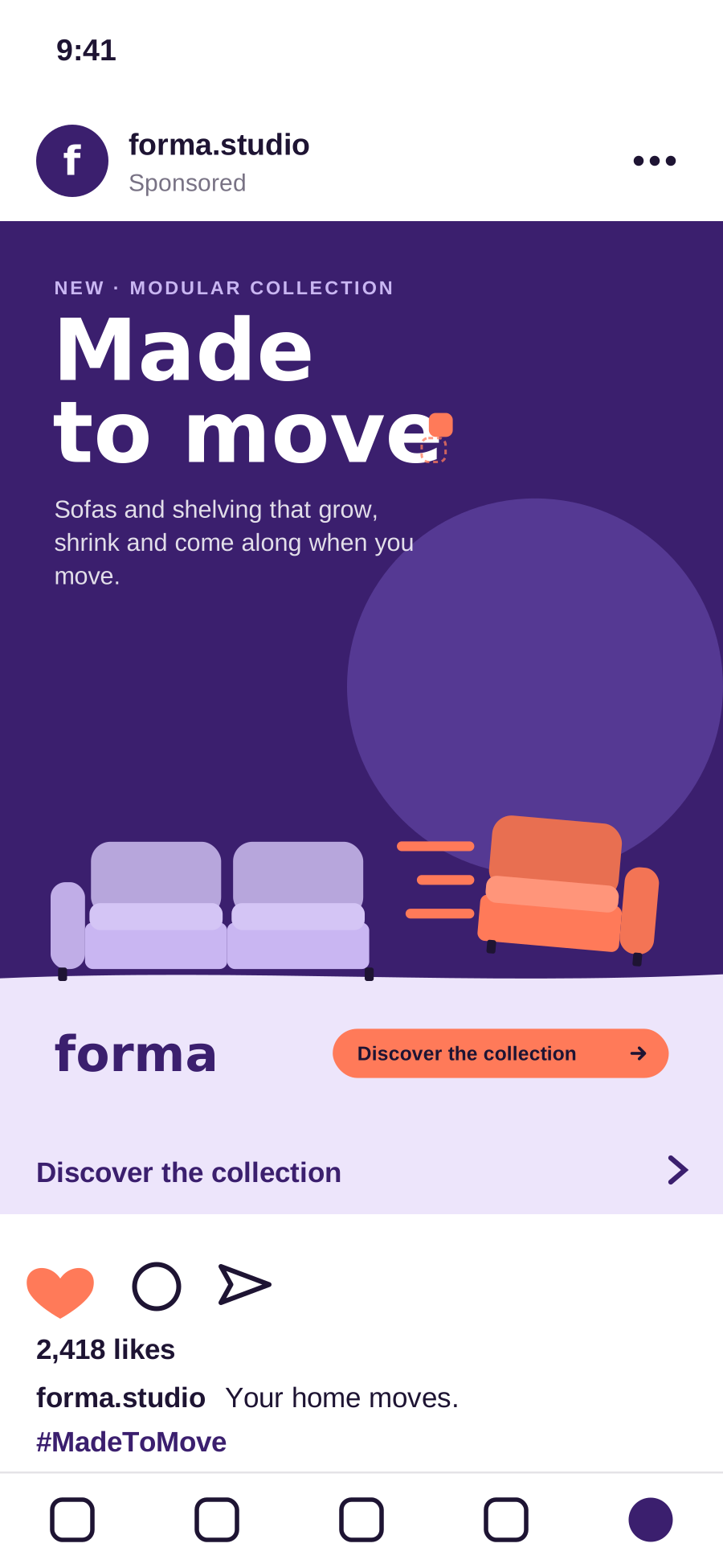
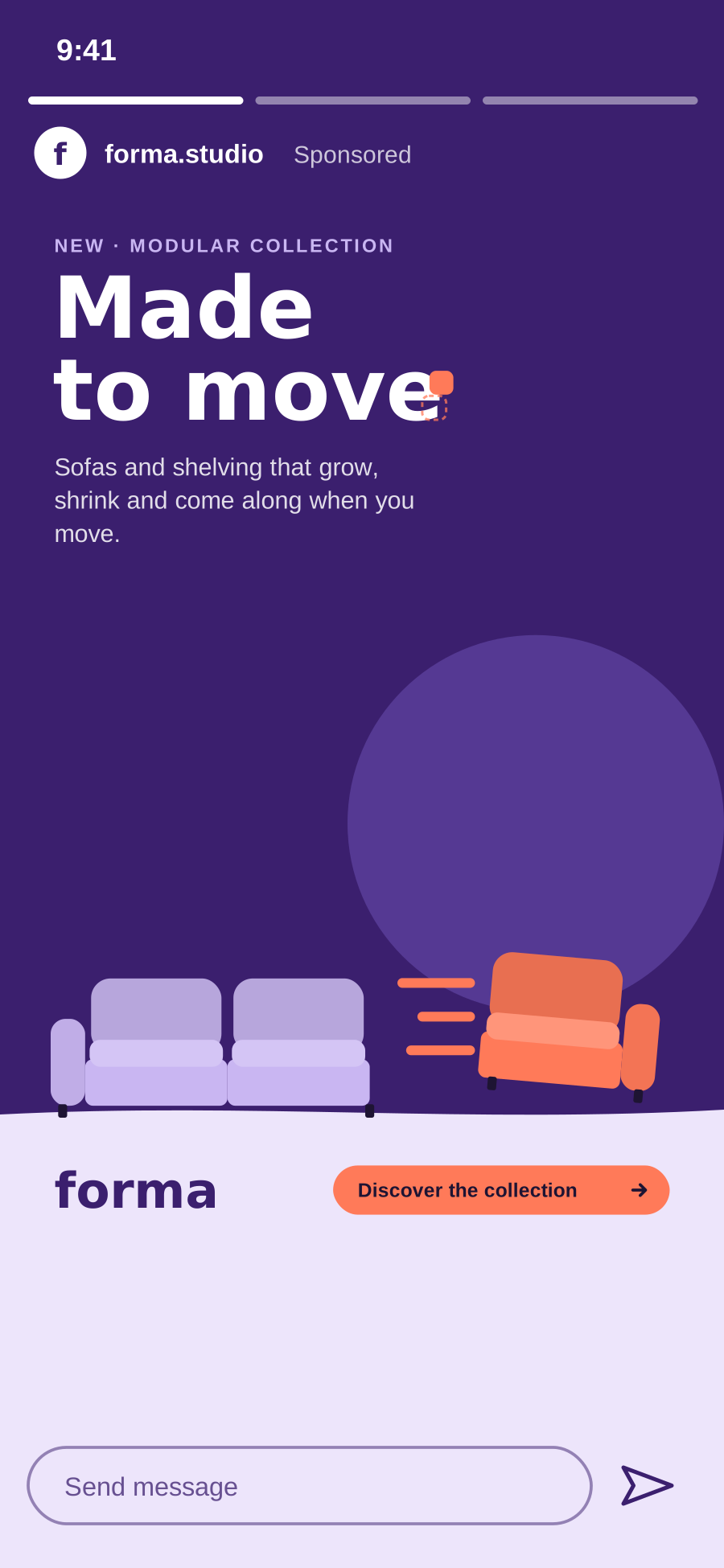
Feed post (4:5) and story (9:16) on Instagram. The bottom band carries the wordmark and the call to action.

Feed posts

1080 × 1350 px (4:5), or 1080 × 1080 px. Headline max. 6 words. Caption max. 125 characters before 'more'. One hashtag: #MadeToMove (EN) or #GemaaktOmTeBewegen (NL).

Stories, Reels and TikTok

1080 × 1920 px (9:16), 6–15 seconds. The module moves within the first second. Safe zones: 250 px top, 340 px bottom. Sound on, but always subtitled.

LinkedIn

1200 × 627 px or 1080 × 1080 px. For partners and the 'working from home' story. Slightly more facts: guarantee, materials, take-back scheme. Tag @Forma Studio in partner posts.

Do
  • Post from your own account and tag @forma.studio, so we can reshare.
  • Use UTM links from Sanne for every link in bio and swipe-up.
Don't
  • Don't add stickers, GIFs or trending sounds on top of the key visual.
  • Don't crop the lockup to fit the story frame — use the 9:16 template.

Out-of-home

Billboards, bus shelters and digital screens

Out-of-home is read in two seconds. One line, one sofa, one lockup — nothing else. Body copy and prices stay off the street.

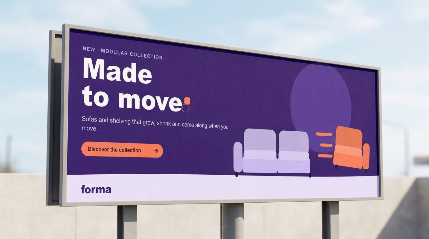
Billboard: campaign line left, the sofa right, the wordmark in the Mist floor band.
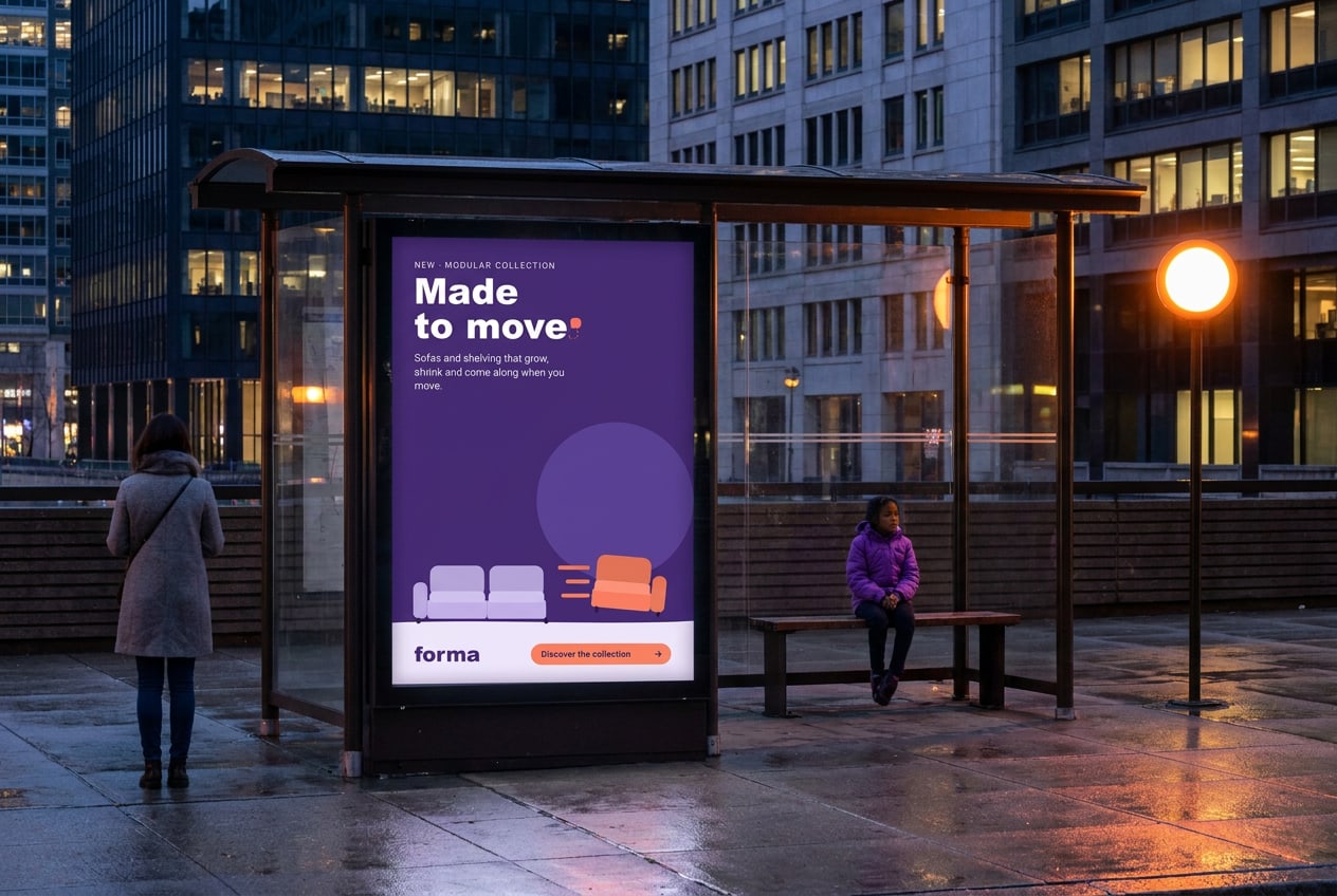
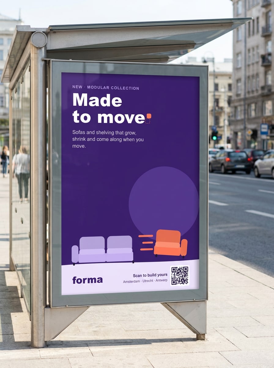
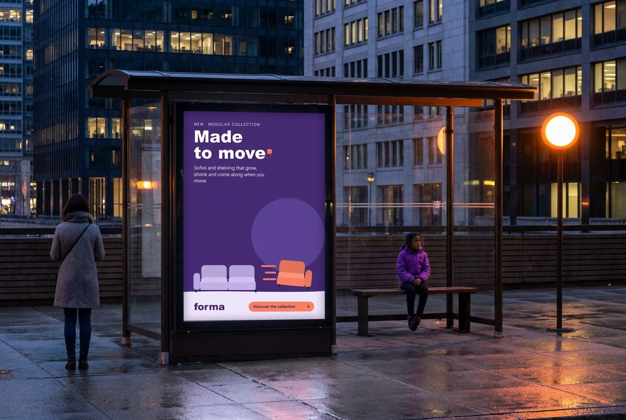
A bus shelter with a backlit portrait poster of the campaign.
Abri (bus shelter): the portrait layout with the call to action in the bottom band.

Billboard 48-sheet

6096 × 3048 mm, delivered at 1:10 with 10 mm bleed. Max. 7 words including the line. Viewing distance 30–50 m: headline at least 1/6 of the height.

Abri

1185 × 1750 mm, visible area 1160 × 1710 mm. Backlit: print on blueback or backlit paper. Keep copy 40 mm inside the visible area; the frame covers the edges.

Digital out-of-home

1080 × 1920 px, 10 seconds, no sound. Three frames: the line (0–4 s), the module slides out (4–7 s), lockup and showroom city (7–10 s). MP4 (H.264) under 10 MB, or JPG per frame.

Print production
Files: PDF/X-4, all fonts outlined, images at 1:10 scale and 150 ppi at final size. Colour: ISO Coated v2 (300%). Signal and Ink Violet are checked against Pantone 1645 C and 2685 C on the proof. Always ask the printer for a hard-copy proof of one abri poster before the full run.
Delivery deadlines
Static billboards and abris: files at the printer by Wednesday 23 September. Digital screens: files at the media owner by Thursday 1 October, 12:00. Late files miss the launch week; there is no second posting cycle until 20 October.

Email

Newsletters and CRM

Four sends to the Forma list and partner lists: launch (6 Oct), two audience stories, and the 'Add a module' offer (17 Nov).

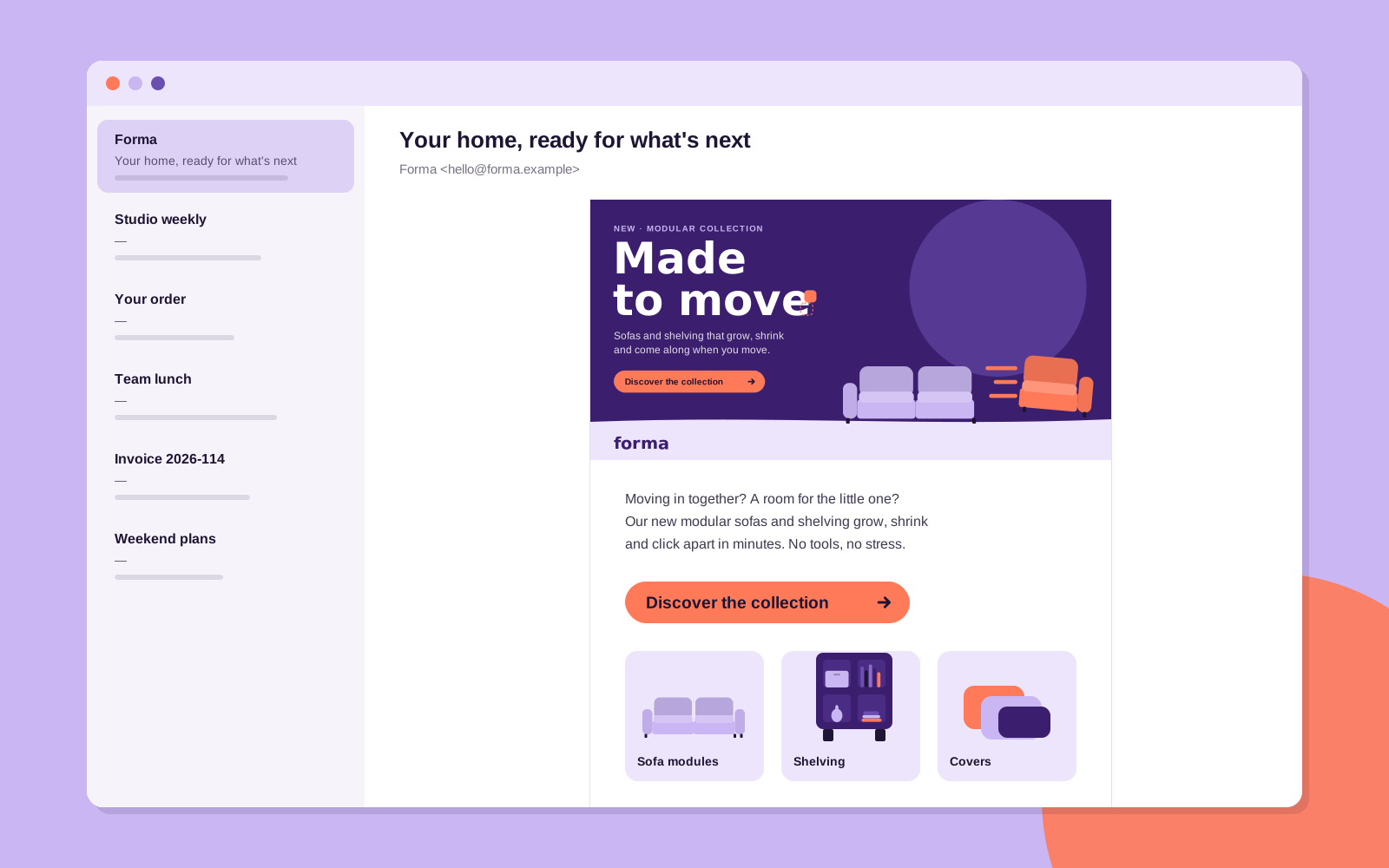
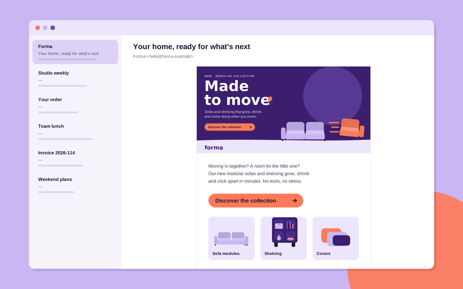
An email client showing the launch newsletter with a landscape header, body copy, a Signal button and three product cards.
The launch email: the header does the work, the copy stays under 50 words.

Header

1200 × 600 px, shown at 600 px wide. Use the landscape layout with the line baked in; also set it as alt text. JPG under 200 KB.

Subject lines

Max. 45 characters, no capitals, no emoji in the subject. — Your home, ready for what's next — One more seat. Same sofa. — Add a module, save 15% (ends 30 Nov)

Body and button

Max. 50 words, one story, one proof point. One Signal button with Night text; secondary links in Ink Violet, underlined. Preheader repeats the proof point, not the subject.

Web banners

Display and retargeting

Banners tell the campaign in three frames: the line, the shift, the action. Static fallbacks always show frame 3.

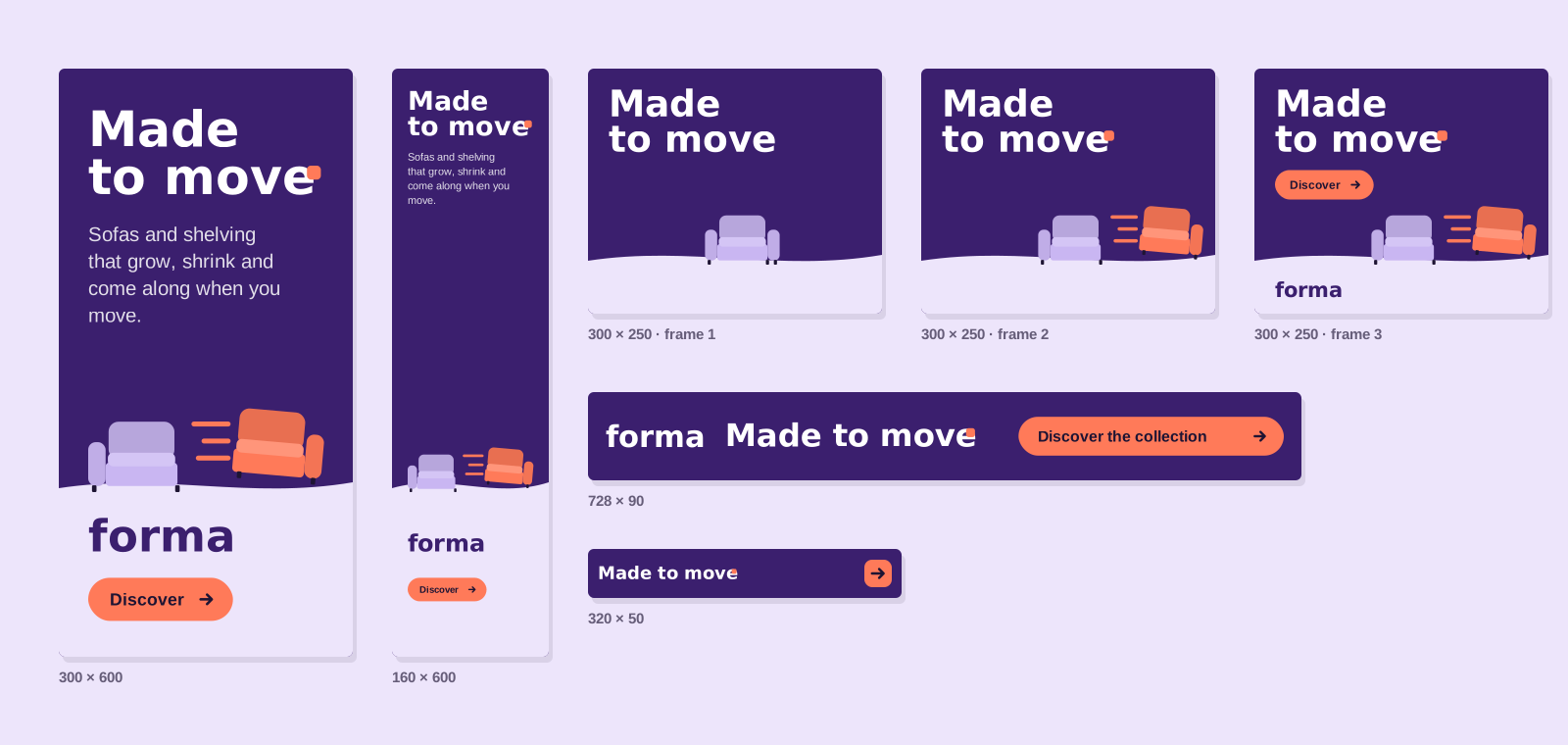
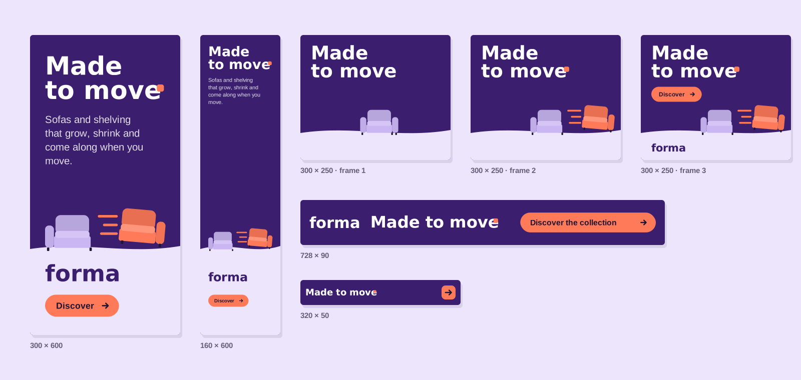
A set of display banners: half page, skyscraper, three frames of a medium rectangle, leaderboard and mobile banner.
The banner set, with the 300 × 250 storyboard in three frames.
  • Sizes: 300 × 250, 300 × 600, 160 × 600, 728 × 90, 970 × 250 and 320 × 50 (mobile).

  • Animation: 15 seconds max., three loops, then stop on frame 3. Frame 1 (0–3 s) the line; frame 2 (3–6 s) the module slides out; frame 3 the wordmark and the button.

  • Files: HTML5 under 150 KB initial load, plus a static JPG fallback under 60 KB.

  • Small formats: under 100 px high, drop the eyebrow and subline; the line goes on one row and the button becomes an arrow.

  • Clickable area: the whole banner, with a 1 px Night border on white sites.

Landing page

Where every click lands

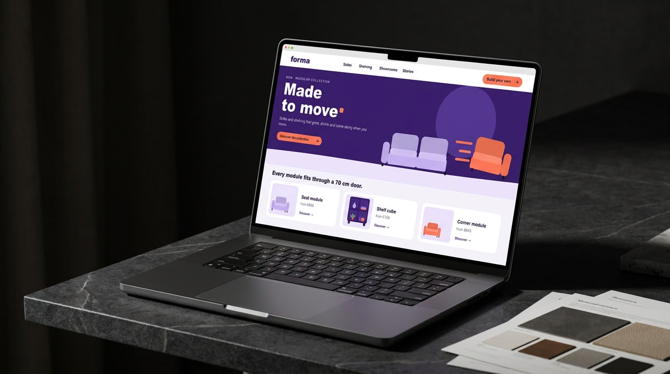
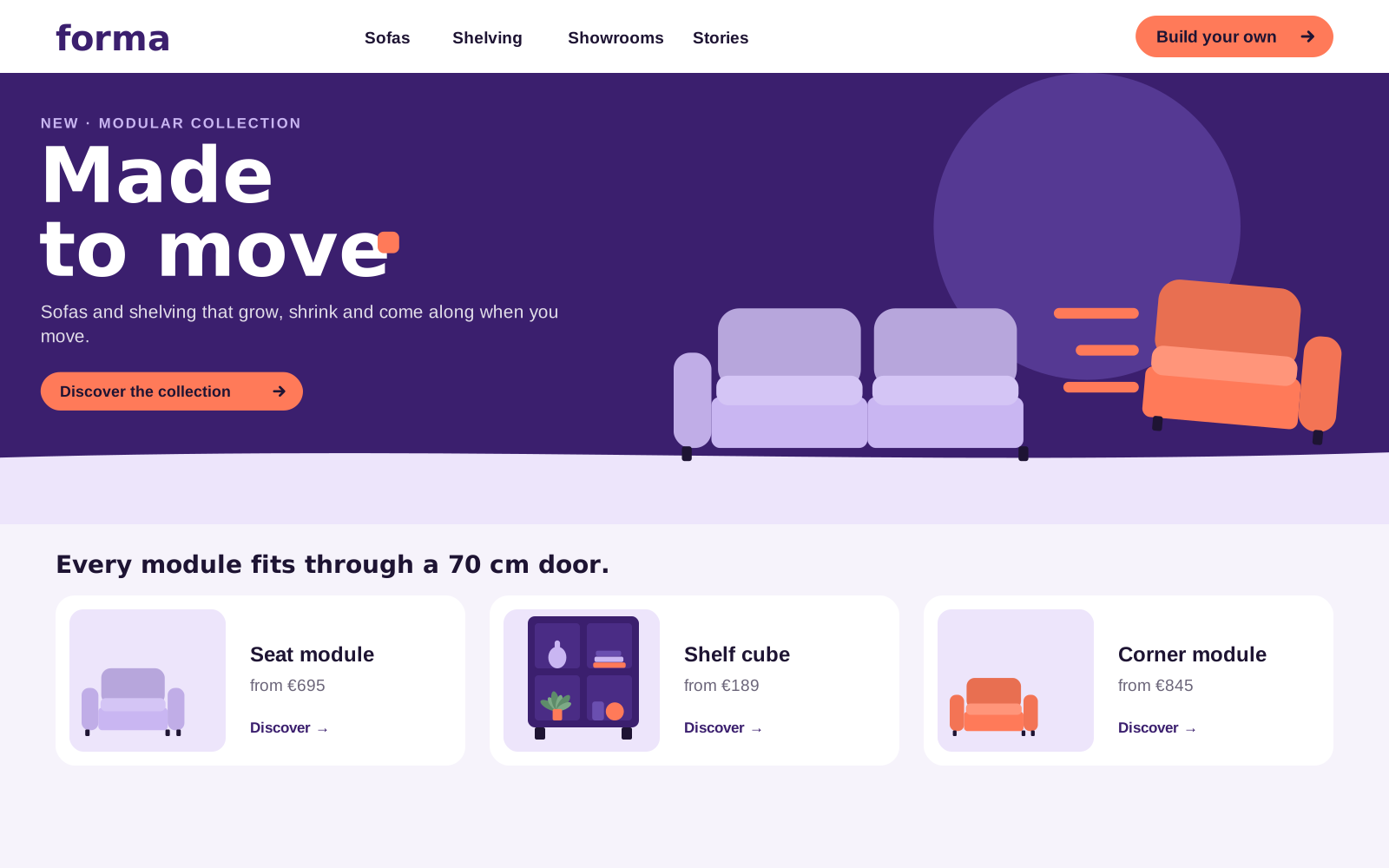
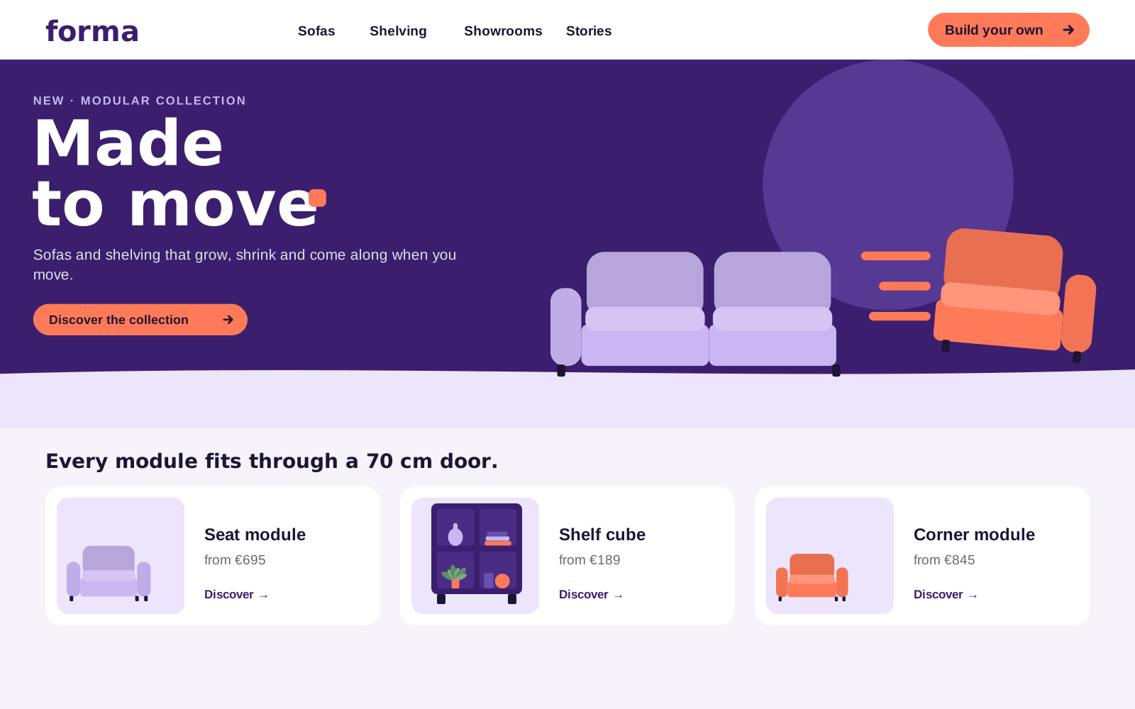
All banners, posts and QR codes lead to forma.example/made-to-move (NL: /gemaakt-om-te-bewegen). The page repeats the key visual one-to-one, so the click feels like the same story — then shows the modules and the configurator.

The campaign landing page: the hero matches the banner the visitor just clicked.

In-store

Showrooms in Amsterdam, Utrecht and Antwerp

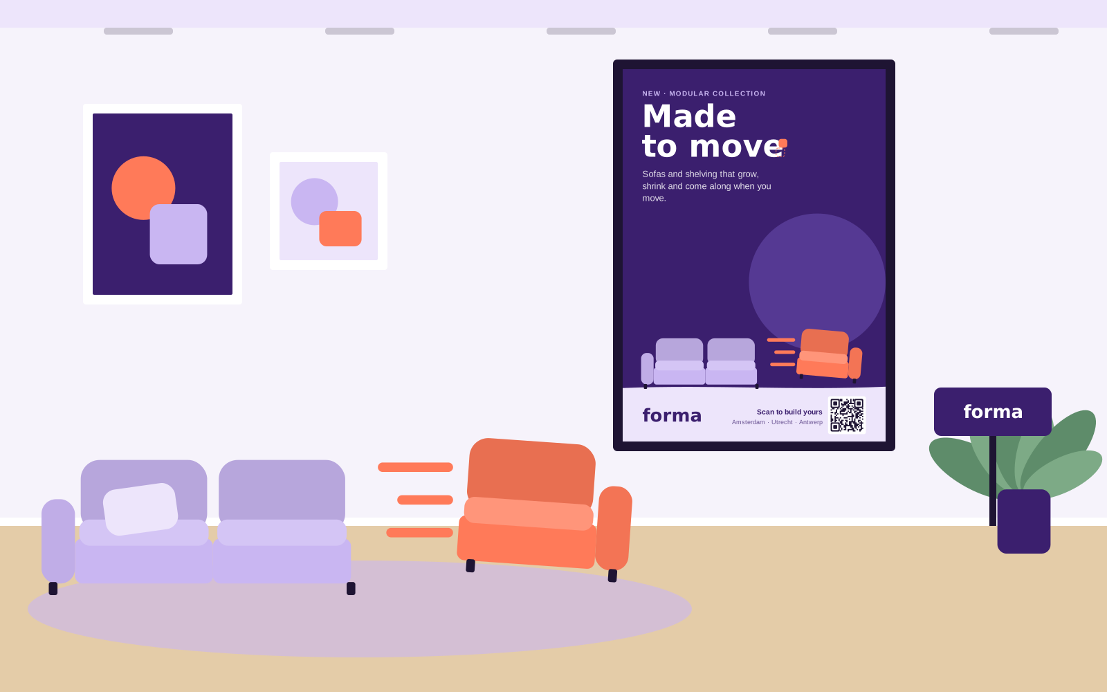
In the showroom, the campaign becomes something you can do: sit, click a module off, click it on somewhere else. Materials invite people to try.

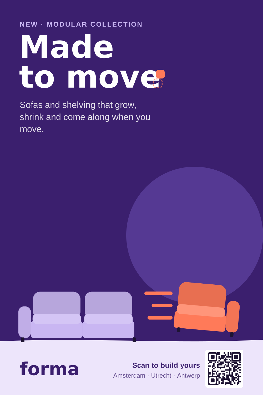
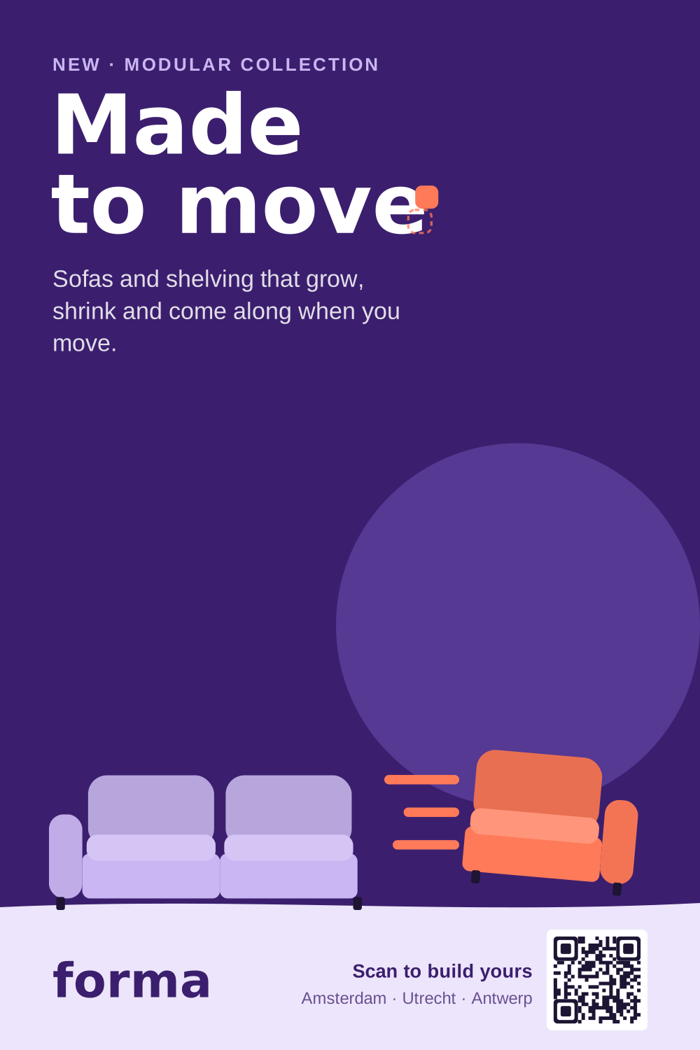
The A1 showroom poster: the QR code replaces the button and leads straight to the configurator.

Posters and signs

A1 poster (594 × 841 mm) with a QR code to the configurator, 3 mm bleed. A6 shelf talkers per module with name, size and price. Hanging sign: 1000 × 400 mm, double-sided.

Windows and floor

Window decal: the Signal module at 600 × 600 mm, with three trail lines, cut vinyl. Floor stickers: dashed module outlines in Lilac (500 × 500 mm) where a module 'used to be'.

Talking points for staff

— 'Want to try? Click this seat off.' — Every module fits through a 70 cm door. — Start small; add a module whenever life changes. — 10-year guarantee on every frame.

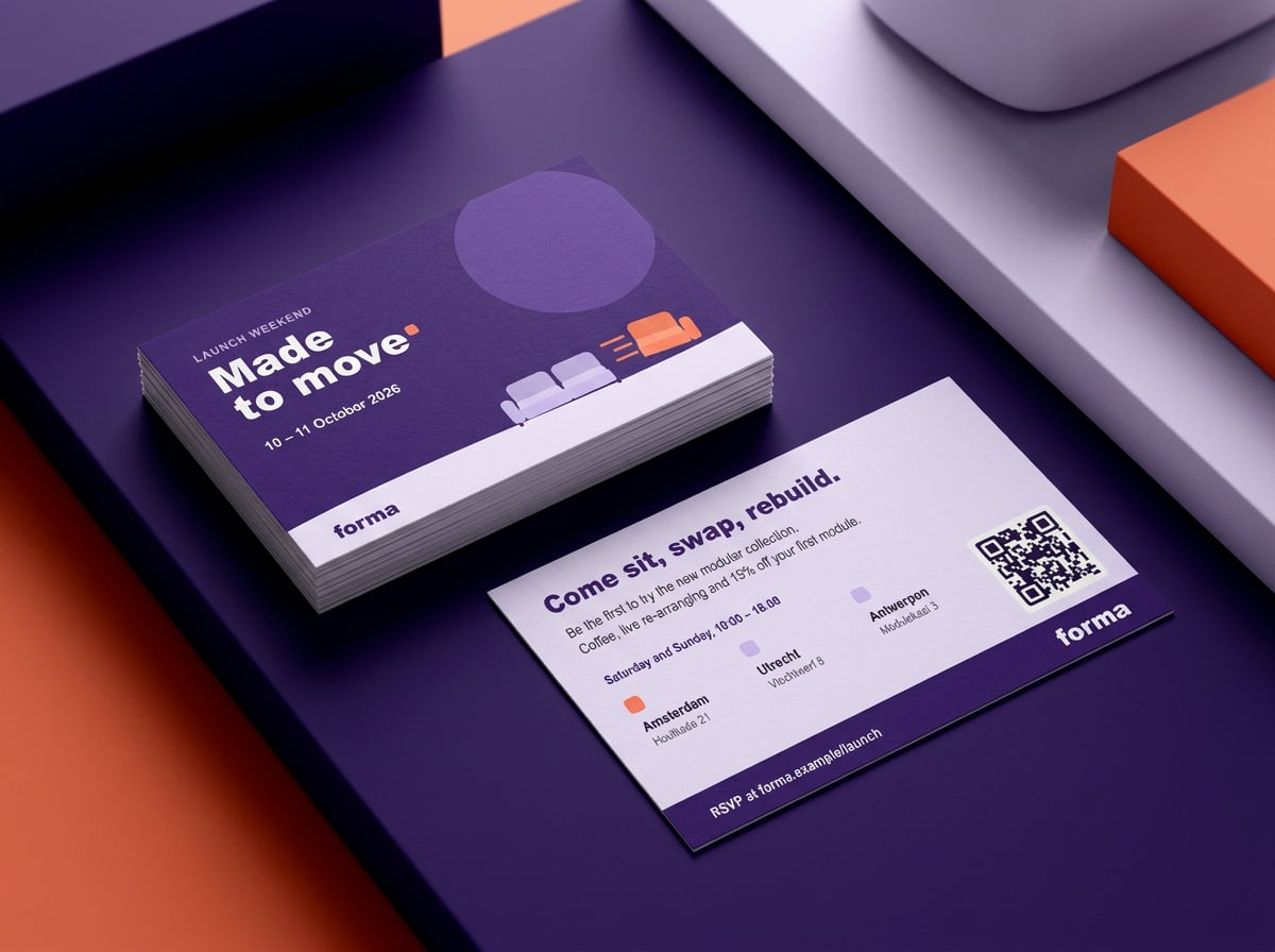
Launch weekend invitation

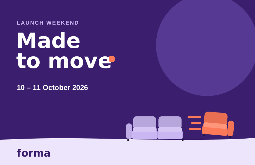
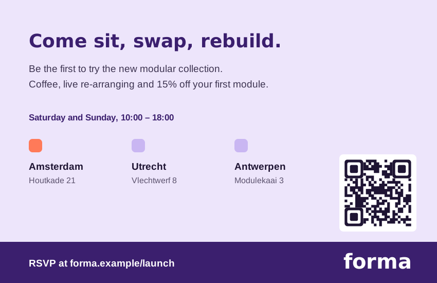
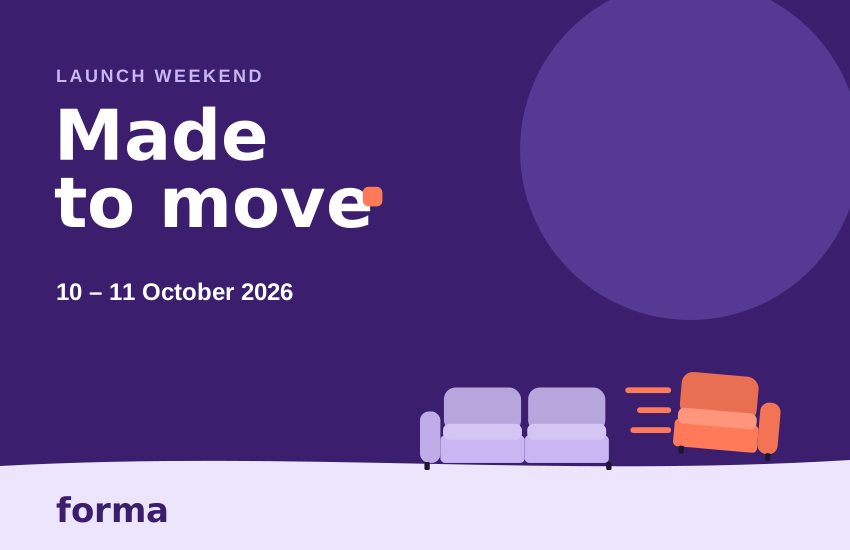
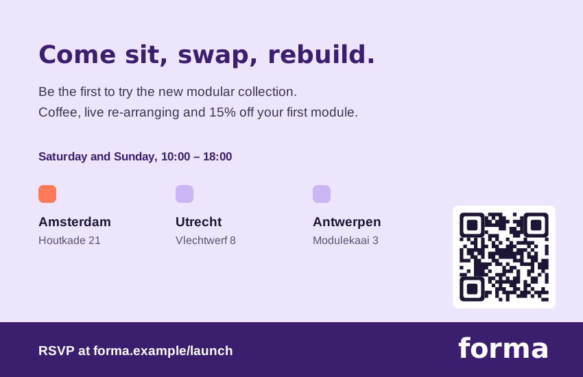
Showrooms and partner stores hand out this card from 28 September and send it with every order. Front: the campaign; back: the three showrooms, opening hours and a QR code to sign up. Printed on 400 g uncoated board, 85 × 55 mm.

Launch weekend invitation, front and back.

Partners

Partner retailers

Around 40 partner stores in the Netherlands and Flanders sell the collection. They get the full kit, with room for their own name and details.

What you can change
Your logo in the bottom band (see co-branding rules), your address, opening hours and prices, and the language (EN / NL / Flemish). Everything else — line, layout, colours, photos — stays as delivered.
Ordering printed materials
Partners order posters, shelf talkers and window decals free of charge via the partner portal until 25 September. Delivery in the week of 28 September, so stores are ready for launch.
Local advertising
Running your own ads with the campaign? Use the templates, send them to Studio Forma for a check, and mention 'In collaboration with Forma'. We co-fund 50% of approved local media up to €2,500 per store.
Next chapter · 07Assets & contact

Chapter 07 / 07

Assets & contact

Every campaign file, print orders, version and who to contact.

Assets & contact

Campaign files

Everything on this page is approved for use by partners and agencies until 31 December 2026. Need a format that isn't here? Ask Daan in Studio Forma — we'd rather make it than have it improvised.

Logos and lockups

Campaign lockup — English
SVG · 954 B
Ink Violet, for light backgrounds.
Campaign lockup — English, reversed
SVG · 954 B
White, for Ink Violet, Night and dark photos.
Campaign lockup — Dutch
SVG · 963 B
For Dutch and Flemish materials.
Campaign lockup — Dutch, reversed
SVG · 963 B
White version of the Dutch lockup.
Forma wordmark
SVG · 246 B
Ink Violet. For layouts where the line is already the headline.
Forma wordmark — reversed
SVG · 246 B
White, for dark backgrounds.
Forma wordmark — black
SVG · 246 B
One-colour print, newspapers, engraving.
Forma mark
SVG · 555 B
Avatars, favicons and app icons. Min. 32 px.
Forma mark — light
SVG · 555 B
For dark interfaces and Ink Violet backgrounds.

Key visuals

Key visual — landscape 16:9
SVG · 2 KB
1920 × 1080 px, without copy. Billboards, email, web.
Key visual — portrait 9:16
SVG · 2 KB
1080 × 1920 px, without copy. Stories, Reels, digital screens.
Key visual — square 1:1
SVG · 2 KB
1080 × 1080 px, without copy. Feed and display.

Guides and diagrams

Clear-space diagram
SVG · 2 KB
Reference for clear space around the lockup.
Key visual formats and copy zones
SVG · 9 KB
Overview with the copy zone per format.
The shift — construction
SVG · 3 KB
How the graphic device is built, in three steps.
Module pattern
SVG · 9 KB
Background pattern for walls, packaging and slides.

Brand icons

The shift
SVG · 398 B
Brand icon, 96 × 96 px.
Seat module
SVG · 384 B
Brand icon, 96 × 96 px.
Fits a 70 cm door
SVG · 352 B
Brand icon, 96 × 96 px.
Click on, click off
SVG · 401 B
Brand icon, 96 × 96 px.

Photography direction

Moving day
JPG · 100 KB
Scene reference: the module travels.
First flat
JPG · 106 KB
Scene reference: one colour wall, one Signal accent.
Growing family
JPG · 117 KB
Scene reference: adding a seat.
Kids' room
JPG · 106 KB
Scene reference: low shelving and soft modules.
Home studio
JPG · 88 KB
Scene reference: shelving as a room divider.
Materials close-up
JPG · 228 KB
Detail reference: fabrics, birch, connector.

Channel examples

Feed post artwork 4:5
SVG · 4 KB
1080 × 1350 px, the grid example.
Social — feed post screen
SVG · 7 KB
Instagram feed with the 4:5 post.
Social — story screen
SVG · 6 KB
Full-screen 9:16 story with safe zones respected.
Billboard artwork
SVG · 4 KB
Landscape layout at 3:1.
Abri
JPG · 177 KB
Portrait layout in a bus shelter.
Launch email
SVG · 12 KB
Header, body, button and product cards.
Web banner set
SVG · 18 KB
All sizes, with the three-frame storyboard.
Landing page
SVG · 10 KB
Home screen of the campaign page.
A1 showroom poster
SVG · 10 KB
Portrait layout with QR code to the configurator.
Showroom set-up
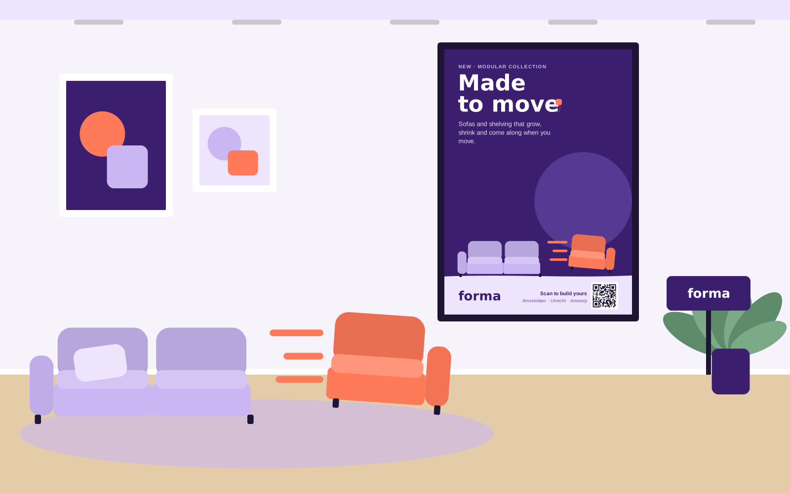
SVG · 16 KB
Poster, display sofa and sign in context.
Launch invitation — front
SVG · 3 KB
85 × 55 mm card.
Launch invitation — back
SVG · 9 KB
Showrooms, opening hours and QR code.

Before you download

  • These are preview files (SVG). Print-ready PDFs, open design files and animated banners are on the partner portal; ask Lotte for access.

  • Don't edit the files beyond what the templates allow — see 'What you can change' under Channels.

  • Using an asset after 31 December 2026? Check with us first; offers and prices will have changed.

Order

Order printed materials

Showrooms and partner stores order campaign print here until 25 September. Studio Forma checks every request and confirms within two working days.

Free for partner stores. Delivery in the week of 28 September.

Handled by Studio Forma
  • A1 showroom poster

    With QR code to the configurator. In packs of 5.

  • Launch weekend invitation

    85 × 55 mm, 400 g board. Per 250.

  • Social template with your store name

    Feed post and story, with your logo in the bottom band.

Version 2.0 · 24 September 2026 · owner: Lotte Vermeulen, Brand & Marketing. Next review after the campaign, in December 2026. Changes since 1.0: logo print files, live contrast checks, the layout grids and the launch invitation.


Questions?

Who to contact

One team runs the campaign. Can't find something in this playbook? Mail the person who fits your question; for anything urgent on launch day, copy all three.

Lotte Vermeulen
Campaign lead
Brand & Marketing

Ask about: planning, approvals, partner co-branding, offers and budgets

Daan Okafor
Art director
Studio Forma

Ask about: key visuals, layouts, new formats and design checks

Sanne de Wit
Online marketing
Digital

Ask about: social scheduling, paid media, banners, email and tracking links (UTMs)