
Layout & formats
A grid that leaves room to move
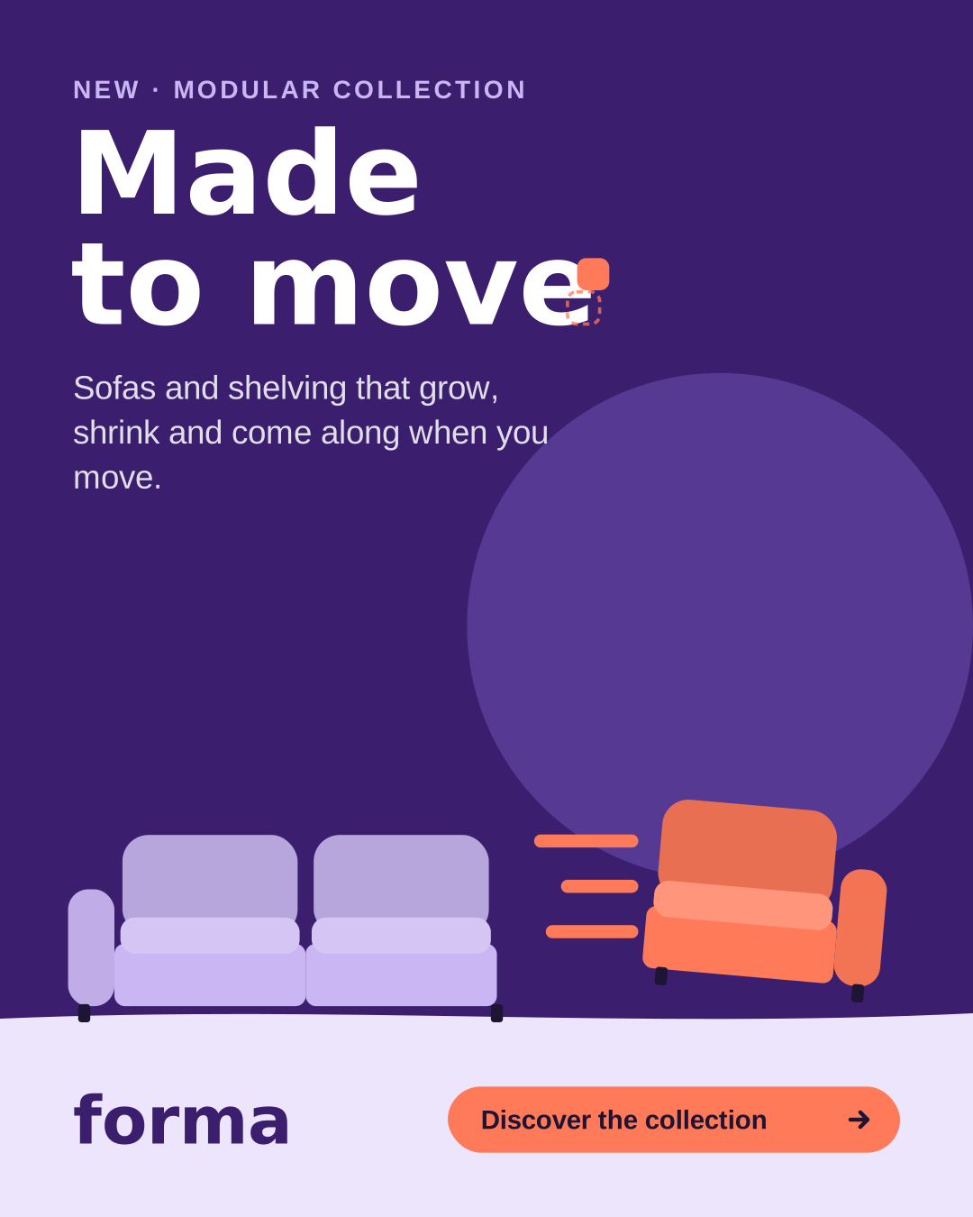
Every campaign layout uses the same logic: copy top left, furniture bottom right on the Mist floor, the lockup or wordmark in the bottom band. Pick a format to see its grid, and switch on the overlay to see it on a real post.
Feed post 4:5
- Format
- 1080 × 1350 px
- Columns
- 4
- Column width
- 212 px
- Gutter
- 24 px
- Side margins
- 80 px
- Top and bottom
- 80 px
- Baseline
- 8 px
Bottom band = 20% of the width, for wordmark and button.
White space
- Margin = 7.5% of the shortest side. Nothing important outside it.
- Text/image ratio: copy takes at most 40% of the area, the scene at least 60%.
- Everything aligns left. Never centre the campaign line.
- The furniture always stands on the Mist floor; the floor band is 14–20% of the height.
- Leave the space between the line and the sofa empty. That's where the module moves.
- One message, one button per format. A second message is a second format.
Key visuals
One scene, three formats
The key visual is always the same scene: two Lilac modules on a Mist floor, one Signal module sliding out. The dashed zone is reserved for copy and the lockup — never move furniture into it.
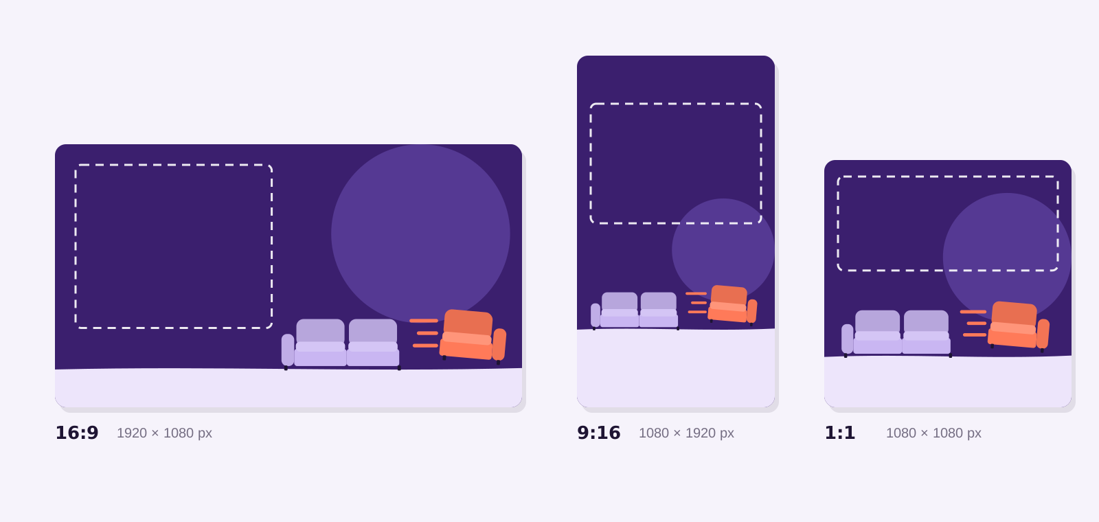
Landscape 16:9
Billboards, email headers, LinkedIn, web heroes. Copy zone: left 45%. Furniture: right half, standing on the bottom 14%.
Portrait 9:16
Stories, Reels, TikTok, digital out-of-home. Keep the top 250 px and bottom 340 px free of copy — the app covers them.
Square 1:1
Feed posts, display, marketplace listings. Copy zone: top 40%. Lockup or wordmark in the Mist band at the bottom.