Live demo of the Brand essentials blueprint · Common Ground is a fictional brand.All blueprintsJoin the waitlist
Common Ground

01Chapter

Brand foundation

Our story, mission, vision and values

Common Ground · Brand essentials · Edition 2026

A more human tomorrow.

Neighbourhood food co-ops and community kitchens in Amsterdam and Rotterdam. This guide holds everything that makes us recognisable, from why we exist to the file you need for the Thursday soup poster.

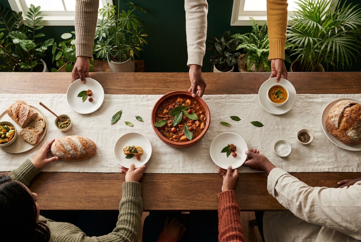
A long shared table seen from above: hands of different skin tones pass bread, a bowl of stew and small plates

Our story

Why Common Ground exists

In 2017 twelve neighbours in Amsterdam-Oost started buying vegetables together, straight from a grower in Zeeburg. Within a year they were cooking for forty people every Thursday. Today Common Ground is eleven co-ops and kitchens, run by 3,200 members and 400 volunteers.

Good food has become something you either pay a lot for or do without. Meanwhile, more people eat alone than ever. We think both problems have the same answer: buy together, cook together, eat together.

“You come for cheap carrots. You come back for the people.” (A member in Rotterdam-West, 2025)

Mission

Make fresh, local food affordable and sharing it normal, one neighbourhood at a time.

Vision

A city where nobody has to choose between good food and paying the rent, and where every neighbourhood has a table you can join.

Our role

We are the link between growers around the city and the people who live in it: a shop, a kitchen and a meeting place in one.

Core values

What we stand for

Four values guide every decision, from which grower we buy from to how we write a poster.

Fair

Fair prices for members, fair pay for growers. We show what things cost and where the money goes.

Together

Members decide, volunteers run the kitchens. Nothing we do works without the people around the table.

Local

Food from within 50 km, seasonal, with as few steps as possible between the field and the plate.

Open

Everyone is welcome, whatever their budget, background or language. Pay what you can is a promise, not a slogan.

About this guide

One brand, many kitchens

Each kitchen has its own character, and that is how it should be. This guide makes sure that, whoever designs the poster, we still look like one network people can trust. Twelve chapters, from why we exist to where the files live.

  1. Start with the logo pack. Never redraw or retype the logo; download the master files at the end of the Logo section.

  2. Pick colours from the palette. Copy the exact values from the Colour section. Don't sample them from a photo or a screenshot.

  3. Use the two typefaces. Newsreader and Inter are free on Google Fonts. Install them before you start.

  4. Check contrast and size. Small text in Clay or on Sage is the most common mistake we see.

  5. When in doubt, ask. Send your design to the brand team. You'll find who to contact at the end of this guide.

02Chapter

Audience & positioning

Who we're for, what they need and how we differ

Audience & positioning

Everyone at the table, three people in mind

Common Ground is for the whole neighbourhood. But when you write a flyer or design a post, picture one of these three people. They are based on our 2025 member survey (1,140 responses) and on conversations in the kitchens.

Amal

38 · Nurse and mother of two, Amsterdam-Oost · member since 2022

I want my kids to eat real vegetables. I just can't spend Saturday at three different shops.
  • Fresh food at a price that fits the monthly budget
  • A weekly box she can pick up after a late shift
  • A place where the kids are welcome too
Henk

74 · Retired tram driver, lives alone in Rotterdam-West · comes to soup night

Since my wife died I don't really cook. On Thursdays I have somewhere to be.
  • Company and a reason to go out
  • A warm meal he can afford on his pension
  • Information on paper, in large type

Sanne

26 · Student and volunteer cook, Amsterdam-Noord · on Instagram daily

I wanted to do something useful that isn't just signing a petition.
  • Meaningful volunteering that fits around her studies
  • To learn to cook for 60 people
  • To meet people outside her bubble

Positioning

For neighbours who want good food without the price tag or the pretence, Common Ground is the local co-op and kitchen that brings growers and neighbours to one table. Unlike supermarkets and organic stores, we're run by our members, and everyone pays what they can.

Positioning map

Local & seasonal
Transaction
Community
Industrial

Brand promise

Good food, a seat at the table

What people can count on, every time they meet us.

Our promise

Fresh, local food at a fair price, and a seat at the table for everyone who wants one.

The proof

86% of our produce comes from within 50 km. Members pay on average 30% less than in organic stores. 2,400 meals a month, pay what you can.

What makes us different

We are a shop and a kitchen in one, owned by the people who use it. Nobody earns a profit on your groceries.

03Chapter

Brand personality

Who we are when we speak, design and cook

Brand personality

Warm, grounded, inclusive, quietly confident

If Common Ground were a person, it would be the neighbour who always has soup on the stove: practical, kind, a little stubborn about doing things properly, and never the loudest in the room. Hover over the sliders to see what each position means in practice.

Where we stand

What this means: We use first names and 'you', never 'dear customer'. But we stay clear and reliable: prices, times and rules are always exact.

What this means: Lots of space, one message per poster, no exclamation marks. We let the food and the people do the talking.

What this means: Food poverty is serious, and we treat it that way. But a kitchen is a happy place: a light touch and a smile are welcome.

What this means: Real photos, natural light, a hand-written menu now and then. Never glossy or over-produced, but always neat.

What this means: We show what works rather than what's wrong. We take a stand on fair food, but we don't preach.

Our traits

01

Warm

We sound like a neighbour, not an institution. First names, real faces, a kitchen that smells of soup.

For example
“Come and eat with us on Thursday. Bring your neighbour.”

But not: Sugary or overfamiliar: no hearts, no 'hey lovely'.

02

Grounded

Honest prices, honest produce. We show where food comes from and what it costs, without the gloss.

For example
“Leeks from Tuinderij Zeeburg, € 1.20 a kilo.”

But not: Vague claims like 'sustainable' or 'conscious' without proof.

03

Inclusive

Everyone is welcome: every budget, background and language. Our design and words should never feel exclusive.

For example
Simple words (B1 level), large type, translations where the neighbourhood needs them.

But not: Foodie jargon, insider jokes or 'for the conscious consumer'.

04

Quietly confident

We don't shout. Calm layouts and plenty of space show we know what we're doing.

For example
A poster with one sentence, one image and a lot of Paper.

But not: Exclamation marks, CAPS, 'the best in town'.

04Chapter

Logo

Versions, mark, clear space, sizes and misuse

Logo

A bowl, a sprout, a shared name

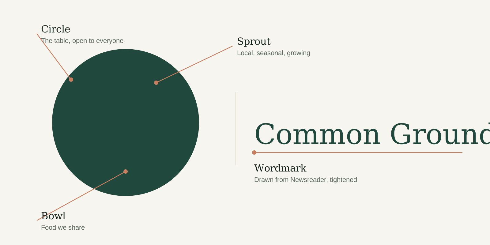
Our logo combines a mark and a wordmark. The mark is a circle, the table everyone can join, with a bowl and a young sprout cut out of it. The wordmark is set in a tightened version of Newsreader. Together they say what we do in one glance: good food, grown nearby, shared.

Diagram of the logo: circle, bowl and sprout in the mark, next to the wordmark
Anatomy of the logo. The mark and wordmark have a fixed size relationship. Never redraw or rearrange them.

Versions

Logo versions

Use the primary logo wherever you can. The other versions exist for specific backgrounds, formats and production methods. Every version comes in three colour modes: switch between Digital and Print to get the right file.

For screens: websites, apps, social media, presentations and email.

Primary
Primary
  • SVGRGB · 755 B · 760 × 200 px
Reversed
Reversed
  • SVGRGB · 755 B · 760 × 200 px
Mono (Ink)
Mono (Ink)
  • SVGRGB · 755 B · 760 × 200 px
Stacked
Stacked
  • SVGRGB · 753 B · 520 × 330 px
Mark
Mark
  • SVGRGB · 542 B · 220 × 220 px
Mark, reversed
Mark, reversed
  • SVGRGB · 542 B · 220 × 220 px

Primary and reversed

The default for almost everything: signage, website, posters, letters. Forest on Paper or Cream; Cream on Forest or on a calm, dark part of a photo.

Stacked

For square and upright spaces where the horizontal logo would get too small: tote bags, stickers, the end frame of a video, a shop window.

Mono

For one-colour production (stamps, receipts, newspaper ads, laser engraving) and on Sage or Clay, where Forest doesn't have enough contrast.

Mark

Only where the name is already clear or space is tiny: app icon, avatar, favicon, embroidery, jar lids. Never as a replacement on a first introduction.

Clear space

Give it room to breathe

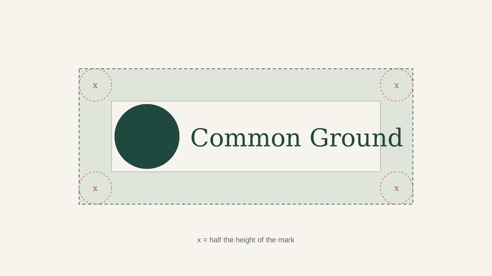
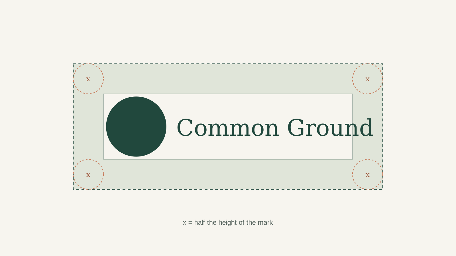
Keep an area free of text, images and edges around the logo. The minimum is x: half the height of the mark. More is almost always better.

Clear-space diagram: a zone of x around the primary logo on all four sides
Clear space applies to every version. For the mark on its own, keep x = half its own height on every side.

Minimum size

Never smaller than this

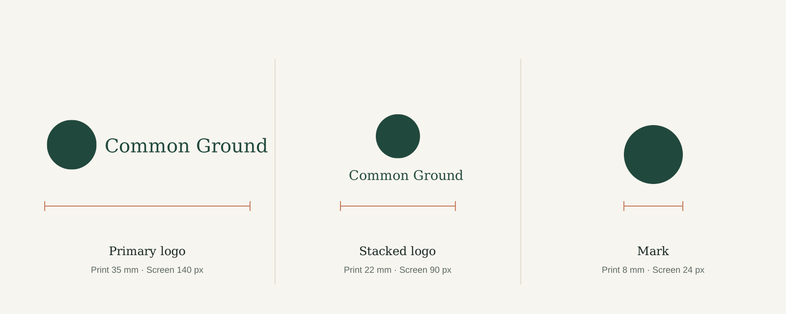
Below these sizes the cut-outs in the mark close up and the wordmark loses its detail. Sizes are measured across the full width of the logo.

Minimum sizes: primary logo 35 mm or 140 px, stacked logo 22 mm or 90 px, mark 8 mm or 24 px
For embroidery and engraving, double the print minimum.

Backgrounds and misuse

Do's and don'ts

The logo is the most recognisable part of our brand. Keep it consistent: the same shapes, the same colours, always on a calm background.

Do
  • Use the primary Forest logo on Paper, Cream or white, with plenty of space around it.
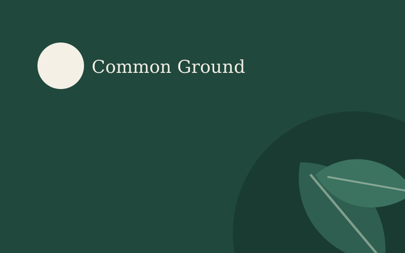
  • Use the reversed Cream logo on Forest, or on a calm, dark area of a photo or illustration.
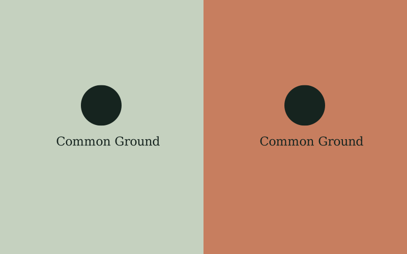
  • Use the Ink version on Sage and Clay. Forest doesn't have enough contrast on those colours.
Don't
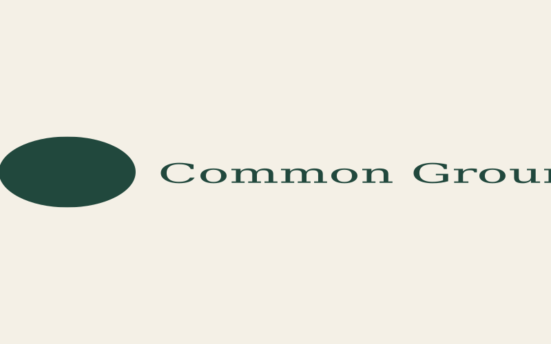
  • Don't stretch, squash or distort the logo. Always scale it proportionally.
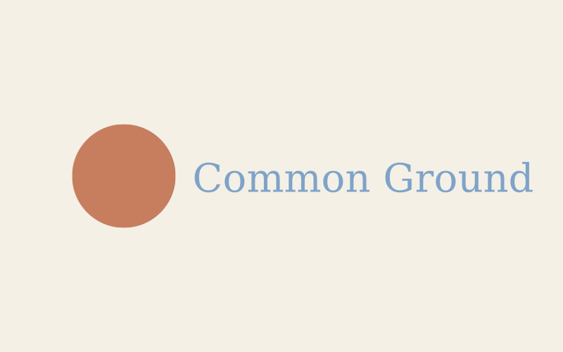
  • Don't recolour the logo, not even in other brand colours. Only Forest, Cream, Ink or white.
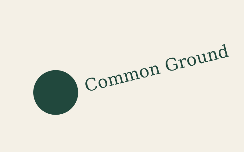
  • Don't rotate the logo or set it on a curve.
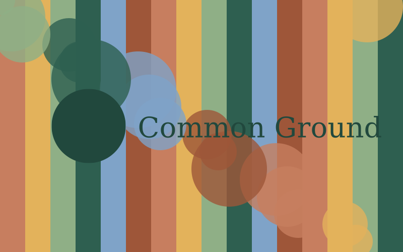
  • Don't place the logo on busy patterns or photos where it can't be read.
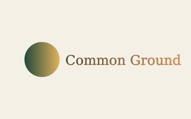
  • Don't add shadows, outlines, gradients or other effects.
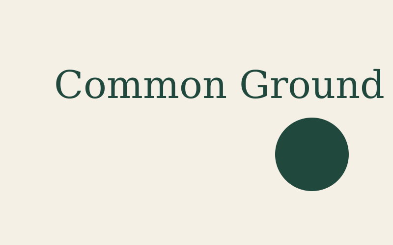
  • Don't rearrange the mark and wordmark or change their size relationship.
The mark in use

Small, crafted, everywhere

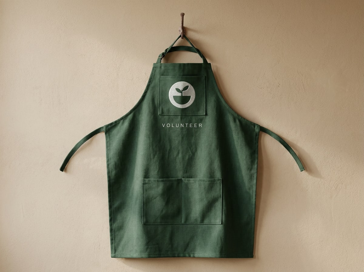
Where people already know they're at Common Ground, the mark is enough. It works as a stamp, a stitch or a label.

Forest volunteer apron with the mark embroidered in Cream
Volunteer apron: mark embroidered at 70 mm, Cream thread on Forest
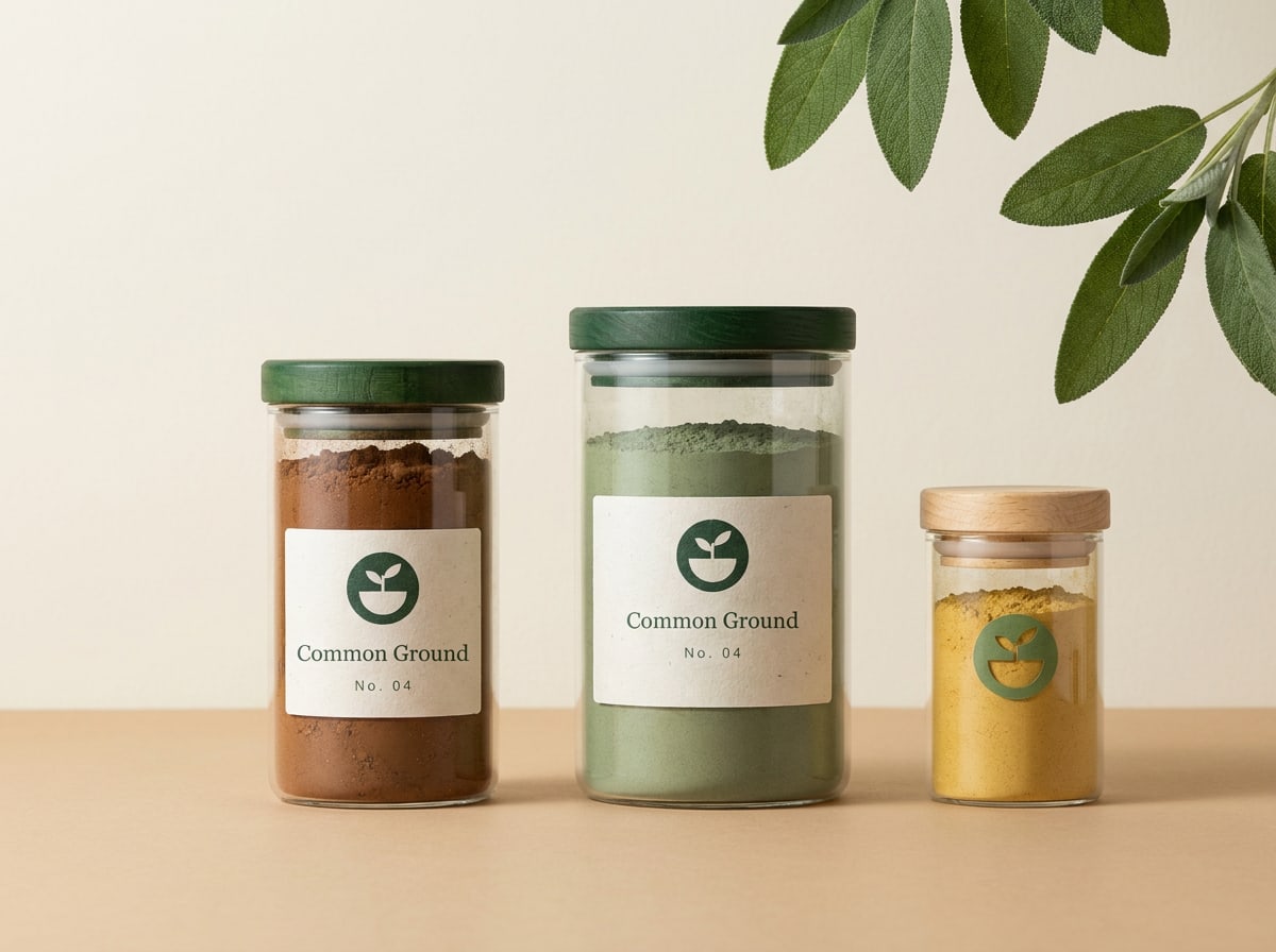
Glass jars of preserves with Cream labels showing the mark and wordmark
Jar labels for our own preserves: stacked logo on Cream, mark on the lid

Good to know

Specifics

Digital or print: which file do I use?
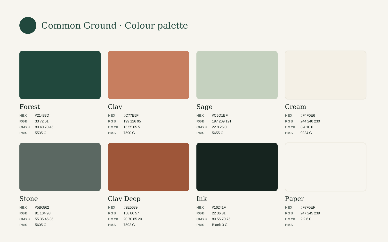
Digital · RGB: websites, apps, social media, presentations and email. SVG stays sharp at every size. Print · CMYK: anything printed in full colour, such as flyers, posters, magazines and packaging. The colours are built from C80 M40 Y70 K45 (Forest). Print · Pantone: spot-colour jobs, such as signage, screen-printed tote bags, aprons and one- or two-colour stationery. Forest is Pantone 5535 C (5535 U on uncoated paper); the one-colour version is Pantone Black 3 C. The print files are previews of the print colour: your printer or layout program does the separation. Need a PNG for a tool that won't take SVG? Export at twice the size you need.
Where does the logo go on a page?
Top left or bottom left, aligned to the margin of the layout. On A4 and A3 the primary logo is 45 mm and 60 mm wide. On posters with a single message, bottom left keeps the headline in charge. Centre the logo only on symmetrical formats such as tote bags, stickers and end frames.
Co-branding with partners
Place partner logos to the right of ours, separated by a thin vertical line in Stone at 2x distance. Match the optical height of the wordmarks, not the width of the files. Our logo comes first on our own materials; for the partner's materials, follow their guidelines. Co-branded items always need approval from the brand manager.
Kitchen and neighbourhood names
Never add a neighbourhood to the logo itself. Set the name of the kitchen separately as a label in Inter Semibold caps, e.g. COMMON GROUND OOST, at least 2x away from the logo. This keeps one logo for the whole network.
Accessibility and alt text
Online, give the logo the alt text "Common Ground" and link it to the homepage. Don't add "logo" to the alt text. When the mark is used as an app icon or avatar, the name must appear next to it in text.

05Chapter

Colour

Palette, print values, proportions and contrast

Colour

Colours from the field and the kitchen

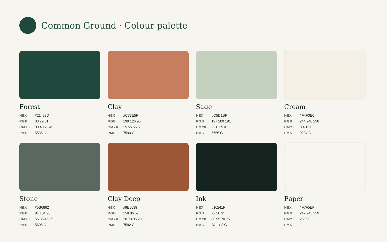
Our palette is earthy and calm: the deep green of a vegetable field, the warm red-brown of a clay pot, soft sage and the cream of unbleached paper. Used with lots of light space, it feels generous and honest, never loud.

The palette has three layers. Primary colours make us recognisable. Supporting colours add warmth and depth. Neutrals carry the text and the space.

Click any value to copy it. Use the HEX and RGB values for screens, CMYK for printing in full colour and Pantone for spot colour, merchandise and signage.

Primary

Primary colours

Forest is our hallmark. Clay is the accent: the one warm thing that draws the eye.

Forest
Logo, headlines, signage and large surfaces. Our most recognisable colour.
Clay
Accent: buttons, highlights, illustration. Max. 10% of a layout. Never for small text.

Supporting

Supporting colours

For backgrounds, illustration and the details: a soft Sage panel, a Cream card, a Clay Deep link.

Sage
Calm panels and illustration. Text on Sage in Ink or Forest.
Cream
Cards, labels and reversed type on Forest.
Clay Deep
Clay for text: links, labels and prices. 5.0:1 on Paper.
Stone
Secondary text, captions, thin lines.

Neutrals

Neutrals

Ink for text, Paper for space. Pure white is for screens and photography backgrounds only.

Ink
All body text. A green-black that's softer than pure black but still reads as black.
Paper
Default background on screen. In print: use uncoated natural paper instead of printing a tint.
White
Screens only: input fields, cards on Paper, product photography.

Proportions

Mostly light, a lot of green, a touch of clay

The balance matters as much as the colours themselves. Measured across a typical set of materials (a poster, a web page and a social post), the palette is used roughly like this.

  • Paper 38% · Backgrounds and space
  • Forest 25% · Logo, headlines, large brand surfaces
  • Cream 15% · Cards, labels, type on Forest
  • Sage 10% · Calm panels and illustration
  • Clay 7% · The one accent: button, price, date
  • Ink 5% · Body text
  • A guide, not a formula. A Forest poster can be 80% green, but the brand as a whole should feel like the bar above.

  • One accent per view. Use Clay for the single thing you want people to notice: the button, the price, the date.

  • Don't combine Clay and Sage in large, equal areas. They compete; let one of them lead.

  • No tints or gradients of brand colours. If you need a lighter green, use Sage.

Accessibility

Combinations that everyone can read

Our members include older people, people with low vision and people reading in a second language. Every text must meet WCAG 2.2 AA: a contrast of at least 4.5:1 for body text and 3:1 for large text (24 px, or 19 px bold).

Preview as
Aa
14.7:1
Ink on Paper

The quick brown fox jumps over the lazy dog.

AAA
Aa
8.9:1
Forest on Cream

The quick brown fox jumps over the lazy dog.

AAA
Aa
10.1:1
Ink on Sage

The quick brown fox jumps over the lazy dog.

AAA
Aa
6.4:1
Forest on Sage

The quick brown fox jumps over the lazy dog.

AA
Aa
5.0:1
Ink on Clay

The quick brown fox jumps over the lazy dog.

AA
Aa
5.0:1
Clay Deep on Paper

The quick brown fox jumps over the lazy dog.

AA
Aa
3.1:1
White on Clay

The quick brown fox jumps over the lazy dog.

AA large text only
Aa
2.9:1
Clay on Paper

The quick brown fox jumps over the lazy dog.

Not for text
Aa
1.4:1
Sage on Paper

The quick brown fox jumps over the lazy dog.

Not for text

Contrast is calculated with the WCAG 2.2 formula. AA: at least 4.5:1 for body text and 3:1 for large text (24 px, or 19 px bold); AAA: 7:1.

Do
  • Set body text in Ink on Paper, Cream or Sage, or in Cream on Forest.
  • Use Ink for text on Clay buttons (5.0:1). White on Clay (3.1:1) is only allowed for large text of 24 px or more.
  • Use Clay Deep instead of Clay for links, prices and labels on light backgrounds.
Don't
  • Don't use Clay or Sage for text on light backgrounds. Clay on Paper is only 2.9:1 and fails.
  • Don't rely on colour alone to show meaning, e.g. a red price for 'sold out'. Always add a word or an icon.
  • Don't place text on Clay and Forest next to each other. They vibrate and are hard to read for people with colour blindness.

Production

Print, screen and paint

Printing on uncoated paper
Most of our print is on uncoated, recycled paper. Colours will look softer and darker than on screen. Ask the printer for the uncoated Pantone references (5535 U, 7590 U) and always request a proof for anything above 500 copies.
Charts and data
Use Forest for the main series, then Clay, Sage and Stone. Never use more than four colours in one chart. Label values directly instead of relying on a colour legend.
Signage and paint
For painted fascias and walls, the closest RAL matches are RAL 6009 (Forest) and RAL 8023 at 60% (Clay). Always check against a Pantone swatch in daylight before ordering.

06Chapter

Typography

Typefaces, hierarchy and setting text

Typography

A warm serif and a clear sans

Two typefaces, both free and open source. Newsreader gives our headlines the warmth and character of a well-loved cookbook. Inter keeps everything else clear and easy to read, from ingredient lists to opening hours.

Display
Newsreader
Regular · Medium

Big statements on posters, hero banners and campaign end frames. Regular weight, sentence case, a full stop at the end. One short line, max. eight words.

Good typography is invisible. It guides the eye from line to line, so readers stay with the story instead of the letters. Spacing between lines matters as much as the letters themselves.

Line height
1.05 · 105% · 16.8 px at 16 px
Letter spacing
-0.01 em · -1%
Fallback font
Use this where Newsreader isn't available.
Brand font · Newsreader

A more human tomorrow.

Good typography is invisible. It guides the eye from line to line, so readers stay with the story instead of the letters. Spacing between lines matters as much as the letters themselves.

In Email, Word, PowerPoint · Georgia

A more human tomorrow.

Good typography is invisible. It guides the eye from line to line, so readers stay with the story instead of the letters. Spacing between lines matters as much as the letters themselves.

CSS font stackfont-family: Newsreader, Georgia, 'Times New Roman', serif;
Headings
Newsreader
Medium · Semibold

Page titles, section headings and menu items. Medium for H1 and H2; Semibold only at small sizes. Never in all caps.

Good typography is invisible. It guides the eye from line to line, so readers stay with the story instead of the letters. Spacing between lines matters as much as the letters themselves.

Line height
1.15 · 115% · 18.4 px at 16 px
Letter spacing
0 em · 0%
Fallback font
Use this where Newsreader isn't available.
Brand font · Newsreader

Cooking classes in Rotterdam-West

Good typography is invisible. It guides the eye from line to line, so readers stay with the story instead of the letters. Spacing between lines matters as much as the letters themselves.

In Email, Word, PowerPoint · Georgia

Cooking classes in Rotterdam-West

Good typography is invisible. It guides the eye from line to line, so readers stay with the story instead of the letters. Spacing between lines matters as much as the letters themselves.

CSS font stackfont-family: Newsreader, Georgia, 'Times New Roman', serif;
Body
Inter
Regular · Medium · Semibold

All running text, forms, buttons and UI. Regular for reading, Medium for emphasis, Semibold for buttons and H3. 16–18 px on screen, 9–10 pt in print.

Good typography is invisible. It guides the eye from line to line, so readers stay with the story instead of the letters. Spacing between lines matters as much as the letters themselves.

Line height
1.6 · 160% · 25.6 px at 16 px
Letter spacing
0 em · 0%
Fallback font
Use this where Inter isn't available.
Brand font · Inter

Bring a container for leftovers.

Good typography is invisible. It guides the eye from line to line, so readers stay with the story instead of the letters. Spacing between lines matters as much as the letters themselves.

In Email, Word, PowerPoint, receipts · Arial

Bring a container for leftovers.

Good typography is invisible. It guides the eye from line to line, so readers stay with the story instead of the letters. Spacing between lines matters as much as the letters themselves.

CSS font stackfont-family: Inter, Arial, Helvetica, sans-serif;
Labels and captions
Inter
Medium · Semibold

Eyebrows, dates, kitchen names and prices: Semibold caps, +8% tracking, 12–14 px. Captions: Regular, sentence case, in Stone.

Good typography is invisible. It guides the eye from line to line, so readers stay with the story instead of the letters. Spacing between lines matters as much as the letters themselves.

Line height
1.25 · 125% · 20 px at 16 px
Letter spacing
+0.08 em · +8%
Fallback font
Use this where Inter isn't available.
Brand font · Inter

EVERY THURSDAY · 18:00

Good typography is invisible. It guides the eye from line to line, so readers stay with the story instead of the letters. Spacing between lines matters as much as the letters themselves.

In Email and Office documents · Arial

EVERY THURSDAY · 18:00

Good typography is invisible. It guides the eye from line to line, so readers stay with the story instead of the letters. Spacing between lines matters as much as the letters themselves.

CSS font stackfont-family: Inter, Arial, Helvetica, sans-serif;

Hierarchy

Type scale

Seven steps cover everything we make. Each one is set live below in Newsreader and Inter; type your own text to try it. Sizes are in px for screen; for A4 documents, halve them and read them as points (body 17 px ≈ 9.5 pt).

Display
Heading font 400 · 72/76 · -1%
A more human tomorrow.
H1
Heading font 500 · 48/56
Good food, shared.
H2
Heading font 500 · 32/40
Cooking classes in Oost
H3
Body font 600 · 20/28
What to bring on your first evening
Body
Body font 400 · 17/27
Every Thursday our kitchen in Amsterdam-Oost cooks for whoever walks in. Members, neighbours and volunteers share one long table, and the washing-up.
Label
Body font 600 · 13/16 · +8% · caps
Every Thursday · 18:00
Caption
Body font 400 · 14/20
Thursday soup night at Common Ground Oost.

On mobile (below 600 px wide), scale down the three largest steps: Display 44/48 px, H1 34/40 px, H2 26/32 px. Everything from H3 down stays the same, and body text is never smaller than 16 px on screen.

Setting text

Easy to read, for everyone

Good typography is mostly about leaving things out. These three rules make the biggest difference.

Line length

Keep lines between 45 and 75 characters. On wide screens, use a narrow column rather than stretching the text across the page.

Alignment

Always align left with a ragged right edge. No justified text: it creates gaps that make reading harder, especially in Dutch with its long words.

Case and punctuation

Sentence case for everything, including headlines and buttons. Caps only for short labels. No exclamation marks. A full stop after a Display line is our hallmark.

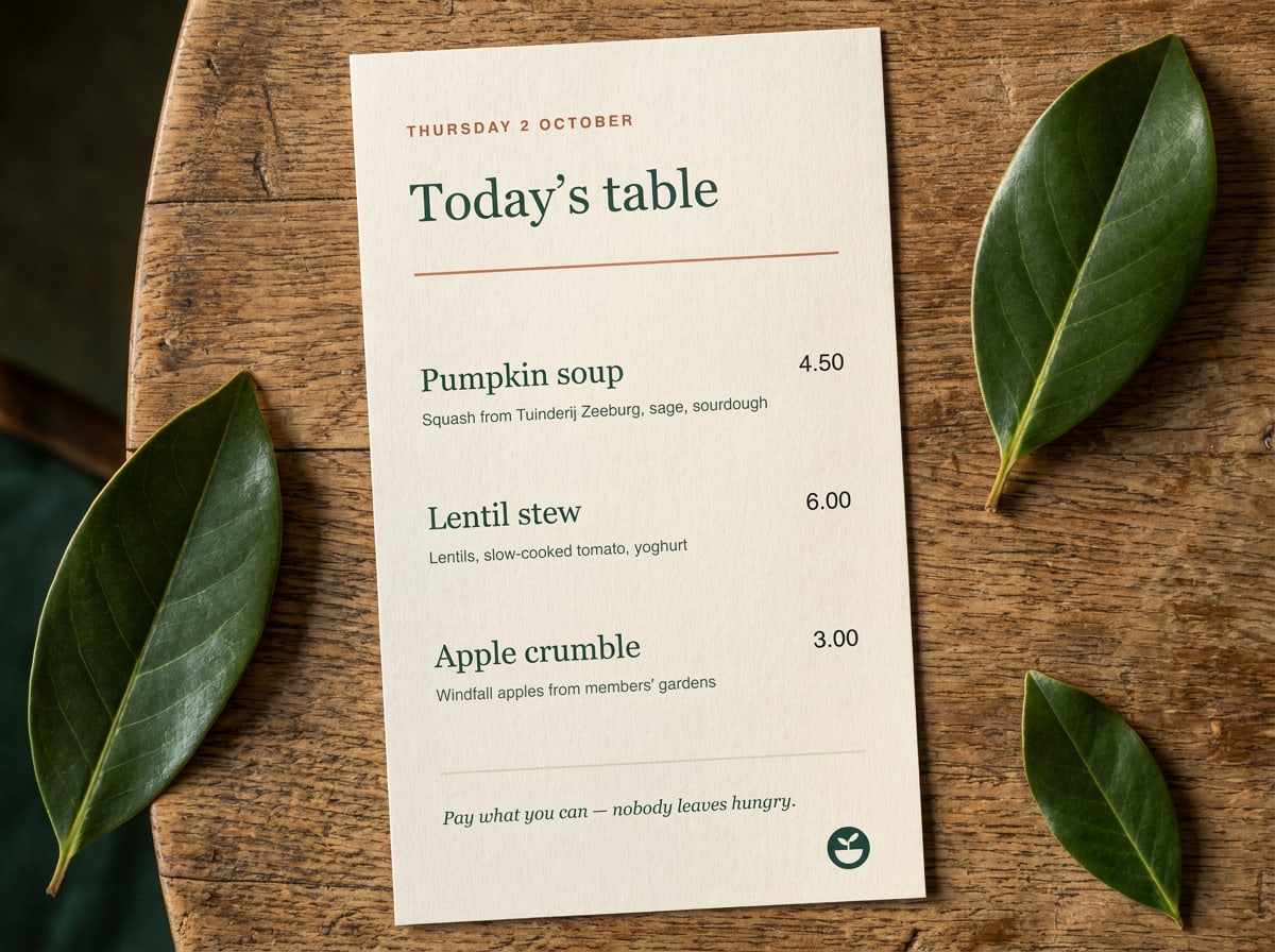
Cream menu card on a Forest table: Newsreader title and dishes, Inter descriptions and prices, a Clay Deep date label
In practice: the weekly menu card. Newsreader for the title and dishes, Inter for descriptions and prices, one Clay Deep label.
Do
  • Combine one Newsreader headline with Inter for everything else.
  • Use real quotation marks and en dashes: “Soup” and 18:00–21:00, not "Soup" and 18:00-21:00.
  • Use tabular figures in Inter for prices and timetables so the numbers line up.
Don't
  • Don't set long paragraphs in Newsreader or headlines in Inter Bold. Each typeface has its job.
  • Don't use italics, underline and bold at the same time to emphasise something. Pick one, preferably Medium.
  • Don't add other typefaces, not even for a single event poster. Script fonts make us look like a café chain.

Practical details

Fonts in daily use

Where do I get the fonts?
Both are free on Google Fonts under the SIL Open Font License: you may use them for print, web, apps and merchandise without paying. Install the variable versions; they include every weight we use. On the website we load them from our own server with font-display: swap.
Fallback fonts
When Newsreader or Inter isn't available, for example in email or on a shared computer: Headings: Georgia, then any system serif. Body: Arial or the system font (Segoe UI, San Francisco, Roboto). In CSS: font-family: Newsreader, Georgia, serif; and font-family: Inter, system-ui, Arial, sans-serif;
Word, Google Docs and email
Use the Common Ground document template: it has the styles set up. Google Docs has both fonts built in. In emails and newsletters, use Arial 14 px for body text and Georgia for headings, so everyone sees the same thing.
Writing in Dutch and English
Many of our kitchens communicate in both languages. Put Dutch first and English second, in the same typeface, with English in Stone or one weight lighter. Times use the Dutch style in Dutch (18.00 uur) and the 24-hour clock in English (18:00). Prices always with a comma in Dutch (€ 4,50).

07Chapter

Graphic language

Shapes, pattern, icons, illustration and frames

Graphic language

Everything grows from the mark

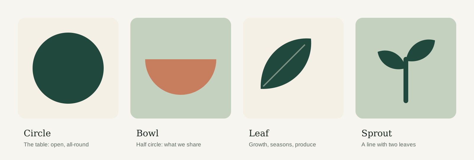
Our shapes, pattern, icons and illustrations all come from the same four forms in the mark. Used together, they make a poster or a post recognisable as Common Ground even before you see the logo.

The four base shapes: a Forest circle, a Clay half-circle bowl, a leaf and a sprout
Use the shapes flat and filled, in brand colours, never with outlines, shadows or gradients.

Pattern

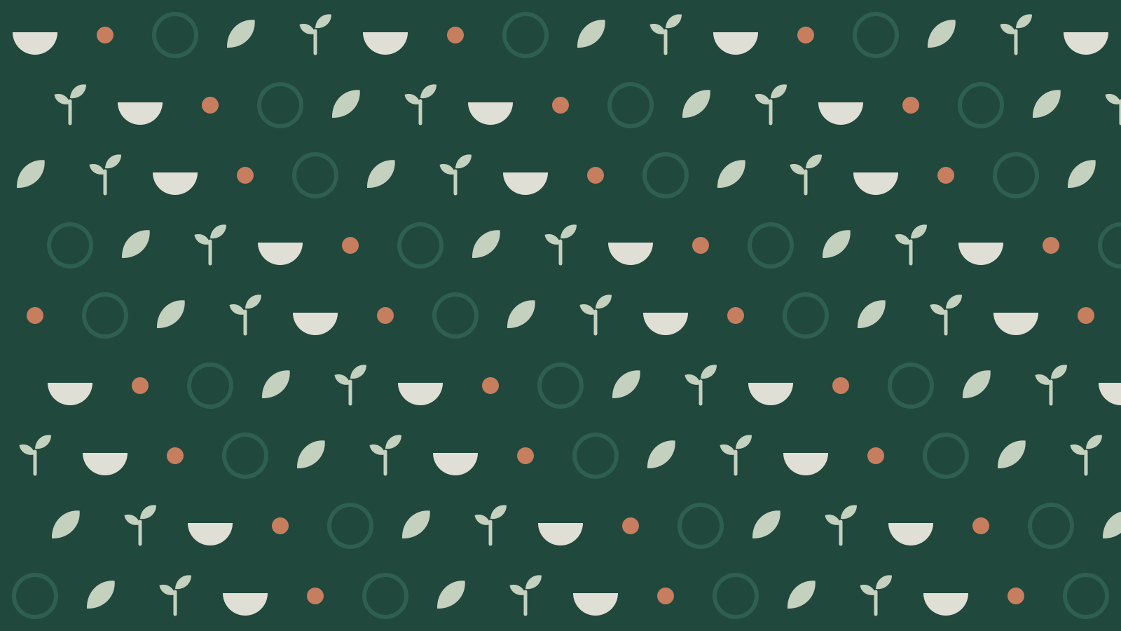
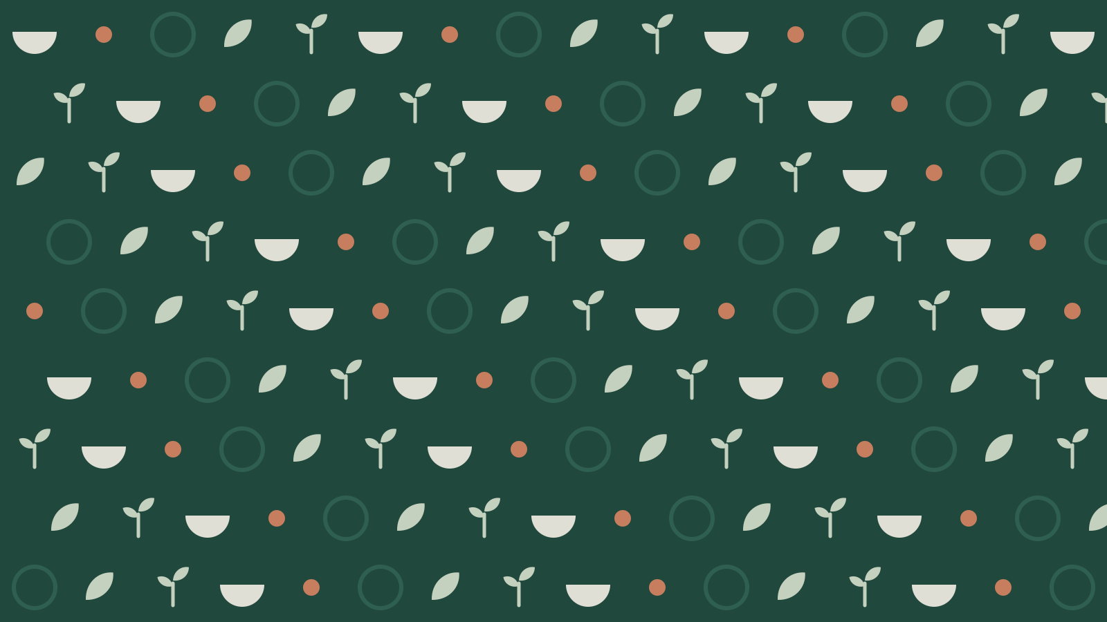
The table pattern

Bowls, leaves and sprouts on a loose grid. Use it on Forest as a backdrop for packaging, bags and event banners, never behind text.

Repeating pattern on Forest with Cream bowls, Sage leaves and sprouts and small Clay dots
Scale it so a bowl is at least 10 mm wide in print and 24 px on screen.

Icons

Icons

We use Material Symbols, Rounded style, weight 400, in Forest. Rounded corners match the soft shapes of the mark. Search the set, switch sizes and download what you need.

Food and produce

8 icons

Community and activities

7 icons

Practical information

8 icons

Material Symbols by Google, open source (Apache 2.0)

Illustration

Spot illustrations

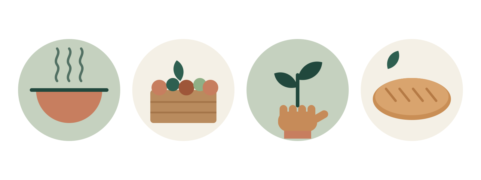
Simple, flat drawings built from the base shapes, in two or three brand colours. They explain (what's in the box, how pick-up works) where a photo would be too busy.

Four spot illustrations in circles: a steaming bowl, a crate of vegetables, a hand holding a sprout and a loaf of bread
No outlines, no gradients, no faces: hands are enough to show people.

Frames

How we crop images

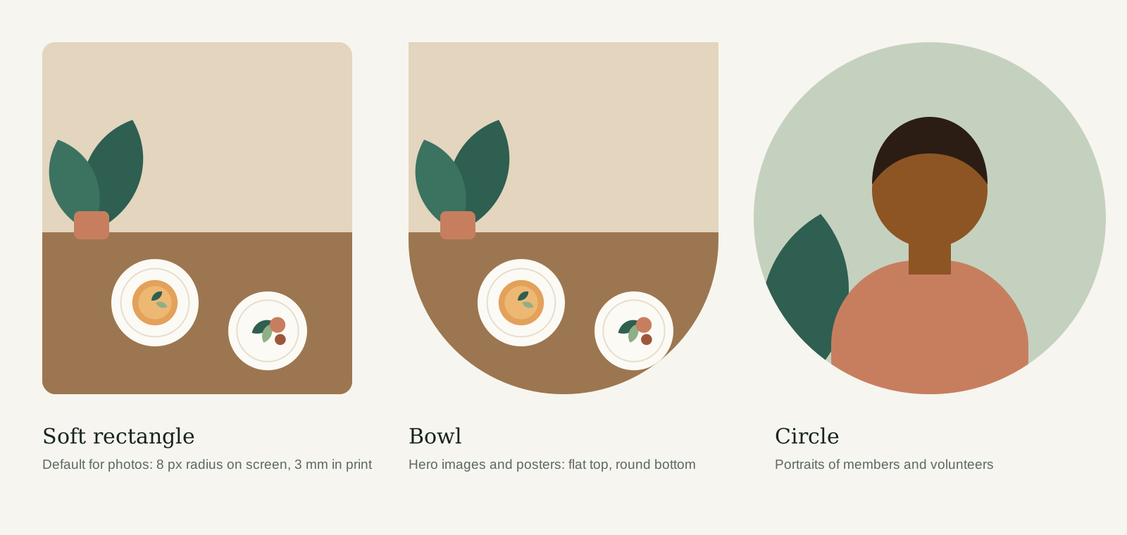
Three frames, each with its own job. The bowl frame is our hallmark: use it once per layout at most.

Three photo frames: a soft rectangle, a bowl shape with a flat top and round bottom, and a circle
Frames hold photos only. Never put text or the logo inside the bowl frame.
Do
  • Combine one photo, one shape or illustration and the logo. Three ingredients are plenty.
  • Let shapes bleed off the edge of the page: it makes the layout feel generous.
  • Use icons next to a word, never instead of one, so everyone understands them.
Don't
  • Don't use the pattern and a photo in the same area. Pick one.
  • Don't mix icon styles or download icons from other sets.
  • Don't draw new illustrations with outlines, shading or cartoon faces.

08Chapter

Photography & image style

Real people, real food, daylight

Photography & image style

Photos that smell of soup

Our pictures show what really happens: hands passing bread, a crate of muddy leeks, a volunteer laughing at the stove. Natural light, warm colours and a little imperfection. If it looks like an advert, it isn't us.

What this means: Window light or outdoors. No flash, no studio lamps. Shoot in the morning or late afternoon for soft shadows.

What this means: Mostly calm and attentive, with room for the buzz of a full kitchen.

What this means: Warm whites, wood, greens and terracotta. Correct cold casts; never add a filter.

What this means: People doing something, not looking into the lens. Hands are often enough.

What this means: Close enough to see texture, wide enough to feel the table. Top-down for food.

Keywords

  • daylight
  • hands
  • seasonal produce
  • wood and linen
  • together
  • unstaged
  • warm
  • real members

Moodboard

Do
  • Ask permission before you photograph someone, and always for children (written consent from a parent).
  • Show the variety of our neighbourhoods: ages, backgrounds, bodies, abilities.
  • Leave calm space in the frame for a headline or the logo.
Don't
  • Don't use stock photos of people who aren't part of Common Ground.
  • Don't show people queuing or in need in a way that takes away their dignity.
  • Don't add filters, vignettes or heavy retouching.

09Chapter

Tone of voice

How we sound, in English and Dutch

Tone of voice

Talk like a neighbour across the table

Short sentences. Everyday words. Say what's on the menu, what it costs and when to come. Then stop.

We are

Warm and direct Practical: times, prices, places Honest about what we don't know Happy to laugh at ourselves

We are not

Preachy about food or the planet Corporate ('dear customer') Pushy ('last chance!') Cute ('yummy goodness')

How we write

  1. Address people as "you". In Dutch we always use je/jij, never u, also with older members.

  2. One idea per sentence. Aim for B1 level: if a 12-year-old gets it, everyone does.

  3. Be specific. "Pumpkin soup, € 4.50" beats "delicious seasonal dishes".

  4. Use "we" for Common Ground, and name people by first name: "Sanne cooks tonight".

  5. No exclamation marks. If something is exciting, the facts will show it.

Before and after

Rewrite it the Common Ground way

Real examples from our own posters, posts and emails.

Do
  • “Soup night, every Thursday. 18:00. Pay what you can.”
  • “Your box is ready. Pick it up on Friday between 16:00 and 19:00.”
  • “We ran out of leeks. Sorry. Kale is back on Tuesday.”
Don't
  • “Join us for an unforgettable culinary community experience!!”
  • “Dear customer, your order has been processed successfully.”
  • “Due to unforeseen supply chain circumstances, certain products are temporarily unavailable.”

Words and slogans

Our words

Tagline
“A more human tomorrow.” In Dutch: “Een menselijker morgen.” Always with the full stop, in Newsreader, never translated freely. Use it on campaign end frames, posters and the website header, not in running text.
Words we use, words we avoid
Members, not customers. Neighbours, not target group. Pay what you can, not discount or free. Kitchen, not food service. Volunteers by first name, not 'our team'. Avoid: sustainable (say what you mean), superfood, exclusive, foodie.
Other languages
Many of our neighbours read Dutch as a second language. Keep Dutch simple first. Translations into English, Arabic, Turkish or Polish are made by members and checked by a second native speaker. Put them below the Dutch, in the same typeface.

10Chapter

Layout & composition

Grids, margins, white space and image-to-text ratio

Layout & composition

Room at the table

White space is our most-used brand colour. Every layout has one clear focal point, aligns to a simple grid and leaves at least a third of the surface empty. Pick a format below to see its grid; the overlay shows it on our homepage.

Website (desktop)

Format
1600 × 1000 px
Columns
12
Column width
98 px
Gutter
24 px
Side margins
80 px
Top and bottom
40 px
Baseline
8 px

Max. content width 1440 px. Text columns span at most 6 of 12 columns.

White space

  • One focal point per layout: a headline, a photo or a shape. Not all three at full size.
  • Leave at least a third of the surface empty.
  • Align everything left to the grid. Centre only on symmetrical formats.
  • Image to text: roughly 60/40 on posters and social, 40/60 on the website and in documents.
  • Spacing in steps of 8 px (screen) or 4 mm (print).
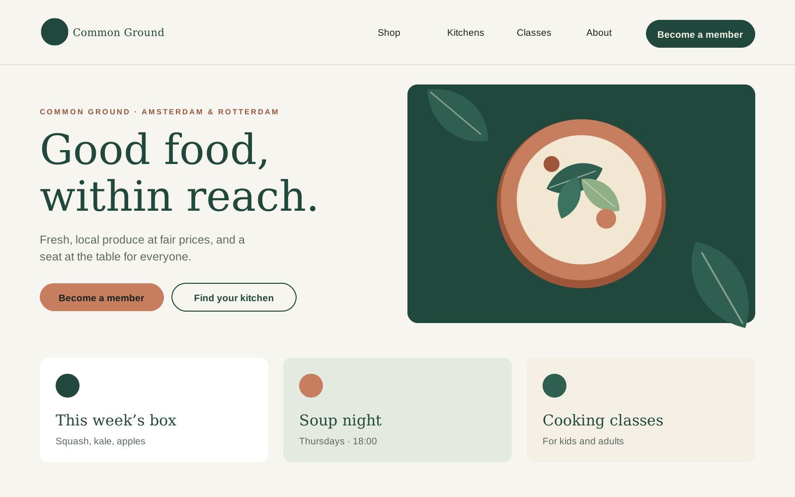
The Common Ground homepage with the 12-column grid laid over it
Example · Website (desktop)
Do
  • Start with the most important message and give it the most space.
  • Use the same margins on every page of a document.
Don't
  • Don't fill every corner. Empty space is not wasted space.
  • Don't place text over the busy part of a photo.

11Chapter

Applications

Website, app, social, print and email

Applications

The brand at work

This is where everything comes together. Use these examples as a reference: they follow all the rules in this guide, and most of them exist as templates you can order or download.

Online

Website

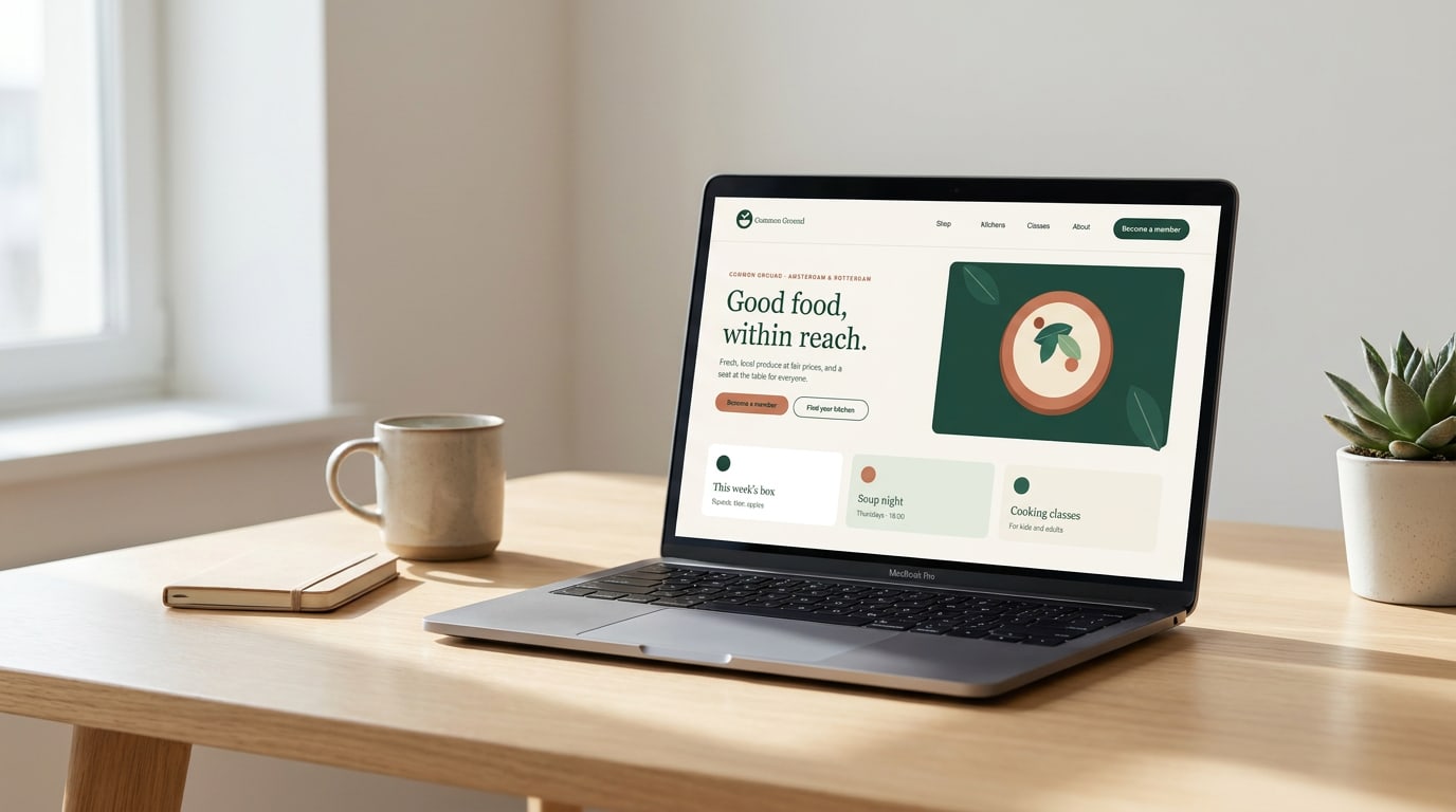
One clear message per screen, one Clay button, real food in the picture.

commonground.example: headline in Newsreader, body in Inter, a 12-column grid with generous margins.

Online

Members' app

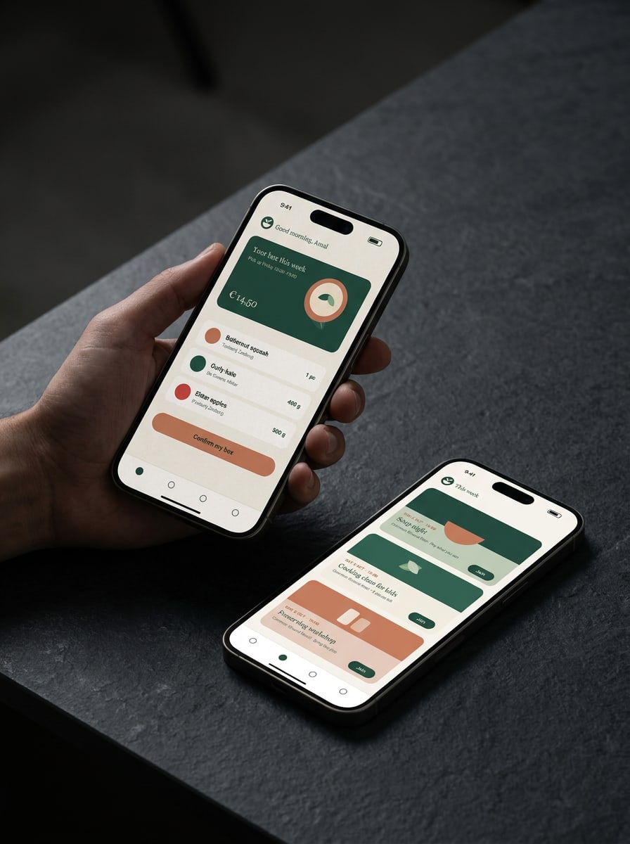
Paper carries the content, Forest marks what matters most and Clay is saved for the one action on each screen.

The weekly box and the agenda. Buttons in Clay with Ink text (5.0:1), event cards in Sage, Cream and a light Clay tint.

Social and posters

Posters and posts

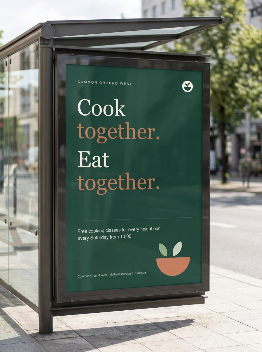
One sentence, one image, the logo. Posters hang in shop windows, libraries and community centres; posts follow the same recipe.

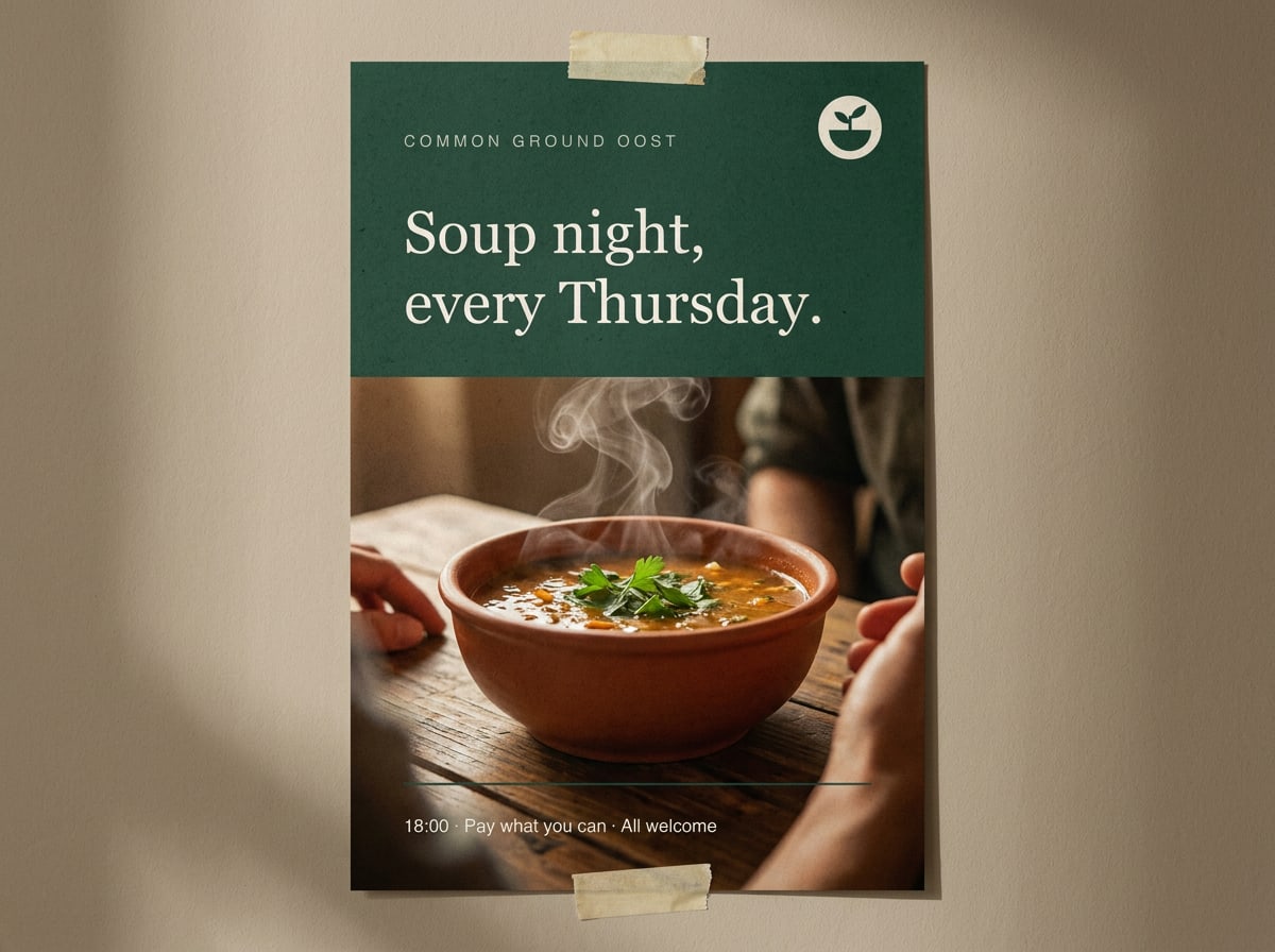
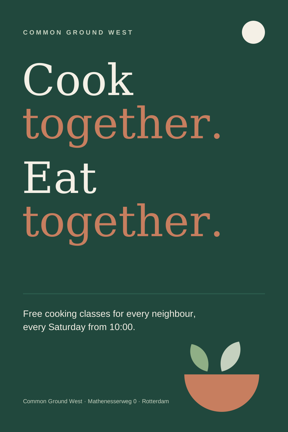
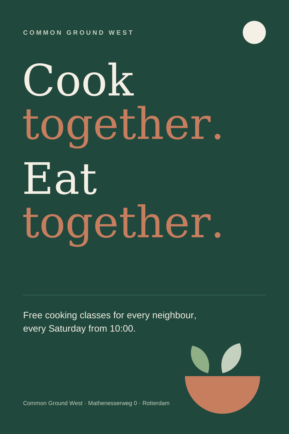
A3 poster for the cooking classes: Display type at full volume, Clay for every second line, details in Inter.
Forest poster for the Thursday soup night with a photo of a bowl of soup
Soup night poster: photo in the lower half, headline on Forest
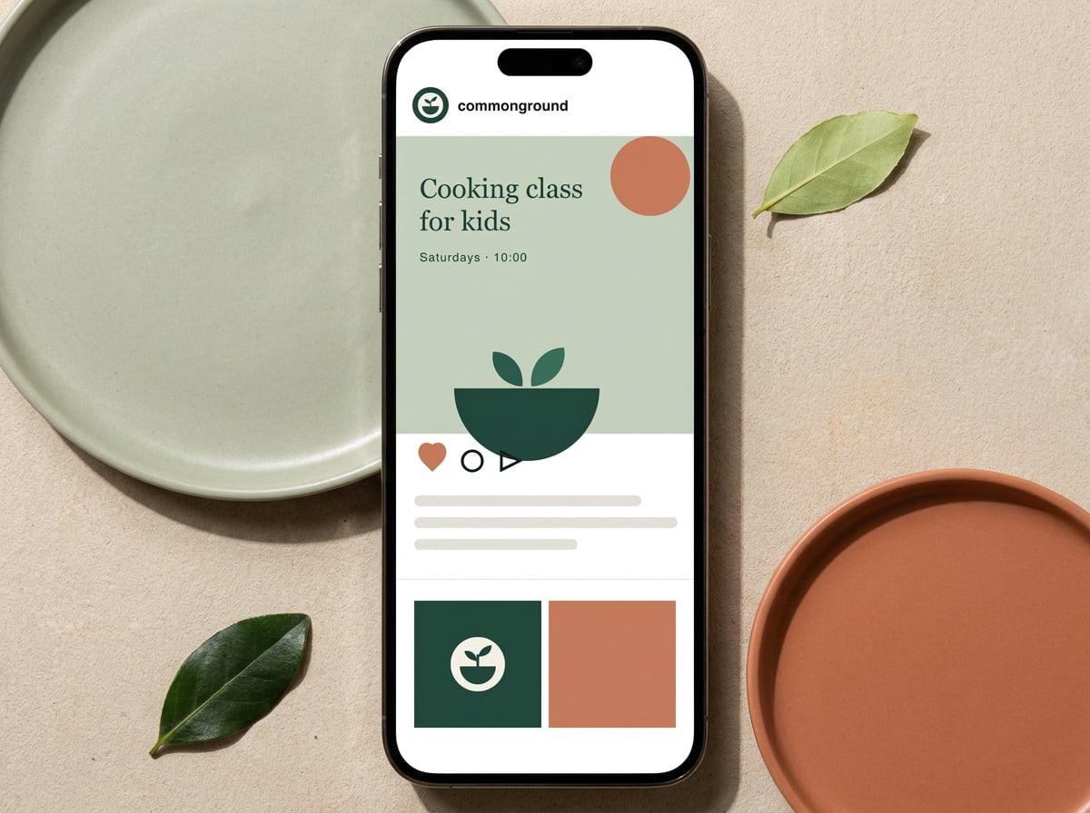
Phone showing an Instagram post about cooking classes for kids
Instagram post, 1080 × 1080 px, on the 6-column social grid

Print

Letters and cards

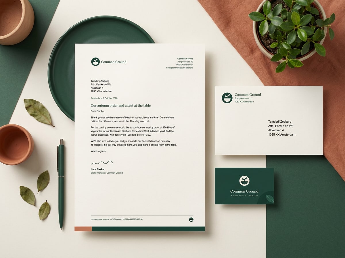
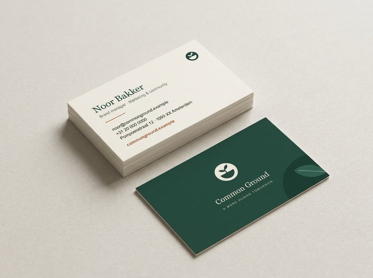
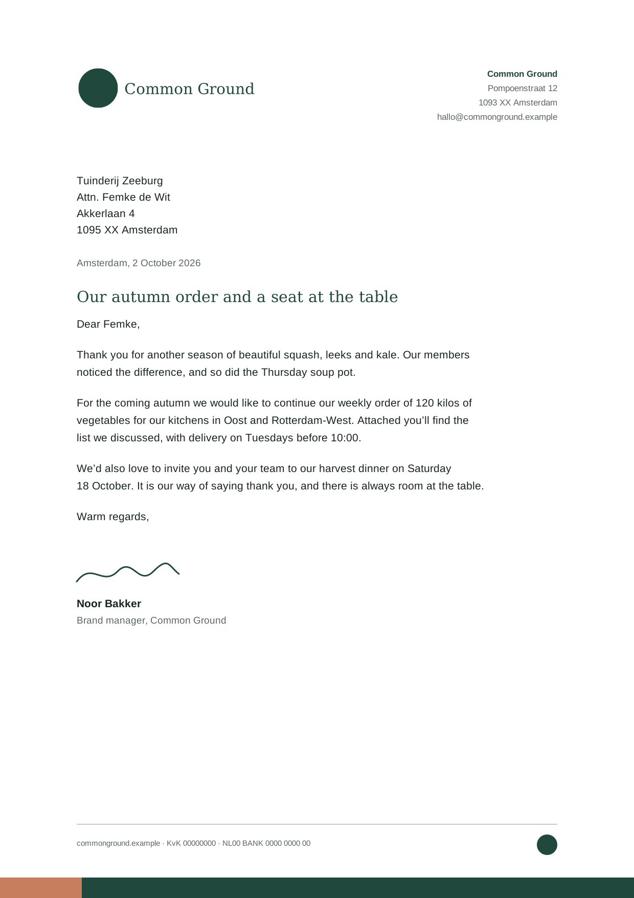
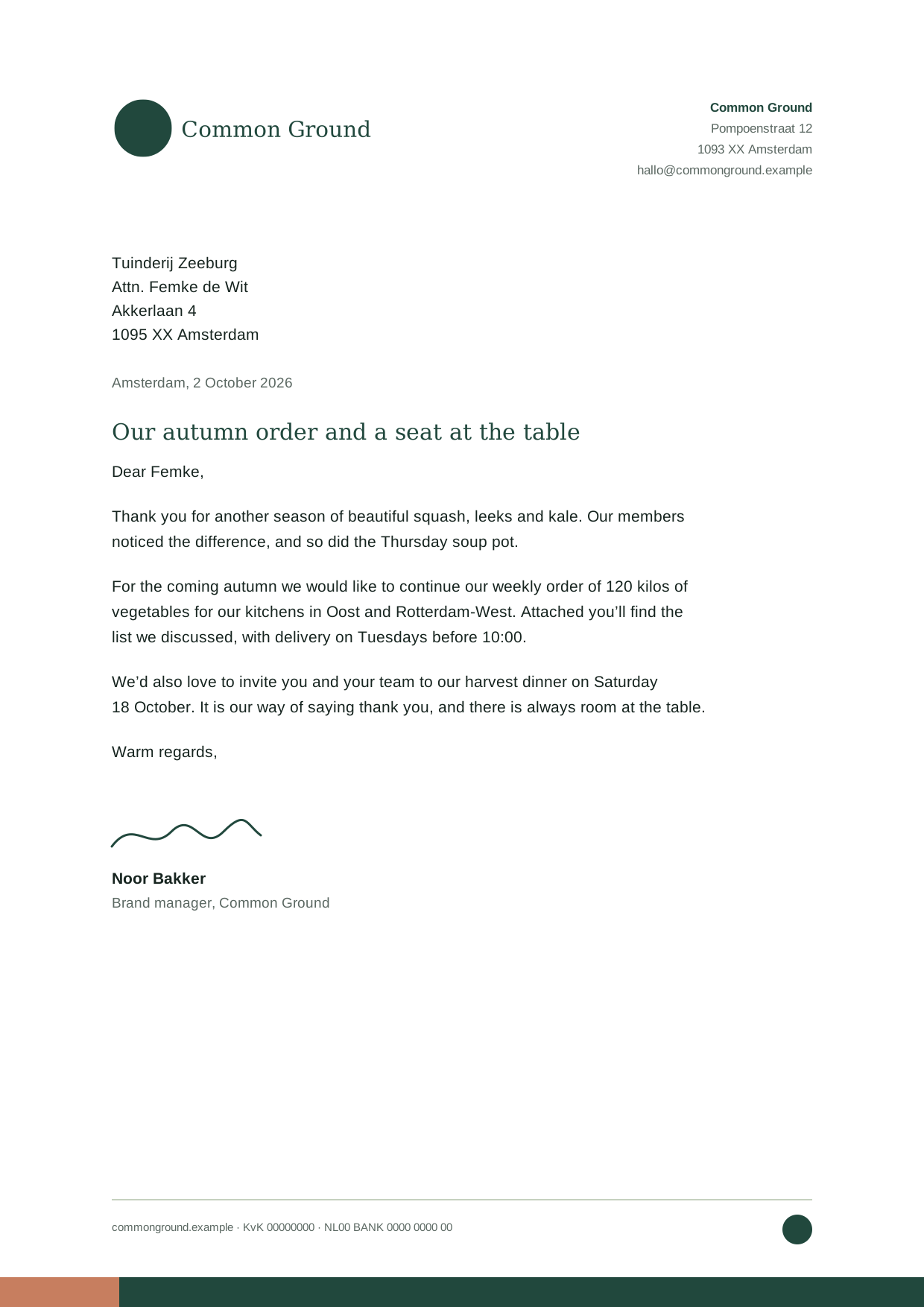
On stationery the logo sits top left at 45 mm, with the address in Inter on the right. Business cards carry the mark and wordmark large on Forest, with contact details on Cream.

A4 letterhead and business card. Letters are set in Inter 10/15 pt, subject line in Newsreader.
Business card, 85 × 55 mm, on 350 g uncoated stock. Front: reversed logo on Forest. Back: Ink and Clay Deep on Cream.

Order

Order business cards and print

Need business cards, letterhead or posters for your kitchen? Fill in the form and the studio prepares a print-ready file and sends it to our printer. Allow five working days.

Handled by the Common Ground design studio
  • Business cards

    250 cards, 350 g uncoated, printed on both sides.

  • Letterhead

    A4, 120 g recycled paper, with your kitchen's address.

  • Poster

    A3 or A2 poster from our templates: soup night, cooking class or open day.

12Chapter

Files & governance

Downloads, which file for what, approvals and contacts

Files & governance

Everything you need, in one place

Always download from this guide: it is the only place where the files are guaranteed to be current. Every logo version, including the reversed ones, in RGB, CMYK and Pantone, is in the colour-mode switch in the Logo chapter.

Primary logo, Forest
SVG · 755 B
For light backgrounds: Paper, Cream, white
Primary logo, CMYK
SVG · 876 B
Full-colour print: flyers, posters, magazines
Mono logo, Ink
SVG · 755 B
One-colour production, Sage and Clay backgrounds
Stacked logo, Forest
SVG · 753 B
Square and upright formats
Mark, Forest
SVG · 542 B
Avatars, favicons, stamps
Primary logo, Pantone
SVG · 875 B
Spot colour 5535 C: signage, screen print, embroidery
Logo with tagline
SVG · 899 B
Campaign end frames and posters only
Clear-space guide
SVG · 2 KB
For printers and sign makers
Palette sheet
SVG · 10 KB
All colours with HEX, RGB, CMYK and Pantone
Table pattern
SVG · 19 KB
Pattern on Forest, for packaging and banners
Poster: cooking classes
SVG · 2 KB
Reference layout for A3 posters
Letterhead
SVG · 5 KB
Reference layout for A4 letters

Governance

How we keep the brand in shape

Which file do I use for what?
Website, app, social, presentations: SVG (RGB). Flyers, posters, magazines: CMYK logo, PDF from your layout program. Signage, merchandise, embroidery, screen print: Pantone logo; ask the studio for the outlined vector file. Word, PowerPoint, email: PNG at twice the size you need, fonts Georgia and Arial. Fonts: Newsreader and Inter from Google Fonts (free, SIL Open Font License).
Where do templates and source files live?
This guide holds the final files. Editable templates (InDesign, Canva, Word, PowerPoint) are in the shared drive under Brand > Templates; ask the design studio for access. Never keep your own copies of the logo on your desktop: they go out of date.
What needs approval?
Anything printed in more than 500 copies, all co-branding with partners, signage and anything with a new illustration. Send it to the brand manager at least five working days before the deadline. Posters and posts made from our templates don't need approval.
Version history
Edition 2026 (24 September 2026): print logos in CMYK and Pantone, members' app, new chapters on audience, personality and layout. Edition 2025 (March 2025): Clay Deep added for text, tone of voice rewritten at B1 level. Edition 2023: first brand guide, after the merger of the Amsterdam and Rotterdam co-ops.

This guide: Edition 2026, last updated 24 September 2026. Owner: Noor Bakker, brand manager. Next review: March 2027.


Who to contact

Questions about the brand?

We're happy to help, whether it's a quick check of a flyer or a new kitchen opening in your neighbourhood. We usually reply within two working days.

Noor Bakker
Brand manager
Marketing & community

Ask about: using the brand, partnerships and co-branding, approval of print runs over 500 copies

Jesse Mensah
Art director
Design

Ask about: source files, print-ready logos, illustrations, signage for a new kitchen

Samira El Amrani
Online marketing
Digital

Ask about: social templates, the website, newsletters, Instagram access for your kitchen