Live demo of the Full brandbook blueprint · Onda is a fictional brand.All blueprintsJoin the waitlist
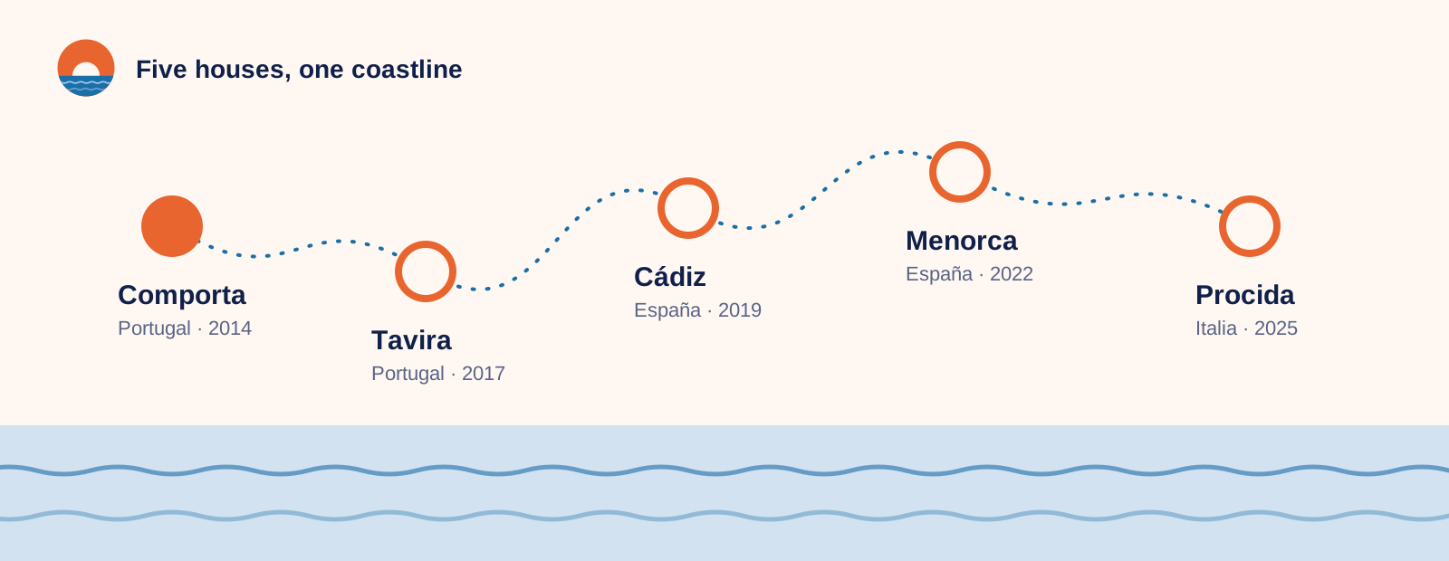
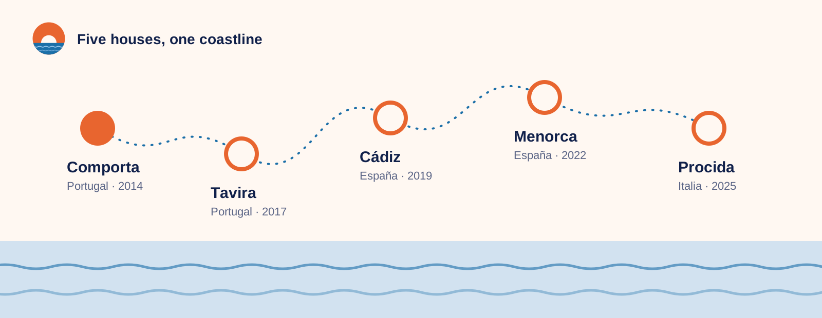
Route along five Onda houses: Comporta, Tavira, Cádiz, Menorca and Procida

Chapter 1 of 12

Brand foundation

Why Onda exists: our story, purpose, vision and values.

Onda brand guidelines · version 3.0

Travel, people, culture.

Everything you need to make Onda look, sound and feel like Onda — from the logo on a key card to the caption under a Sunday-morning post.
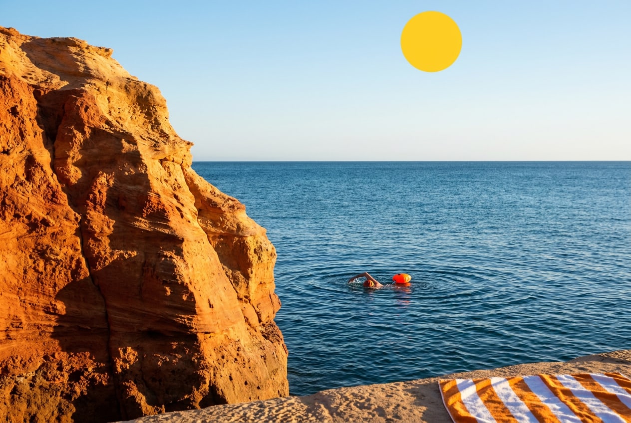
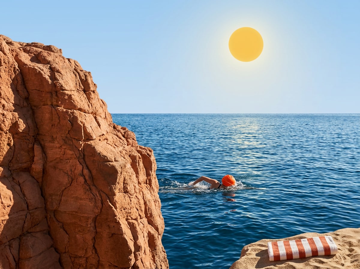
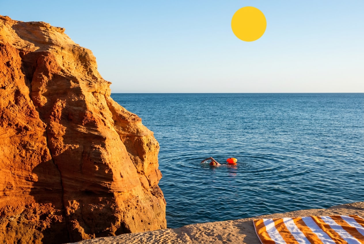
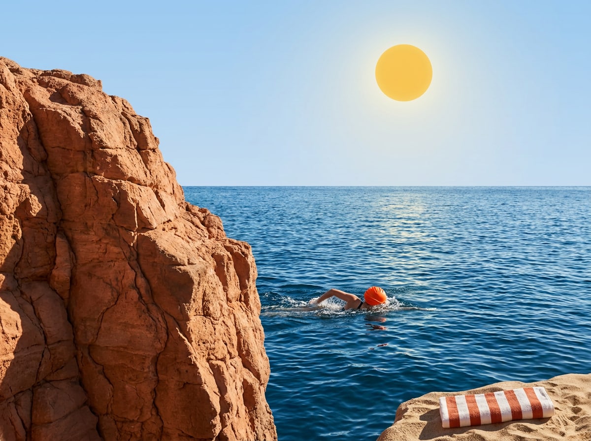
Illustration of a swimmer in a turquoise cove below an ochre cliff

Onda is a small family of coastal guesthouses in Portugal, Spain and Italy — five houses, around a hundred rooms, and a lot of people who love where they live. We don't sell holidays. We invite people to slow down, meet our hosts and neighbours, and go home with stories instead of souvenirs.

This guide is for everyone who makes something in our name: our own teams in the houses, the agencies and photographers we work with, and partners who put our logo next to theirs. It explains who we are, how we look and how we sound, and it gives you the files to get started.

If something isn't covered here, ask yourself what a good host would do. Then ask us.

Brand story

Slow down. Stay longer. Go home with stories.

Onda means wave in Portuguese, Spanish and Italian — the one word our three countries share. It's also how we'd like a stay to feel: unhurried, rhythmic, and always pulling you back to the sea.

How it started

In 2014, Ana Duarte and Marco Ricci bought a tired fisherman's house in Comporta, on the Alentejo coast. They fixed the roof, painted the shutters blue and opened six rooms. There was no reception desk — just a long kitchen table where Ana poured coffee and Marco drew maps of the best beaches on the back of napkins.

Guests didn't come back for the rooms. They came back for the table: for the neighbour who brought fish at seven, the baker who saved them the last loaf, the evening swims nobody had planned.

"We never wanted to run a hotel. We wanted to share the place we love with people who'd take care of it." — Ana Duarte, co-founder

Ten years and five houses later, that table is still the heart of Onda. Each house is small (12 to 24 rooms), run by people from the area, and rooted in its own village.

Route along five Onda houses: Comporta, Tavira, Cádiz, Menorca and Procida
Five houses, one coastline — from the Alentejo to the Bay of Naples.

Why we exist

Purpose, vision and mission

Purpose

To bring people closer to the places they visit — and to the people who live there.

Vision

A Mediterranean where travel gives back more than it takes: to villages, to the sea, and to the people who come to rest.

Mission

We run small coastal houses with local hosts, and we open doors guests couldn't open alone: a fisherman's morning, a grandmother's kitchen, a cove only the neighbours know.

What we stand for

Our values

Four values guide every decision, from who we hire to which supplier we choose. If a piece of communication contradicts one of them, it isn't Onda.

Hosted, not handled

Every guest knows their host's name by the first evening. We'd rather remember how you take your coffee than upsell you a room.

Local first

Our hosts, cooks and guides live nearby. At least 80% of what we buy comes from within 50 km of the house.

Unhurried

No checklists, no must-sees. We plan less so there's room for the things you'd never find in a guidebook.

Leave it better

We restore old buildings instead of building new ones, and 2% of every stay goes to our coastal clean-up fund.

Remember

Five things to get right

  1. Lead with people and place. A host, a street, a plate of food — never an empty infinity pool.

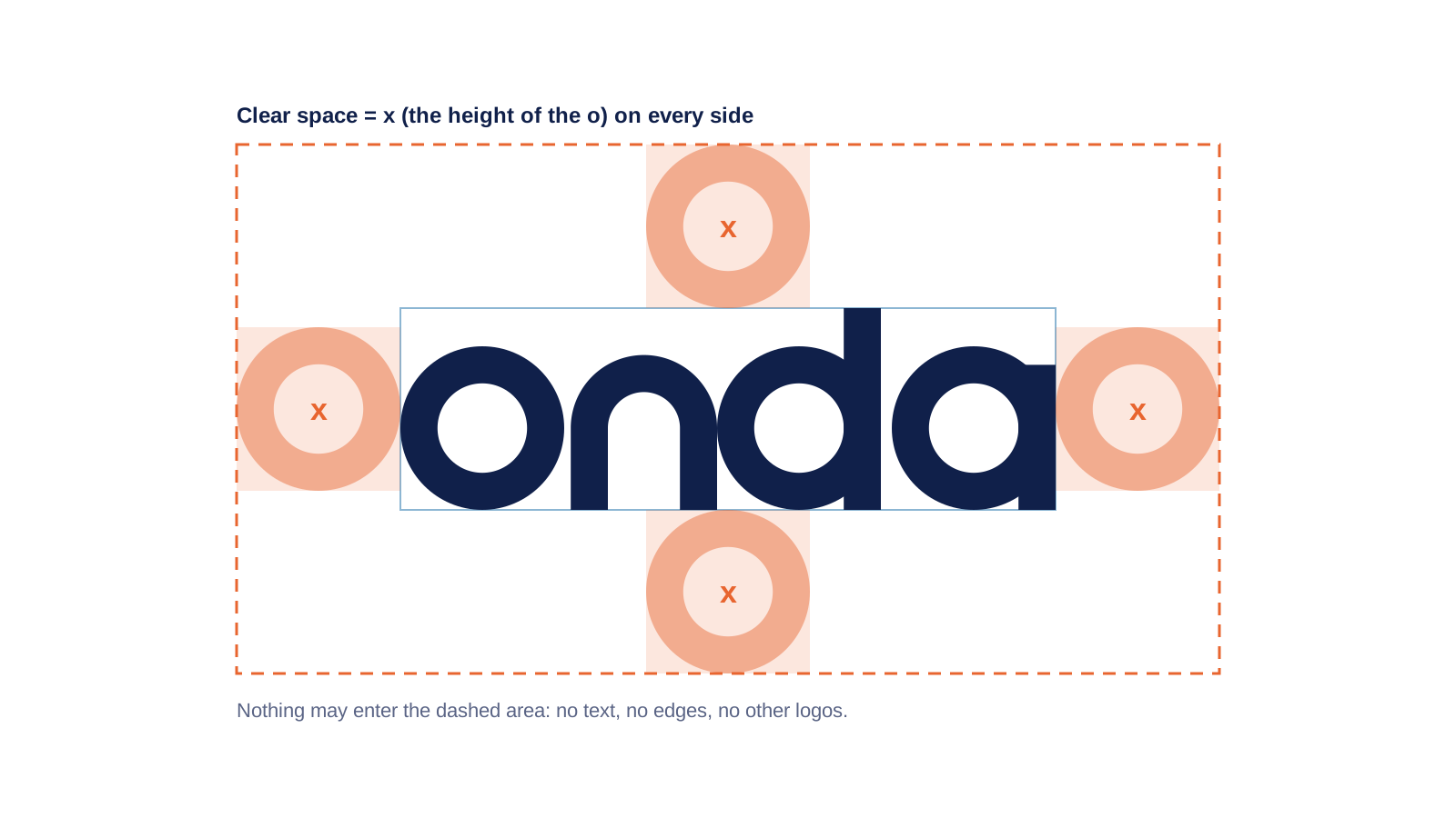
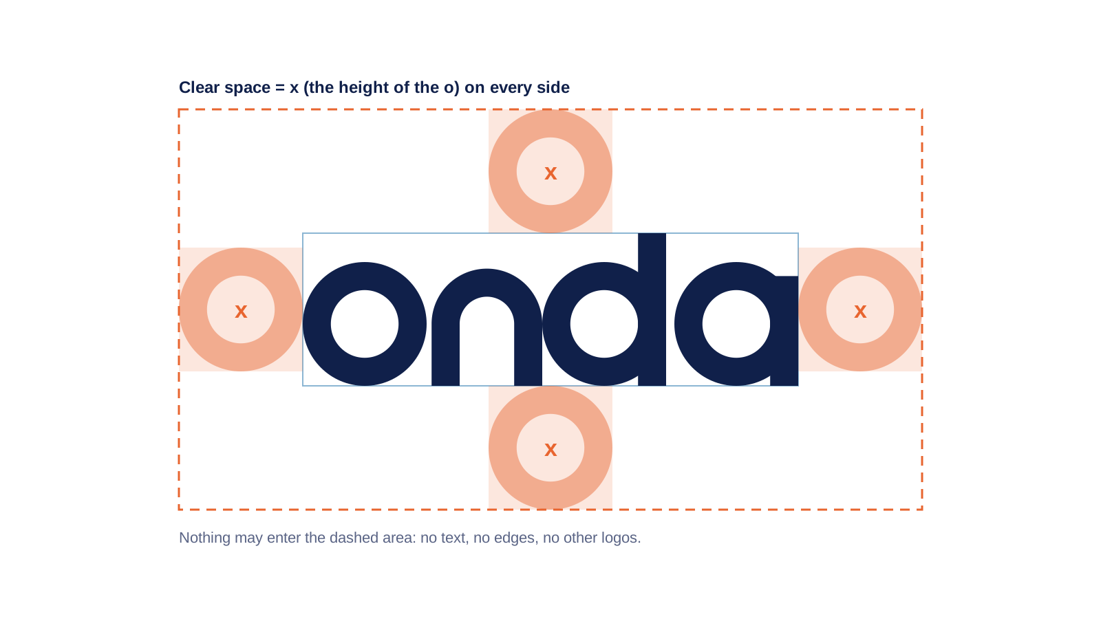
  2. Give the logo room. Clear space is the height of the "o", on every side.

  3. Sunset is the accent, not the wallpaper. Most of a layout is Shell and Night.

  4. Write like a host, not a hotel. Short sentences, specific details, no superlatives.

  5. Use the files in this guide. Don't redraw, retype or recolour the logo.
02Up nextAudience & positioning
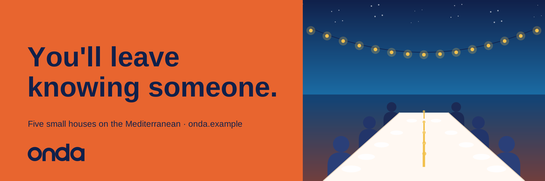
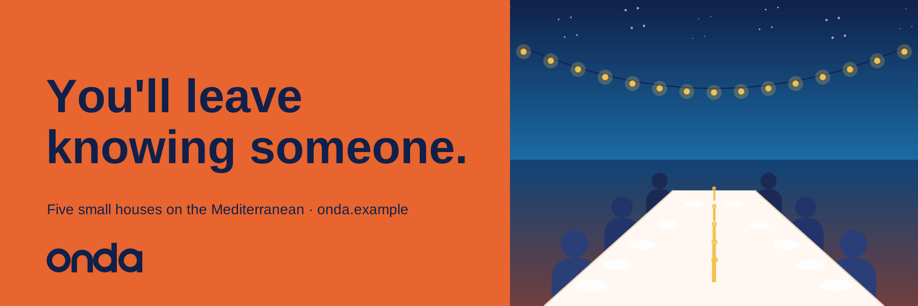
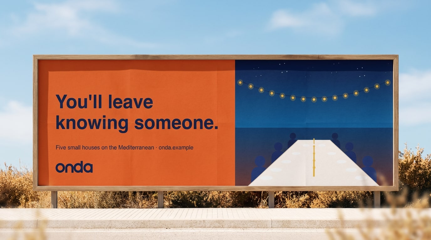
The promise, out loud: our 2026 billboard along the N261 to Comporta.

Chapter 2 of 12

Audience & positioning

Who we're for, what they need and how we're different.

Audience & positioning

Who we're for, and why us

Our guests differ in age and budget, but they share a mindset: they travel to understand a place, not to tick it off. Click through the three guests we design for, then see where Onda sits among the alternatives.

Sanne & Tom — curious couple

Both 41, Amsterdam · four nights or more, twice a year

We want to eat where the neighbours eat — and know their names by Friday.
  • Real local tips from someone who lives there
  • A calm room with good sheets and good coffee
  • Freedom: no programme, no fixed meal times

The Ruiz family — slow family

Parents 38 and 40, two children (6 and 9), Madrid · a week in May or October

I want the kids to learn to fish, not to queue for a slide.
  • Space, safe swimming and simple food
  • Things to do that aren't screens
  • Flexible check-in after a long drive

Elif — solo explorer

34, writer and remote worker, Berlin · stays two to four weeks

I come for the quiet, and I stay for the people at the table.
  • A desk by a window and fast, reliable wifi
  • Company when she wants it, quiet when she doesn't
  • Long-stay rates without a hotel feel

Positioning

For curious travellers who want to feel at home somewhere new, Onda is the group of small Mediterranean coastal houses that connects you with local people and culture — because every house is run by people who live there.

Positioning map

Fully hosted
Standardised
Local & personal
Do it yourself

Where we sit

Between resort and rental

Onda sits between the anonymous resort and the do-it-yourself holiday rental. We offer the comfort and care of a good hotel, with the closeness and character of staying with friends.

  • Not a resort. No buffets, no animation team, no wristbands.

  • Not a rental. There's always a host, a breakfast table and a tip for tomorrow.

  • Not luxury for show. Linen sheets and good coffee, yes. Gold taps, no.

Our promise

You'll leave knowing someone

Every guest goes home with at least one real connection — a host, a neighbour, a fisherman, a cook. That is the promise behind everything we make, and the test for every message: does it bring people closer?

The promise, out loud: our 2026 billboard along the N261 to Comporta.
03Up nextBrand personality

Chapter 3 of 12

Brand personality

The traits that shape how Onda looks, sounds and behaves.

Brand personality

Sunny, curious, unhurried, welcoming

If Onda were a person, you'd meet her on the terrace at eight: barefoot, coffee in hand, already knowing where the boats will come in. Slide over each scale to see what it means for design and copy.

Where we stand

What this means: We never shout. One headline, one accent colour, plenty of space — confidence doesn't need volume.

What this means: We write like a host: first names, 'you', a personal tip in every message.

What this means: Comfortable, never posh. No 'VIP', no velvet ropes — everyone gets the same welcome.

What this means: Crafted, not glossy: real photos, hand-drawn maps, local ceramics — but always neat and correct.

What this means: A light touch and a smile, never jokes or puns. Practical information stays practical.

What this means: Old fishermen's houses, modern comfort. Our design is simple and current, our stories are rooted in history.

Our traits

01

Sunny

Warm and optimistic, quick to smile. We see the best in a place and in people.

For example
“Rain today? Perfect for Rosa's bread class at eleven.”

But not: Forced cheerfulness, exclamation marks, 'Amazing!!'

02

Curious

We ask questions, notice details and love a good story — about the village, the food, the guest.

For example
“Did you know the shutters in Tavira are blue to keep the flies away?”

But not: Showing off, trivia for its own sake

03

Unhurried

Calm and confident. We give people time and space — on the page and in the house.

For example
“Breakfast waits for you. Come down whenever you're ready.”

But not: Urgency, countdowns, 'only 2 rooms left!'

04

Welcoming

We make everyone feel like a regular, from the first email to the last goodbye.

For example
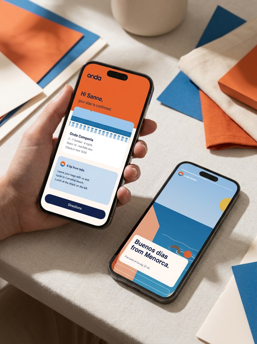
“Hi Sanne, your room faces the rice fields. See you on Thursday — Inês.”

But not: Formal phrases like 'Dear valued guest'

In practice

How the personality shows

In design

Generous white space, one accent per layout, round shapes and real photography. Nothing glossy, nothing crowded.

In words

Short sentences, first names and specific details: times, places, people. We'd rather tell one true story than list ten features.

In the houses

Hosts introduce themselves by name, breakfast has no end time and every guest gets a hand-drawn map on arrival.

04Up nextLogo

Chapter 5 of 12

Colour

Our palette, codes, proportions and accessible pairs.

Colour

From first light to the last swim

Our palette comes straight from a day on the coast: the sun going down, the harbour at noon, the sky after a swim and the deep blue of a summer night. Warm, but never loud.

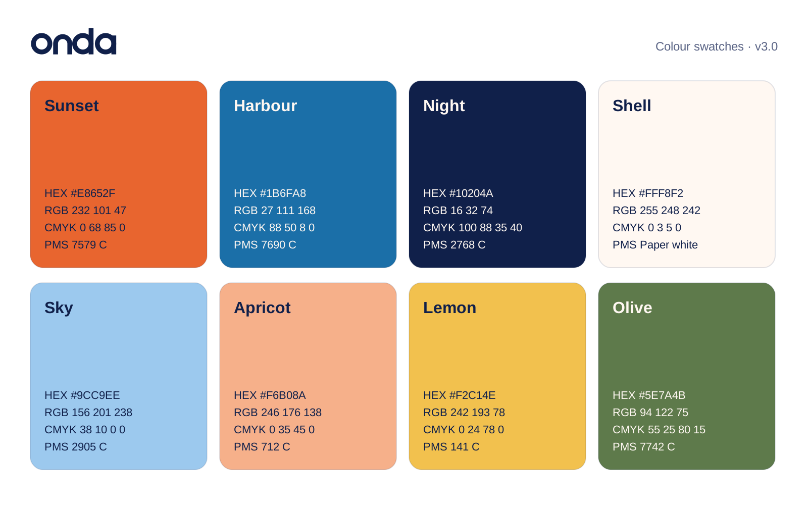
Primary palette

Four colours do most of the work

Click a value to copy it. Use the CMYK values on coated paper and the Pantone references for signage, textiles and merchandise.

Sunset
Our signature. Accents, key buttons and big moments.
Harbour
Links, sea and secondary actions.
Night
Text, the logo and dark backgrounds.
Shell
Our 'white'. Backgrounds and space.

Supporting palette

Colours for warmth and detail

Use these in illustrations, tiles, charts and backgrounds for quieter content. They never replace Sunset as the accent.

Sky
Light backgrounds, maps and calm panels.
Apricot
Soft warmth behind photos and quotes.
Lemon
Small highlights only: icons, food, labels.
Olive
Nature, gardens and our sustainability content.

Proportion

Mostly light, a little sun

A typical Onda layout is mostly Shell and Night, with Sunset as the one accent that draws the eye. Supporting colours appear in small doses. If a page feels orange, there's too much Sunset.

  • Shell 38% · Backgrounds and space
  • Night 20% · Text, logo and dark panels
  • Sunset 16% · The one accent: buttons, highlights
  • Harbour 12% · Links, sea, information panels
  • Sky 6% · Light panels and maps
  • Apricot 4% · Warmth behind photos and quotes
  • Lemon 2% · Tiny highlights only
  • Olive 2% · Nature and sustainability

Accessibility

Pairs that pass

We follow WCAG 2.2 AA: at least 4.5:1 for body text and 3:1 for large text (24 px, or 19 px bold) and icons. The ratios below are calculated live — try your own text, or swap the colours. The last two pairs fail on purpose.

Preview as
Aa
15.0:1
Night on Shell

The quick brown fox jumps over the lazy dog.

AAA
Aa
4.7:1
Night on Sunset

The quick brown fox jumps over the lazy dog.

AA
Aa
5.1:1
Shell on Harbour

The quick brown fox jumps over the lazy dog.

AA
Aa
9.0:1
Night on Sky

The quick brown fox jumps over the lazy dog.

AAA
Aa
8.6:1
Night on Apricot

The quick brown fox jumps over the lazy dog.

AAA
Aa
4.5:1
Shell on Olive

The quick brown fox jumps over the lazy dog.

AA
Aa
3.1:1
Sunset on Shell

The quick brown fox jumps over the lazy dog.

AA large text only
Aa
3.3:1
White on Sunset

The quick brown fox jumps over the lazy dog.

AA large text only
Aa
1.5:1
Lemon on Shell

The quick brown fox jumps over the lazy dog.

Not for text

Contrast is calculated with the WCAG 2.2 formula. AA: at least 4.5:1 for body text and 3:1 for large text (24 px, or 19 px bold); AAA: 7:1.

Do
  • Use Night for all body text, on Shell, white, Sky or Apricot.
  • Use Sunset for one thing per screen: the main button, a highlight or a headline.
  • Pair Harbour with Shell text for calm, informative panels.
Don't
  • Don't set small white or Shell text on Sunset — it fails contrast.
  • Don't use Lemon for text or large backgrounds.
  • Don't create new tints, gradients or neon versions of our colours.

Details

Colour in production

Print: coated and uncoated paper
Use the CMYK values on coated stock. On uncoated paper, Sunset prints darker and duller: use Pantone 7579 U or ask the printer for a proof. Shell is never printed — it's the paper. We use a warm white uncoated stock (about 90% whiteness) for menus and stationery.
Screen
Use HEX or RGB values on screens. Button states: hover is Sunset at 90%, pressed is #C9542A. Focus rings are 2 px Harbour with a 2 px Shell offset, so they're visible on every background.
Tints and muted text
The only tints we use are Night at 70% (#5A6485) for secondary text and Night at 10% for lines and dividers. Supporting colours may be used at 40% behind photos. Nothing else.
Charts and maps
Order for data series: Harbour, Sunset, Olive, Sky, Apricot. Label lines directly instead of using a legend. On maps, the sea is Sky, land is Shell and our houses are Sunset dots.
06Up nextTypography

Chapter 6 of 12

Typography

Typefaces, hierarchy, scale and practical rules.

Typography

Round letters, easy reading

Two free, open-source typefaces from Google Fonts. Outfit has the same round geometry as our wordmark and sets every headline. DM Sans is friendly and very legible at small sizes, so it carries everything else.

Display
Outfit
Light · Medium

Hero titles, posters and covers. Medium (500), 56–96 px, line height 1.05, tracking −1%. One short line, ideally fewer than six words.

Good typography is invisible. It guides the eye from line to line, so readers stay with the story instead of the letters. Spacing between lines matters as much as the letters themselves.

Line height
1.05 · 105% · 16.8 px at 16 px
Letter spacing
-0.01 em · -1%
Fallback font
Use this where Outfit isn't available.
Brand font · Outfit

Stay a little longer.

Good typography is invisible. It guides the eye from line to line, so readers stay with the story instead of the letters. Spacing between lines matters as much as the letters themselves.

In e-mail & Office · Arial

Stay a little longer.

Good typography is invisible. It guides the eye from line to line, so readers stay with the story instead of the letters. Spacing between lines matters as much as the letters themselves.

CSS font stackfont-family: Outfit, Arial, Helvetica, sans-serif;
Headings
Outfit
Regular · Medium · Semibold

Page and section headings. Medium (500) for H1 and H2, Regular (400) for H3. Sentence case, never all capitals.

Good typography is invisible. It guides the eye from line to line, so readers stay with the story instead of the letters. Spacing between lines matters as much as the letters themselves.

Line height
1.5 · 150% · 24 px at 16 px
Body
DM Sans
Regular · Medium · Bold

All running text, from web pages to booking emails. Regular (400) at 16–18 px, line height 1.6, 60–75 characters per line. Bold (700) for emphasis only.

Good typography is invisible. It guides the eye from line to line, so readers stay with the story instead of the letters. Spacing between lines matters as much as the letters themselves.

Line height
1.6 · 160% · 25.6 px at 16 px
Fallback font
Use this where DM Sans isn't available.
Brand font · DM Sans

Rosa bakes the bread at six.

Good typography is invisible. It guides the eye from line to line, so readers stay with the story instead of the letters. Spacing between lines matters as much as the letters themselves.

In email, Word & PowerPoint · Arial

Rosa bakes the bread at six.

Good typography is invisible. It guides the eye from line to line, so readers stay with the story instead of the letters. Spacing between lines matters as much as the letters themselves.

CSS font stackfont-family: "DM Sans", Arial, Helvetica, sans-serif;
Captions & labels
DM Sans
Medium · Bold

Captions in Regular at 13–14 px. Labels, tags and wayfinding in Bold capitals at 11–12 px with +12% letter spacing.

Good typography is invisible. It guides the eye from line to line, so readers stay with the story instead of the letters. Spacing between lines matters as much as the letters themselves.

Line height
1.5 · 150% · 24 px at 16 px
Letter spacing
+0.12 em · +12%

Scale

The type scale

Seven steps cover everything from a poster to a key card, set live in our fonts — type your own text to try it. Sizes are px on screen; read them as pt for A4 print (body 9.5–10 pt). On mobile, scale Display and H1 down by about 30%; body text stays at least 16 px.

Display
Heading font 500 · 72/76 · -1%
Stay a little longer.
Heading 1
Heading font 500 · 44/48 · -1%
Slow mornings in Comporta
Heading 2
Heading font 400 · 28/34
Breakfast on the terrace
Intro
Body font 400 · 21/32
Twelve rooms between the rice fields and the Atlantic.
Body
Body font 400 · 17/28
Rosa bakes the bread at six, so come down whenever you like: breakfast waits for you.
Caption
Body font 400 · 14/20
08:00–10:30 · Breakfast on the terrace · € 18
Label
Body font 700 · 12/16 · +12% · caps
Onda Comporta · Room 12

In use

Typography at work

Letters, menus and cards use the same scale: one bold subject line, calm body text, generous margins.

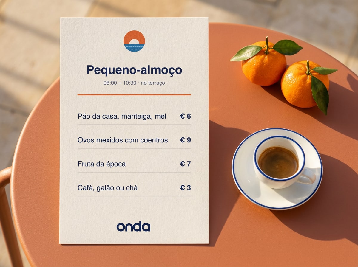
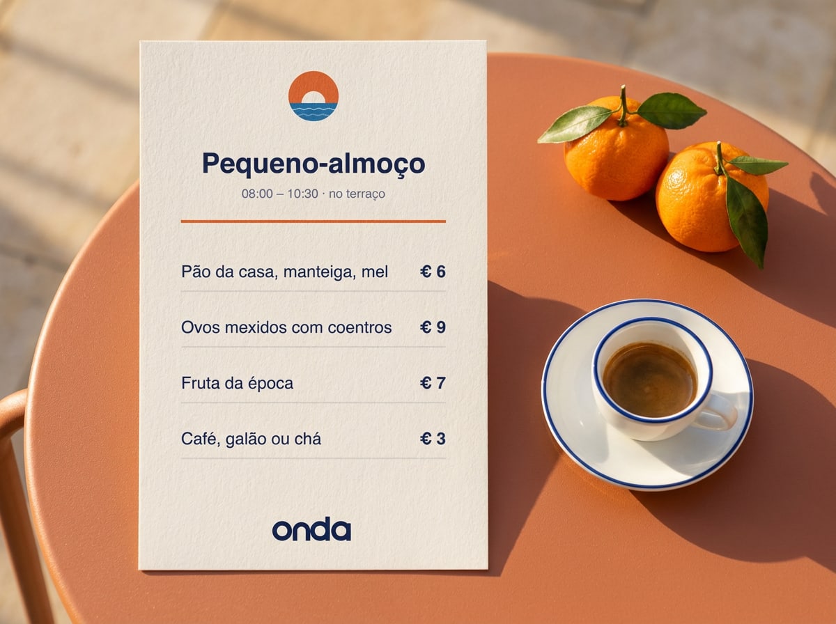
Breakfast menu card on Shell paper with Outfit headline and items in DM Sans, next to a cup of coffee
Breakfast menu: one headline, generous spacing, prices aligned right. Menus are written in the local language first.
Do
  • Use sentence case for headings: 'Breakfast on the terrace'.
  • Left-align text. Centre only short lines on posters, menus and cards.
  • Keep accents and local spelling: Cádiz, Procida, pequeno-almoço.
Don't
  • Don't set long passages in capitals or in Outfit.
  • Don't use more than three type sizes on one page or screen.
  • Don't use other fonts — no script fonts for a 'Mediterranean feel'.

Details

Typesetting rules

Numbers, times and prices
Use the 24-hour clock with a colon: 08:00, 19:30. Prices with the euro sign and a space: € 18 (no ,00). Use an en dash for ranges: 08:00–10:30, 12–24 rooms. In tables, use DM Sans tabular figures so numbers line up.
Languages and accents
We publish in English, Portuguese, Spanish, Italian, Dutch and German. Both typefaces support all their accents. Allow about 30% extra space for German and Dutch, which run longer than English.
Fallback fonts
Where you can't install our fonts — email, PowerPoint, Word — use Arial for both headings and body text. Never substitute Outfit with Futura or Montserrat in printed work.
Licence and installation
Outfit and DM Sans are free under the SIL Open Font License, for print, web and apps. Download them from Google Fonts. On the website, load only the weights you use (Outfit 400/500, DM Sans 400/500/700) with font-display: swap.
07Up nextGraphic language
Sunset-orange wall with an arched window looking out over a blue sea

Chapter 7 of 12

Graphic language

Shapes, pattern, illustration and icons — and how to combine them.

Graphic language

A sun, a wave and an open arch

Three shapes from the symbol do all the graphic work: the circle of the sun, the line of the wave and the arch of a Mediterranean doorway. Combined with real photos and plenty of Shell, they make anything recognisably Onda — even without the logo.

The sun

A full or half circle in Sunset. Use one per layout, as a highlight behind a headline, a price or a photo. Never more than one sun.

The wave

A soft wave line in Harbour or Sky, 2% of the format width. Use it as a divider or along the bottom edge — never as a frame around text.

The arch

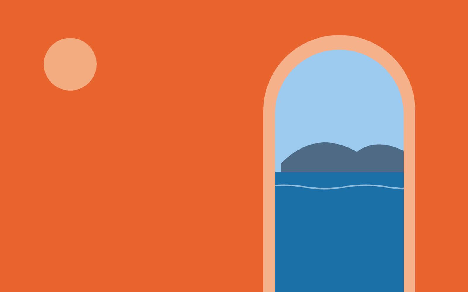
Our frame for photos: a rectangle with a half-round top, like the doorways of our houses. Corners elsewhere are rounded at 24 px (screen) or 4 mm (print).

Sunset-orange wall with an arched window looking out over a blue sea
The arch frame with a sun: our most recognisable composition. Use it for covers, posters and the first slide of a presentation.

Illustration

One line, one sun

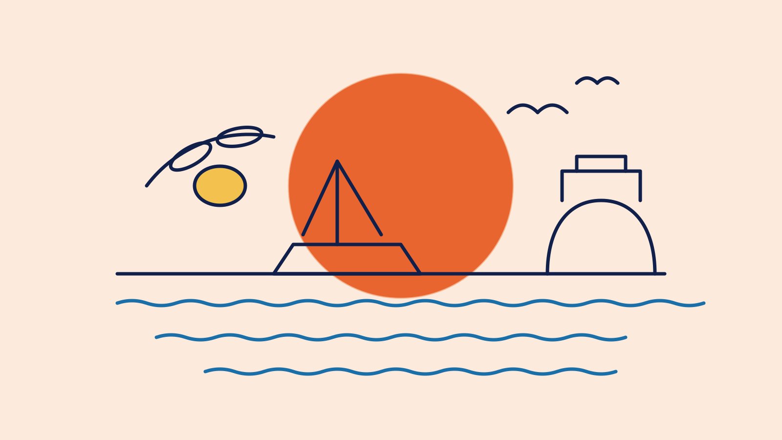
Our illustrations borrow the logic of the wordmark: one even line weight in Night, round ends, and a single Sunset sun as the only solid shape. Use them for maps, menus, little guides and anywhere a photo would be too much.

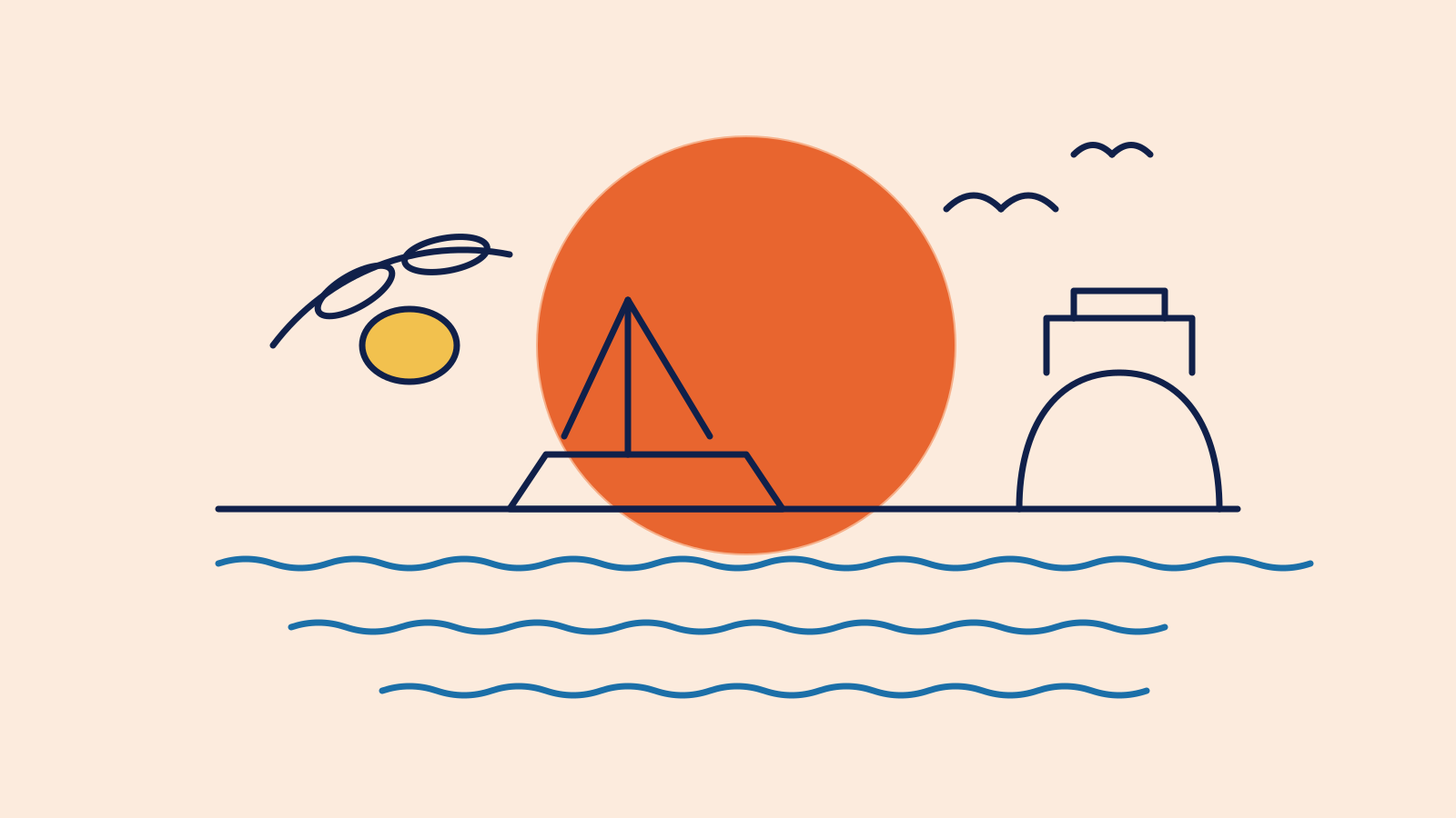
Line illustration of a sailing boat, waves, a lemon branch and a beach hut in front of a large orange sun
Line weight: 2% of the image width. Colours: Night lines, Harbour water, one Sunset sun and at most one Lemon detail.

The sun-and-wave pattern

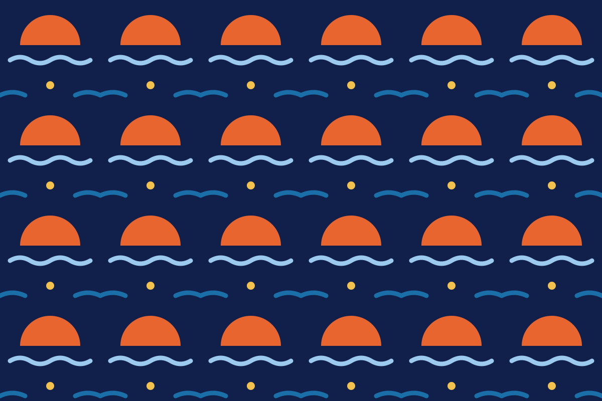
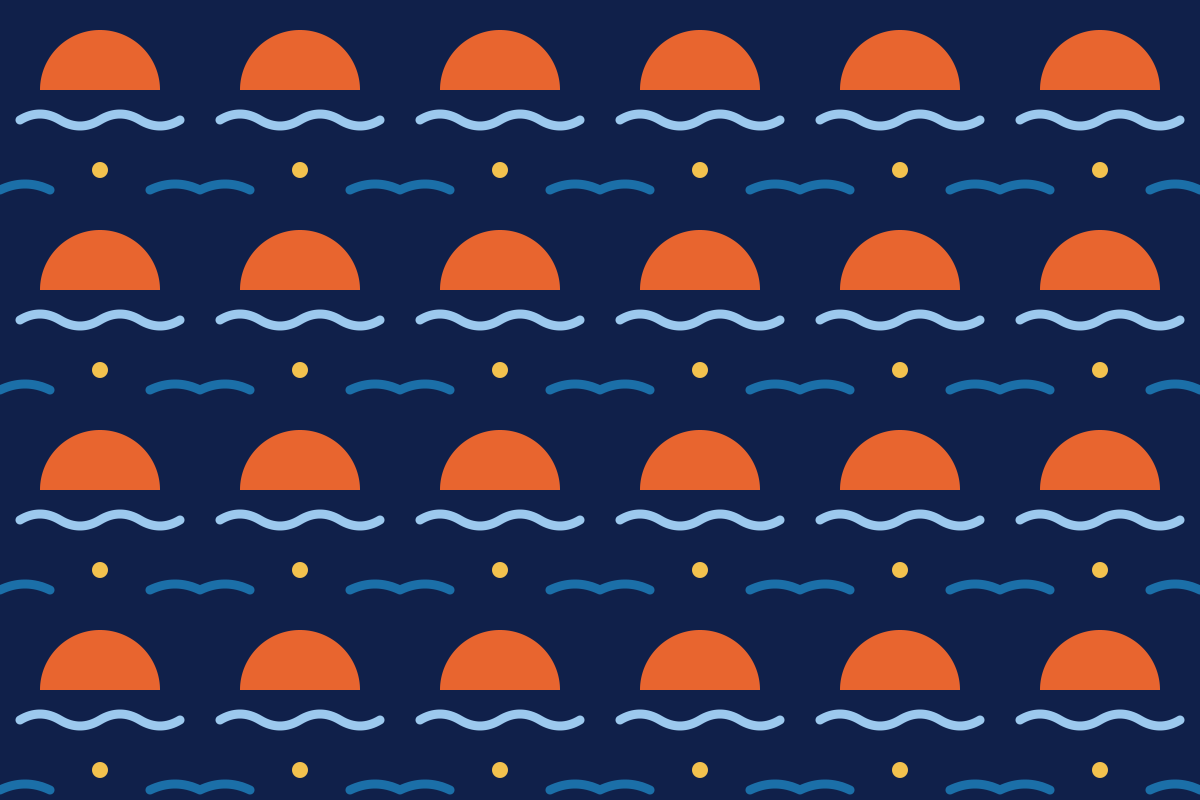
Built from the symbol: half a sun and a wave, repeated. Use it on packaging, tissue paper, room-key sleeves and the back of business cards — never behind text or the logo, and never on more than one surface per item.

Repeating pattern of orange half suns and blue waves on Shell
Pattern tile: 200 × 200 px. Scale it so that each sun is at least 10 mm wide in print.

Icons

Interface icons

On the website, in the app and on signs in the houses we use Material Symbols: Rounded, weight 300, in Harbour. Search for what you need, click an icon to copy its name or SVG, or download it as SVG or PNG.

Staying with us

12 icons

Getting around

12 icons

Material Symbols by Google, open source (Apache 2.0)

Combining

How the elements work together

Do
  • Pick one graphic element per layout: a sun, a wave or an arch.
  • Let photos fill an arch; let the sun sit behind type or a price.
  • Use icons at 24 px with labels in interfaces, at 48 px on signage.
Don't
  • Don't stack sun, wave and pattern on the same surface.
  • Don't put the pattern behind text or the logo.
  • Don't mix Material Symbols with other icon sets or emoji.
08Up nextPhotography & image style
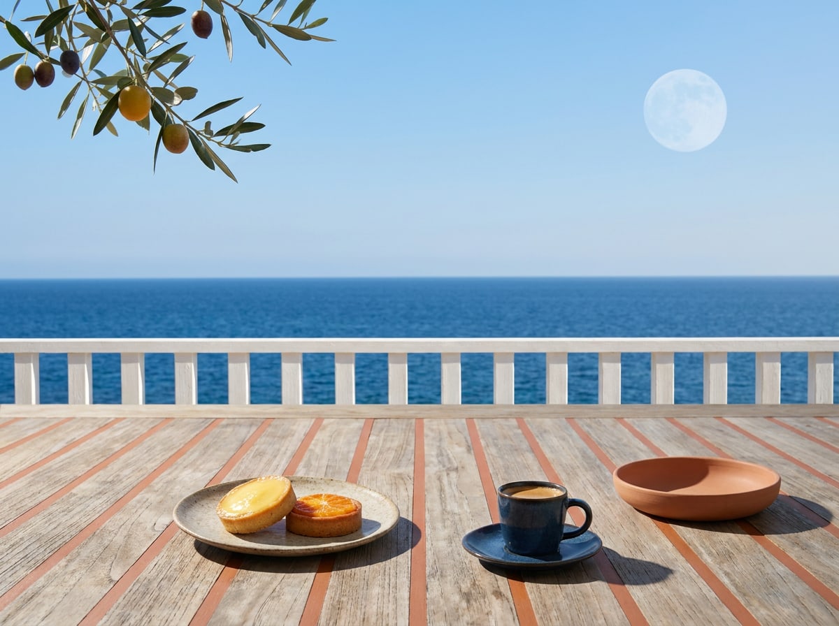
Breakfast table on a terrace above the sea, with oranges and a blue cup

Chapter 8 of 12

Photography & image style

Subjects, light, mood and what fits — with a moodboard.

Photography & image style

Real light, real people, room to breathe

Our pictures should make you want to be there — not because it looks perfect, but because it looks real. We show the morning light on a terrace, the host who made the bread, the street behind the house. People and places first; rooms second.

Natural light

Shoot in the first two hours after sunrise or the last two before sunset. No flash, no studio light. Shadows are welcome.

People mid-moment

Hosts and guests doing something — pouring, laughing, swimming. Nobody looks into the lens, nobody poses.

Room to breathe

Straight horizons, simple compositions and plenty of sky or sea, so there's always space for a headline.

Image style

How an Onda photo feels

Hover over each scale to see what it means, and use the moodboard when you choose or brief images: green fits, red doesn't.

What this means: Daylight, ideally early or late. Bright but never blown out; real shadows stay in.

What this means: True to life and sun-warmed. No filters, no teal-and-orange grading.

What this means: Slow moments: a swim, a long lunch, a quiet street at noon.

What this means: Caught mid-moment, never looking into the lens. Hosts and guests, not models.

What this means: Mostly wide with room for a headline; close-ups for food, hands and textures.

Keywords

  • morning light
  • real hosts
  • salt and sun
  • linen
  • hands at work
  • long tables
  • straight horizons
  • warm colour
  • room to breathe
  • local markets
  • bare feet
  • honest shadows

Moodboard

Gallery

A day at Onda

From the first coffee to the last candle. Use this set as a reference for briefing photographers and choosing images.

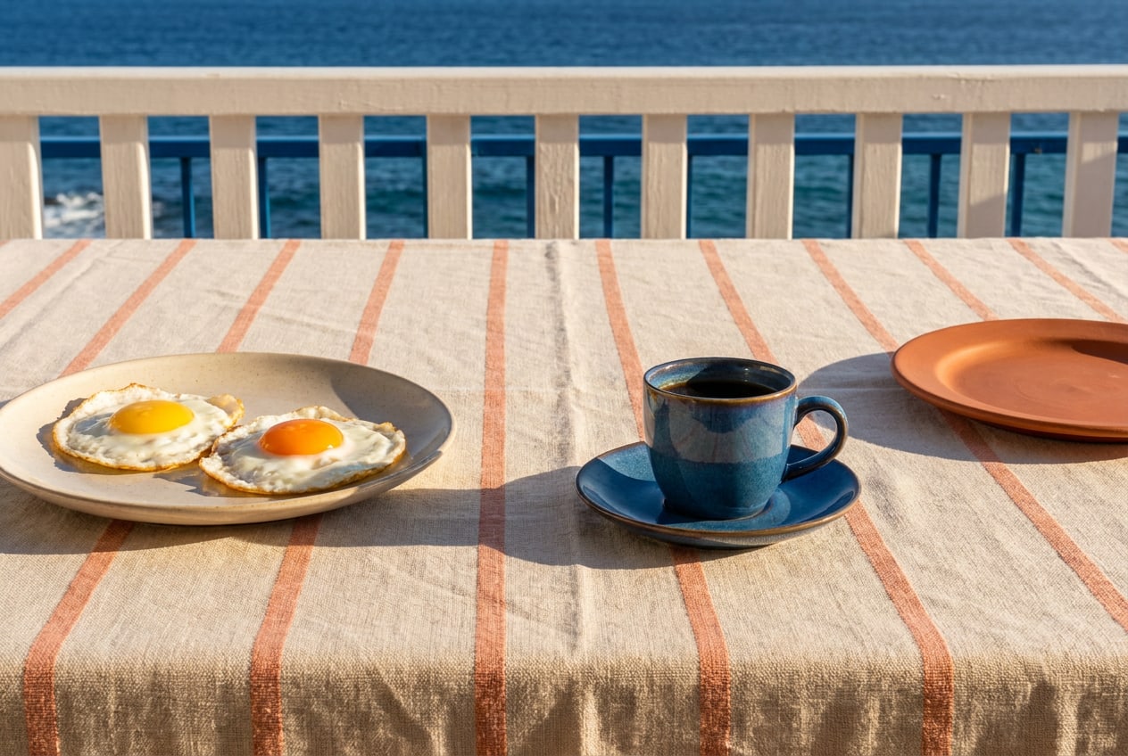
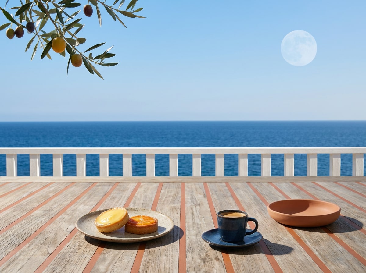
Breakfast table on a terrace above the sea, with oranges and a blue cup
08:00 — Breakfast on the terrace, Comporta.
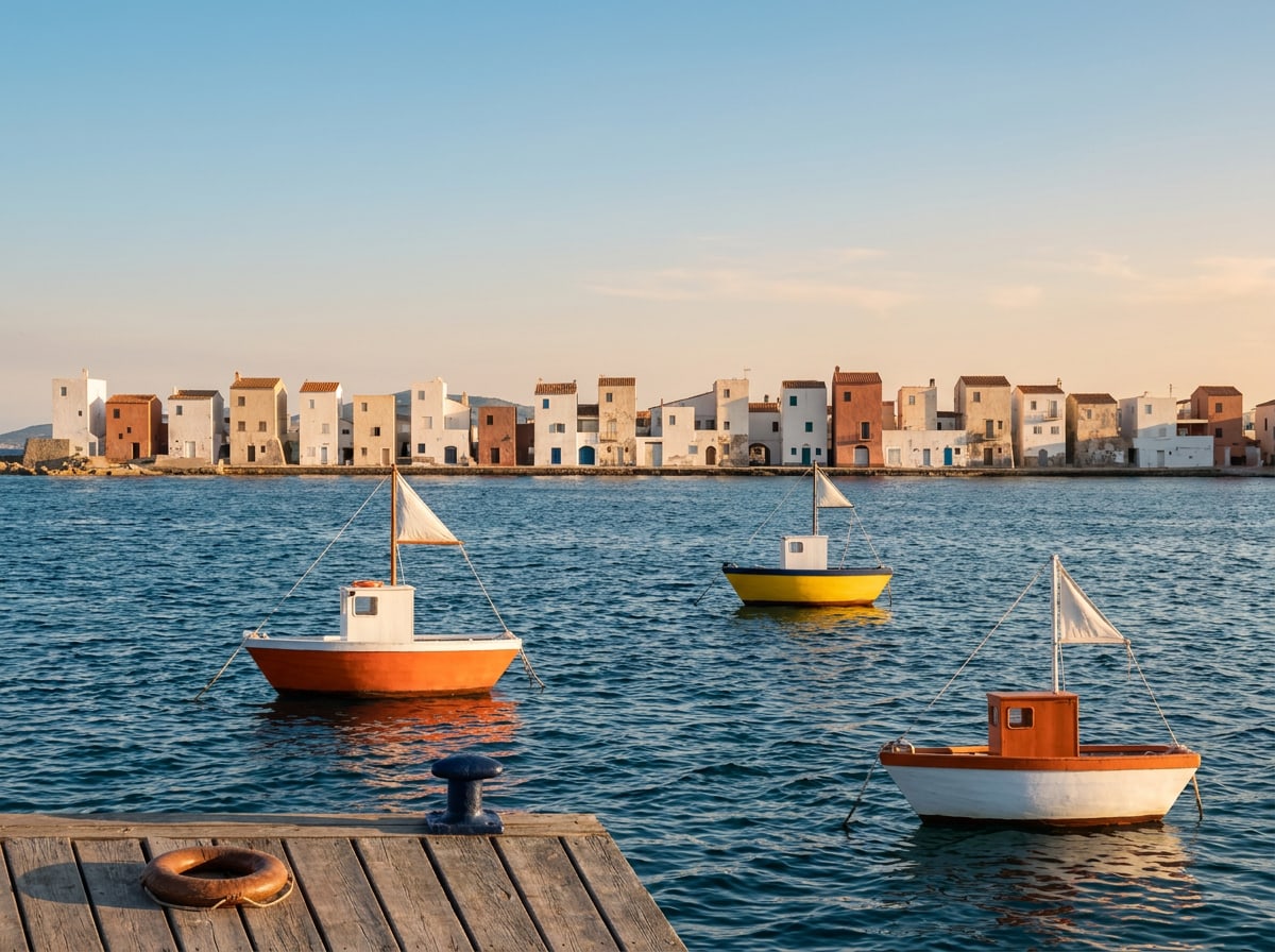
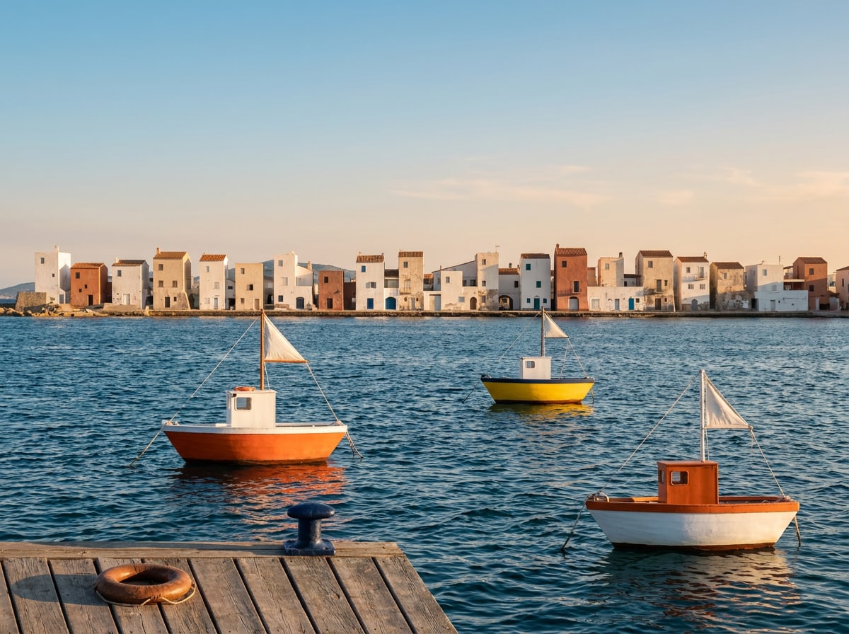
Small fishing boats in a blue harbour with white houses on the far shore
09:00 — The fishing boats come in, Tavira.
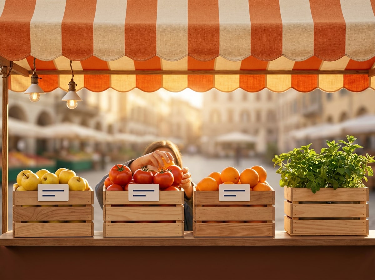
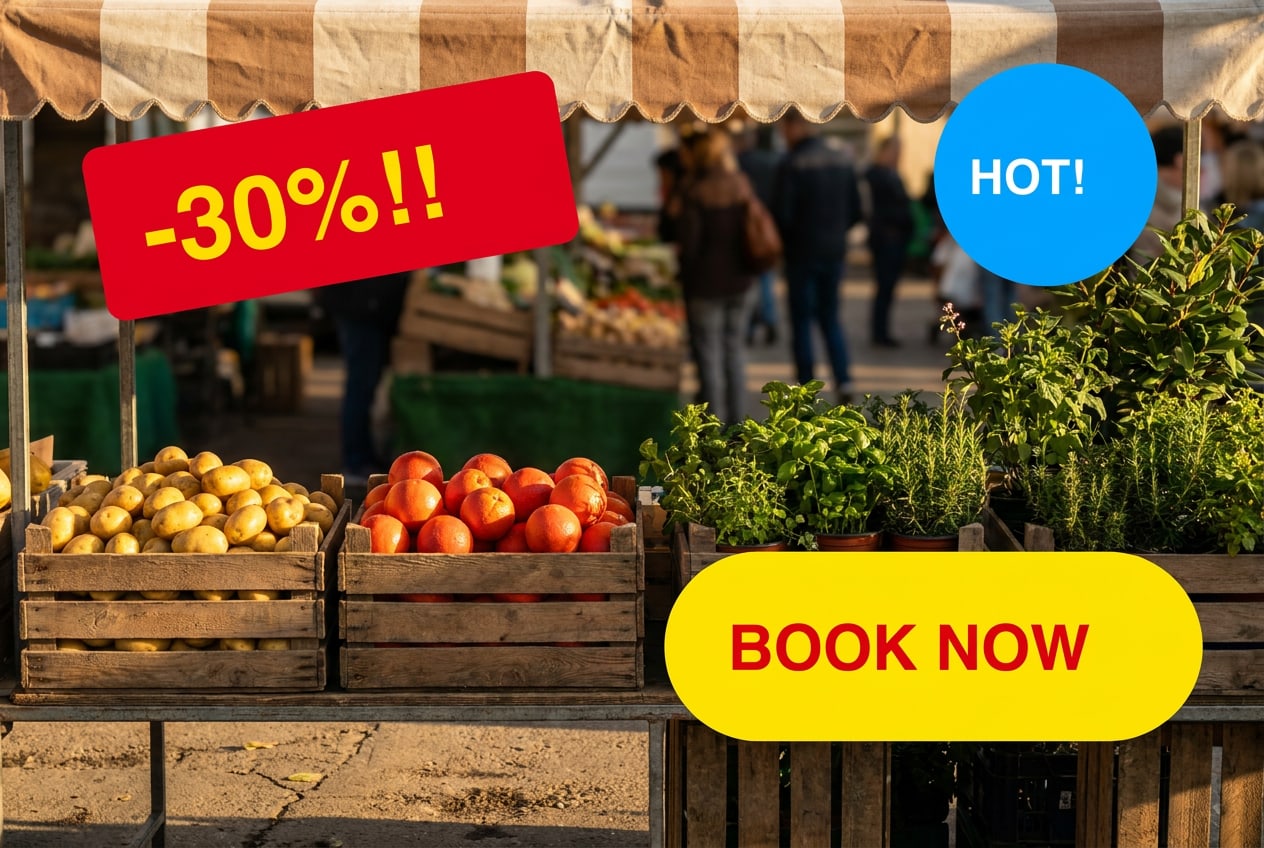
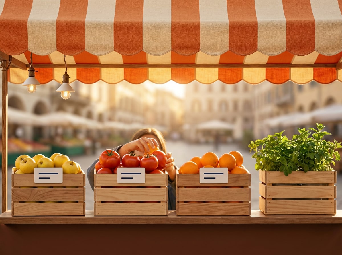
Market stall under a striped awning with crates of lemons and tomatoes
10:30 — Saturday market with our cook.
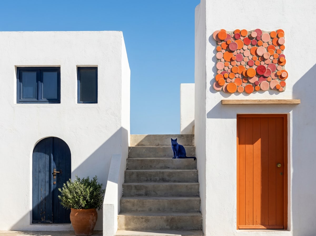
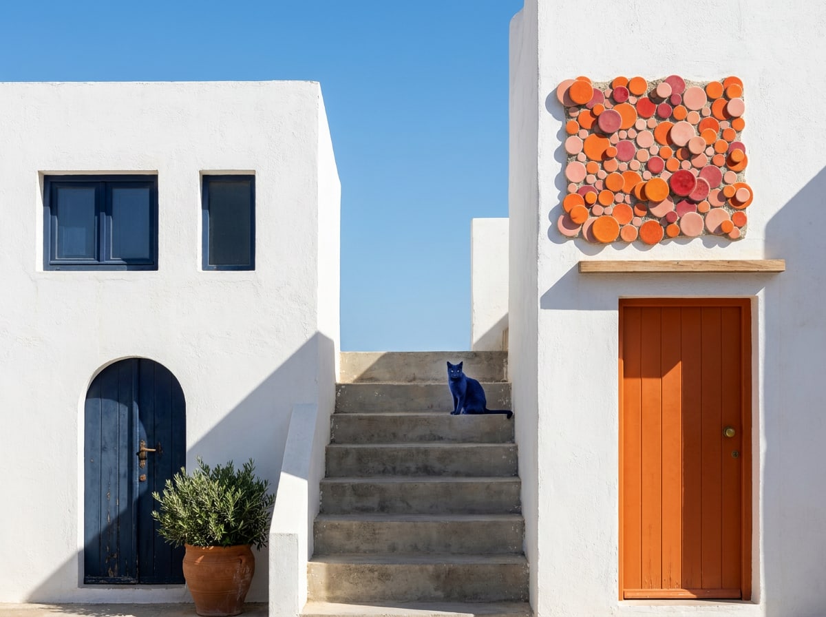
Whitewashed street with blue door, steps and a cat in the sun
12:00 — The back streets of Cádiz.
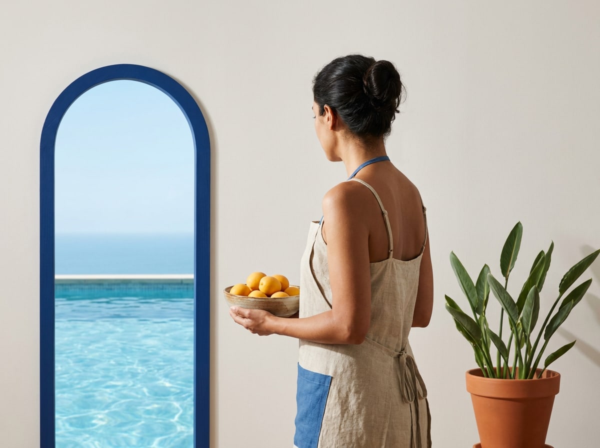
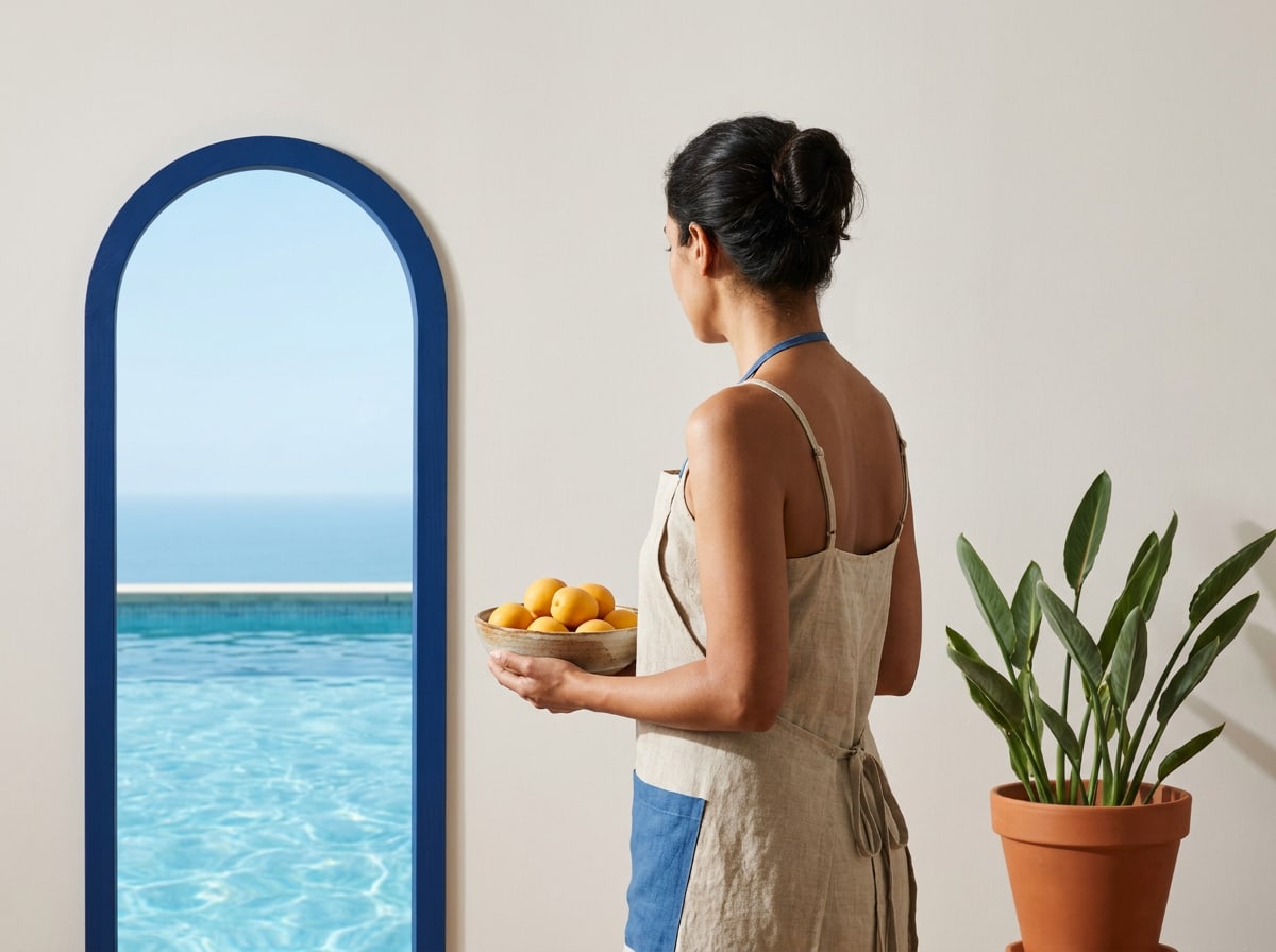
Host in a blue apron holding a bowl of lemons in a doorway
13:00 — Rosa, our host in Procida.
Swimmer in a turquoise cove below an ochre cliff
15:00 — The cove below the house, Menorca.
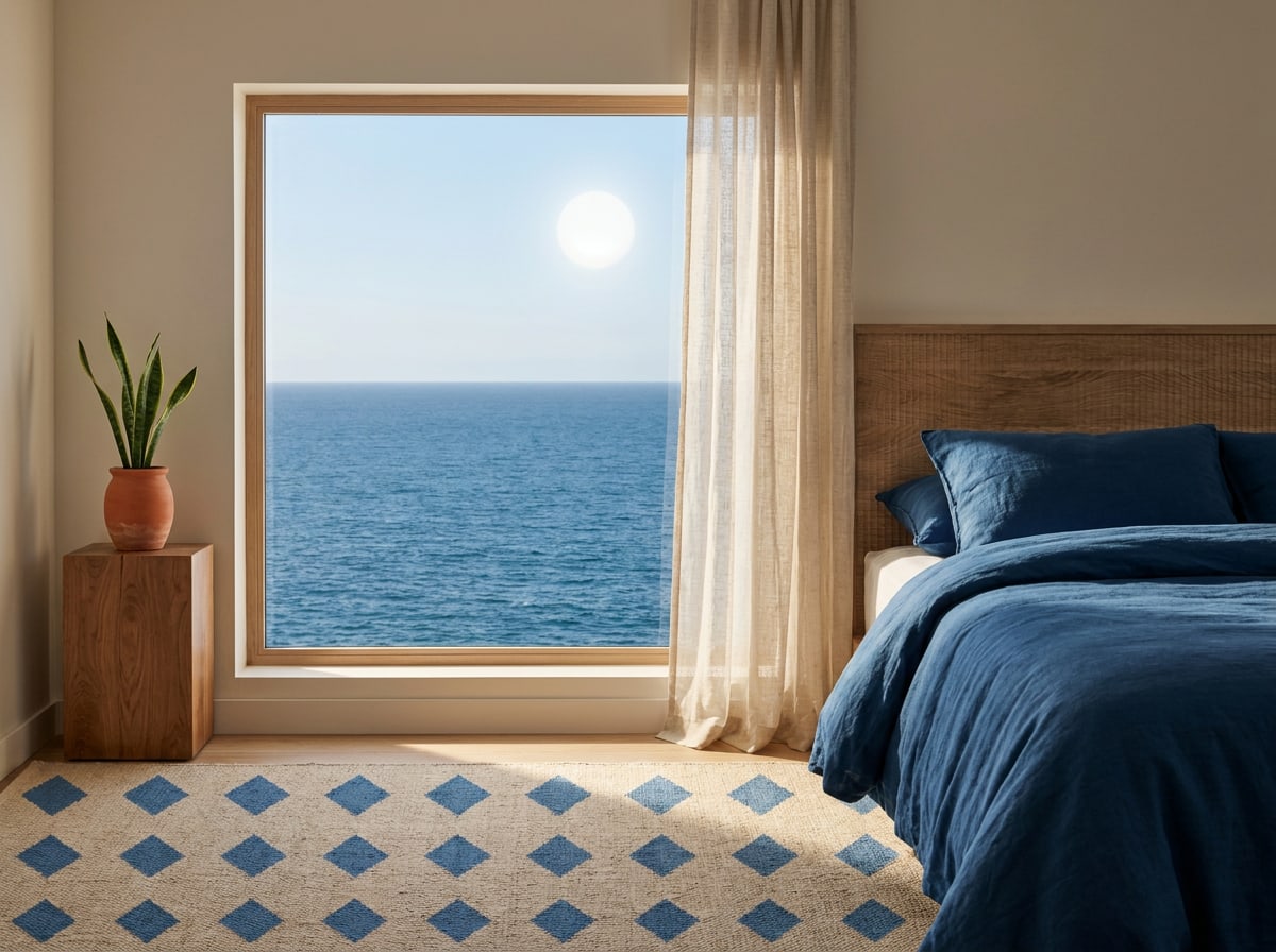
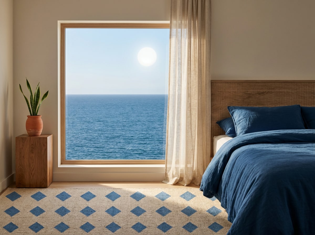
Simple room with linen curtains blowing in front of a sea view
17:00 — Room 12, windows open.
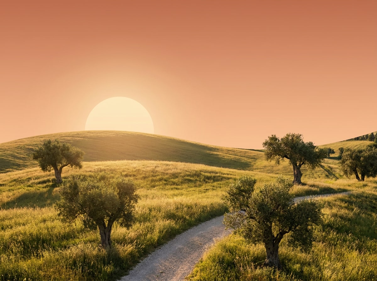
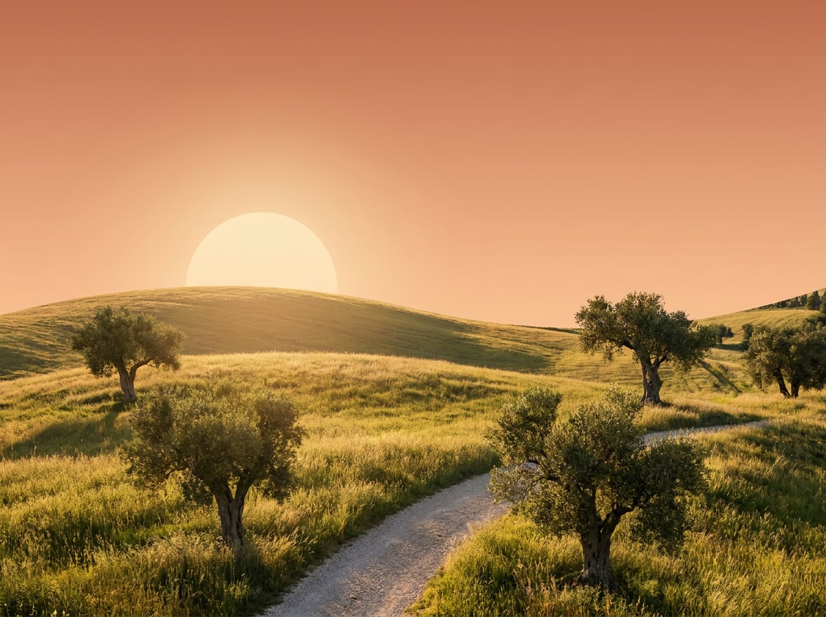
Olive trees on rolling hills in warm evening light
19:00 — Walk through the olive grove.
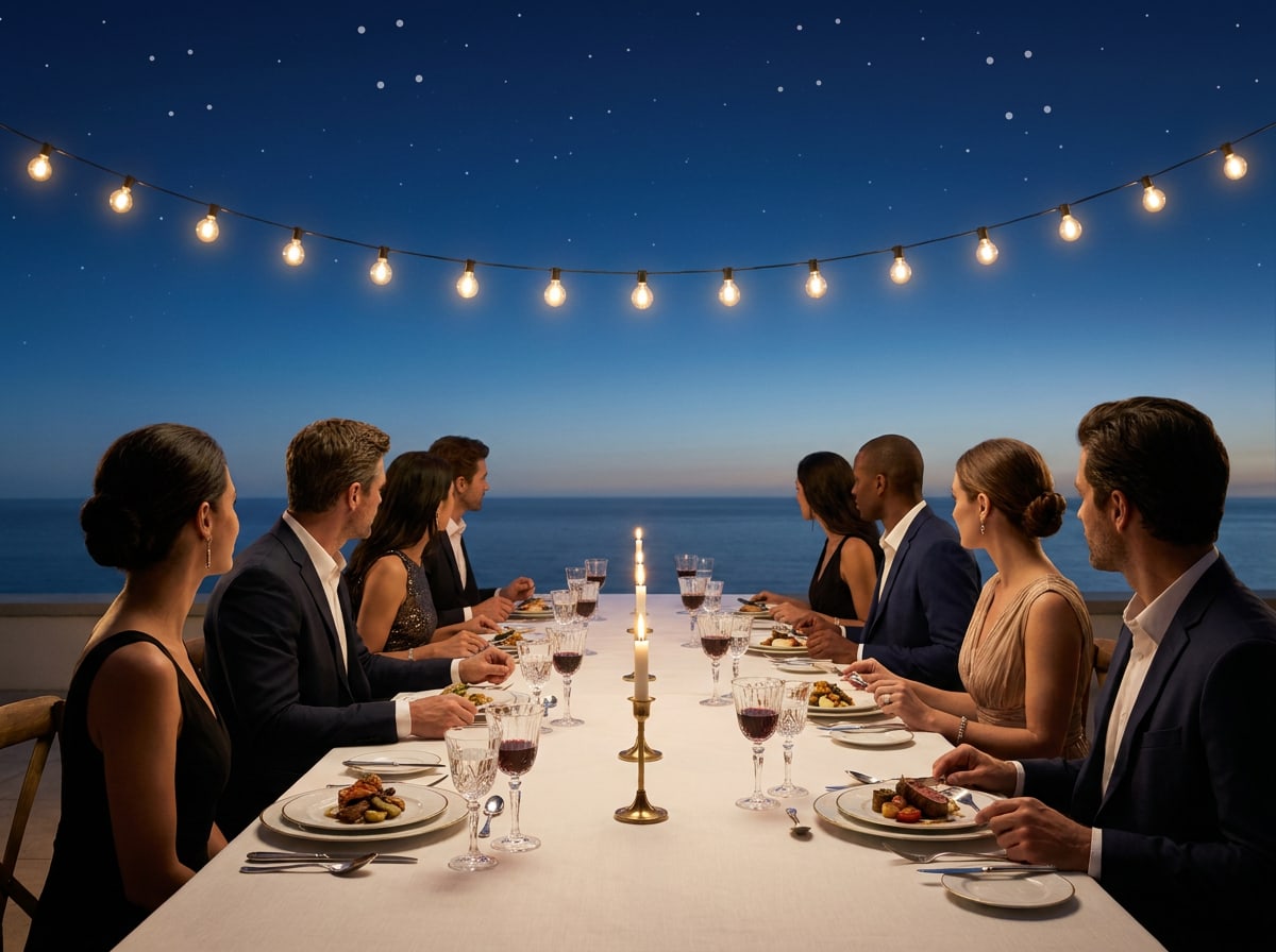
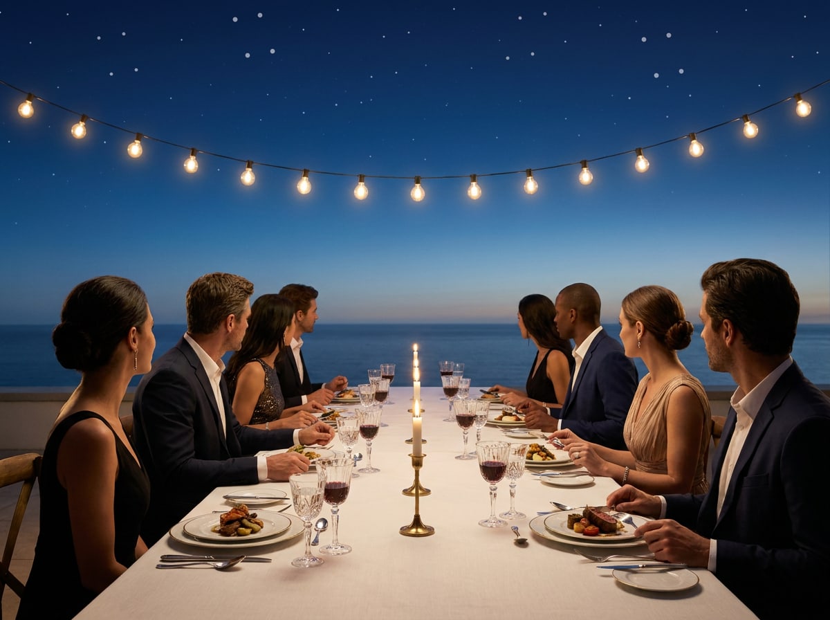
Long dinner table under string lights at dusk with guests on both sides
21:00 — Long-table dinner with neighbours.

Do's and don'ts

Choosing the right picture

Do
  • Natural daylight with real shadows and true colours.
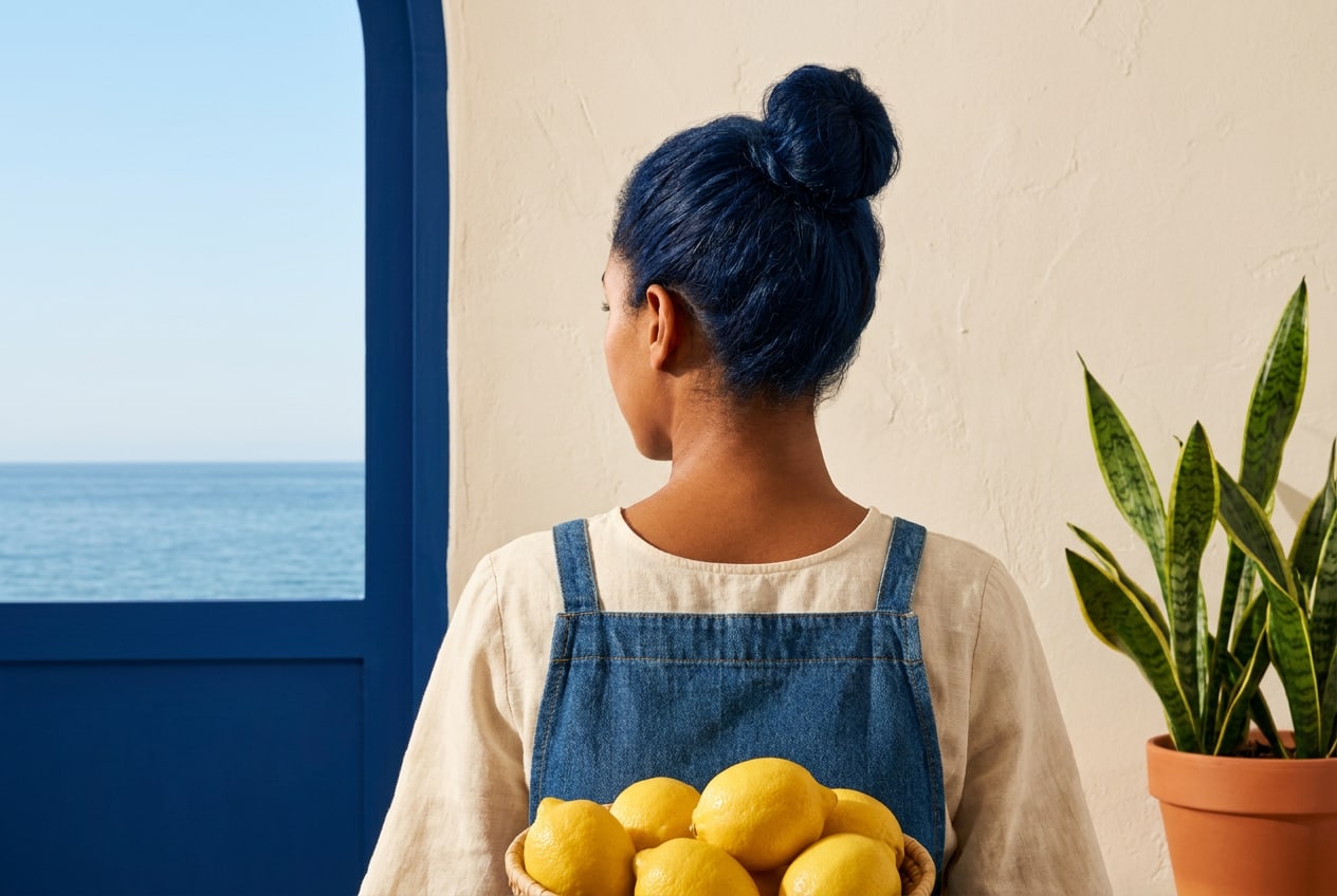
  • People caught mid-moment, in their own setting.
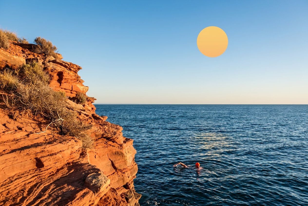
  • A straight horizon and space for a headline.
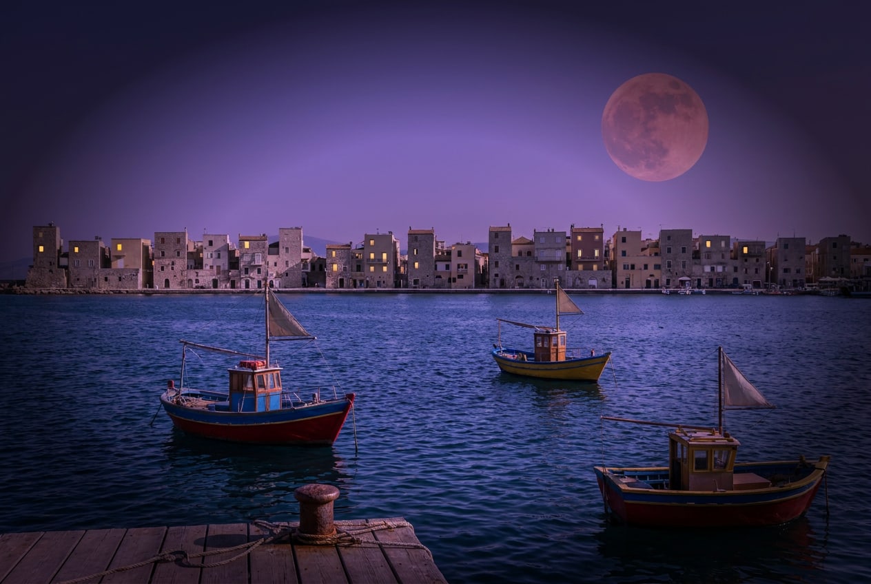
Don't
  • Heavy filters, colour casts or dark vignettes.
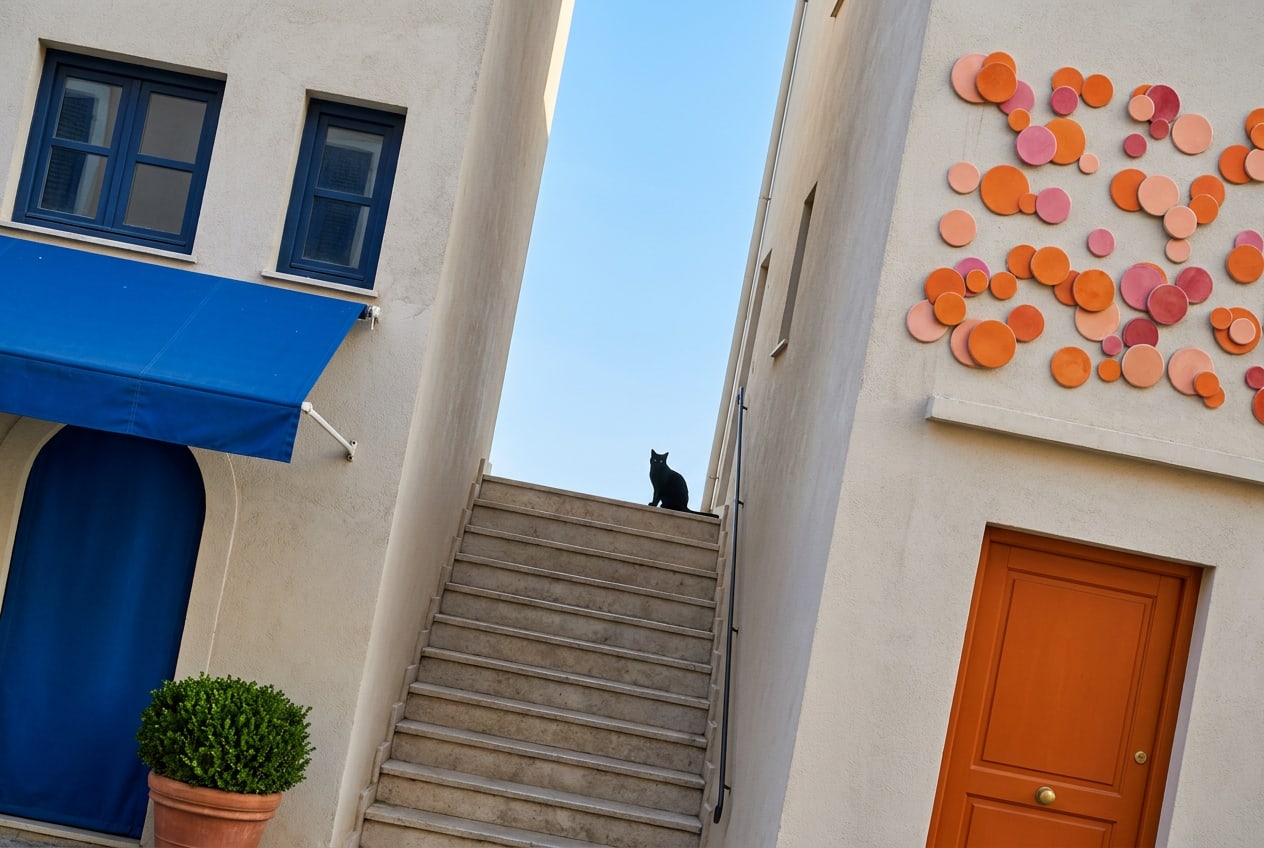
  • Tilted horizons and 'dramatic' angles.
  • Discount stickers or text slapped on top of a photo.
Specifications

Practical details

Formats and crops
Shoot in 3:2 landscape and 4:5 portrait. Our standard crops are 3:2 (web hero), 4:3 (cards and galleries), 4:5 (Instagram feed), 9:16 (stories) and 1:1 (avatars and tiles). Keep the subject out of the outer 10% so every crop works.
Resolution and export
Web: JPG or WebP, sRGB, 2400 px on the long side, under 400 KB. Print: TIFF or maximum-quality JPG, Adobe RGB converted by the printer, 300 dpi at final size. Name files as house-subject-yyyymmdd, e.g. procida-market-20260512.jpg.
Retouching
Correct exposure, white balance and straight lines. Don't change skin, body shapes, the colour of the sea or the weather. Remove only temporary distractions such as a bin bag or a parked scooter.
Consent and credits
Everyone recognisable needs a signed model release (forms in four languages are in the shared drive). Never photograph guests without asking. Credit photographers as 'Photo: First Last' in captions and on social posts.
Alt text and captions
Every image online gets alt text that describes what you see, in one sentence, without 'image of'. Captions add what you can't see: who, where and when — like a host would tell it.
Stock photography
We don't use stock photos of people. Stock is only allowed for landscapes and textures, after approval by the art director — and never for a place we don't actually have a house.
09Up nextTone of voice
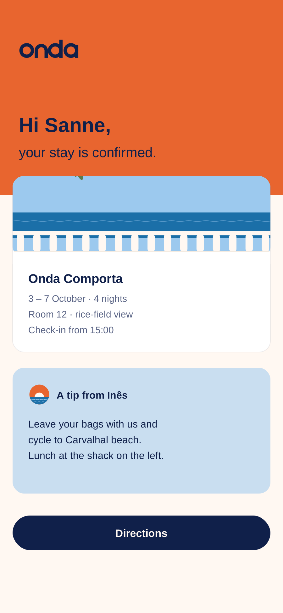
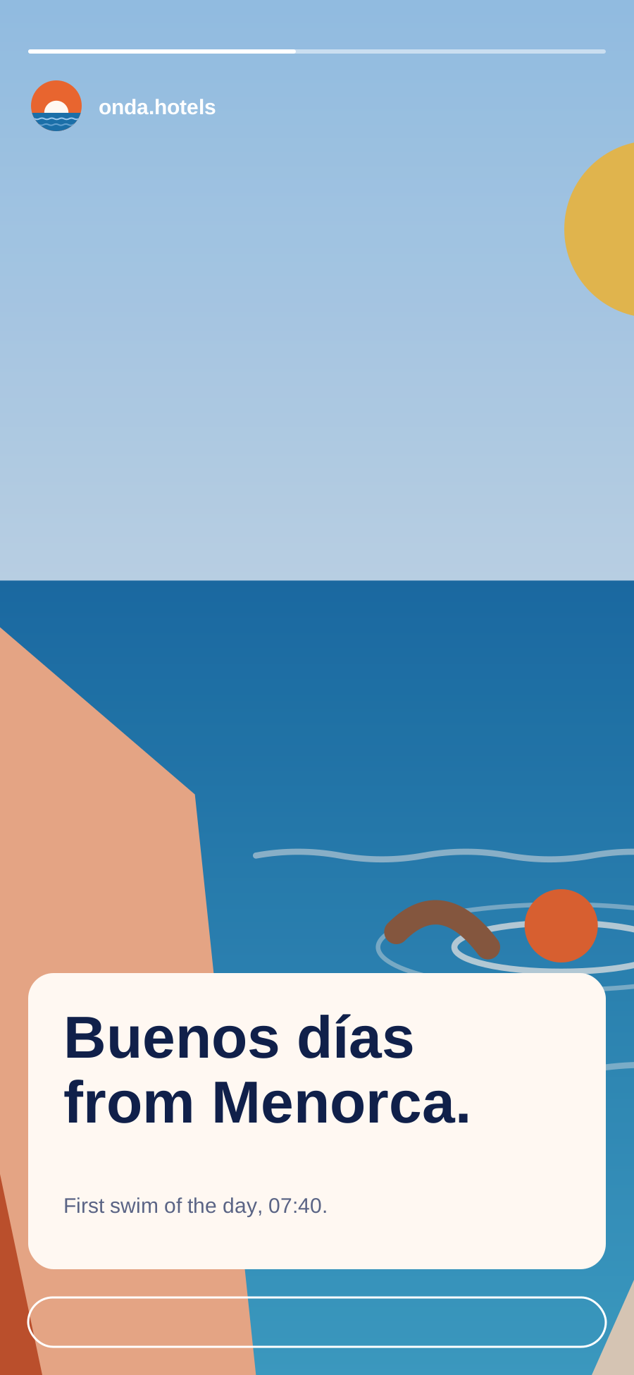
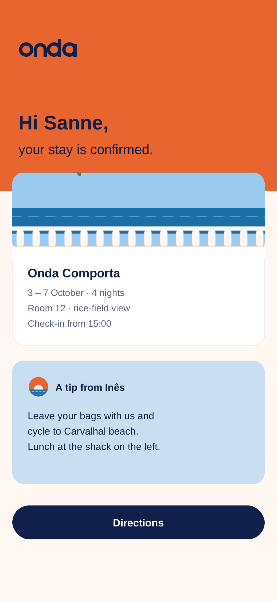
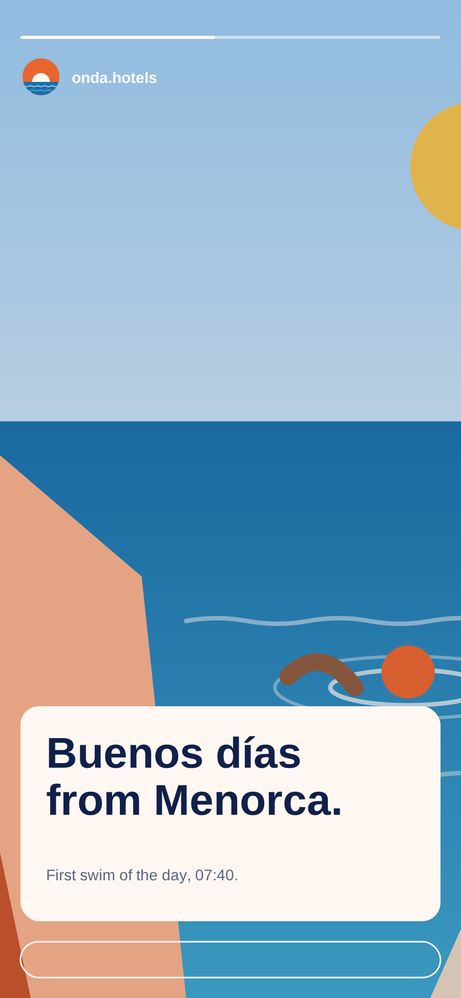
Same voice, two volumes: a booking confirmation with a host's tip, and an Instagram story that leads with the moment.

Chapter 9 of 12

Tone of voice

How we write: principles, slogans, examples per channel and a word list.

Tone of voice

Talk like a good host

Imagine you've just arrived and your host is showing you around: relaxed, warm, full of little tips, never selling. That's how we sound everywhere — on the website, in a confirmation email and on the card on your pillow.

Warm, not syrupy

We're glad you're here, and we say so simply. No 'dear valued guest', no exclamation marks in every line.

Specific, not generic

Not 'authentic local experiences', but 'fishing with João at six'. Names, times, smells and places.

Curious, not clever

We share what we love and ask what you love. No puns, no jargon, no showing off.

Unhurried, not lazy

Short sentences and plenty of air — but always correct, clear and complete. Calm is not careless.

Character

We are, we are not

We are

Welcoming, like an open kitchen door Curious about people and places Calm and confident Sunny and optimistic Honest about what we are — and aren't

We are not

Pushy, salesy or full of urgency Posh, exclusive or snobbish Over-familiar or too cute Vague, poetic for its own sake A hotel chain talking to 'customers'

Lines

Our line and slogans

The brand line is fixed; campaign lines change by season. Always in the guest's language — never translate the brand line word for word into a third language without checking with us.

Brand line

Travel, people, culture. Under the logo on covers, posters and the website footer. Always with full stop, never in capitals.

Campaign lines 2026

Stay a little longer. You'll leave knowing someone. Breakfast waits for you.

House greetings

Bom dia, Comporta. Buenos días, Cádiz. Buongiorno, Procida. Local greetings are welcome in headlines and on social — never in contracts or invoices.

Before and after

Same message, Onda voice

Do
  • “Rosa bakes the bread at six. Come down whenever you're ready — breakfast waits for you.”
  • “Your room faces the harbour. Leave the shutters open and the boats will wake you around seven.”
  • “Five rooms left for September. That's when the sea is warmest and the beaches are ours again.”
Don't
  • “Enjoy our luxurious breakfast buffet, served daily between 07:00 and 10:00!”
  • “Experience breathtaking sea views from our premium deluxe rooms.”
  • “HURRY! Only 5 rooms left — book now before it's too late!!”

In practice

Writing per channel

The voice stays the same; the volume changes. Here's how we adjust it, with examples you can borrow.

Same voice, two volumes: a booking confirmation with a host's tip, and an Instagram story that leads with the moment.
Website
Headlines: four to eight words, no full stop needed. Intro: two sentences about the place, then the practical stuff. Buttons say what happens: 'Check dates', not 'Discover more'. Example Headline: Slow mornings in Comporta Intro: Twelve rooms between the rice fields and the Atlantic. Bikes at the door, fish on the grill, nothing on the schedule.
Booking and pre-arrival emails
From a real person, signed with their name. Facts first (dates, address, check-in time), then one personal tip. Subject lines are plain and useful. Example Subject: Your stay in Tavira, 12–16 May Body: Hi Sanne, we're looking forward to having you. Check-in is from 15:00; if you arrive earlier, leave your bags with us and head to Mercado da Ribeira for lunch. — Inês
Instagram and social
Lead with the moment, not the offer. One or two short lines, the place as a tag, at most one emoji. Reply to every comment within a day, as the house ('Rosa from Onda Procida'). Example The boats came in early today. João saved us the sardines. 📍 Onda Tavira
In-room cards and printed matter
Short, handwritten-feeling notes in the local language, with an English line below. Be helpful, not instructive. Example (towel card) The sea will wash these again tomorrow. If you'd like fresh towels, leave them on the floor — otherwise we'll let them dry in the sun.
Signage
Local language first, English second, arrows after the words. Nouns only, no instructions: 'Praia ↑ Beach', not 'Please follow this path to the beach'.
Replying to reviews
Thank them by name, mention one detail from their stay, and sign with your own name. When something went wrong, say sorry plainly, explain what you've changed and invite them to get in touch directly. Never argue in public.

Word list

Words we use, words we avoid

Words we love

house (not hotel or property) guest (not customer) host (not staff) room, terrace, table, kitchen slow, warm, simple, together local names: João, Mercado, praia stay, come back, see you tomorrow

Words we avoid

luxury, luxurious, premium, deluxe breathtaking, stunning, paradise hidden gem, authentic experience exclusive, VIP, world-class book now, last chance, hurry package, upgrade, amenities dear valued guest

House style

Writing mechanics

Spelling and form of address
English: British spelling (colour, favourite, travelling). Address guests as 'you'. Dutch and German: always informal (je/jij, du). Portuguese, Spanish and Italian: informal on social, formal-friendly in emails.
Punctuation and emoji
At most one exclamation mark per piece, and never two in a row. No ALL CAPS for emphasis. At most one emoji per social post and none in emails, signage or print.
Names and places
Our name is always 'Onda' — never ONDA, onda or Onda Hotels in running text. Houses are 'Onda Comporta', 'Onda Procida'. Keep local spelling and accents: Cádiz, Alentejo, Isola di Procida.
10Up nextLayout & composition

Chapter 10 of 12

Layout & composition

Grids, white space, alignment and the balance of text and image.

Layout & composition

Plenty of space, one clear focus

Every layout should feel like a quiet terrace: room to breathe, one thing to look at, nothing in a hurry. Pick a format to see its grid, and switch on the overlay to see it on our home page.

Website · desktop

Format
1440 × 900 px
Columns
12
Column width
84.7 px
Gutter
24 px
Side margins
80 px
Top and bottom
64 px
Baseline
8 px

Content max. 1280 px wide. Text columns span at most 7 of 12 columns (about 70 characters).

White space

  • At least 40% of every layout is empty Shell. When in doubt, take something out.
  • One focal point per layout: a photo, a headline or a sun — never all three fighting.
  • Align text left on the grid; centre only short lines on posters, menus and cards.
  • Text-to-image ratio: about 1:2 on web and social, 1:1 in print. Photos lead, words support.
  • Spacing follows an 8 px rhythm (8, 16, 24, 40, 64, 104). Sections are separated by 104 px on desktop.
  • Logo top left or bottom centre, aligned with the text column — never floating in a corner on its own.
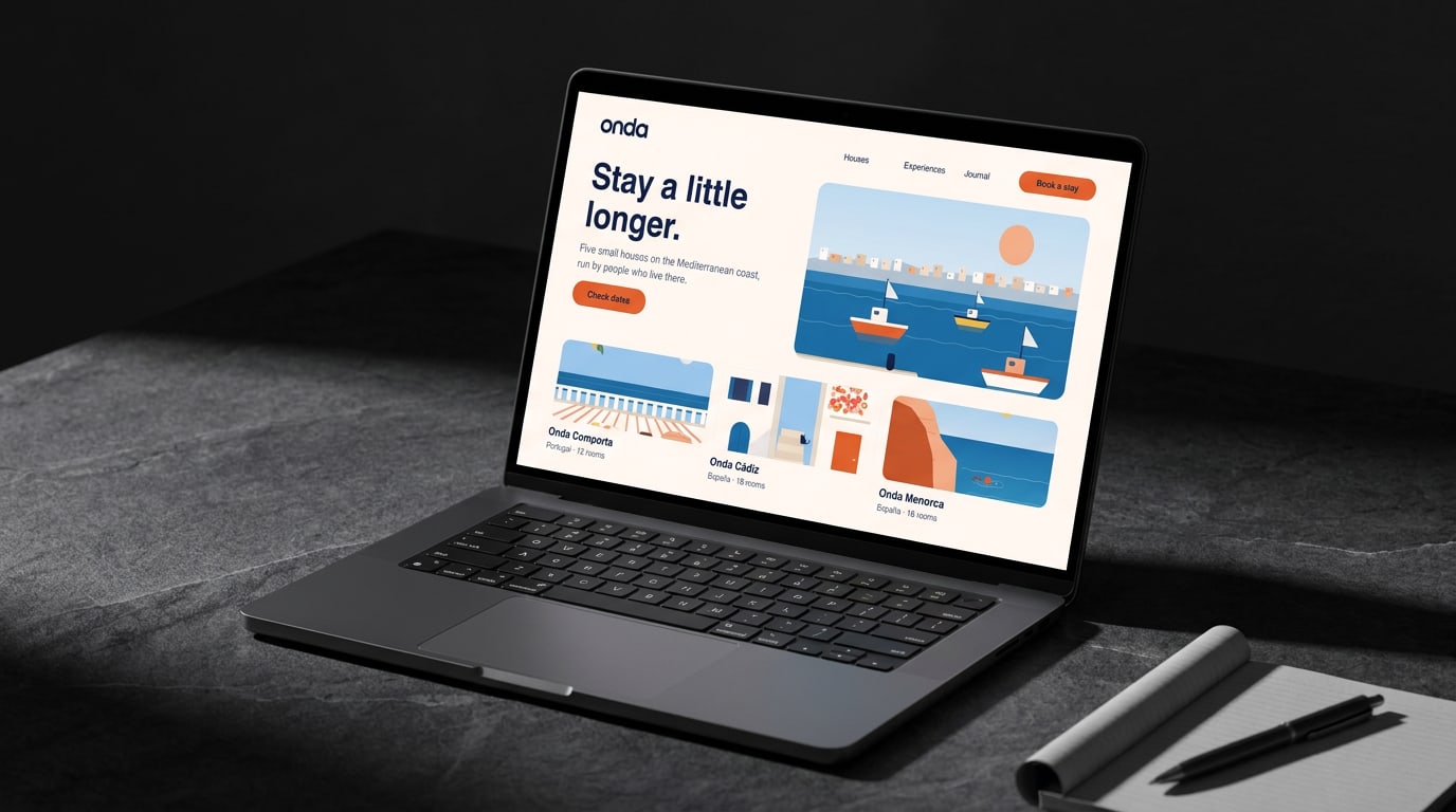
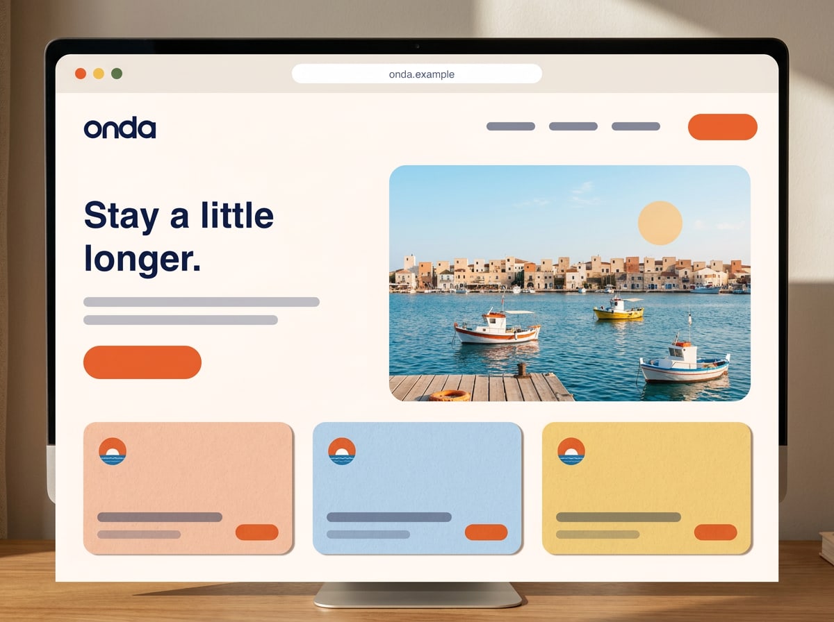
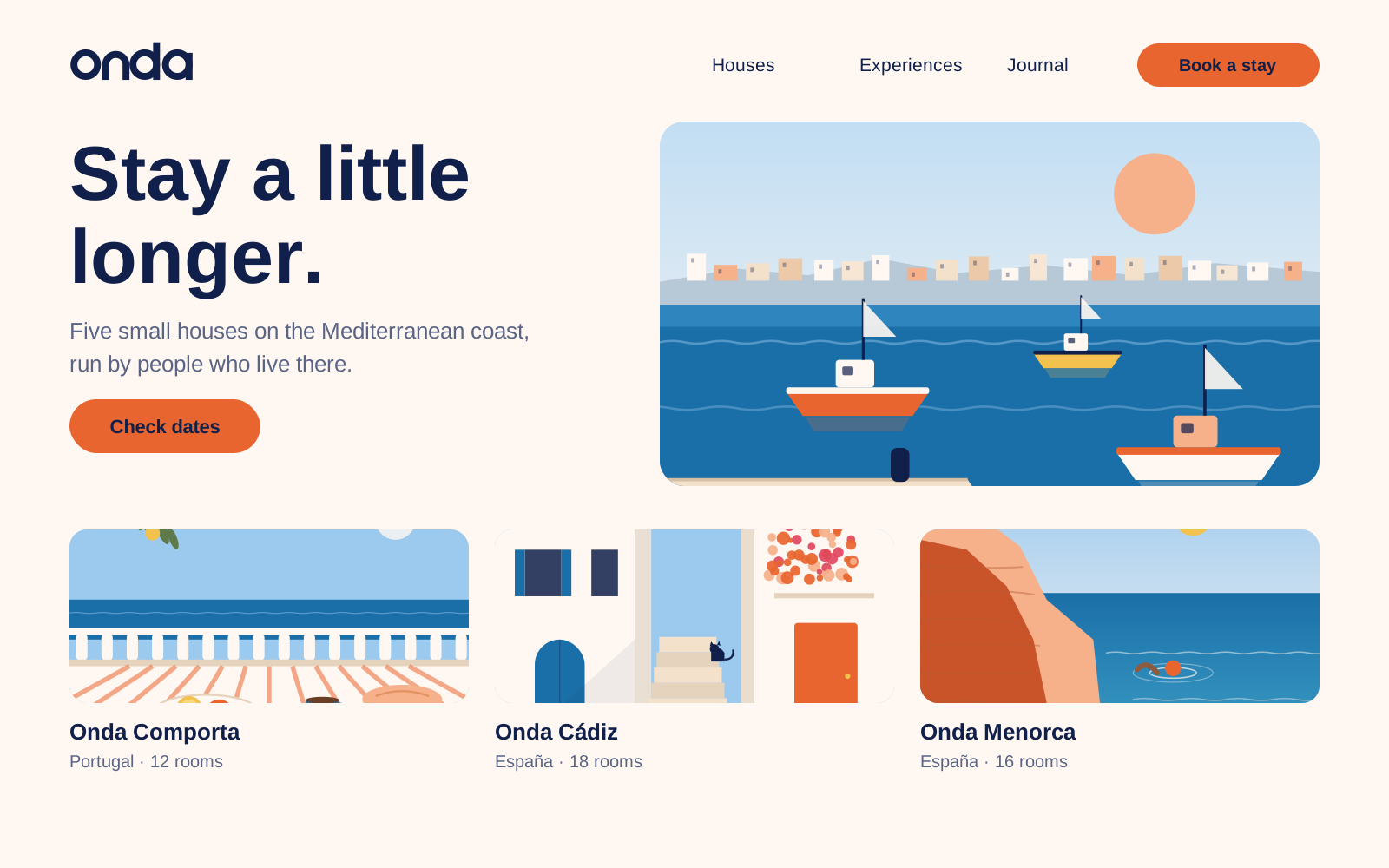
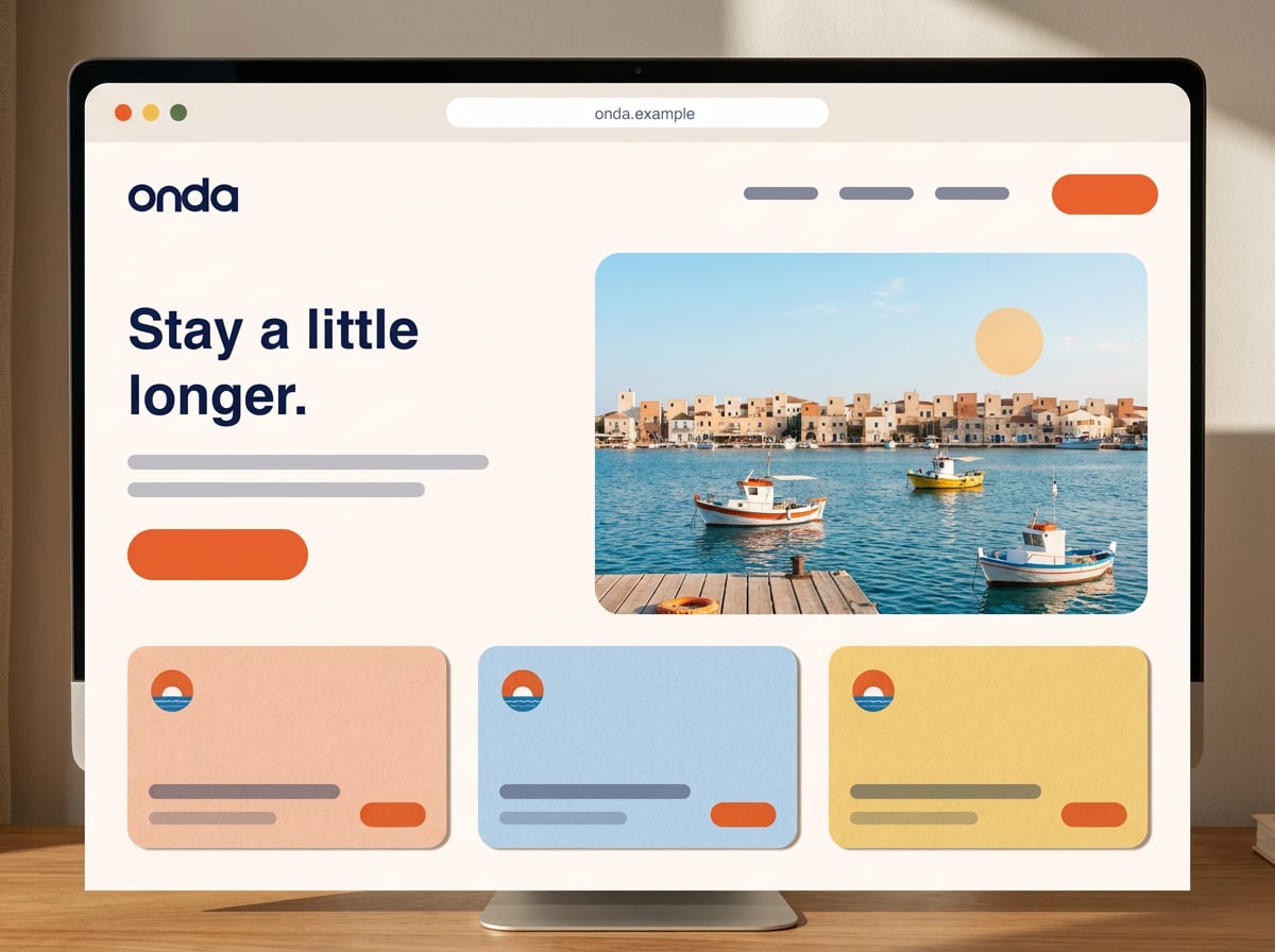
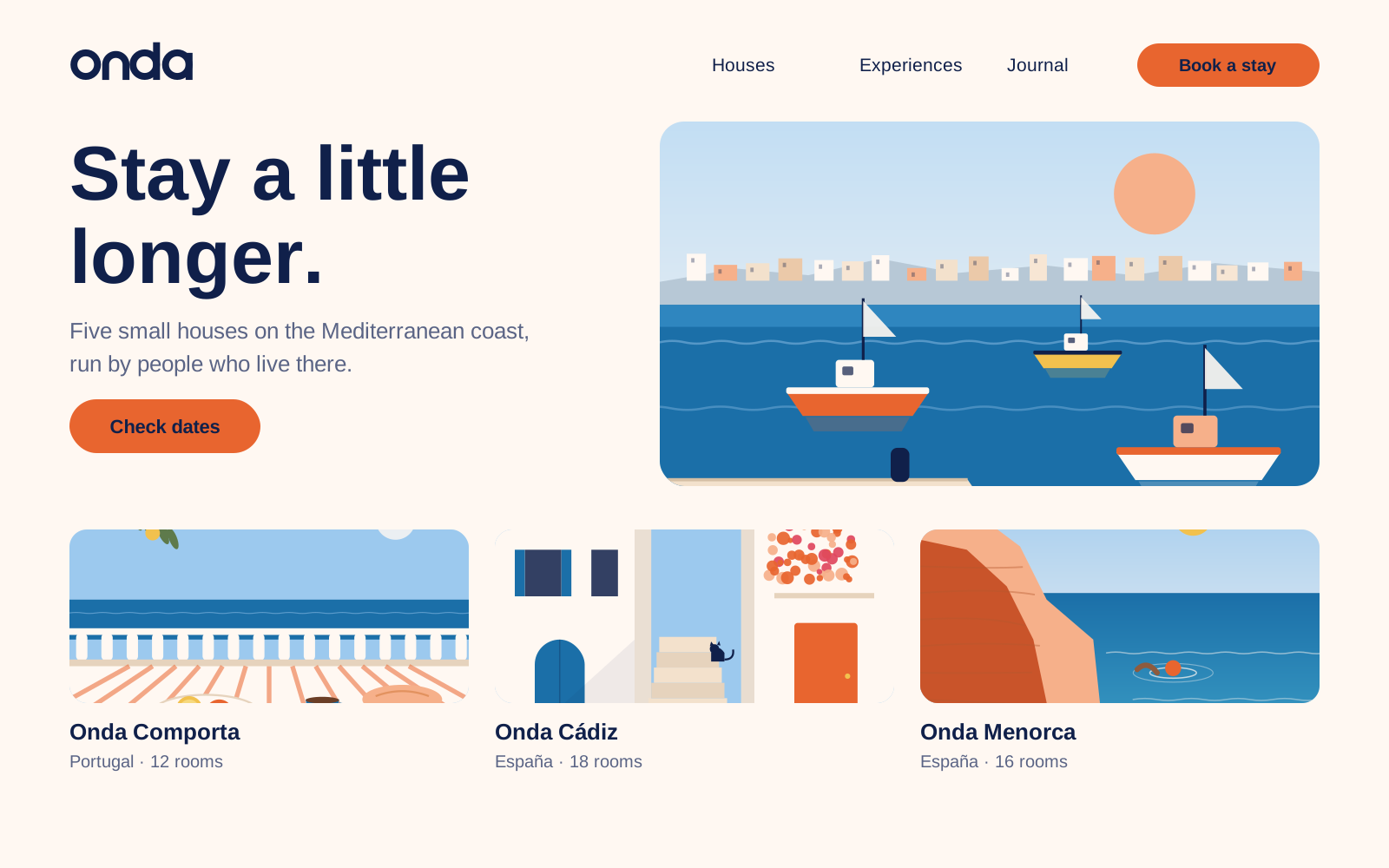
Onda home page with headline, harbour photo and three house cards
Example · Website · desktop

Composition

Three compositions we use most

Split

Text on Shell on the left (5 columns), photo on the right (7 columns). For web heroes, brochures and presentations.

Arch

One photo in an arch, centred, with a short headline above and the logo below. For posters, covers and menus.

Full bleed

Photo edge to edge, headline in Shell on the calmest area (sky or sea). For social, billboards and campaign pages.

11Up nextApplications
Home page at 1440 px: the harbour photo as hero, house cards below.

Chapter 11 of 12

Applications

The brand at work: website, print, social, signage — and ordering.

Applications

Onda in the wild

This is where everything comes together: the logo, colour, type, images and voice on the things guests actually see and touch. Use these as the reference when you make something new — and use the templates in Files & governance to start.

Website

onda.example

Home page at 1440 px: the harbour photo as hero, house cards below.

Print

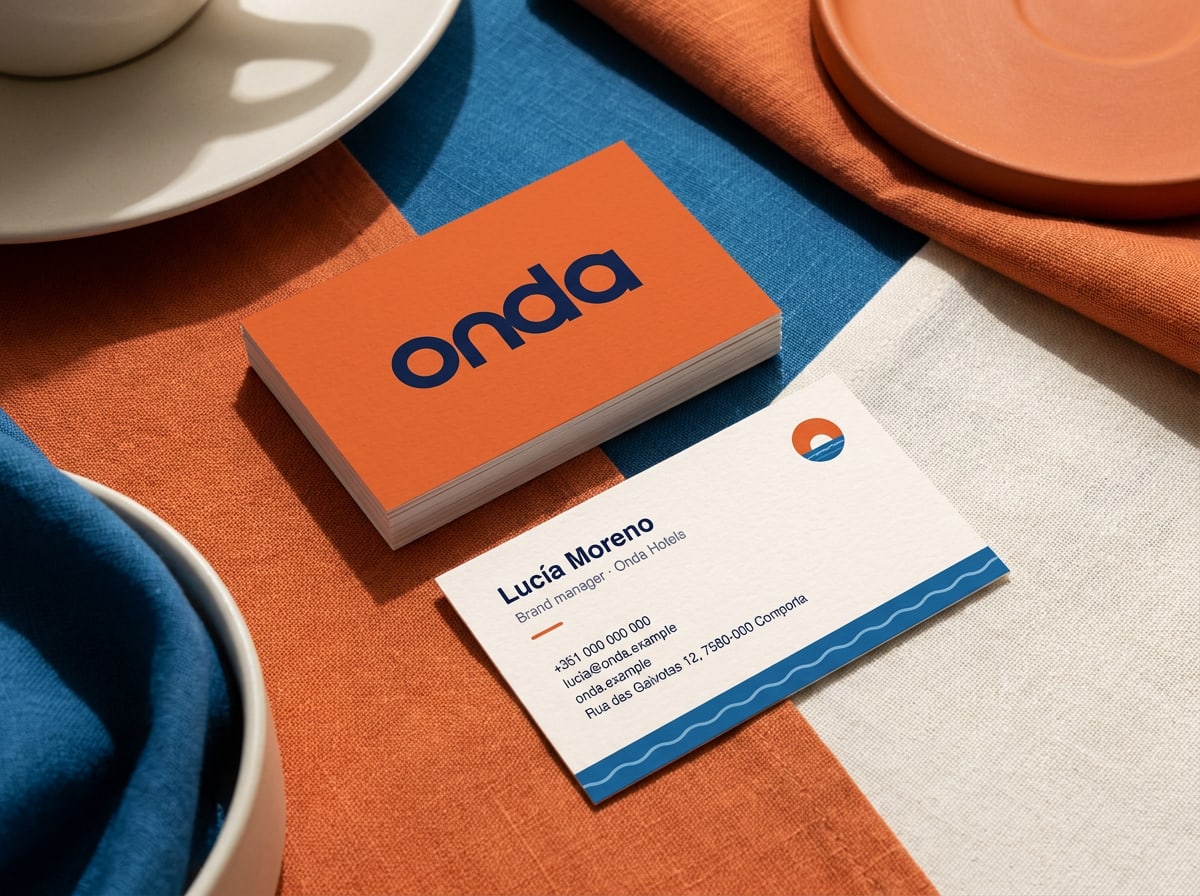
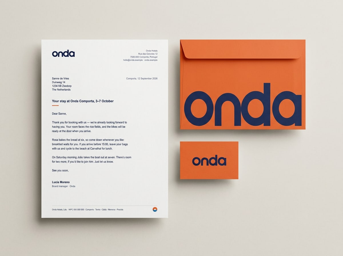
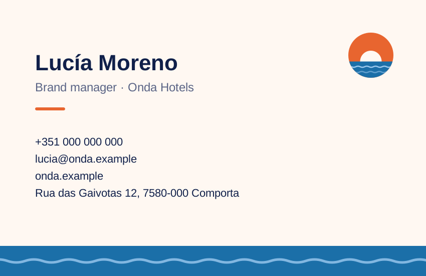
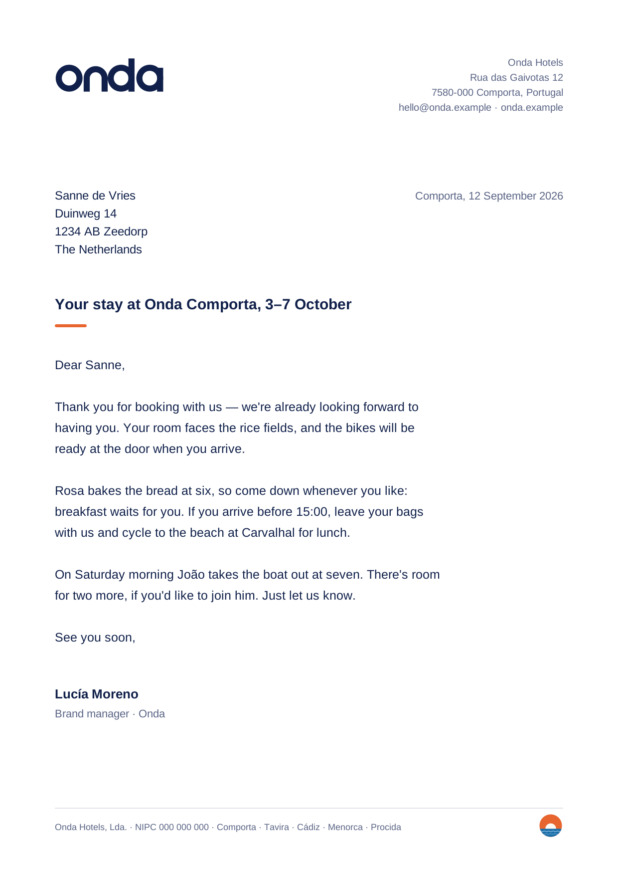
Business cards and stationery

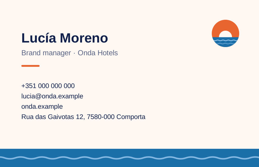
Business card, 85 × 55 mm: the wordmark alone on Sunset, contact details on Shell with a Harbour wave.
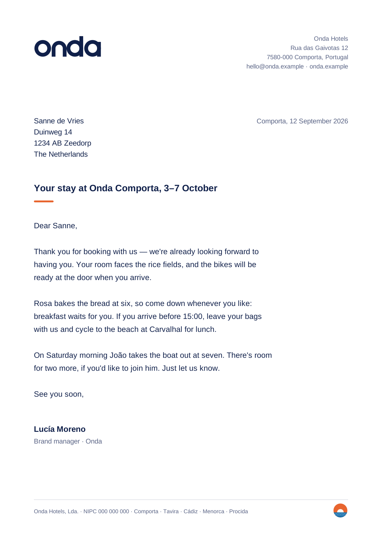
A4 letterhead: DM Sans 10 pt on 15 pt, left margin 25 mm, the wordmark top left at 40 mm wide.

More

Posters, social and the houses

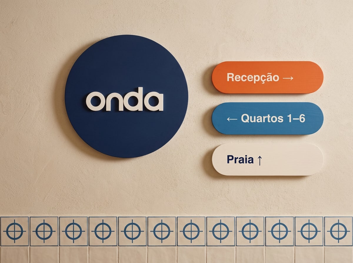
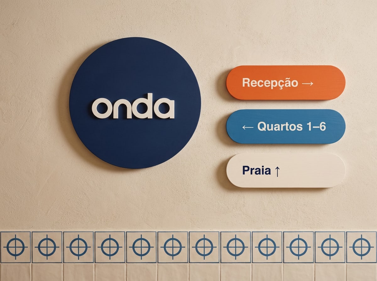
Round Night sign with the white Onda logo, next to rounded wayfinding signs
Front-door plaque and wayfinding — in the local language first.
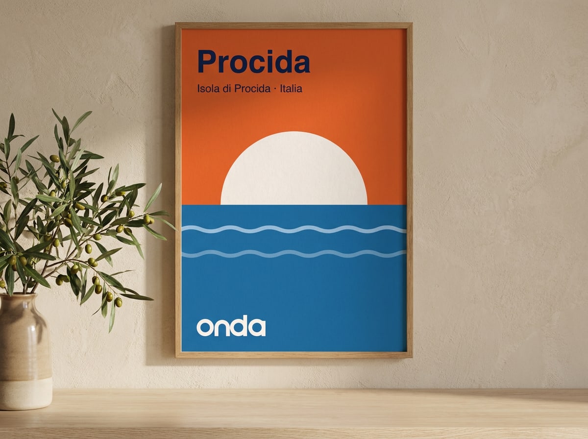
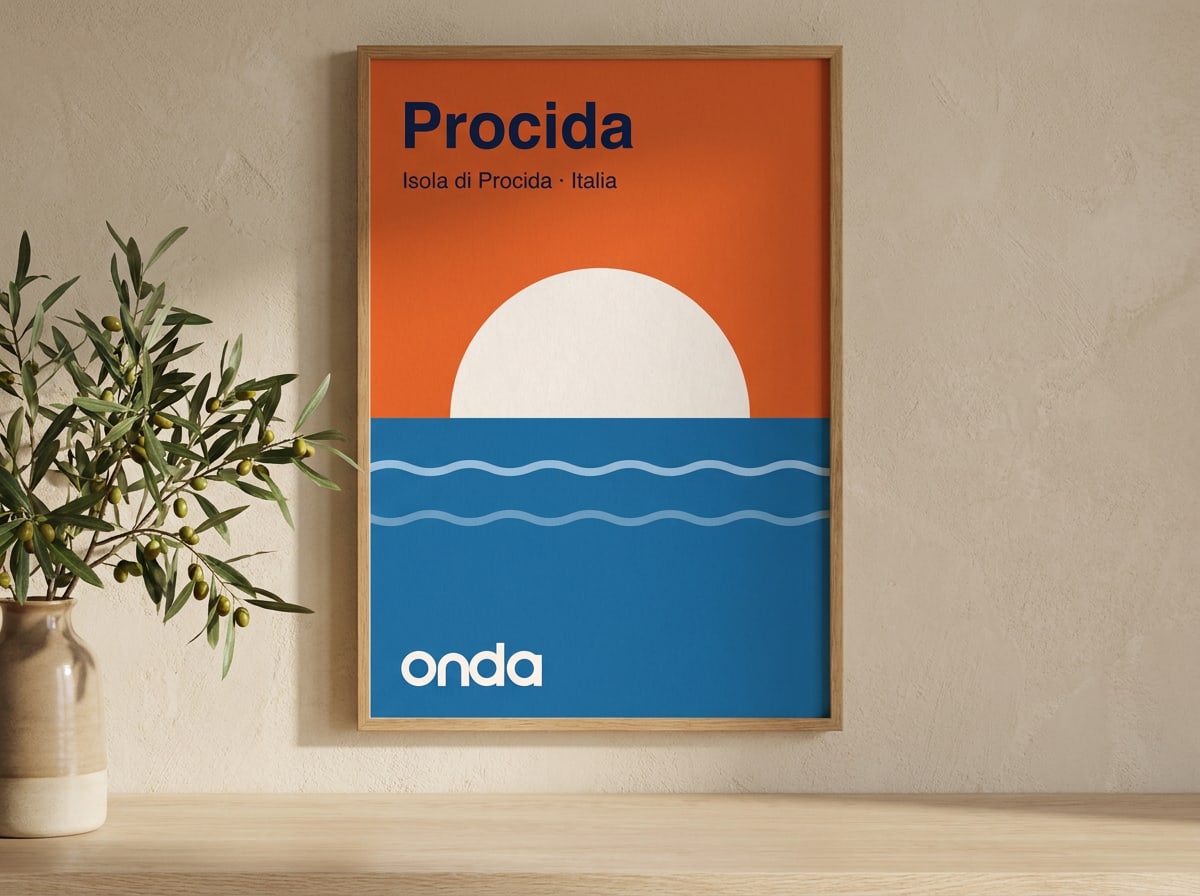
Poster for Procida with a white sun setting into a blue sea
Destination poster — one sun, one place name.
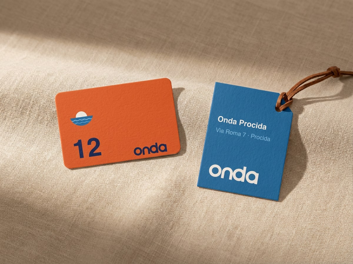
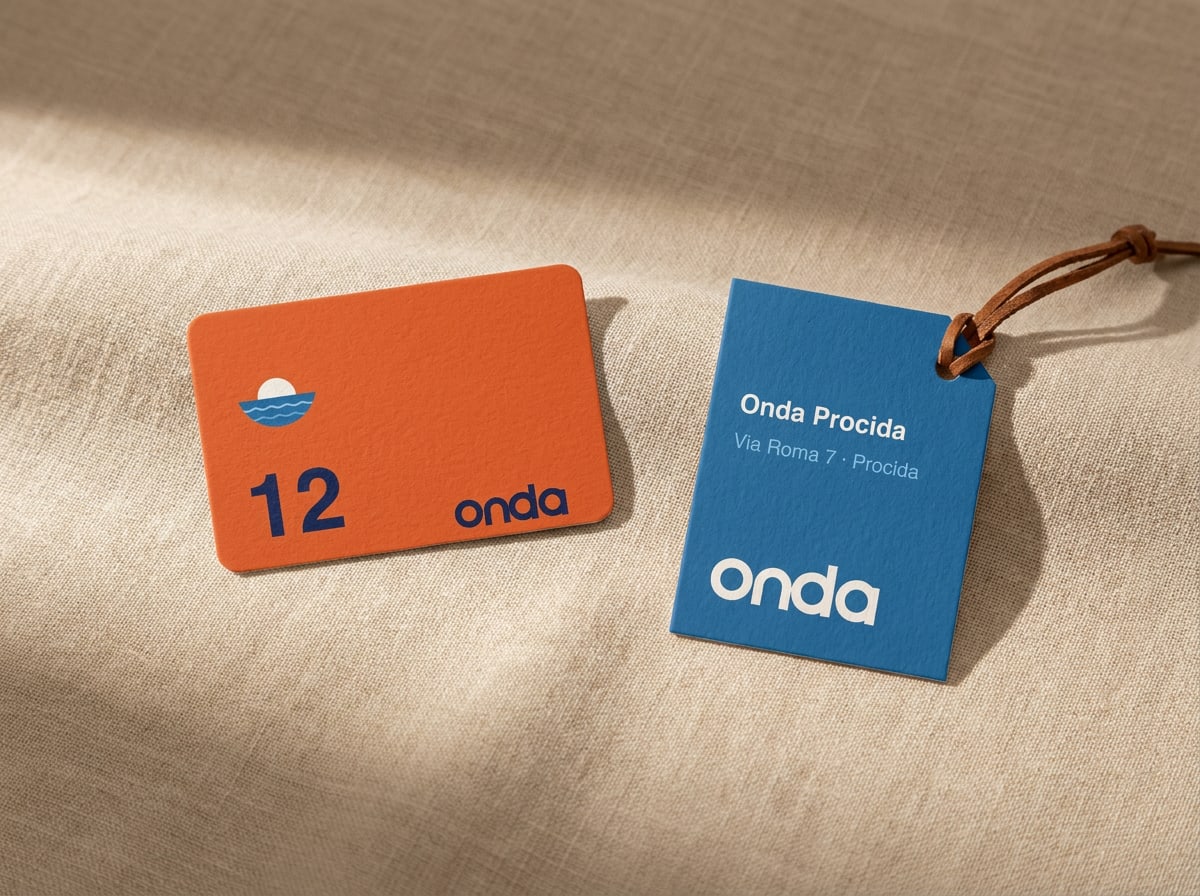
Sunset key card with room number 12 and a Harbour-blue luggage tag
Key card and luggage tag — the symbol works where space is tight.
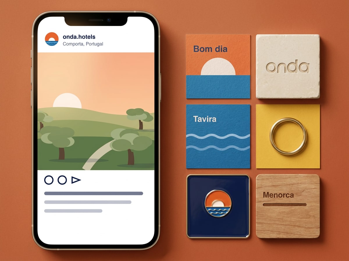
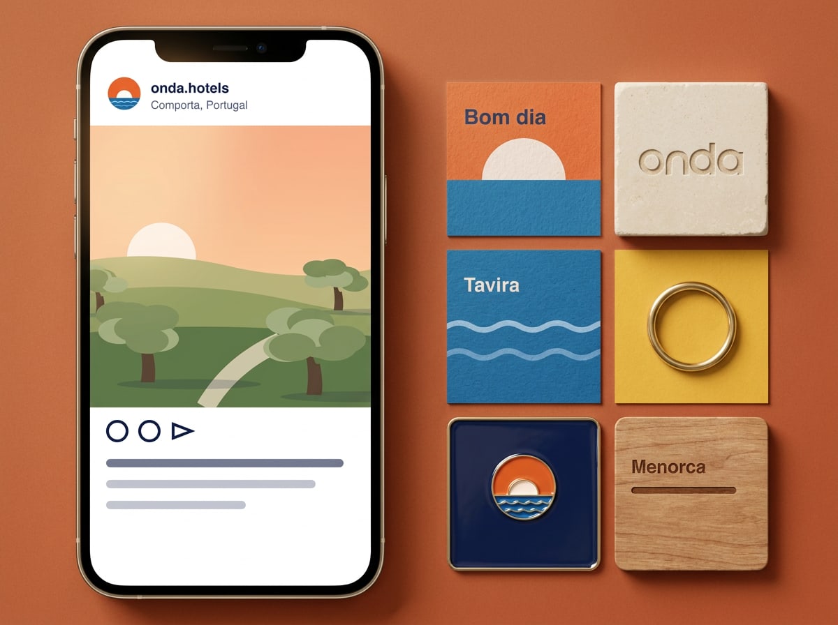
Phone showing an Onda Instagram post beside a grid of branded tiles
Social — real moments first, graphic tiles as punctuation.

Order

Order printed matter

Need business cards, letterhead or a poster for your house? Fill in the form and the design studio prepares a print-ready file and a proof within three working days.

Handled by Matteo Ricci, design studio
  • Business cards

    85 × 55 mm, 400 g uncoated, Sunset front. Boxes of 250.

  • Letterhead

    A4, 120 g warm-white uncoated, printed in Pantone 2768 C and 7579 C.

  • Poster

    A2 or 50 × 70 cm destination poster with your house name.

12Up nextFiles & governance

Chapter 12 of 12

Files & governance

Master files, which file for what, version and who to ask.

Files & governance

Where everything lives

All files on this page are the master versions — download them here rather than from an old email or a shared drive. They are vector SVGs that scale to any size; please don't edit the logo files. Need PDF, EPS or PNG? Ask the design studio.
Version

3.0 · 24 September 2026 New in 3.0: print logo files (CMYK and Pantone), the image-style moodboard and layout grids.
Owner

Lucía Moreno, brand manager, owns this guide. The design studio maintains the files and templates.

Approval

Anything new that carries the logo — signage, campaigns, partner materials — is checked by the brand manager before it's published or printed.

Which file for what
Website, apps, social media, presentations → SVG (RGB) or PNG at 2×. Office documents and email signatures → PNG with transparency. Four-colour print (brochures, menus, cards) → CMYK file, PDF/X-4 from the studio. Signage, textiles, ceramics, embroidery → Pantone file. Newspapers, stamps, engraving → black file.
Fonts
Outfit and DM Sans are free on Google Fonts (SIL Open Font License). Install them from there; no licence purchase needed. In email and Office, use Arial.
Version history
3.0 · September 2026 — print logo files, layout grids, image style, ordering. 2.1 · March 2025 — Procida added, hotel lockups. 2.0 · January 2023 — new symbol, supporting palette, tone of voice. 1.0 · June 2014 — first guide for Onda Comporta.

01

Logo pack

Wordmark — Night
SVG · 361 B
Default version for light backgrounds
Wordmark — Shell
SVG · 339 B
Reversed, for dark backgrounds and photos
Wordmark — black
SVG · 339 B
Single-colour print only
Symbol
SVG · 885 B
App icons, avatars and small spaces
Lockup
SVG · 1 KB
Symbol and wordmark side by side
Hotel lockups
SVG · 2 KB
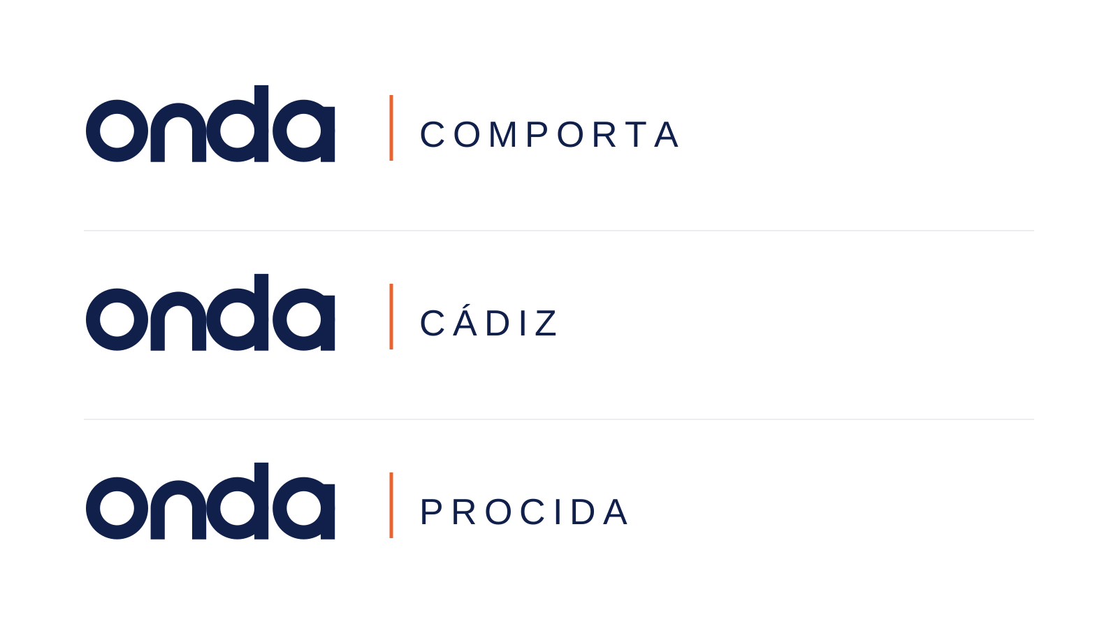
Comporta, Cádiz and Procida

02

Colour

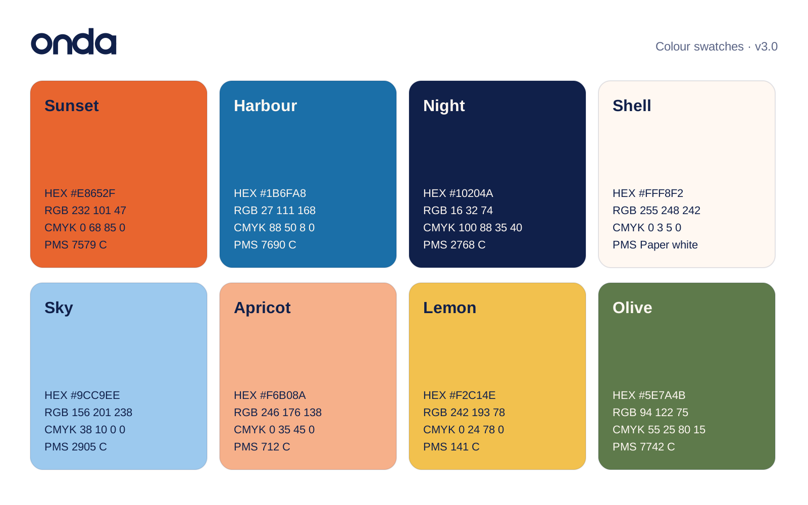
Colour swatch sheet
SVG · 6 KB
HEX, RGB, CMYK and Pantone for all eight colours
Sun-and-wave pattern
SVG · 701 B
Repeating tile for packaging and paper

03

Templates

Business card — front
SVG · 499 B
85 × 55 mm, Sunset
Business card — back
SVG · 2 KB
85 × 55 mm, contact details
Letterhead
SVG · 5 KB
A4, with an example letter
Destination poster
JPG · 118 KB
A2 portrait, one per house
Social media set
JPG · 98 KB
Feed post 1080 × 1350, tiles 1080 × 1080
Breakfast menu
JPG · 118 KB
A5 portrait, local language first
Key card and luggage tag
JPG · 199 KB
Credit-card size, room number in Display
Signage and wayfinding
JPG · 131 KB
Door plaque Ø 400 mm, signs 380 × 110 mm
Website home page
SVG · 24 KB
1600 × 1000, structure and spacing
Booking confirmation screen
SVG · 8 KB
App and email, 9:19.5
Instagram story
SVG · 5 KB
1080 × 1920 safe zones
Billboard
SVG · 7 KB
3:1, e.g. 12 × 4 m

Email

Email signature

Bonus
Your own email signature

Everyone at Onda uses the same signature. Fill in your details, check the preview and copy it into Gmail, Outlook or Apple Mail. Your first name is enough in the greeting — the signature does the rest.

Your email signature

Your details

Your details are only saved in this browser.
Onda Hotels
Alex Morgan
Senior designer · Marketing
T +31 20 123 45 67
E alex.morgan@example.com
Onda Hotels
Rua das Gaivotas 12, 7580-000 Comporta, Portugal
+351 000 000 000  ·  onda.example
Instagram  ·  Journal  ·  Book a stay
Onda Hotels, Lda. · Comporta · Tavira · Cádiz · Menorca · Procida. This email may contain confidential information. If it reached you by mistake, please let us know and delete it.
Fill in your name first.

How to add it to your mail program

Outlook for Windows

  1. New Outlook: go to Settings › Account › Signatures. Classic Outlook: File › Options › Mail › Signatures.
  2. Create a new signature and give it a name.
  3. Paste your signature (Ctrl+V) into the editing box.
  4. Choose it as the default for new messages and replies, then save.

Outlook for Mac

  1. Go to Outlook › Settings › Signatures.
  2. Click + to add a signature and give it a name.
  3. Paste your signature (⌘V) and close the editing window to save it.
  4. Under “Choose default signature”, select it for your account.

Outlook on the web (Outlook.com, Microsoft 365)

  1. Click the gear icon › Account › Signatures.
  2. Add a new signature and give it a name.
  3. Paste your signature (Ctrl+V or ⌘V) and click Save.
  4. Select it as the default for new messages and replies.

Gmail

  1. Click the gear icon › See all settings, and stay on the General tab.
  2. Scroll to Signature and click Create new.
  3. Paste your signature into the box.
  4. Choose it under Signature defaults, then click Save Changes at the bottom of the page.

Apple Mail

  1. Go to Mail › Settings › Signatures and select your account.
  2. Click + to add a signature.
  3. Untick “Always match my default message font”, otherwise your fonts and colours are replaced.
  4. Paste your signature (⌘V) over the sample text and close the window.

iPhone and Android

  1. Mail apps on phones often lose the layout and logo when you paste a signature. Set it up on your computer if you can.
  2. iPhone Mail: Settings › Apps › Mail › Signature. Gmail and Outlook apps: look for Signature in the app’s settings.
  3. These apps often only accept plain text; the text version of your signature is pasted automatically.

04

Imagery

Key visual — morning swim
JPG · 229 KB
Hero image for web and campaigns
Breakfast on the terrace
JPG · 139 KB
Comporta · 4:3
Harbour at nine
JPG · 198 KB
Tavira · 4:3
Saturday market
JPG · 157 KB
4:3
Back streets
JPG · 120 KB
Cádiz · 4:3
Our host Rosa
JPG · 89 KB
Procida · 4:3 · release on file
The cove below the house
JPG · 197 KB
Menorca · 4:3
Room 12, sea view
JPG · 144 KB
4:3
Olive grove at golden hour
JPG · 179 KB
4:3
Long-table dinner
JPG · 116 KB
4:3
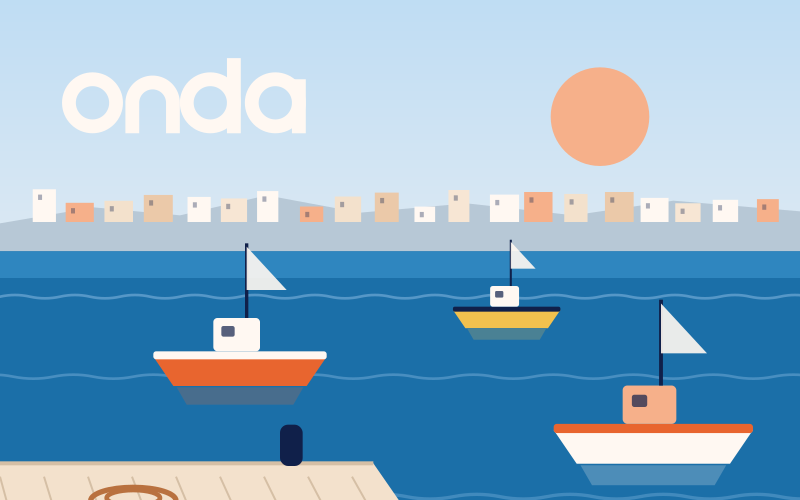
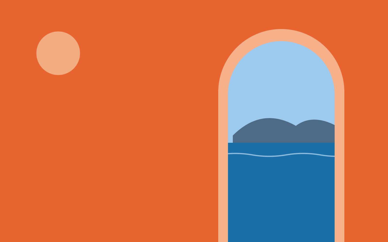
The arch onto the sea
SVG · 696 B
Graphic image · 16:10
Illustration style sheet
SVG · 3 KB
Line weight, colours and motifs

05

Reference sheets

Logo clear space
SVG · 2 KB · Diagram for printers and agencies
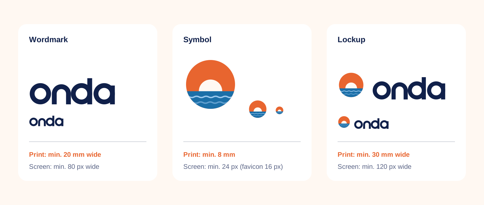
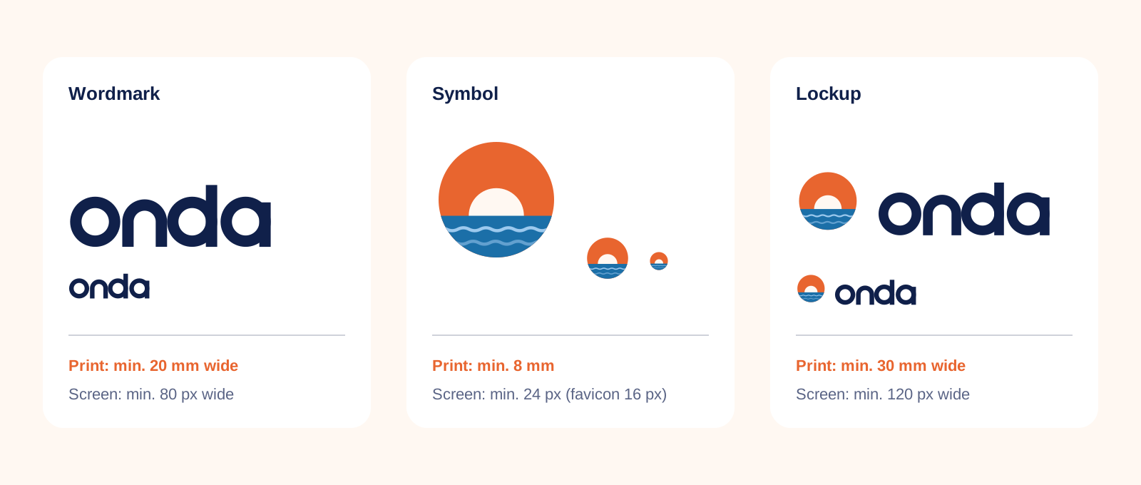
Logo minimum sizes
SVG · 8 KB · Print and screen
Website layout sketch
JPG · 109 KB · Illustrated overview
Map of our houses
SVG · 4 KB · For presentations and press kits

Questions?

Who to contact

We'd rather answer a question than fix a print run. Get in touch early — we usually reply within one working day.

Lucía Moreno
Brand manager
Brand & Marketing

Ask about: brand approvals, partnerships, co-branding and anything this guide doesn't answer

Matteo Ricci
Art director
Design studio

Ask about: logo files, templates, print specs, proofs and photo briefs

Joana Pires
Online marketing
Digital

Ask about: the website, newsletters, social media, ads and the email signature

Back to the start