
Logo
One line, drawn like a wave
The Onda wordmark is built from circles and straight stems in a single, even line weight — round like the sun, steady like the horizon. Use the files from this guide; never redraw or retype it.
For screens: websites, apps, social media, presentations and email.

 Screen preview
- No RGB file for this version.






Which version to use
Wordmark is the default, in almost every situation. Use Night on light backgrounds and Shell on dark ones.
On Sunset the wordmark is always Night (4.7:1) — never white, which only reaches 3.3:1.
Black is only for single-colour print: newspapers, stamps, engraving and embossing.
Symbol is for small or square spaces where the name is already clear: app icons, favicons, avatars, wax seals and room keys.
Lockup is for first impressions where we need both: the website header on mobile, the front of a brochure, flags.
Digital or print
Use the switch on each logo card to pick the right file. Digital · RGB is for screens: websites, apps, social media, presentations and email. Print · CMYK is for everything printed in four colours: brochures, menus, posters and business cards. Pantone is for spot-colour work where the colour must match exactly: signage, textiles, ceramics, embroidery and our letterhead (Pantone 2768 C for Night, 7579 C for Sunset). The reversed logo in print is never printed white — it's the paper showing through.
Clear space
Give it room to breathe
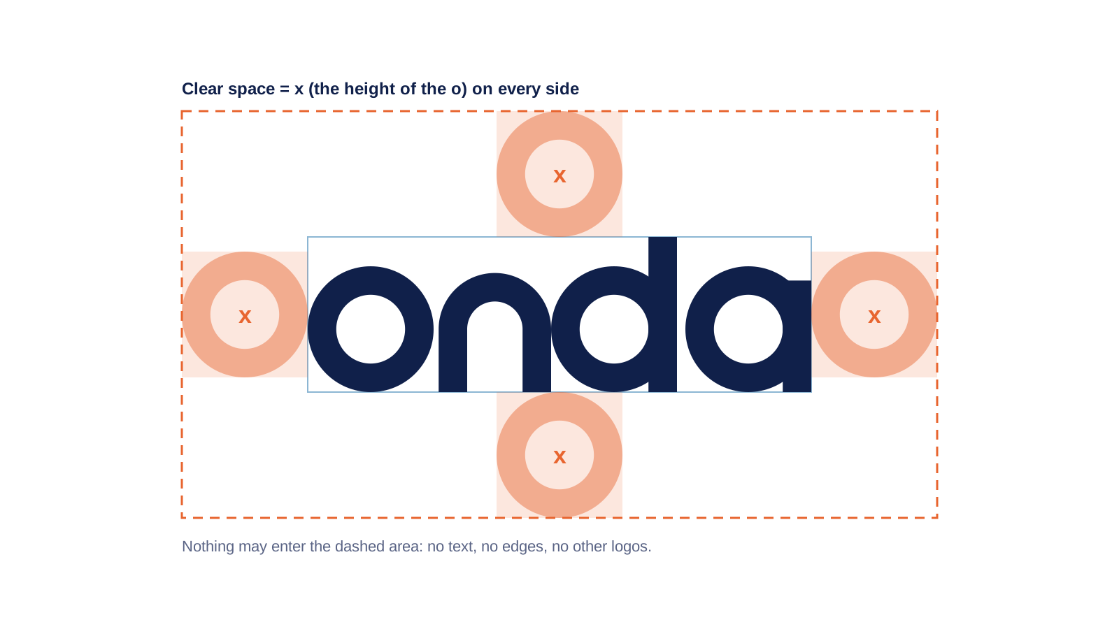
The minimum clear space around the logo is x: the height of the letter o. Nothing enters that area — no text, no image edges, no other logos. More space is always better.
Minimum size
Small, but always legible
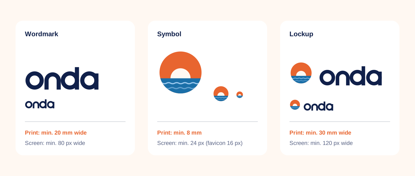
Below these sizes the counters of the o and d close up. If you need to go smaller, switch to the symbol.
Hotel lockups
One family, five houses
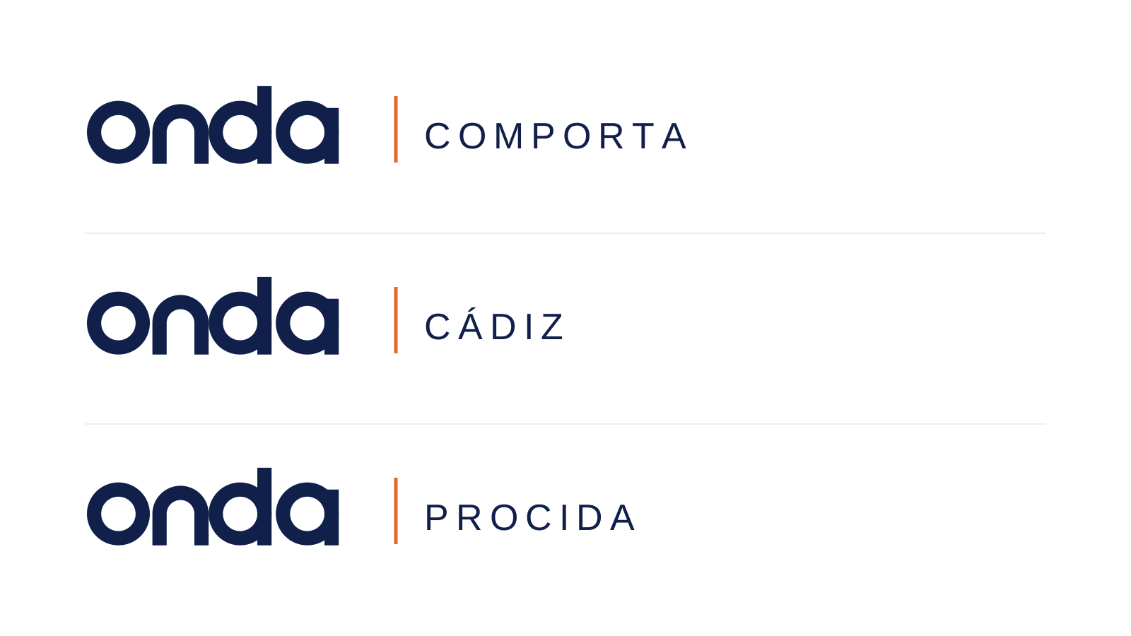
Each house uses the Onda wordmark with its place name, separated by a short Sunset rule. The place name is set in DM Sans Regular, in capitals, with 20% letter spacing, at 45% of the wordmark's height.
Do's and don'ts
Keep it simple
The logo works because it's calm. Please don't add anything to it.
 Use Night on Shell or white, with generous clear space.
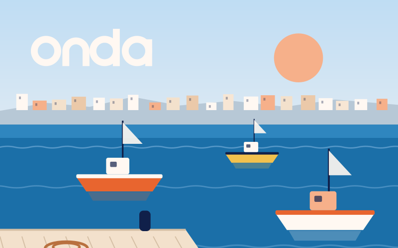 Place Shell on a calm, even area of a photo — sky, sea or a plain wall.
 Use the Night wordmark on Sunset for our boldest moments.
 Use the symbol on its own for app icons and avatars, centred with even padding.
 Use the lockup on light supporting colours such as Sky or Apricot.
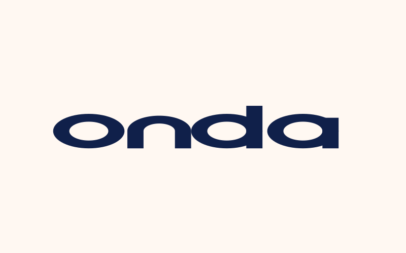 Don't stretch, squash or change the proportions.
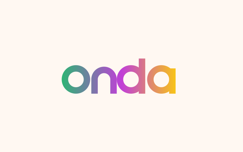 Don't recolour the logo or use gradients.
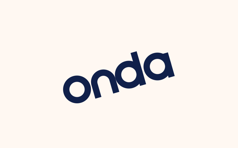 Don't rotate the logo or set it on a curve.
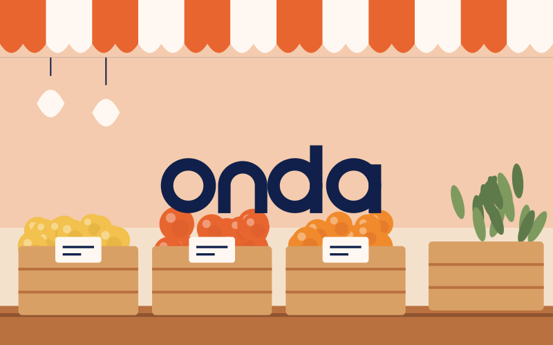 Don't place it on busy images where it loses contrast.
 Don't add shadows, outlines, glows or 3D effects.
Details