
Layout & composition
Plenty of space, one clear focus
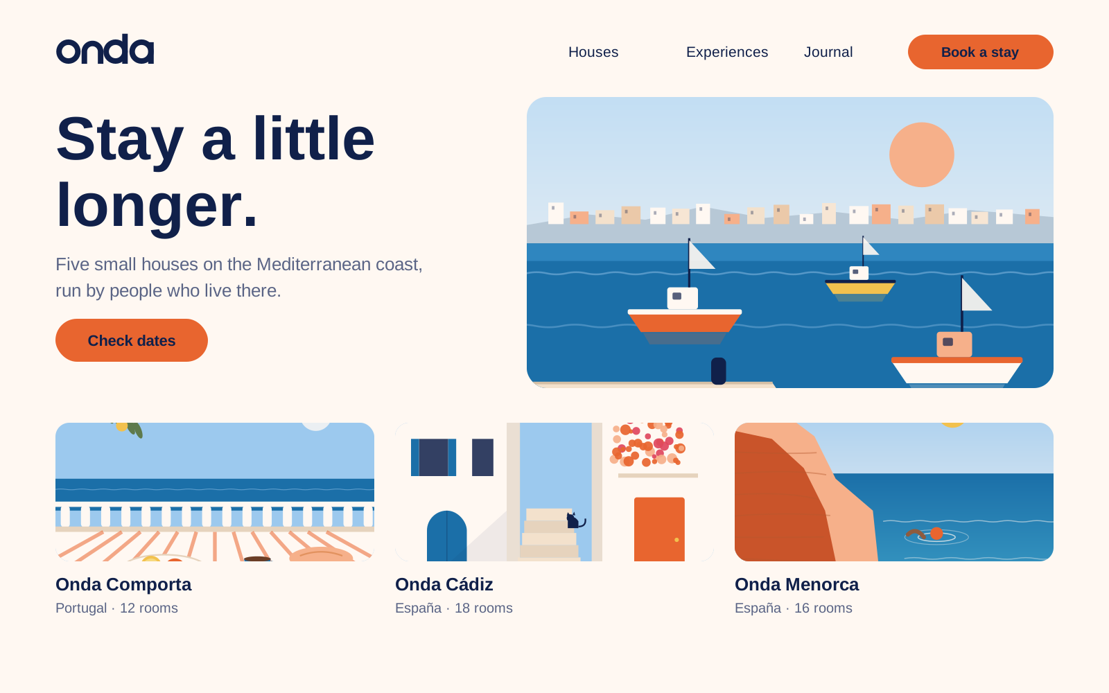
Every layout should feel like a quiet terrace: room to breathe, one thing to look at, nothing in a hurry. Pick a format to see its grid, and switch on the overlay to see it on our home page.
Website · desktop
- Format
- 1440 × 900 px
- Columns
- 12
- Column width
- 84.7 px
- Gutter
- 24 px
- Side margins
- 80 px
- Top and bottom
- 64 px
- Baseline
- 8 px
Content max. 1280 px wide. Text columns span at most 7 of 12 columns (about 70 characters).
White space
- At least 40% of every layout is empty Shell. When in doubt, take something out.
- One focal point per layout: a photo, a headline or a sun — never all three fighting.
- Align text left on the grid; centre only short lines on posters, menus and cards.
- Text-to-image ratio: about 1:2 on web and social, 1:1 in print. Photos lead, words support.
- Spacing follows an 8 px rhythm (8, 16, 24, 40, 64, 104). Sections are separated by 104 px on desktop.
- Logo top left or bottom centre, aligned with the text column — never floating in a corner on its own.
Composition
Three compositions we use most
Split
Text on Shell on the left (5 columns), photo on the right (7 columns). For web heroes, brochures and presentations.
Arch
One photo in an arch, centred, with a short headline above and the logo below. For posters, covers and menus.
Full bleed
Photo edge to edge, headline in Shell on the calmest area (sky or sea). For social, billboards and campaign pages.