Live demo of the Full brandbook blueprint · Onda is a fictional brand.All blueprintsJoin the waitlist

Layout & composition
Layout & composition
Plenty of space, one clear focus
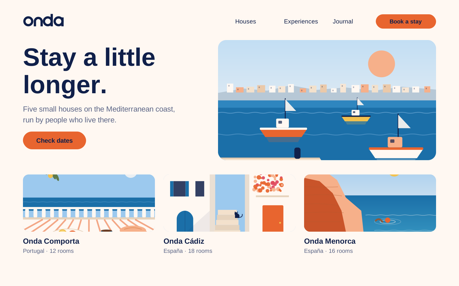
Every layout should feel like a quiet terrace: room to breathe, one thing to look at, nothing in a hurry. Pick a format to see its grid, and switch on the overlay to see it on our home page.
Website · desktop
- Format
- 1440 × 900 px
- Columns
- 12
- Column width
- 84.7 px
- Gutter
- 24 px
- Side margins
- 80 px
- Top and bottom
- 64 px
- Baseline
- 8 px
Content max. 1280 px wide. Text columns span at most 7 of 12 columns (about 70 characters).
White space
- At least 40% of every layout is empty Shell. When in doubt, take something out.
- One focal point per layout: a photo, a headline or a sun — never all three fighting.
- Align text left on the grid; centre only short lines on posters, menus and cards.
- Text-to-image ratio: about 1:2 on web and social, 1:1 in print. Photos lead, words support.
- Spacing follows an 8 px rhythm (8, 16, 24, 40, 64, 104). Sections are separated by 104 px on desktop.
- Logo top left or bottom centre, aligned with the text column — never floating in a corner on its own.
Slide 43 of 56 · Use the arrow keys to move