Logo
A bowl, a sprout, a shared name
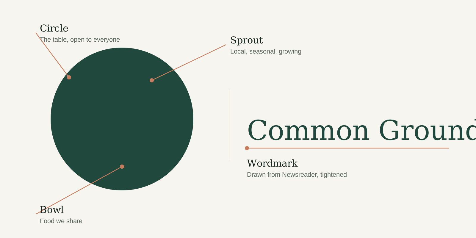
Our logo combines a mark and a wordmark. The mark is a circle, the table everyone can join, with a bowl and a young sprout cut out of it. The wordmark is set in a tightened version of Newsreader. Together they say what we do in one glance: good food, grown nearby, shared.
Versions
Logo versions
Use the primary logo wherever you can. The other versions exist for specific backgrounds, formats and production methods. Every version comes in three colour modes: switch between Digital and Print to get the right file.



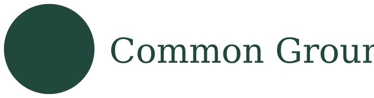

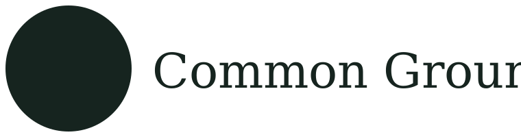


Primary and reversed
The default for almost everything: signage, website, posters, letters. Forest on Paper or Cream; Cream on Forest or on a calm, dark part of a photo.
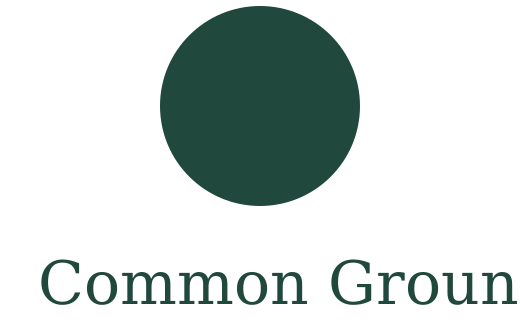
Stacked
For square and upright spaces where the horizontal logo would get too small: tote bags, stickers, the end frame of a video, a shop window.
Mono
For one-colour production (stamps, receipts, newspaper ads, laser engraving) and on Sage or Clay, where Forest doesn't have enough contrast.
Mark
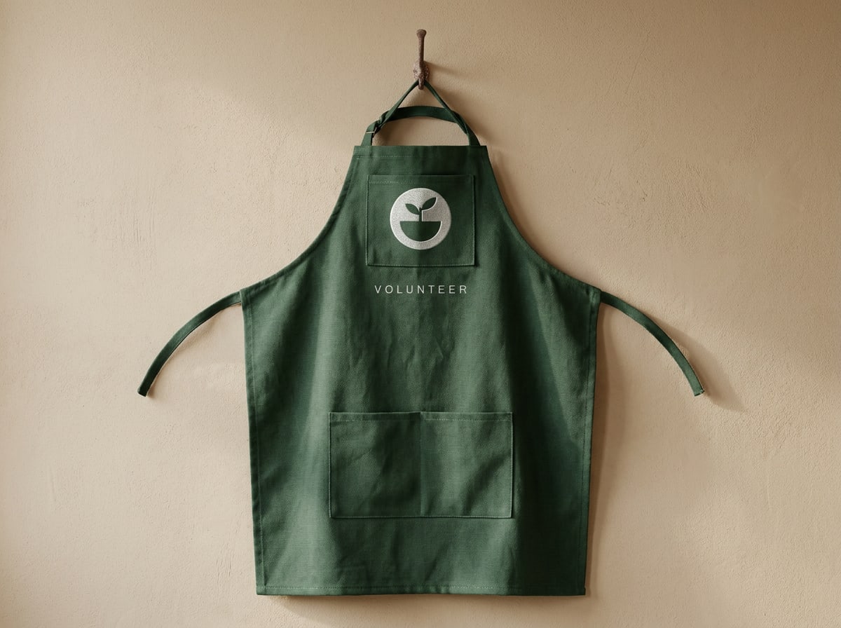
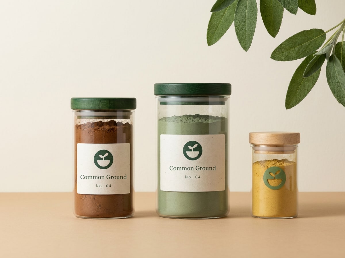
Only where the name is already clear or space is tiny: app icon, avatar, favicon, embroidery, jar lids. Never as a replacement on a first introduction.
Clear space
Give it room to breathe
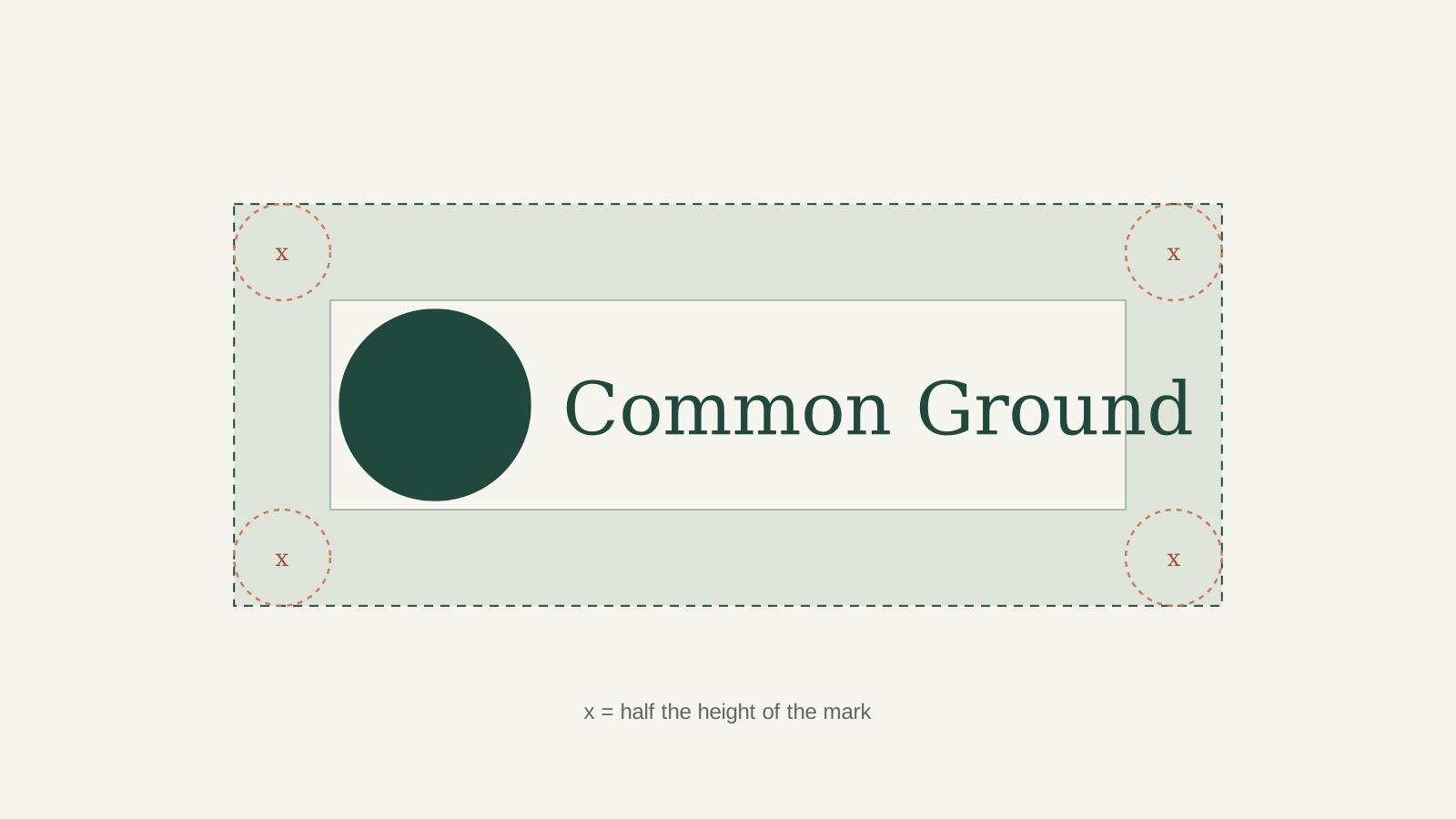
Keep an area free of text, images and edges around the logo. The minimum is x: half the height of the mark. More is almost always better.
Minimum size
Never smaller than this
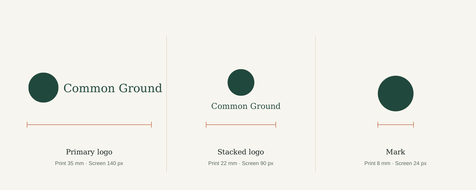
Below these sizes the cut-outs in the mark close up and the wordmark loses its detail. Sizes are measured across the full width of the logo.
Backgrounds and misuse
Do's and don'ts
The logo is the most recognisable part of our brand. Keep it consistent: the same shapes, the same colours, always on a calm background.
 Use the primary Forest logo on Paper, Cream or white, with plenty of space around it.
 Use the reversed Cream logo on Forest, or on a calm, dark area of a photo or illustration.
 Use the Ink version on Sage and Clay. Forest doesn't have enough contrast on those colours.
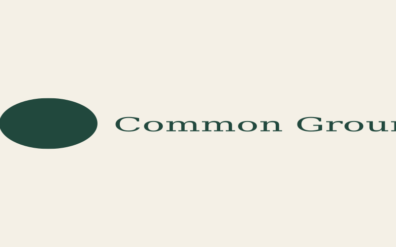 Don't stretch, squash or distort the logo. Always scale it proportionally.
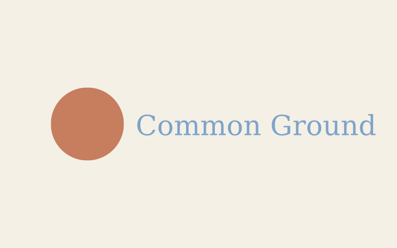 Don't recolour the logo, not even in other brand colours. Only Forest, Cream, Ink or white.
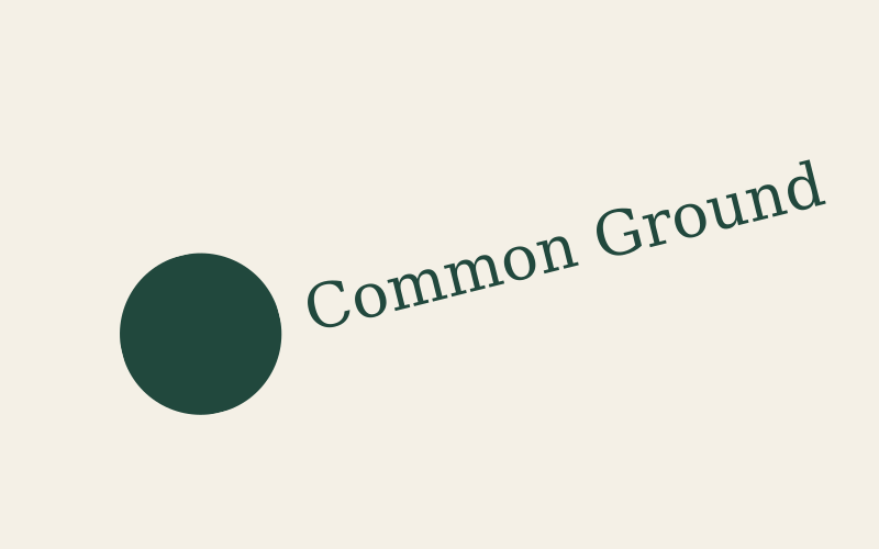 Don't rotate the logo or set it on a curve.
 Don't place the logo on busy patterns or photos where it can't be read.
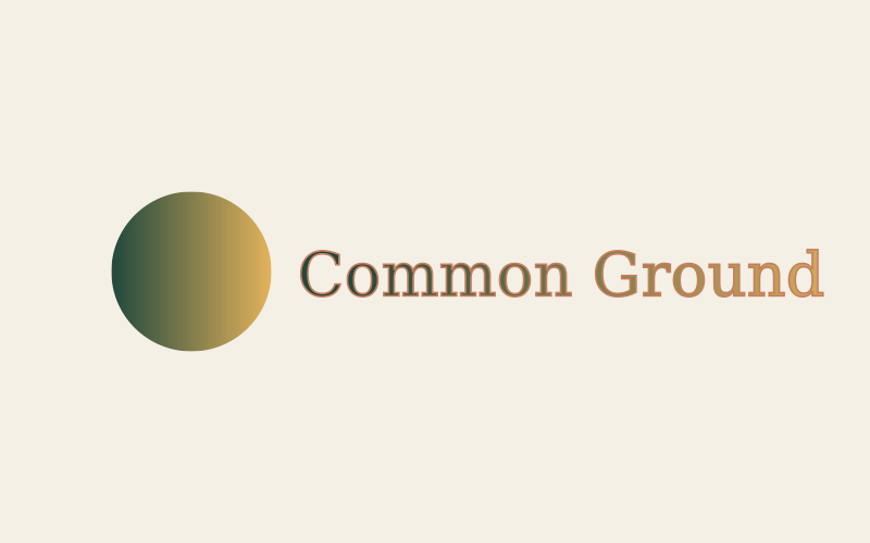 Don't add shadows, outlines, gradients or other effects.
 Don't rearrange the mark and wordmark or change their size relationship.
The mark in use
Small, crafted, everywhere
Where people already know they're at Common Ground, the mark is enough. It works as a stamp, a stitch or a label.
Good to know