
Chapter 6 of 12
Typography
Round letters, easy reading
Two free, open-source typefaces from Google Fonts. Outfit has the same round geometry as our wordmark and sets every headline. DM Sans is friendly and very legible at small sizes, so it carries everything else.
Hero titles, posters and covers. Medium (500), 56–96 px, line height 1.05, tracking −1%. One short line, ideally fewer than six words.
Good typography is invisible. It guides the eye from line to line, so readers stay with the story instead of the letters. Spacing between lines matters as much as the letters themselves.
- Line height
- 1.05 · 105% · 16.8 px at 16 px
- Letter spacing
- -0.01 em · -1%
Stay a little longer.
Good typography is invisible. It guides the eye from line to line, so readers stay with the story instead of the letters. Spacing between lines matters as much as the letters themselves.
Stay a little longer.
Good typography is invisible. It guides the eye from line to line, so readers stay with the story instead of the letters. Spacing between lines matters as much as the letters themselves.
font-family: Outfit, Arial, Helvetica, sans-serif;Page and section headings. Medium (500) for H1 and H2, Regular (400) for H3. Sentence case, never all capitals.
Good typography is invisible. It guides the eye from line to line, so readers stay with the story instead of the letters. Spacing between lines matters as much as the letters themselves.
- Line height
- 1.5 · 150% · 24 px at 16 px
All running text, from web pages to booking emails. Regular (400) at 16–18 px, line height 1.6, 60–75 characters per line. Bold (700) for emphasis only.
Good typography is invisible. It guides the eye from line to line, so readers stay with the story instead of the letters. Spacing between lines matters as much as the letters themselves.
- Line height
- 1.6 · 160% · 25.6 px at 16 px
Rosa bakes the bread at six.
Good typography is invisible. It guides the eye from line to line, so readers stay with the story instead of the letters. Spacing between lines matters as much as the letters themselves.
Rosa bakes the bread at six.
Good typography is invisible. It guides the eye from line to line, so readers stay with the story instead of the letters. Spacing between lines matters as much as the letters themselves.
font-family: "DM Sans", Arial, Helvetica, sans-serif;Captions in Regular at 13–14 px. Labels, tags and wayfinding in Bold capitals at 11–12 px with +12% letter spacing.
Good typography is invisible. It guides the eye from line to line, so readers stay with the story instead of the letters. Spacing between lines matters as much as the letters themselves.
- Line height
- 1.5 · 150% · 24 px at 16 px
- Letter spacing
- +0.12 em · +12%
Scale
The type scale
Seven steps cover everything from a poster to a key card, set live in our fonts — type your own text to try it. Sizes are px on screen; read them as pt for A4 print (body 9.5–10 pt). On mobile, scale Display and H1 down by about 30%; body text stays at least 16 px.
In use
Typography at work
Letters, menus and cards use the same scale: one bold subject line, calm body text, generous margins.
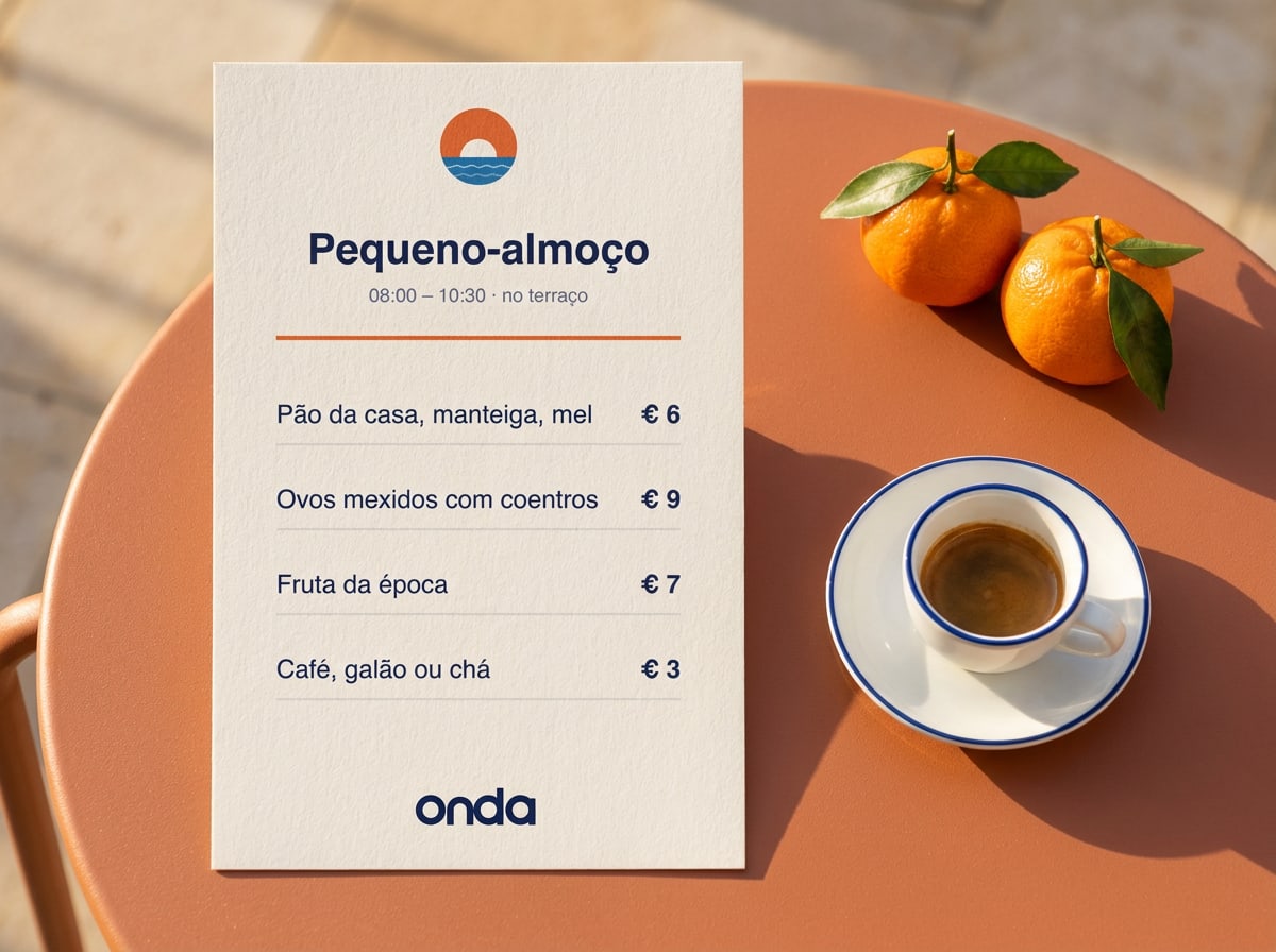
- Use sentence case for headings: 'Breakfast on the terrace'.
- Left-align text. Centre only short lines on posters, menus and cards.
- Keep accents and local spelling: Cádiz, Procida, pequeno-almoço.
- Don't set long passages in capitals or in Outfit.
- Don't use more than three type sizes on one page or screen.
- Don't use other fonts — no script fonts for a 'Mediterranean feel'.
Details
Typesetting rules
Numbers, times and prices
Languages and accents
Fallback fonts
Licence and installation
Questions about this guide?
Contact LucíaLast updated 24 Sept 2026
Made with brandbooks