Chapter 7 of 12
Graphic language
A sun, a wave and an open arch
Three shapes from the symbol do all the graphic work: the circle of the sun, the line of the wave and the arch of a Mediterranean doorway. Combined with real photos and plenty of Shell, they make anything recognisably Onda — even without the logo.
The sun
A full or half circle in Sunset. Use one per layout, as a highlight behind a headline, a price or a photo. Never more than one sun.
The wave
A soft wave line in Harbour or Sky, 2% of the format width. Use it as a divider or along the bottom edge — never as a frame around text.
The arch
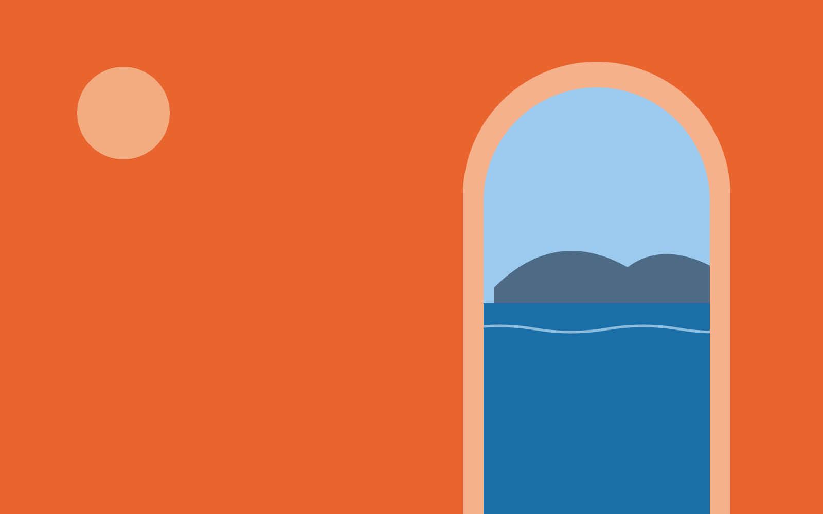
Our frame for photos: a rectangle with a half-round top, like the doorways of our houses. Corners elsewhere are rounded at 24 px (screen) or 4 mm (print).
Illustration
One line, one sun
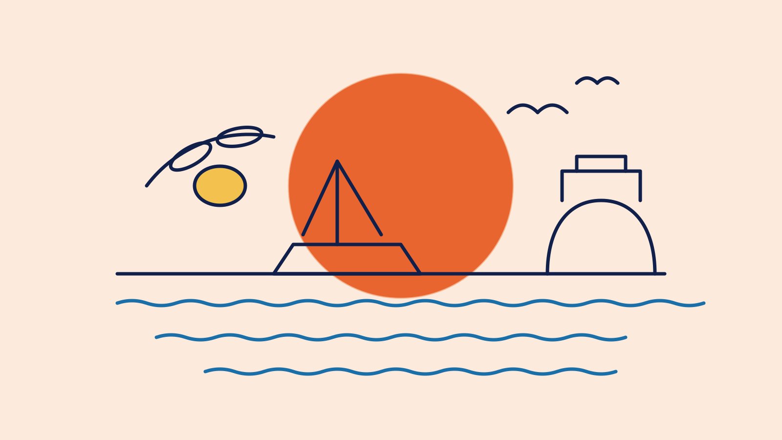
Our illustrations borrow the logic of the wordmark: one even line weight in Night, round ends, and a single Sunset sun as the only solid shape. Use them for maps, menus, little guides and anywhere a photo would be too much.
The sun-and-wave pattern
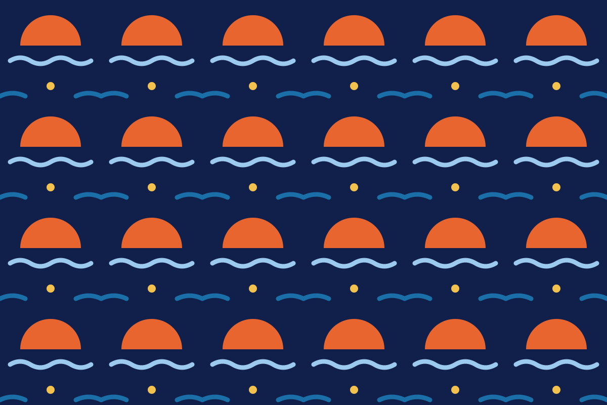
Built from the symbol: half a sun and a wave, repeated. Use it on packaging, tissue paper, room-key sleeves and the back of business cards — never behind text or the logo, and never on more than one surface per item.
Icons
Interface icons
On the website, in the app and on signs in the houses we use Material Symbols: Rounded, weight 300, in Harbour. Search for what you need, click an icon to copy its name or SVG, or download it as SVG or PNG.
Staying with us
12 iconsGetting around
12 iconsMaterial Symbols by Google, open source (Apache 2.0)
Combining
How the elements work together
- Pick one graphic element per layout: a sun, a wave or an arch.
- Let photos fill an arch; let the sun sit behind type or a price.
- Use icons at 24 px with labels in interfaces, at 48 px on signage.
- Don't stack sun, wave and pattern on the same surface.
- Don't put the pattern behind text or the logo.
- Don't mix Material Symbols with other icon sets or emoji.
Questions about this guide?
Contact LucíaLast updated 24 Sept 2026
Made with brandbooks