Guide · Visual identity
What is a brand style guide?
A brand style guide is the set of rules for an organisation’s visual identity: how to use the logo, which colour codes and typefaces belong to the brand, how print, web and social should look, and which files to use for each. It makes sure everyone who creates something gets the same result.
By the Brandbooks team9 min read
What is a brand style guide, exactly?
A brand style guide is the user manual for your visual identity. You’ll also find it called visual identity guidelines, a brand standards manual, design guidelines or the older ‘corporate identity manual’. It doesn’t just list which elements exist; above all it explains how to apply them: how small the logo may go, which colour sits on which background, which typeface to use in a Word document when the brand font isn’t available.
Large organisations — public bodies, airlines, banks, transport networks — have had manuals like this for decades. Today a bakery with three shops or a five-person consultancy benefits just as much. Anyone who orders print, has a website built or works with a freelancer runs into the same question: how do we make sure it looks the same every time?
A good brand style guide holds three things: rules (what’s allowed and what isn’t), specifications (colour codes, sizes, file formats) and files (logos, fonts, templates). Leave out any one of the three and people start guessing.
Brand, visual identity and style guide: what’s the difference?
A brand is what people think of you and expect from you: what you stand for, how you behave, what feeling you leave behind. You build it with everything you do, from your product to the way you answer the phone.
A visual identity is the visible part of that: the consistent design people recognise you by. A logo in turn is one element of that identity. So anyone who says ‘we have a new visual identity’ means more than a new logo — and anyone who says ‘we have a new brand’ usually means more than a new visual identity.
- Brand: why you exist, who you’re for and how you want to come across.
- Visual identity: logo, colour, typography, imagery, graphic elements and layout.
- Brand style guide: the rules, specifications and files to apply that identity correctly.
What does a brand style guide include?
The core is the same everywhere. The difference is in how precise you are: a good guide gives sizes, codes and files, not just descriptions.
Logo
Primary logo and variants (horizontal, stacked, symbol), clear space around it, minimum size in millimetres and pixels, which backgrounds it may sit on, and examples of misuse. See Onda’s logo section.
Colour
Every colour in HEX and RGB for screens, CMYK for print and a Pantone reference for spot colours. Plus the proportions (how much of each colour) and which pairs are legible enough. See colour.
Typography
Typefaces and weights, how headings relate to body text, line height, and a fallback font for Office, email and systems where the brand font doesn’t work. See typography.
Imagery and icons
Which photos fit (subject, light, colour, composition) and which don’t, the illustration style and a consistent icon set in one stroke weight.
Layout and graphic elements
Grids and margins per format, alignment, the balance between text and image, and graphic devices such as shapes, patterns or frames.
Applications and templates
Worked examples of the business card, letterhead, presentation, social post, ad, signage or uniforms — ideally with templates to start from.
Files
Logos per use (SVG or PNG for screen, PDF or EPS in CMYK or Pantone for print), fonts or a link to the licence, templates, and which file to use for what.
Ownership
Who manages the guide and answers questions, and the date of the last change, so readers know whether they’re looking at the current version.
Some brand style guides also cover language: how you address people, writing style and set phrases. At that point it’s moving towards a full brand book. For an overview of all twelve parts you could include, including brand foundation and tone of voice, see what to include in brand guidelines.
Who uses a brand style guide, and for what?
The readers of a brand style guide are mostly people who make things. Each of them looks for something different, and each of them gets stuck when it isn’t there.
| Who | Looks for | Without a guide |
|---|---|---|
| Graphic designer or agency | Logo variants, grids, type hierarchy, image style | Interprets the identity by feel; every agency slightly differently |
| Printer | CMYK and Pantone values, vector logos, paper and finish preferences | Converts RGB to CMYK themselves, with dull or off-brand colour |
| Web developer | HEX codes, web fonts and fallbacks, accessible contrast, icons | Picks colours with an eyedropper from a screenshot |
| Marketing and communications | Templates for social, ads and newsletters, image style | Rebuilds every piece from scratch, so channels drift apart |
| Colleagues outside marketing | Presentation template, letterhead, the right logo | Copies the logo from the website and stretches it |
| Partners, resellers, sponsors | Logo with co-branding rules, clear space, backgrounds | Places your logo too small, in the wrong colour or crammed against theirs |
| Sign maker or garment printer | Pantone or RAL, vector logo, minimum sizes at a distance | Picks a ‘close enough’ colour from their own swatches |
When you reach for the style guide
A brand style guide doesn’t prove itself at the launch of an identity, but months later, when someone else has to make something new.
Ordering print
Business cards for a new colleague, a leaflet, a pull-up banner for an event: the printer gets the right files and colour values first time.
A new website
The developer picks up colours, fonts and image style without you digging them out of old emails.
A partner asks for your logo
You send a link instead of a zip file, and the placement rules are right there with it.
A new agency or colleague
Instead of an intro meeting about ‘how we do things here’, they read the guide and come back with focused questions.
A trade show or event
Stand, banners, clothing and slides come from different suppliers, but look like one whole.
A new location or product line
Shopfront signage, lettering and packaging follow the same rules, even when they’re arranged locally.
What a visual identity looks like in practice
Applications from the example style guide of Common Ground, a fictional food cooperative. Business card, letterhead, poster and tote bag share the same colours, type and shapes because they come from one guide. See the complete light version or the annotated brand style guide example.
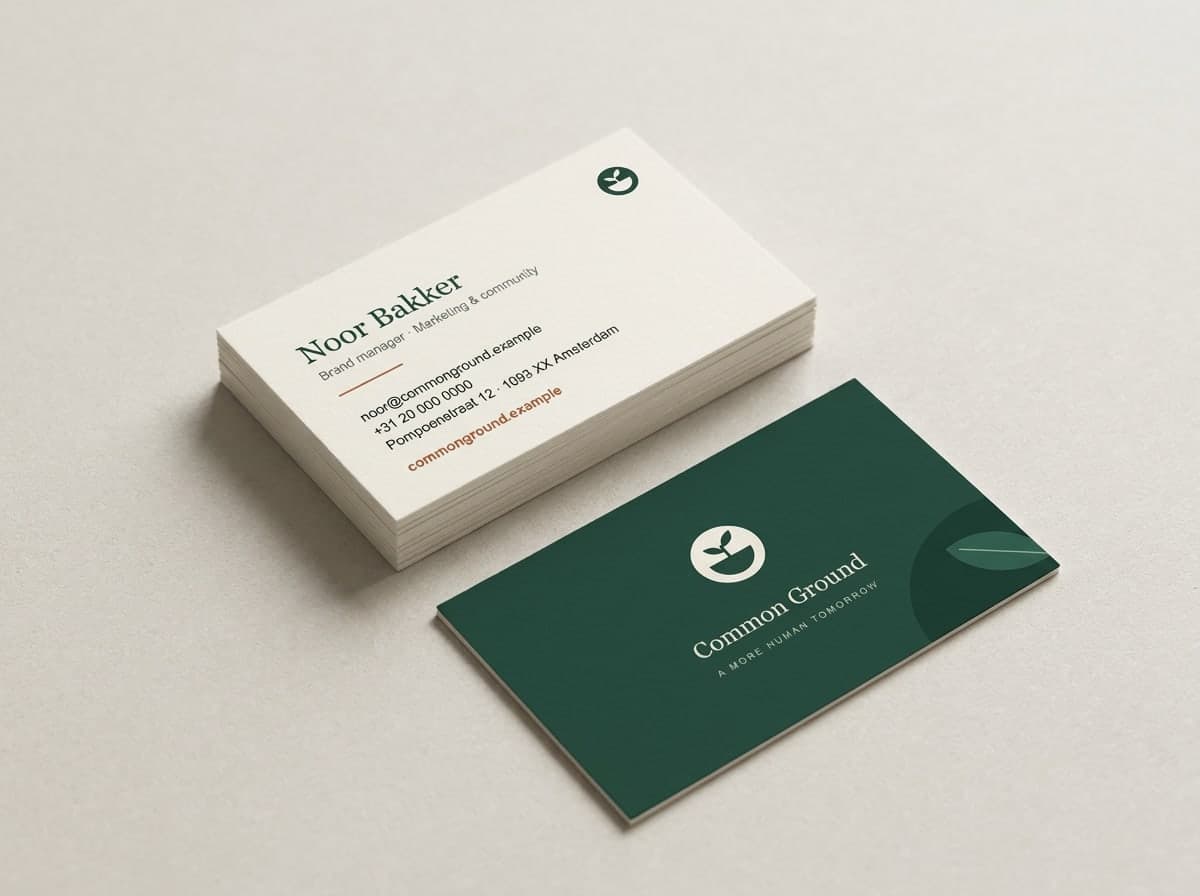
Business card, front and back 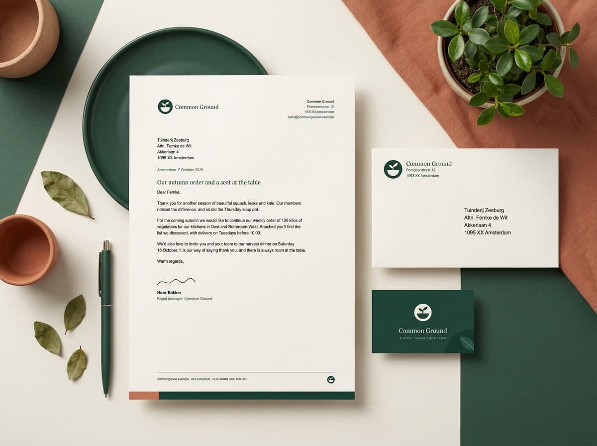
Letterhead with business card 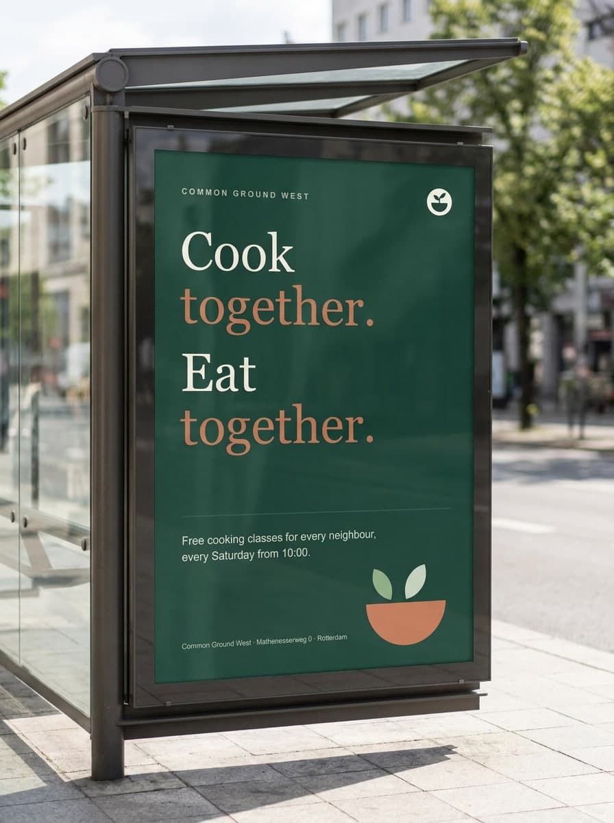
Poster for a cooking night 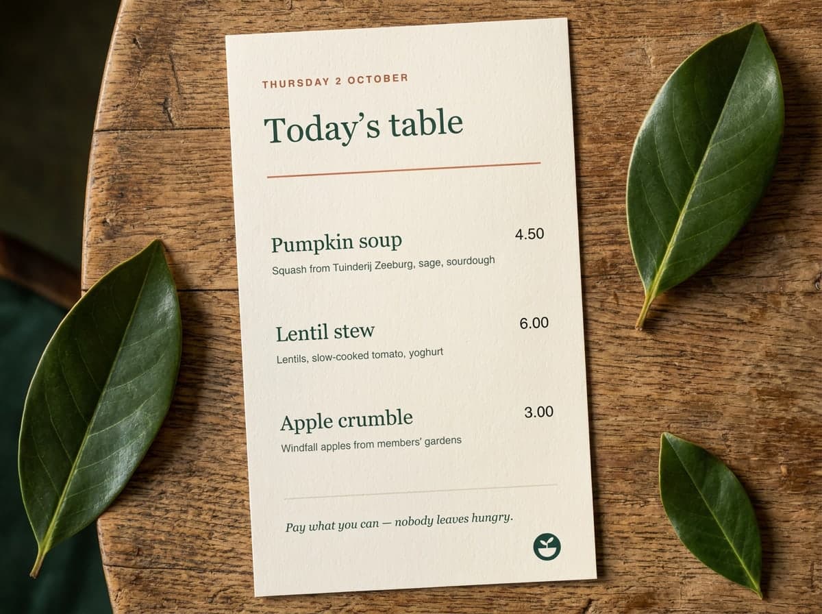
Menu card 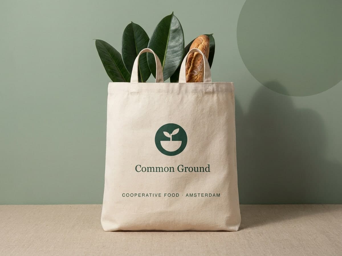
Tote bag 
Shopfront
Brand style guide or brand book?
The two overlap, but answer a different main question. Many organisations end up with one document that does both.
| Brand style guide | Brand book | |
|---|---|---|
| Main question | What does the brand look like, and how do you apply it? | Who is the brand, and how do you show and say that? |
| Core contents | Logo, colour, typography, imagery, layout, templates, files | Everything in the style guide, plus mission, values, audience, personality and tone of voice |
| Main readers | Designers, printers, web developers, marketing | Everyone who communicates for the brand, including leadership and sales |
| Choose this when | The brand strategy is already documented elsewhere, or it’s mainly about execution | The brand is new, changing or carried by many different people |
More on the broader version in what is a brand book.
How do you keep a brand style guide up to date?
A visual identity is alive. A new channel appears, a colour turns out too light on screen, the printer recommends a different Pantone number, a template gets replaced. A guide that doesn’t keep up falls behind within a year — and then people start working around it.
- One owner. One person or team decides on changes and answers questions. Put their name in the guide.
- One place. A permanent link or location, and no copies in inboxes. Remove old versions actively.
- A visible date. Readers must be able to see whether they’re looking at the latest version.
- Files next to the rules. Whoever reads a rule should be able to download the matching file straight away.
- A fixed review moment. Every year, for example, or with every new campaign: is everything still right?
That’s exactly why we built Brandbooks. Your brand style guide becomes a website with one link: you work in a draft and publish when it’s ready, with version history and a ‘last updated’ date. Colour codes copy in one click, WCAG contrast is calculated for every colour pair, and logos download per variant for screen, print or Pantone, with the real file details. Contacts are listed in the guide, and with an order block colleagues can request business cards or stationery from the agency that manages the identity. You give access per brand or per guide, so your printer and partners can see it too.
Making a brand style guide yourself, or hiring someone
If you already have a logo, colours and typefaces, you can often put the guide together yourself. The steps are in how to create brand guidelines, and the outline in our brand guidelines template gives you a structure to fill in straight away.
If the identity itself still needs designing or refreshing, bring in a designer or agency. Brand guidelines cost covers what to expect and what to ask for at handover. Either way, ask for a guide you can update yourself, not just a PDF.
Frequently asked questions about brand style guides
What is the difference between a visual identity and a brand style guide?
The visual identity is the design itself: logo, colours, typography, imagery and layout. The brand style guide is the document that explains how to apply that design, with rules, specifications and files.
Is a brand style guide the same as brand guidelines?
Often, yes — the terms overlap heavily. Strictly speaking, a style guide is mostly about the visual identity, while brand guidelines or a brand book also describe the brand itself: mission, values, audience, personality and tone of voice. Many organisations combine both. See what is a brand book.
How many pages should a brand style guide be?
Anything from a handful of pages for a small business to a hundred or more for a large organisation with many applications. Page count says little; what matters is that every rule has an example and every colour a code.
Why does a brand style guide have so many colour codes?
Because every medium handles colour differently. HEX and RGB are for screens, CMYK for standard print and Pantone for spot colours that have to match exactly, such as on packaging or textiles. With only a HEX code, a printer has to convert it themselves, and the colour often shifts.
Who creates a brand style guide?
Usually the designer or agency that developed the visual identity, as part of the handover. But you can also put one together yourself once the identity exists. The brand style guide example shows how a complete one is built up.
Do freelancers and small businesses need a brand style guide?
Not an extensive one, but a compact version, yes, as soon as you work with a printer, web developer or freelancer. Logos in the right formats, colour codes, typefaces and a few examples stop everyone from filling in your identity differently.