
Chapter 10 of 12
Layout & composition
Room at the table
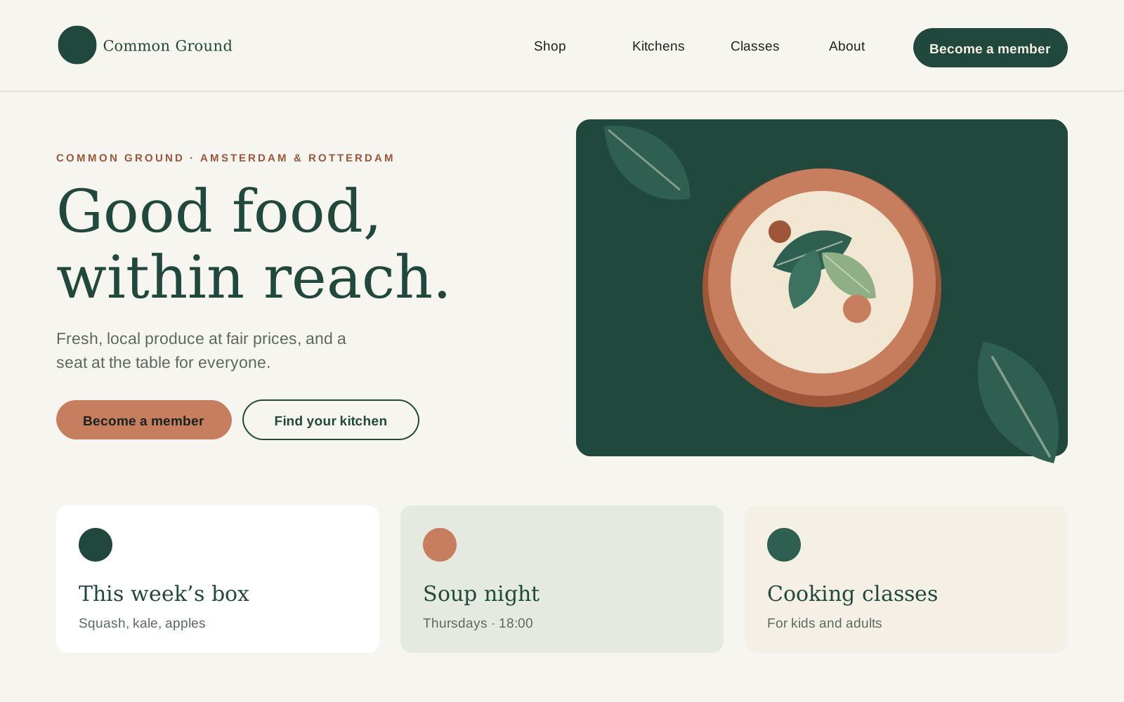
White space is our most-used brand colour. Every layout has one clear focal point, aligns to a simple grid and leaves at least a third of the surface empty. Pick a format below to see its grid; the overlay shows it on our homepage.
Website (desktop)
- Format
- 1600 × 1000 px
- Columns
- 12
- Column width
- 98 px
- Gutter
- 24 px
- Side margins
- 80 px
- Top and bottom
- 40 px
- Baseline
- 8 px
Max. content width 1440 px. Text columns span at most 6 of 12 columns.
White space
- One focal point per layout: a headline, a photo or a shape. Not all three at full size.
- Leave at least a third of the surface empty.
- Align everything left to the grid. Centre only on symmetrical formats.
- Image to text: roughly 60/40 on posters and social, 40/60 on the website and in documents.
- Spacing in steps of 8 px (screen) or 4 mm (print).
Do
- Start with the most important message and give it the most space.
- Use the same margins on every page of a document.
Don't
- Don't fill every corner. Empty space is not wasted space.
- Don't place text over the busy part of a photo.
Questions about this guide?
Contact NoorLast updated 24 Sept 2026
Made with brandbooks