Chapter 7 of 12
Graphic language
Everything grows from the mark
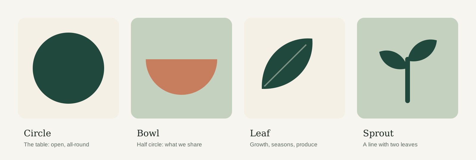
Our shapes, pattern, icons and illustrations all come from the same four forms in the mark. Used together, they make a poster or a post recognisable as Common Ground even before you see the logo.
Pattern
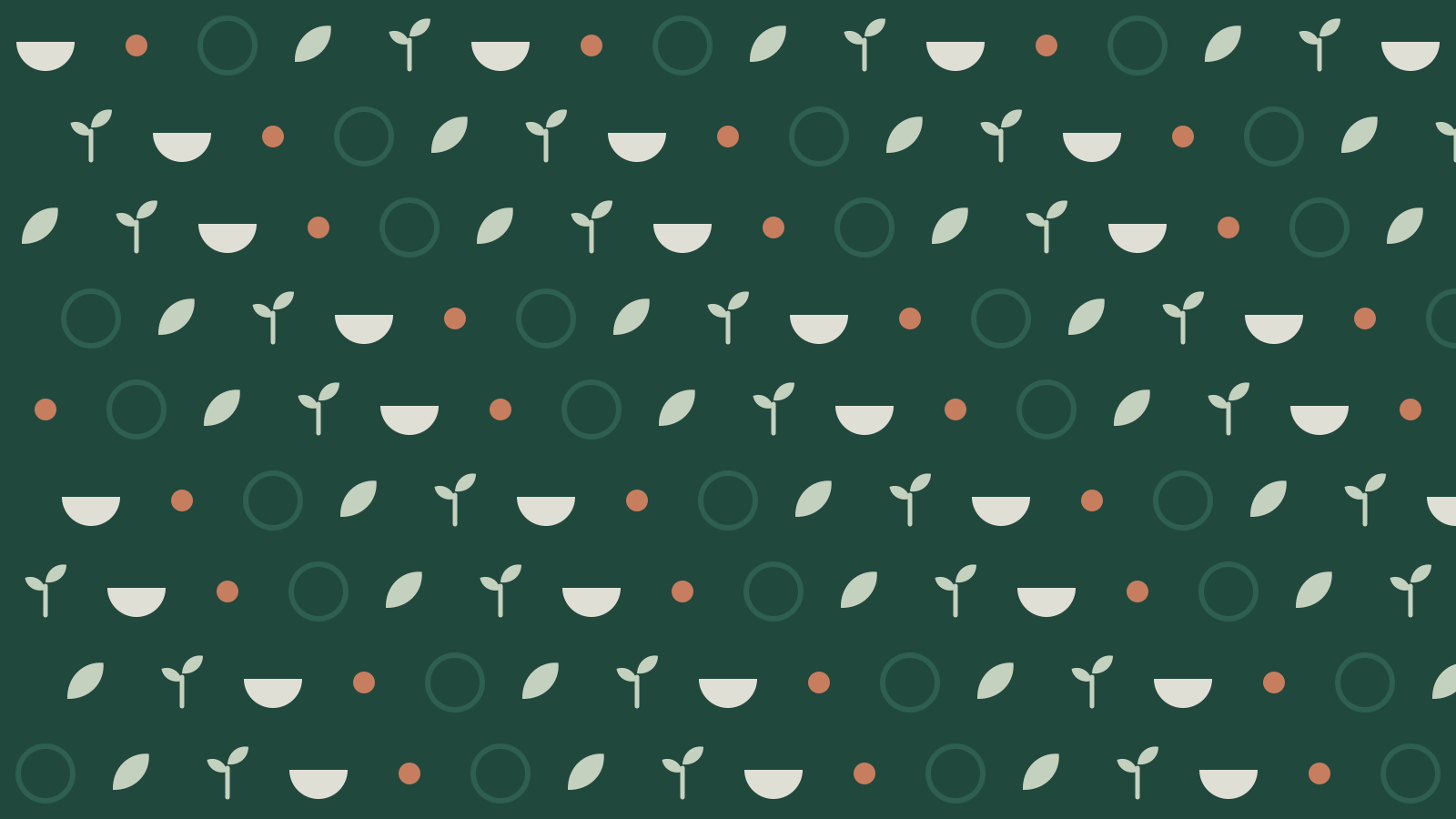
The table pattern
Bowls, leaves and sprouts on a loose grid. Use it on Forest as a backdrop for packaging, bags and event banners, never behind text.
Icons
Icons
We use Material Symbols, Rounded style, weight 400, in Forest. Rounded corners match the soft shapes of the mark. Search the set, switch sizes and download what you need.
Food and produce
8 iconsCommunity and activities
7 iconsPractical information
8 iconsMaterial Symbols by Google, open source (Apache 2.0)
Illustration
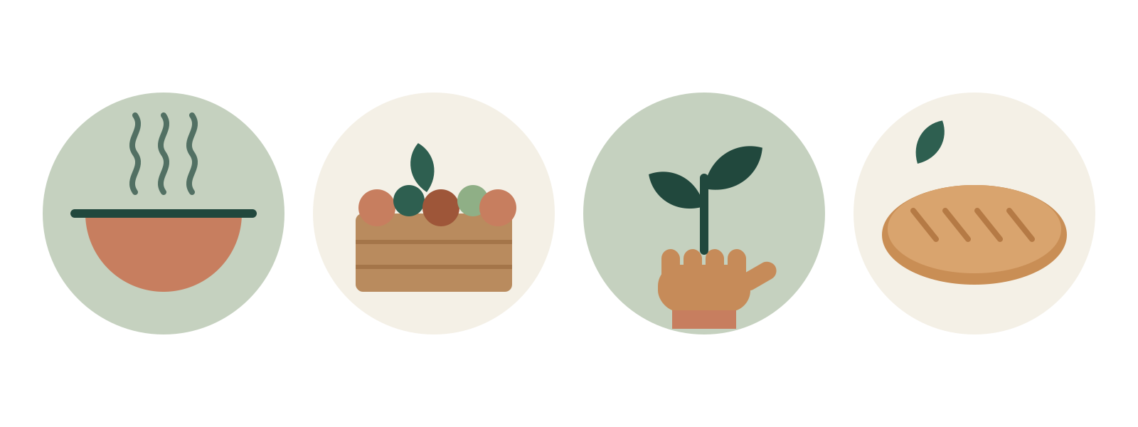
Spot illustrations
Simple, flat drawings built from the base shapes, in two or three brand colours. They explain (what's in the box, how pick-up works) where a photo would be too busy.
Frames
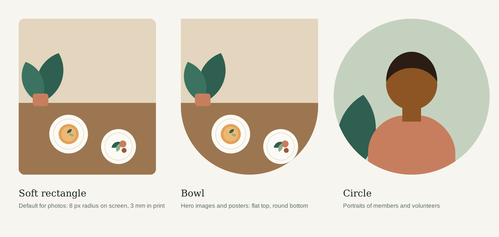
How we crop images
Three frames, each with its own job. The bowl frame is our signature: use it once per layout at most.
- Combine one photo, one shape or illustration and the logo. Three ingredients are plenty.
- Let shapes bleed off the edge of the page: it makes the layout feel generous.
- Use icons next to a word, never instead of one, so everyone understands them.
- Don't use the pattern and a photo in the same area. Pick one.
- Don't mix icon styles or download icons from other sets.
- Don't draw new illustrations with outlines, shading or cartoon faces.
Questions about this guide?
Contact NoorLast updated 24 Sept 2026
Made with brandbooks