Chapter 6 of 12
Typography
A warm serif and a clear sans
Two typefaces, both free and open source. Newsreader gives our headlines the warmth and character of a well-loved cookbook. Inter keeps everything else clear and easy to read, from ingredient lists to opening hours.
Big statements on posters, hero banners and campaign end frames. Regular weight, sentence case, a full stop at the end. One short line, max. eight words.
Good typography is invisible. It guides the eye from line to line, so readers stay with the story instead of the letters. Spacing between lines matters as much as the letters themselves.
- Line height
- 1.05 · 105% · 16.8 px at 16 px
- Letter spacing
- -0.01 em · -1%
A more human tomorrow.
Good typography is invisible. It guides the eye from line to line, so readers stay with the story instead of the letters. Spacing between lines matters as much as the letters themselves.
A more human tomorrow.
Good typography is invisible. It guides the eye from line to line, so readers stay with the story instead of the letters. Spacing between lines matters as much as the letters themselves.
font-family: Newsreader, Georgia, 'Times New Roman', serif;Page titles, section headings and menu items. Medium for H1 and H2; Semibold only at small sizes. Never in all caps.
Good typography is invisible. It guides the eye from line to line, so readers stay with the story instead of the letters. Spacing between lines matters as much as the letters themselves.
- Line height
- 1.15 · 115% · 18.4 px at 16 px
- Letter spacing
- 0 em · 0%
Cooking classes in Rotterdam-West
Good typography is invisible. It guides the eye from line to line, so readers stay with the story instead of the letters. Spacing between lines matters as much as the letters themselves.
Cooking classes in Rotterdam-West
Good typography is invisible. It guides the eye from line to line, so readers stay with the story instead of the letters. Spacing between lines matters as much as the letters themselves.
font-family: Newsreader, Georgia, 'Times New Roman', serif;All running text, forms, buttons and UI. Regular for reading, Medium for emphasis, Semibold for buttons and H3. 16–18 px on screen, 9–10 pt in print.
Good typography is invisible. It guides the eye from line to line, so readers stay with the story instead of the letters. Spacing between lines matters as much as the letters themselves.
- Line height
- 1.6 · 160% · 25.6 px at 16 px
- Letter spacing
- 0 em · 0%
Bring a container for leftovers.
Good typography is invisible. It guides the eye from line to line, so readers stay with the story instead of the letters. Spacing between lines matters as much as the letters themselves.
Bring a container for leftovers.
Good typography is invisible. It guides the eye from line to line, so readers stay with the story instead of the letters. Spacing between lines matters as much as the letters themselves.
font-family: Inter, Arial, Helvetica, sans-serif;Eyebrows, dates, kitchen names and prices: Semibold caps, +8% tracking, 12–14 px. Captions: Regular, sentence case, in Stone.
Good typography is invisible. It guides the eye from line to line, so readers stay with the story instead of the letters. Spacing between lines matters as much as the letters themselves.
- Line height
- 1.25 · 125% · 20 px at 16 px
- Letter spacing
- +0.08 em · +8%
EVERY THURSDAY · 18:00
Good typography is invisible. It guides the eye from line to line, so readers stay with the story instead of the letters. Spacing between lines matters as much as the letters themselves.
EVERY THURSDAY · 18:00
Good typography is invisible. It guides the eye from line to line, so readers stay with the story instead of the letters. Spacing between lines matters as much as the letters themselves.
font-family: Inter, Arial, Helvetica, sans-serif;Hierarchy
Type scale
Seven steps cover everything we make. Each one is set live below in Newsreader and Inter; type your own text to try it. Sizes are in px for screen; for A4 documents, halve them and read them as points (body 17 px ≈ 9.5 pt).
On mobile (below 600 px wide), scale down the three largest steps: Display 44/48 px, H1 34/40 px, H2 26/32 px. Everything from H3 down stays the same, and body text is never smaller than 16 px on screen.
Setting text
Easy to read, for everyone
Good typography is mostly about leaving things out. These three rules make the biggest difference.
Line length
Keep lines between 45 and 75 characters. On wide screens, use a narrow column rather than stretching the text across the page.
Alignment
Always align left with a ragged right edge. No justified text: it creates gaps that make reading harder, especially in Dutch with its long words.
Case and punctuation
Sentence case for everything, including headlines and buttons. Caps only for short labels. No exclamation marks. A full stop after a Display line is our hallmark.
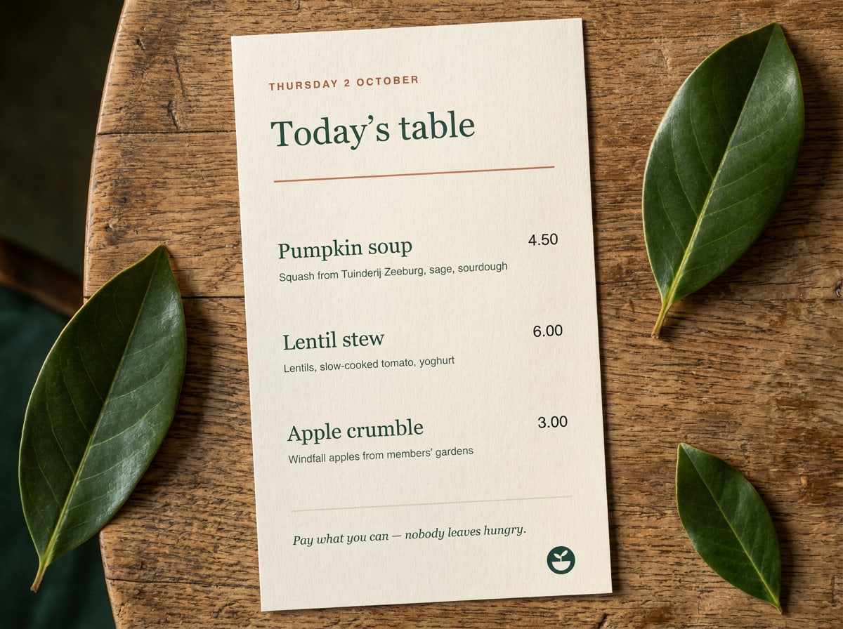
- Combine one Newsreader headline with Inter for everything else.
- Use real quotation marks and en dashes: “Soup” and 18:00–21:00, not "Soup" and 18:00-21:00.
- Use tabular figures in Inter for prices and timetables so the numbers line up.
- Don't set long paragraphs in Newsreader or headlines in Inter Bold. Each typeface has its job.
- Don't use italics, underline and bold at the same time to emphasise something. Pick one, preferably Medium.
- Don't add other typefaces, not even for a single event poster. Script fonts make us look like a café chain.
Practical details
Fonts in daily use
Where do I get the fonts?
Fallback fonts
Word, Google Docs and email
Writing in Dutch and English
Questions about this guide?
Contact NoorLast updated 24 Sept 2026
Made with brandbooks